If you think your dining space is too far gone, let me stop you right there. These makeovers prove that even the most awkward layouts and dusty corners can turn into something sleek, cozy, or straight-up jaw-dropping.
I’ve rounded up my favorite before-and-afters that had me doing double takes. Get ready for clever layouts, lighting that makes the room feel twice the size, and a few design tricks you might want to steal.
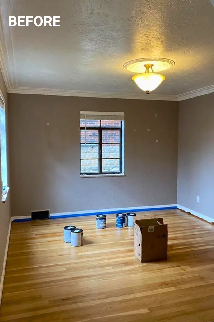

Starting with a blank, boring dining room? This transformation is proof that the right details can turn it into something surprisingly cozy.
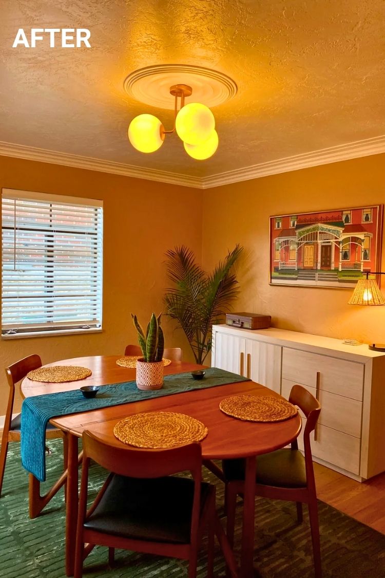
Credit: u/StatisticianWhich461
The walls are painted Covered Wagon by PPG, and it completely transforms the space into something golden and glowing. That sculptural globe light fits right in with the vintage teak table, and the deep green rug adds just enough mood.
I’m especially into the woven placemats and the artwork. It’s simple but so full of soul.
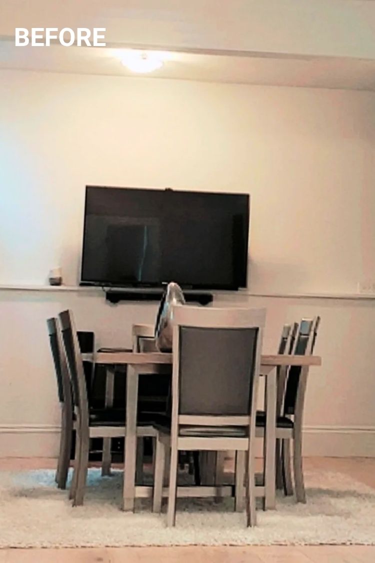
It’s wild what some lighting and styling can do. What started as a plain setup with a wall-mounted TV turned into a seriously glam dining space.
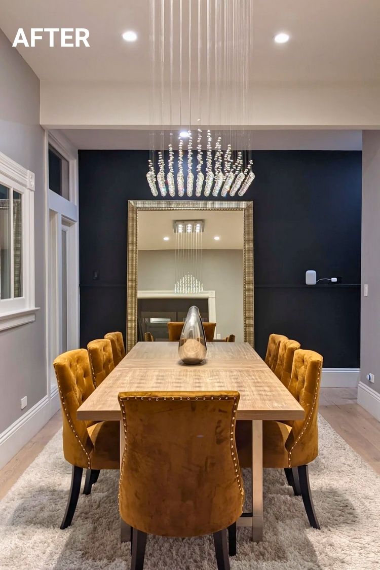
The mustard velvet chairs pop like crazy, and that chandelier? Looks like it belongs in a boutique hotel. The giant mirror is doing heavy lifting too, bouncing all the light around and making the whole room feel way bigger.
I also love how the dark wall adds just enough drama without taking over. Wildest part? They pulled this off for under $2,500, and it doesn’t look budget at all.
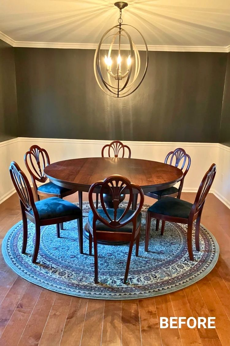
I didn’t expect teal walls to feel this rich and soft at the same time, but here we are. The color is Dragonfly by Behr, and painting the ceiling too makes it feel like you’re fully inside a jewel box.
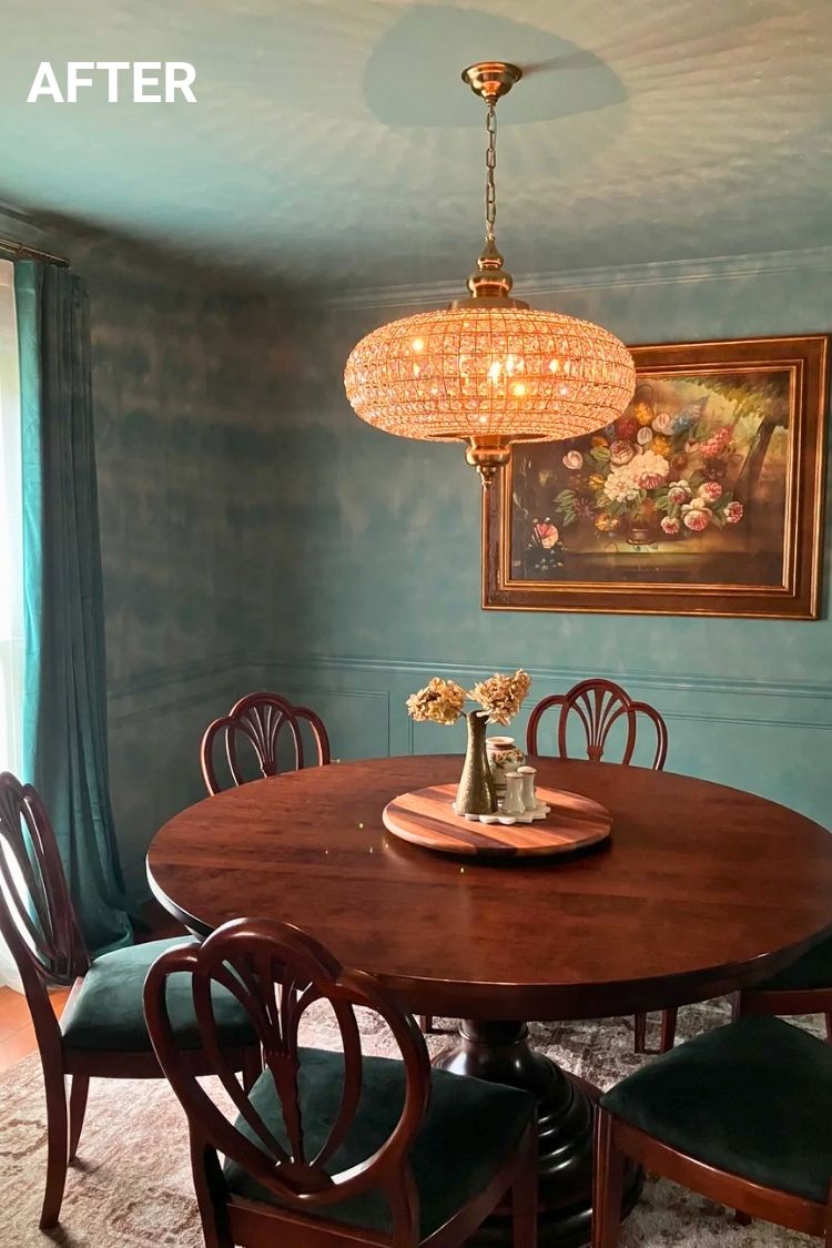
That crystal chandelier from Ballard Designs throws the prettiest shimmer, especially in low light. The round dining table keeps things cozy, and the 1920s shield-back chairs were a Facebook Marketplace find that honestly look custom.
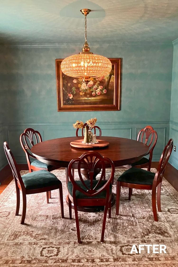
The vintage floral painting ties it all together. It’s moody, a little romantic, and feels straight out of a period film.
This dining space by u/Maryfonasari had me looking twice.
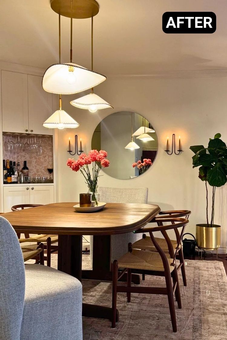
The sculptural pendant is the Arroyo chandelier from Lulu and Georgia, and it shifts the vibe from basic to boutique hotel. That table? A 40-year-old heirloom she refinished with her dad, paired with Facebook Marketplace wishbone chairs that totally nail the warm-modern feel.
I love the round mirror. It doubles the glow from those dreamy sconces. Every choice feels thoughtful but still down-to-earth, like a room meant for slow dinners and good wine.
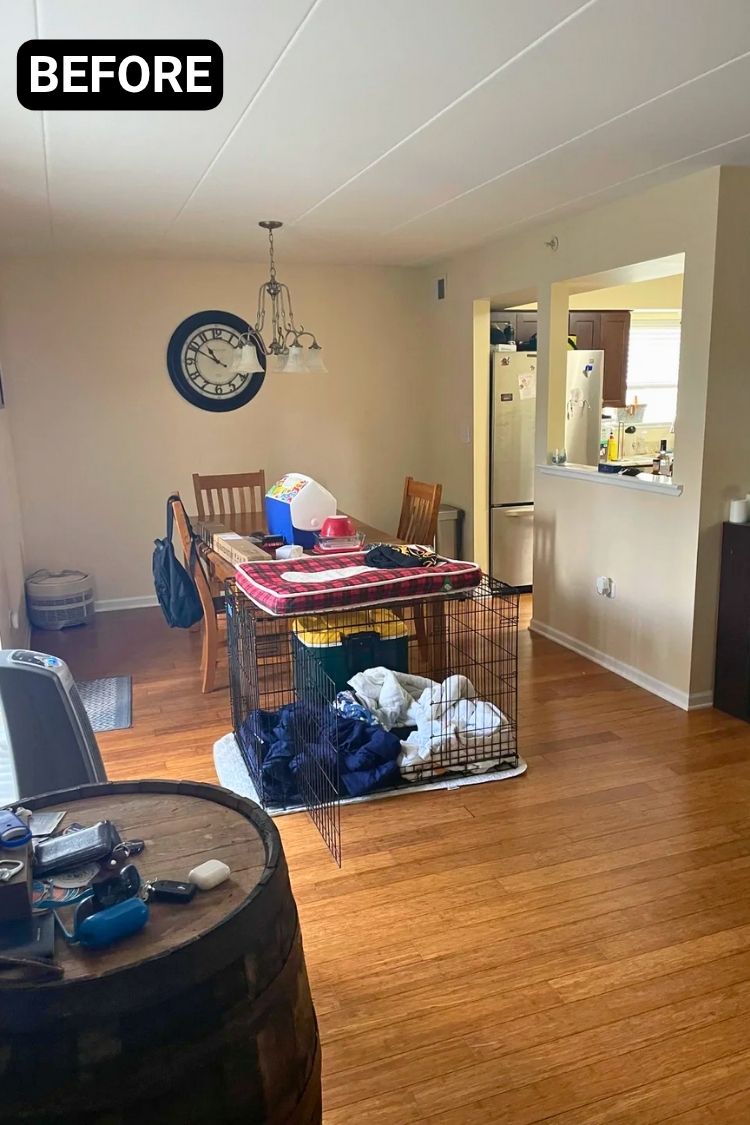
This dining room makeover is a total scene-stealer. The before was just your average space—neutral walls, random storage, and a big dog crate right in the middle. But the after? It’s vibrant and full of life.
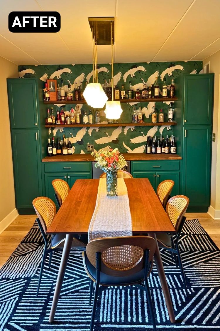
That deep green paint (Hunt Club by Sherwin Williams) and the crane wallpaper from Spoonflower completely transformed the vibe.
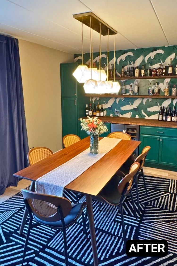
I love how the built-in cabinets solve the storage problem while doubling as a stylish bar. Everything feels thoughtfully chosen, from the wood table to the bold rug and geometric lighting from West Elm. It’s not just pretty. It’s practical, personal, and full of character.
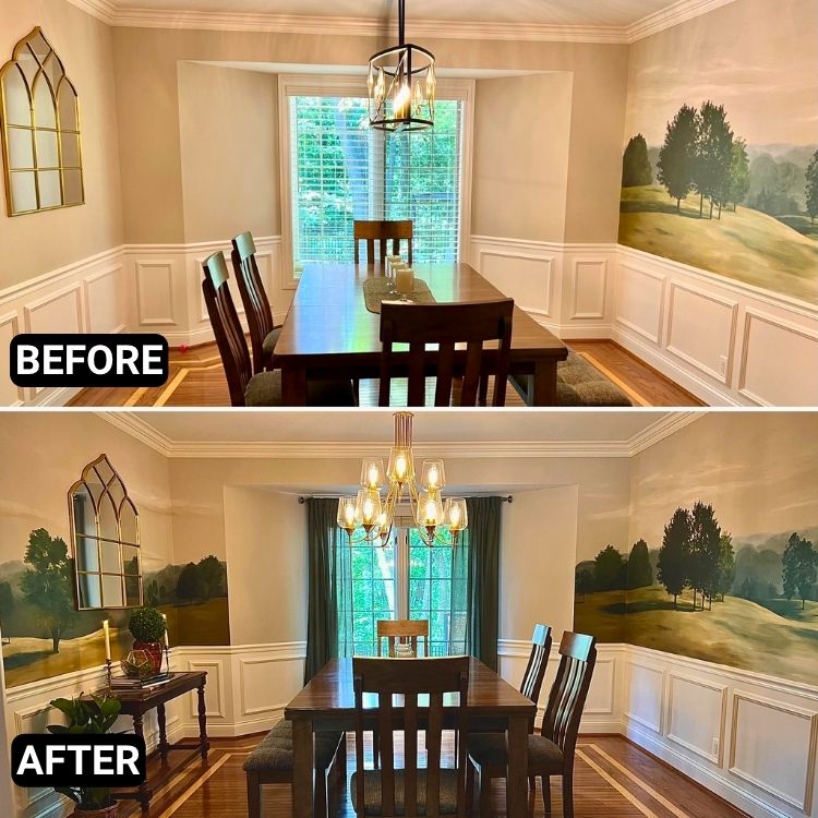
u/knitstorm pulled it together by extending the mural across the whole room. That single change alone makes the space feel complete, like you’re dining inside a peaceful painting. The new chandelier warms things up without being too showy, and the darker curtains finally ground the big window.
I wasn’t sure about the mirror at first, but now it totally works, it almost feels like another window into the landscape. The setup’s still simple, but way more intentional now. Just goes to show, you don’t always need new furniture to make a space feel fresh.
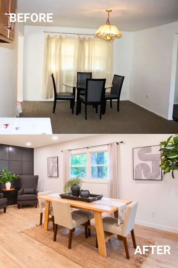
The transformation here is wild. That dingy little corner went from looking like a forgotten waiting room to a real dining moment. The soft rug, pale wood tones, and cushioned chairs make it feel warm without trying too hard.
I’m into the way the black accent wall gives just enough drama, and those sheer curtains keep the whole thing feeling bright.
It finally feels like a place where people actually want to sit and hang out, not just eat and leave. Honestly, the layout and textures do most of the heavy lifting, and they nailed both.
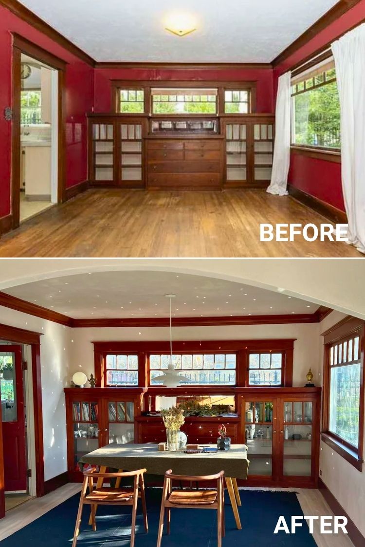
This room went from dark and dated to calm and collected. The white plaster walls give the wood trim space to breathe, and now the built-ins are the real star.
I like how the cooler floor tone softens everything without feeling cold. It’s not the typical golden oak, but it balances the warmth of the wood in a more relaxed way.
Even with all the original characters intact, the whole space feels lighter and more usable now. There’s something really satisfying about keeping the charm while giving it room to glow.
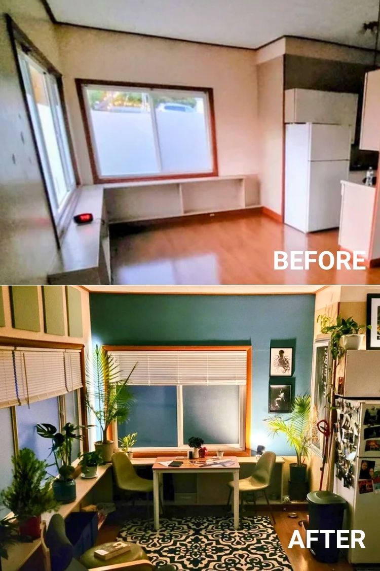
This transformation feels like the definition of turning a blank slate into a cozy retreat. The painted wall panels and rich blue backdrop make the window area pop without overpowering the space.
What I really like is how the long built-in ledge got repurposed with greenery and seating, super smart use of an awkward layout. The layered textures from the rug, plants, and artwork add warmth without making things feel crammed.
It’s not flashy or overly styled, just personal, inviting, and full of life. Feels like the kind of spot you’d linger with a coffee or lose track of time in.
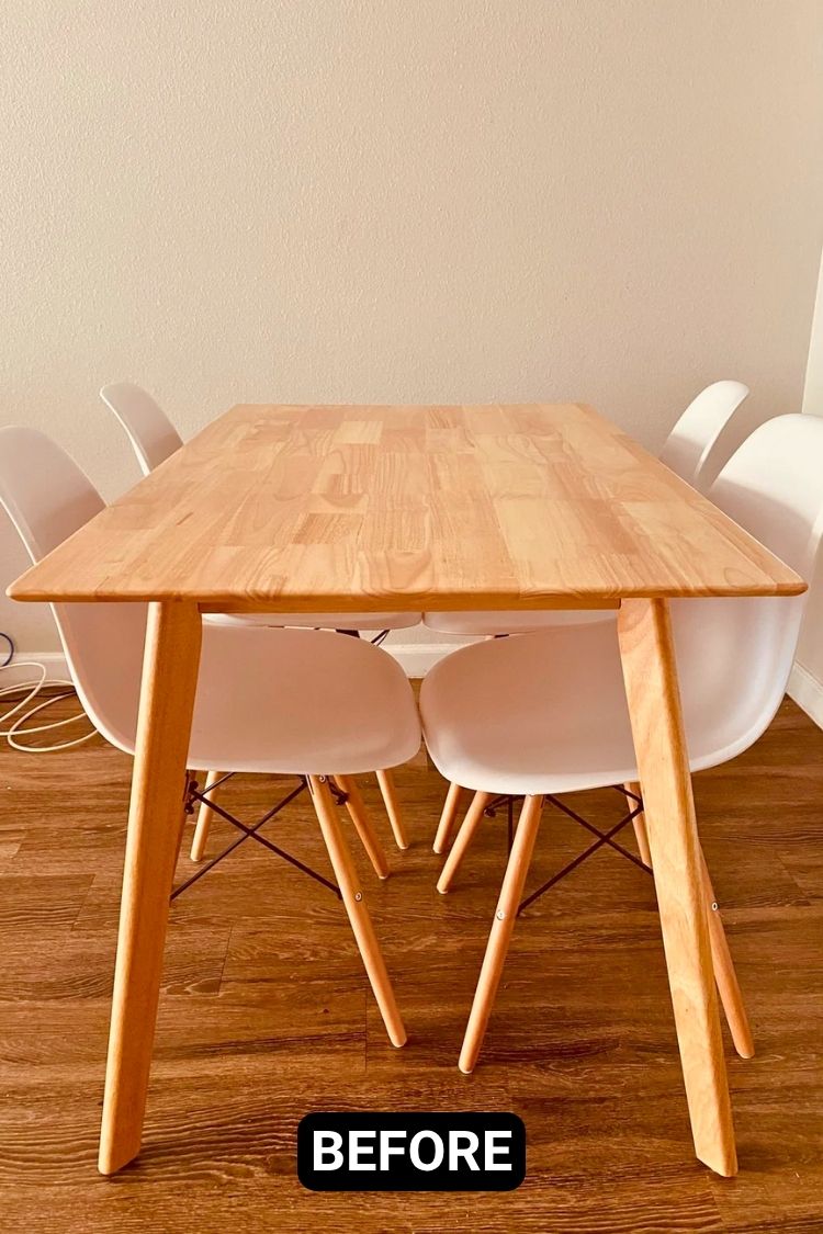
This one’s such a great example of how just a few pieces can completely shift the mood. The plain setup already had good bones, but adding the tribal rug, the wall prints, and that woven table runner made the space feel styled without being overdone.
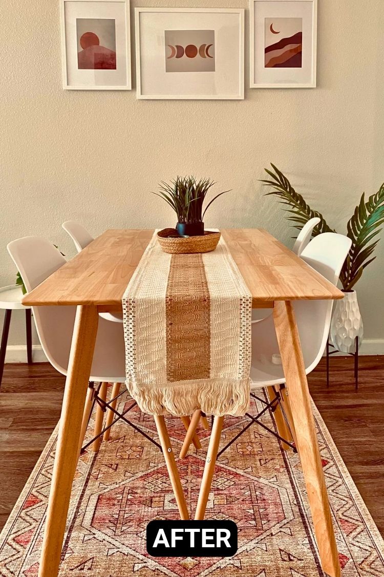
The palm in the corner gives it that breezy, relaxed energy, and now the dining area actually feels like a finished room instead of a placeholder.
Hard to believe the whole thing came together for just around $1,200. The vibe now reads boho but clean, and it’s a setup that feels both personal and polished.
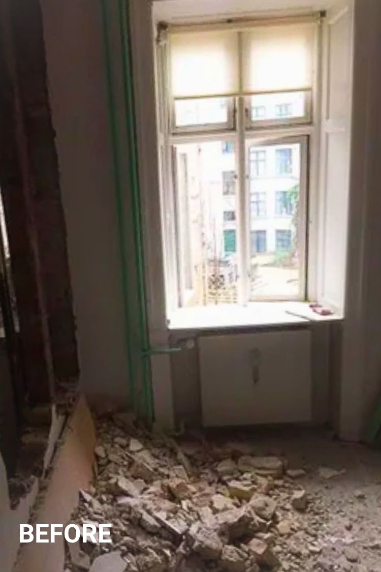
It’s wild to think this corner once looked completely unfinished, because now it’s the calmest spot in the apartment.
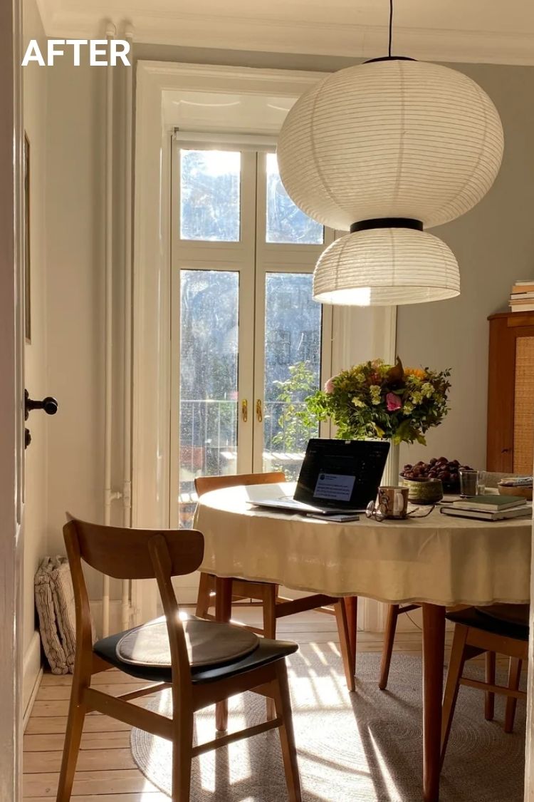
u/r37n1w turned it into the kind of dining nook that soaks up every drop of light. That sculptural paper lantern pendant adds softness without feeling fussy, and the tall windows do most of the heavy lifting.
The round table, bentwood chairs, and even the scattered books all feel lived-in and warm. Nothing here screams for attention, but together it’s one of those spaces you don’t want to leave, even when the coffee’s cold.
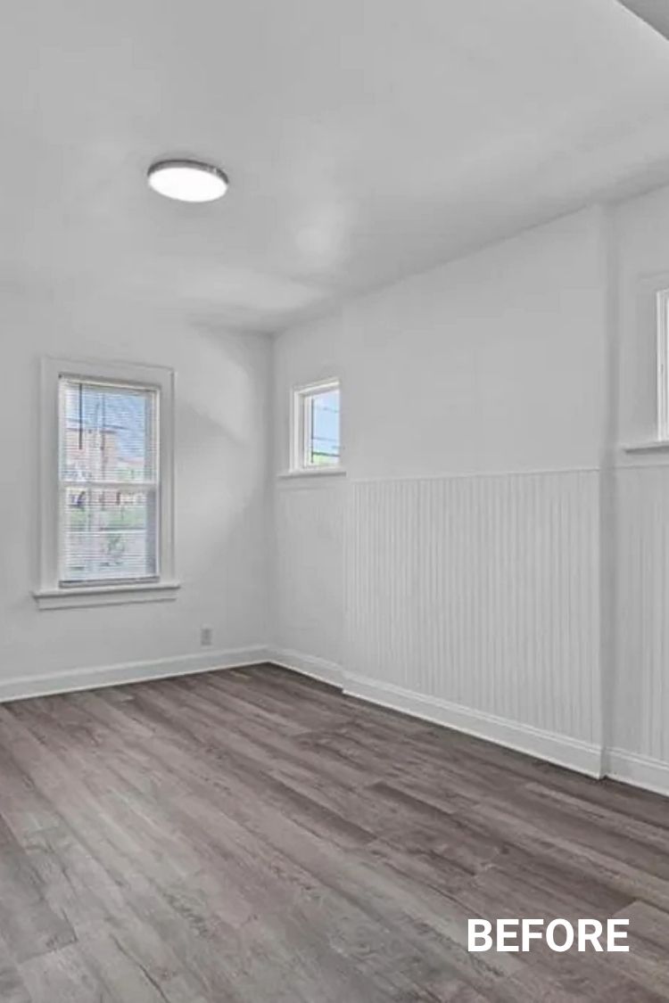
When you start with bright white everything, it can feel like a blank slate and a bit of a trap.
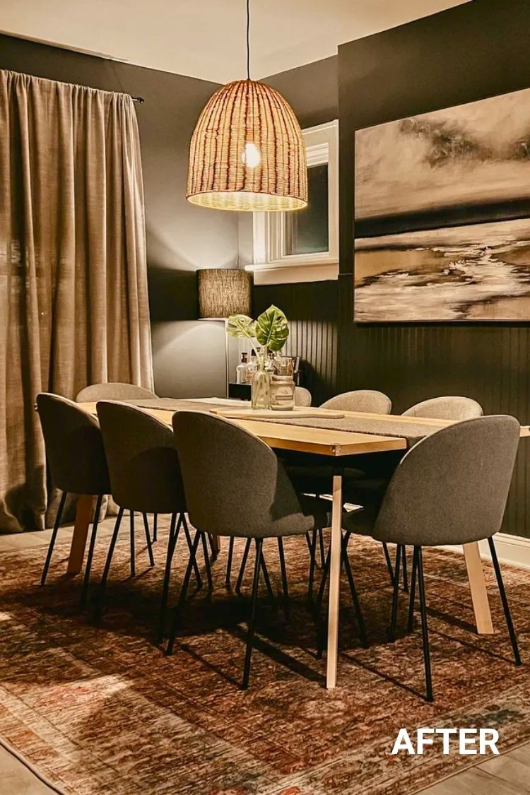
I love how this space leans hard into deep tones instead—Graphic Charcoal on the walls, a rust-colored rug, and those soft linen curtains that hit the floor just right.
The rattan pendant from Home Depot doesn’t blast light, but it adds this perfect warm glow. And those dark modern chairs? Total Restoration Hardware energy without the stuffiness.
The layered lighting ties it all together. It’s moody, cozy, and feels way more grown-up than what it started as.
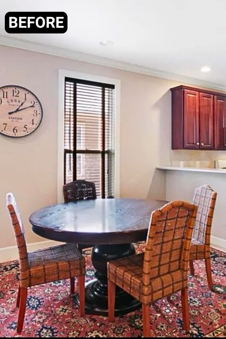
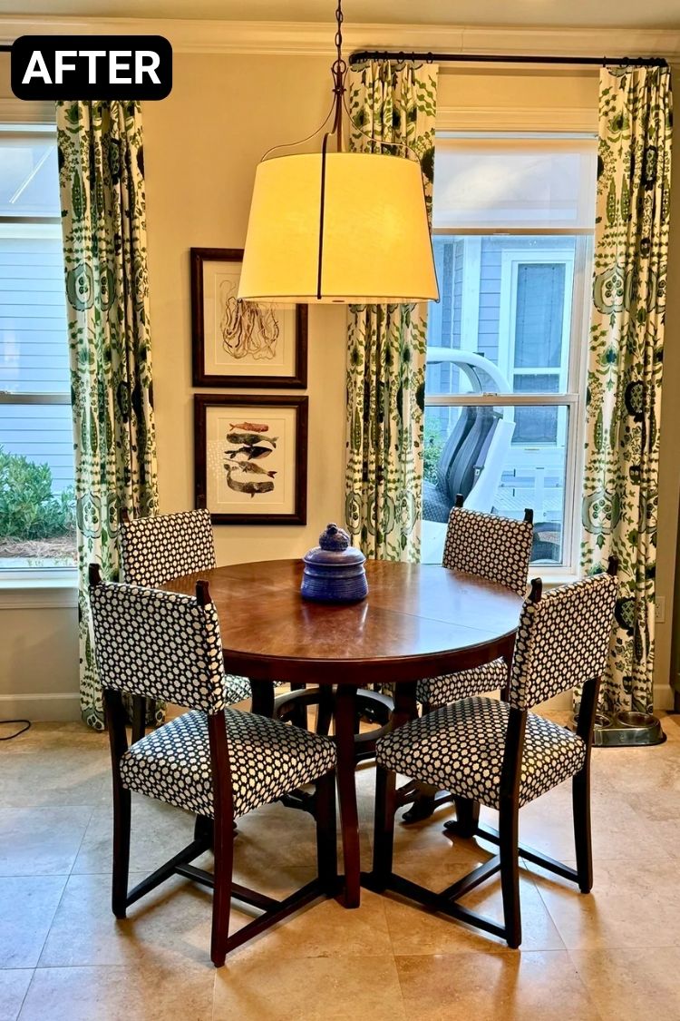
It’s kind of wild what some fabric and a new light fixture can do. The old setup felt heavy, but now it’s got this easy, breezy charm.
Credit: u/Jackson2348
I’m into how the bold green curtains make the windows pop without overwhelming the space, and reupholstering those chairs in a crisp pattern gives them a new life.
The pendant’s simple, warm glow ties it all together, and that little blue jar on the table is such a nice touch. The whole space just feels way more personal now.
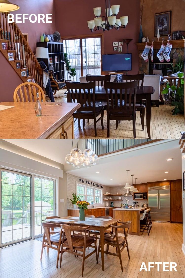
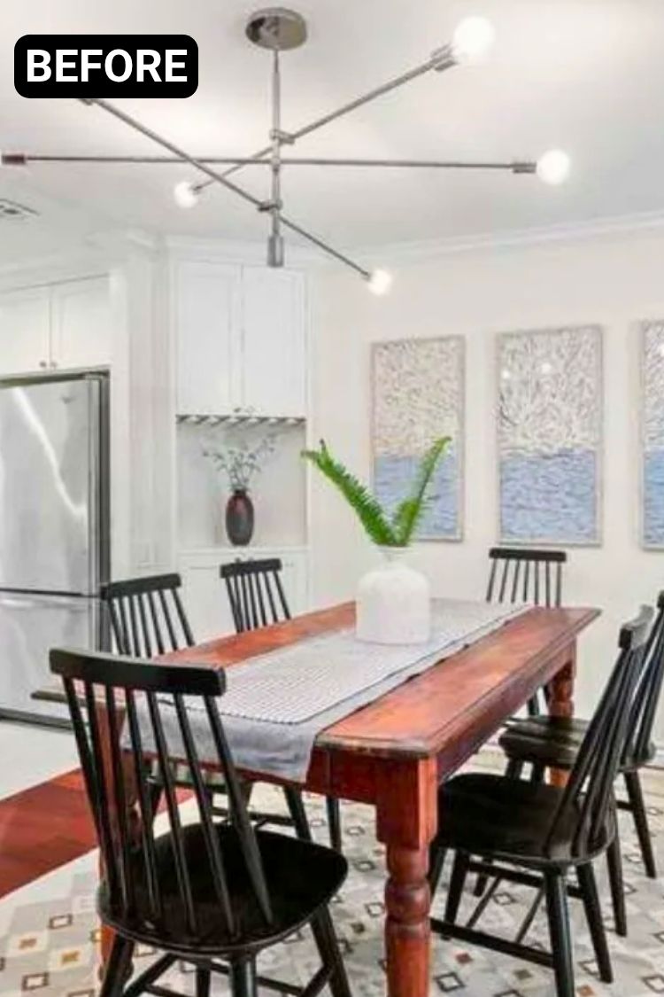
If you started with a dark, cluttered layout that made everything feel tight, this transformation feels like breathing room. The kitchen now flows right into the dining space with zero visual noise—just clean lines, warm walnut cabinets, and that dreamy wall of windows.
I’m obsessed with the wood grain running perfectly across the drawers, and those Room & Board chairs and table fit the vibe without trying too hard.
The chandelier was swapped out for a cluster of modern globes that somehow looks playful and architectural at the same time. It’s bright, practical, and still feels cozy.
This used to be one of those blank gray rooms that felt like a rental even if you owned it. Now it’s got this calm, collected Japandi vibe that feels so intentional.
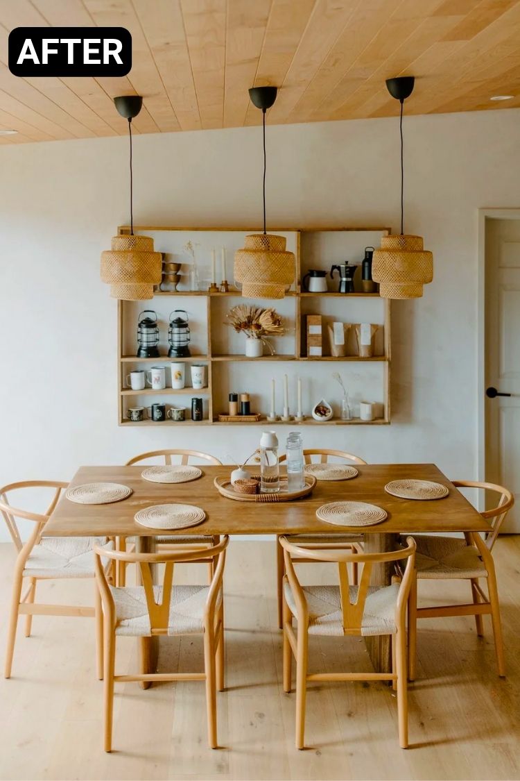
The wood-paneled ceiling adds just enough contrast without making the space dark, and those rattan pendants bring this soft, diffused glow that warms everything up.
I really like how the open shelf blends decor and storage without feeling staged. The table’s from West Elm, and the chairs (Poly & Bark) are a perfect balance of form and comfort.
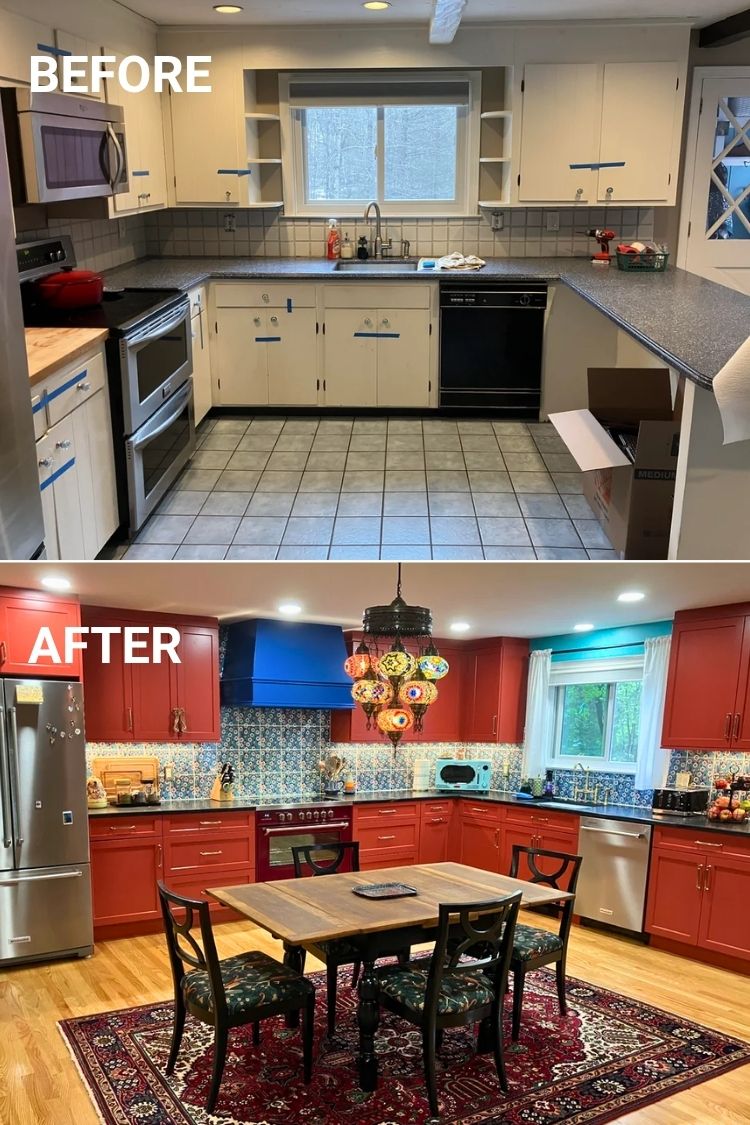
The next kitchen started as a standard-issue kitchen, but now it feels like a joyful escape. The red cabinets and bold tile bring energy, but the dining area really anchors it.
That heirloom table, paired with dark chairs and a rich rug, adds just the right weight. And the lantern chandelier? It’s dramatic in the best way. The whole space feels layered, lived-in, and ready for a long, happy meal.
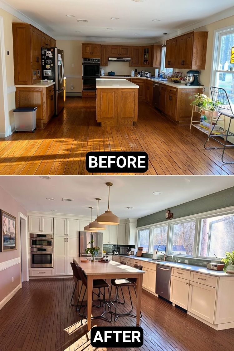
I’m still blown away by this change. Swapping out the heavy oak cabinets for soft white and adding that stretch of windows made everything feel calm, open, and full of light.
The wood-tone island gives just enough warmth, and the green backsplash is the quiet little statement that ties it all together. It finally feels like a space you want to cook in and hang out in too.
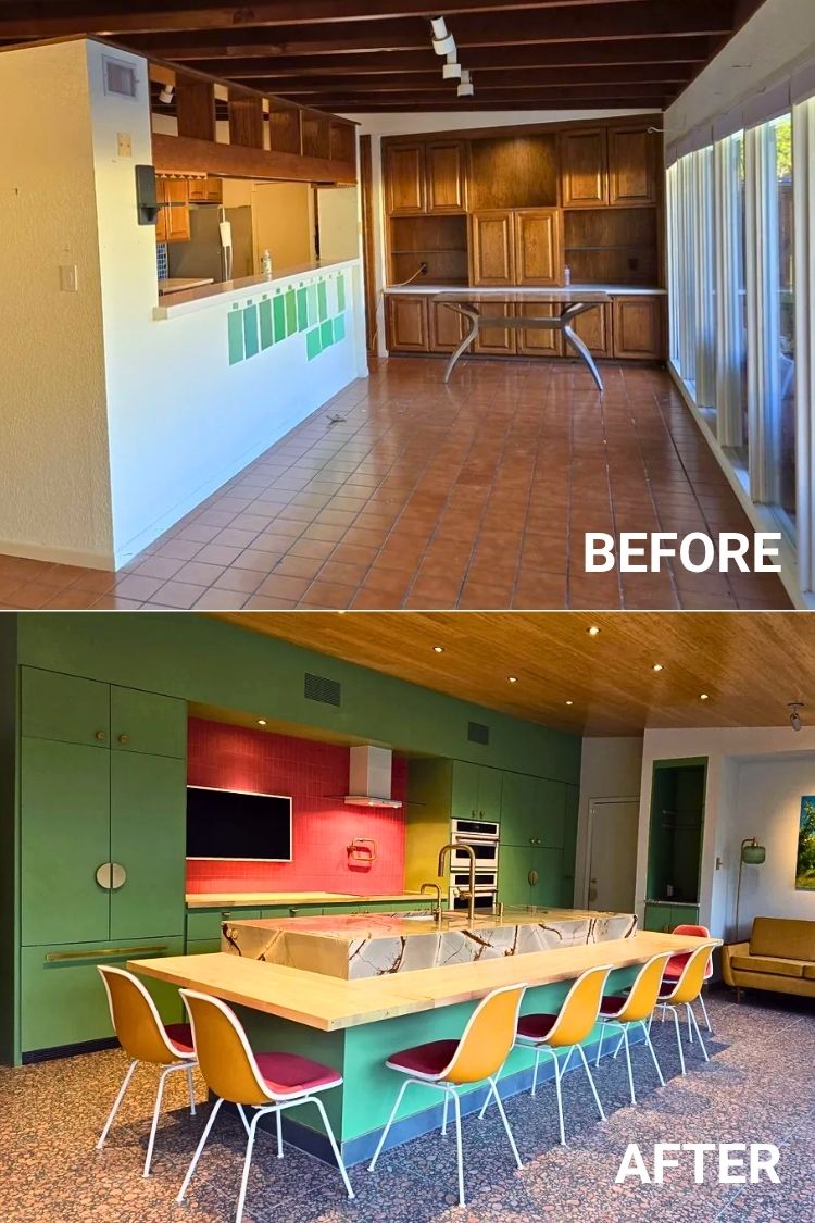
Credit: u/turntoveranewleaf
You’d never guess this was once a walled-in kitchen box with dark wood and heavy beams. The remodel brought in that wild midcentury energy—with Lounge Green cabinets, a red tile backsplash, and terrazzo floors that feel straight out of Palm Springs.
That sculptural island is a showstopper, but the bar stools and wood ceiling pull everything together like it was always meant to be this way. It’s bold, colorful, and full of personality without losing comfort.
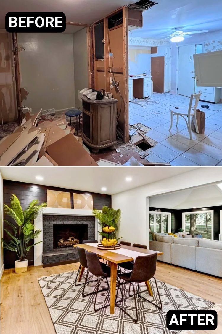
If you ever wondered whether a home could come back from the studs, this one’s your proof. That fireplace wall totally steals the show with its black brick, white trim, and mid-mod artwork that pulls it all together.
I love how the dark shiplap adds depth without making the room feel closed in, and the warm wood table with those dark chairs keeps things grounded.
The palms soften the edges, and that layered lighting really makes it all glow. It’s polished, but still feels like a place where people actually hang out, and probably never want to leave.
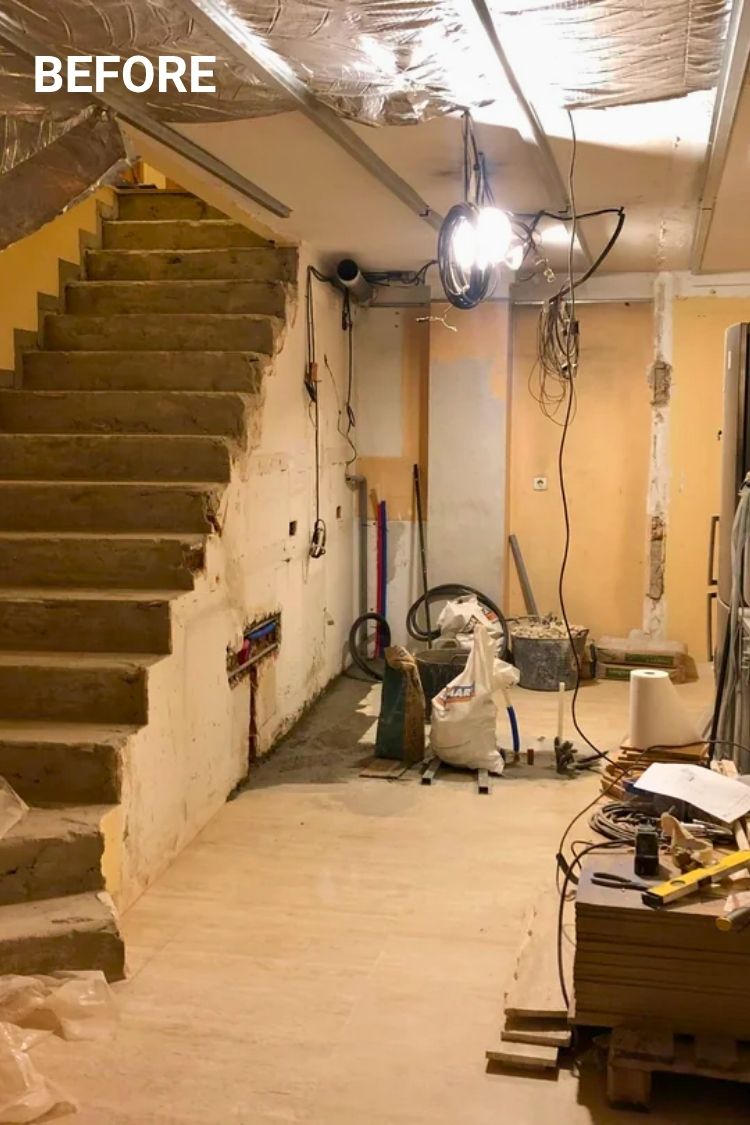
It’s hard to believe this used to be a mid-reno shell.
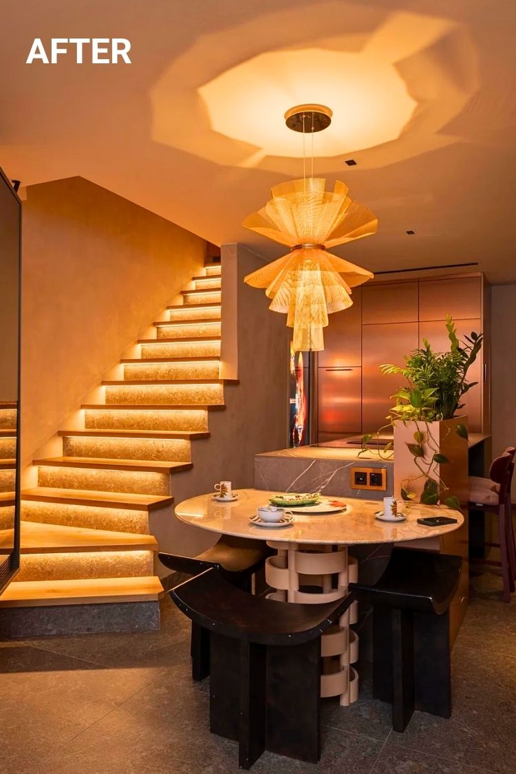
u/CotaPT managed to turn a bare-bones stairwell into something that looks like a designer showroom. The gold-lit stairs instantly pull your eye upward, while that folded metal pendant is like an art piece glowing from the ceiling.
The curved dining table with that woven base? Total statement. And somehow, they even tucked a little greenery in without it feeling crowded. It’s compact, but every inch feels intentional.
Hi, I’m Grace. I love quiet corners, natural light, and the kind of decor that doesn’t shout but stays with you. I’m drawn to slow, intentional spaces and I share what inspires me here.