There’re lots of kitchen floor plans out there, but when it comes to small kitchens, I usually see L-shaped and U-shaped layouts popping up the most, they’re definitely not the only ones that work.
I’m featuring a mix of layouts here because small kitchens all have different needs, and sometimes the less obvious setup ends up being the best fit for how you actually live and cook.

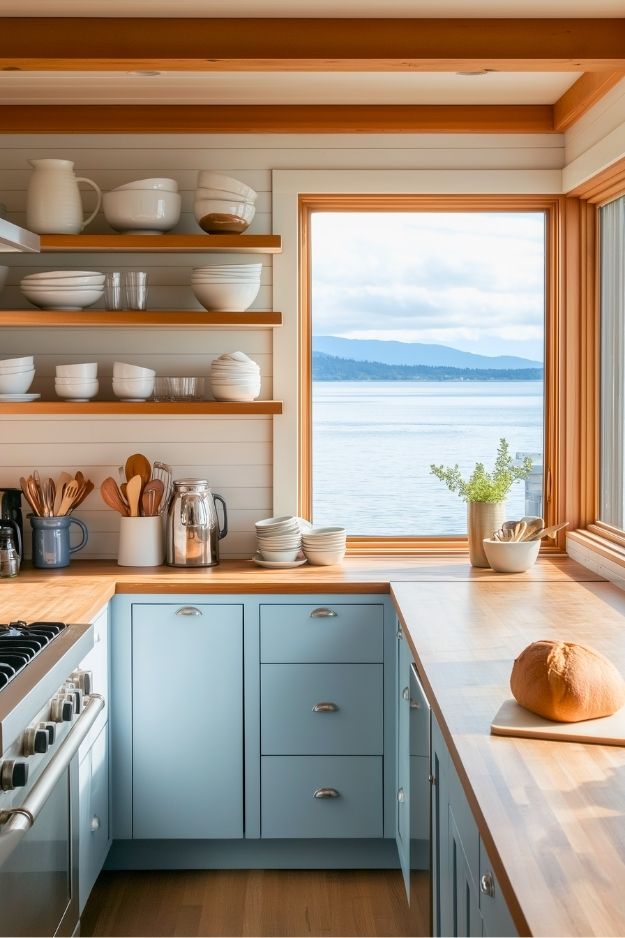
This is what I would call a small L-shaped kitchen with a breakfast bar. I really like how the open ENHET shelving under the overhang makes the peninsula feel lighter instead of bulky, which is usually the risk in tighter kitchens.

The mix of closed cabinets and open shelves avoids that boxed-in IKEA showroom look, and the warm wood counter softens all the white. By: Snuffvieh
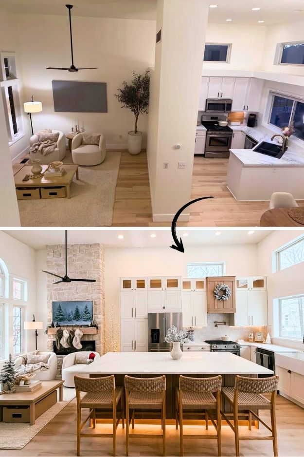
The kitchen clearly becomes the anchor of the whole space, with the L-shape wrapping the perimeter and the oversized island doing triple duty as prep zone, seating, and soft boundary.
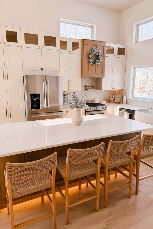
I actually like how the island replaces a wall without fully erasing separation, it creates a natural pause before you land in the living area. The tall ceilings and extra windows save it from feeling kitchen-heavy, and the warm whites, wood stools, and stone fireplace stop the open plan from going cold or echoey.
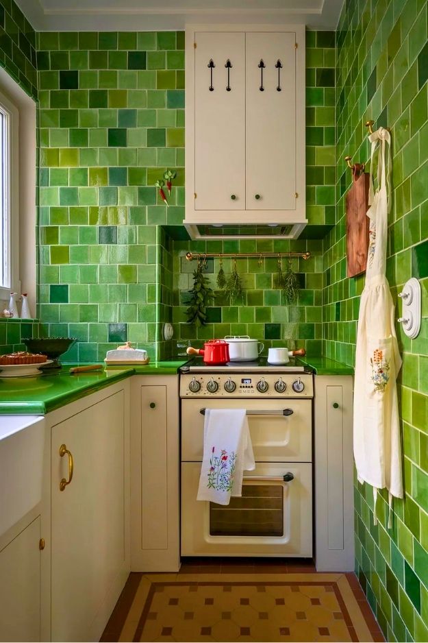
This kitchen is a great example of when a U-shape actually makes sense instead of feeling claustrophobic.
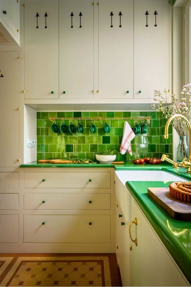
Everything is tucked in tight, but the layout clearly prioritizes workflow, sink under the window, range centered, prep space flanking both sides.
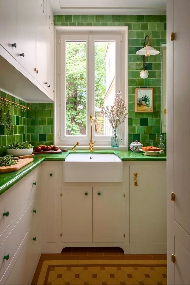
I really like the green tiles, they turn what could’ve been a purely functional setup into the entire personality of the room. Paired with classic cabinetry and warm brass details, the space feels intentional rather than cramped, like a little jewel box kitchen you actually want to spend time in. By ManiaforBeatles
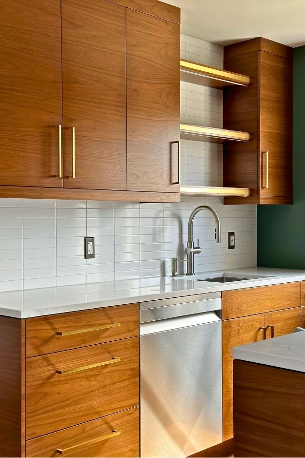
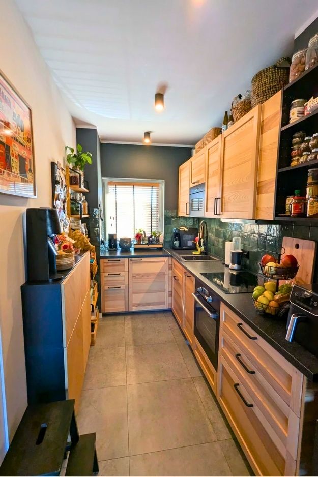
This kitchen feels like a love letter to detail if you’re the kind of person who notices grain direction and hardware before square footage. The galley layout is tight, but it’s handled confidently, everything runs in clean parallel lines, which actually makes the space feel longer and calmer instead of cramped. What really stands out to me is the book-matched walnut cabinetry and horizontal grain choice, it’s doing visual magic to widen the room. By southside_jim

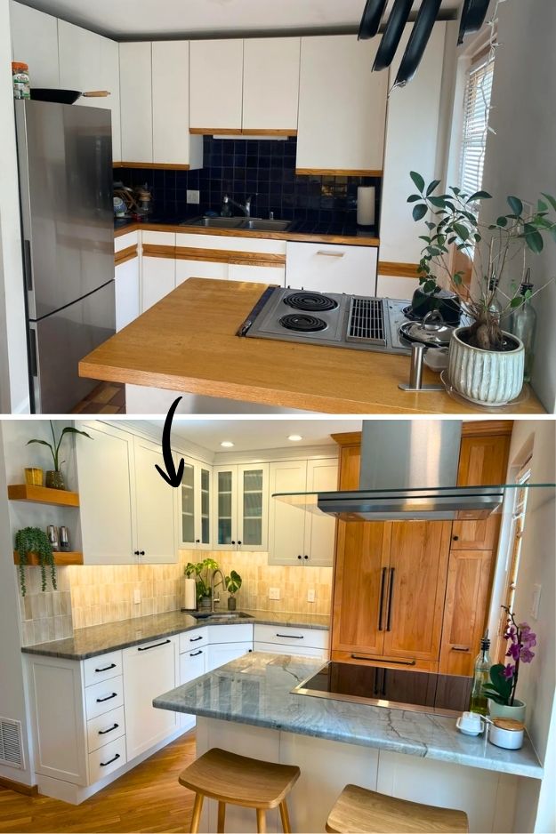
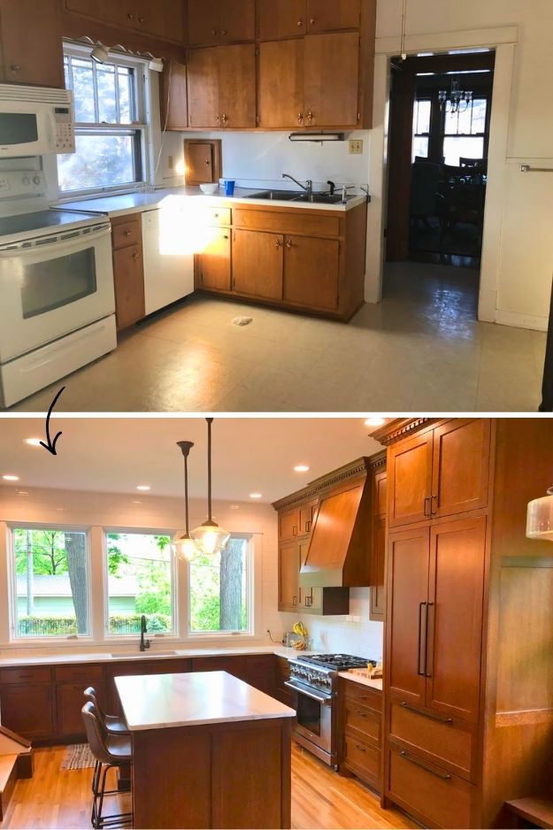
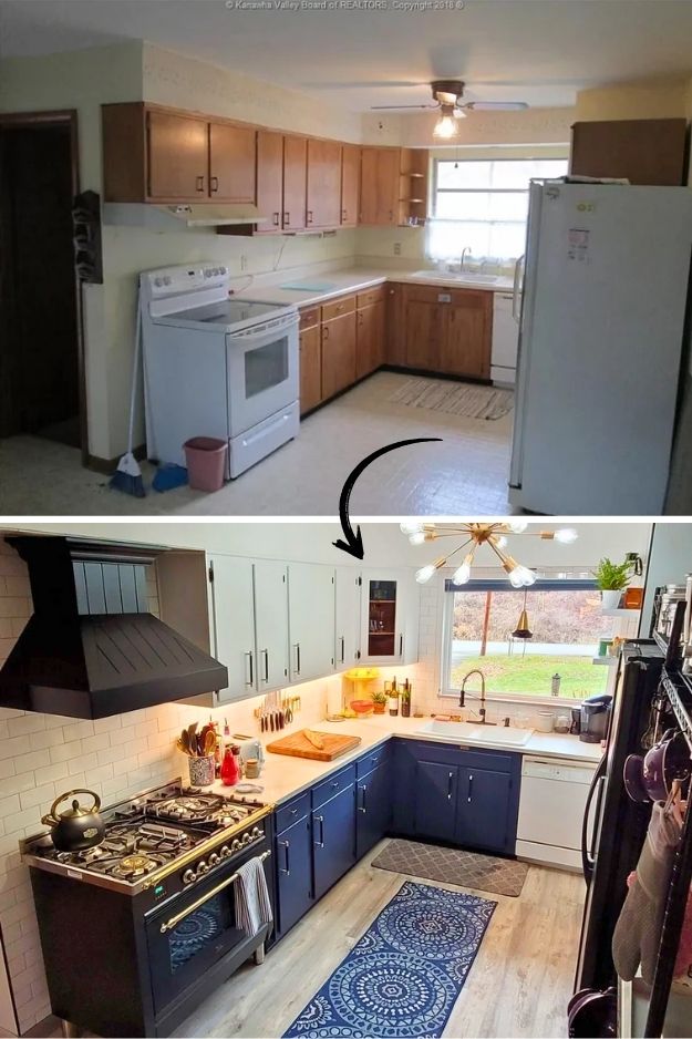
Before, the kitchen was essentially a tight galley kitchen with cabinets wrapping almost every wall. On paper that sounds efficient, but in reality it left no space for a radiator, trapped steam while cooking, and made the room feel cold and boxed in.
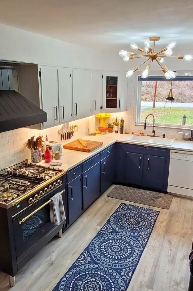
After the remodel, it becomes a practical L-shaped kitchen with one main run and a shorter return under the window. That shift frees up a full wall for heating, improves airflow around the cooking area, and makes the space feel wider and calmer. It’s a great example of how fewer cabinets can actually make a small kitchen work better. Credit: Aneres88
This kitchen feels like it was designed by someone who actually cooks, not someone staging for photos. It’s essentially a narrow galley, but the smart use of shallow cabinets, open shelving, and vertical storage keeps everything within arm’s reach without choking the space. I love how the thin IKEA cabinet and wall-mounted storage absorb all the “ugly” necessities so the counters stay usable, even if visually busy. The dark wall paired with light wood is a bold move that oddly makes the room recede instead of closing in.
This remodel is a great reminder that you don’t need more square footage to make a kitchen feel bigger. The L-shaped layout with a small peninsula does a lot of heavy lifting here, it defines the cooking zone while keeping things open to the dining room so people can hang out without crowding the stove.
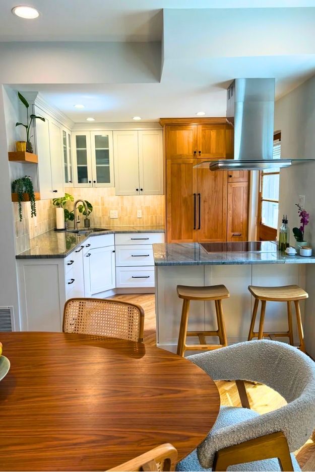
I’m really into how the paneled fridge and pull-out pantry disappear into the cabinetry, which keeps the room feeling calm and uncluttered. The blue quartzite countertop adds just enough drama, and the added vent hood finally makes cooking practical, not just pretty. Credit goes to sparklebarks
This remodel feels like a masterclass in respecting a home’s history without freezing it in time. The L-shaped layout keeps everything efficient and grounded, while the darker oak cabinetry ties beautifully into the original woodwork throughout the house.
The marble, the inset doors, and that dentil molding all feel intentional, not decorative for decoration’s sake. The built-in banquette is such a smart move too. It softens the space and makes the kitchen feel lived-in rather than showroom-perfect.

It’s classic, warm, and confident, the kind of kitchen that still makes sense decades from now, not just on Pinterest today.
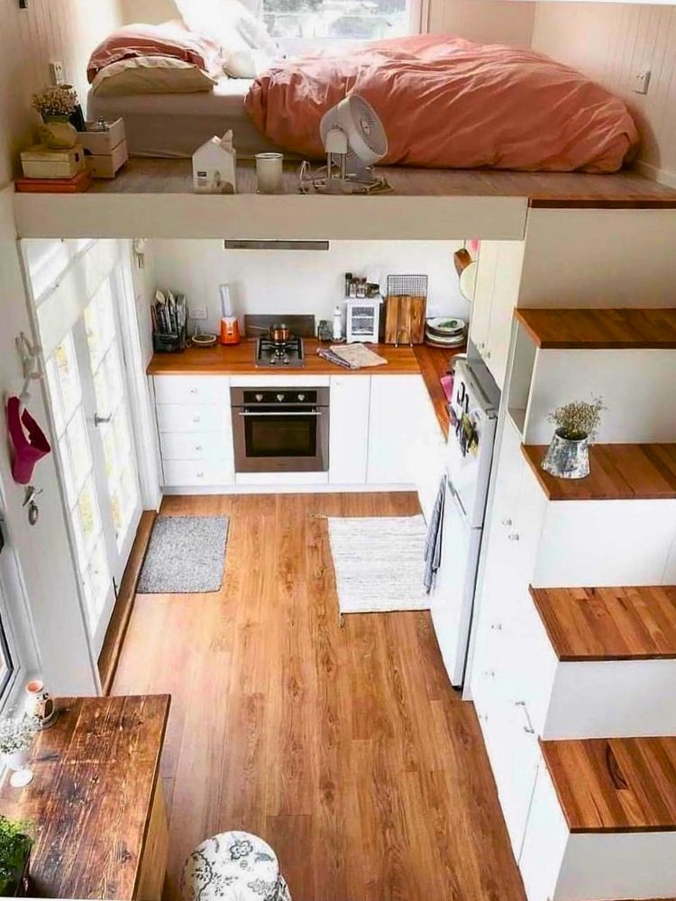
At first glance, this setup feels like peak tiny-home romance, and then your brain kicks in. The mini kitchen below uses a compact L-shaped layout, with the sleeping loft tucked directly above it, which makes the space feel efficient and visually cozy. Falling asleep to the smell of cinnamon rolls sounds adorable… until you remember gravity, stairs, and cooking smells rising straight into your bedding. Cozy? Yes. Calm? Maybe. Practical? I’m still thinking about it. By: myshambar
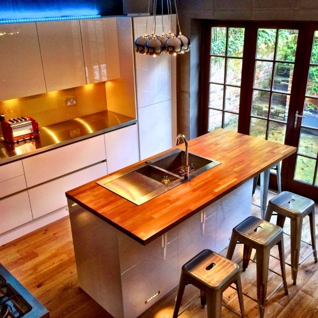
Walking into this kitchen, it’s hard not to feel a little jealous because for London standards, this space is huge. The cabinetry clearly follows a L-shaped layout, which explains why it feels so functional and generous, with everything wrapping neatly around the room and leaving the island to do the social heavy lifting. I really like how the wood countertop warms up all the sleek finishes, and the subtle lighting under the cabinets and island gives it that polished, magazine-worthy glow.

What makes this kitchen work so well is how not serious it is. The layout reads like a compact one-wall setup, more about charm than heavy cooking, and that honestly fits the guest-cabin vibe perfectly. I really like the green walls paired with that bold red cabinet, also, the rug is the real scene-stealer though, slightly rebellious for a kitchen but totally believable here since it’s more for coffee, snacks, and slow mornings than frying everything in sight.
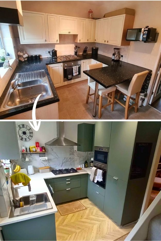
What stands out to me is that this is a layout change, not just a cosmetic swap. It shifts from a G-shaped into an U-shaped kitchen.
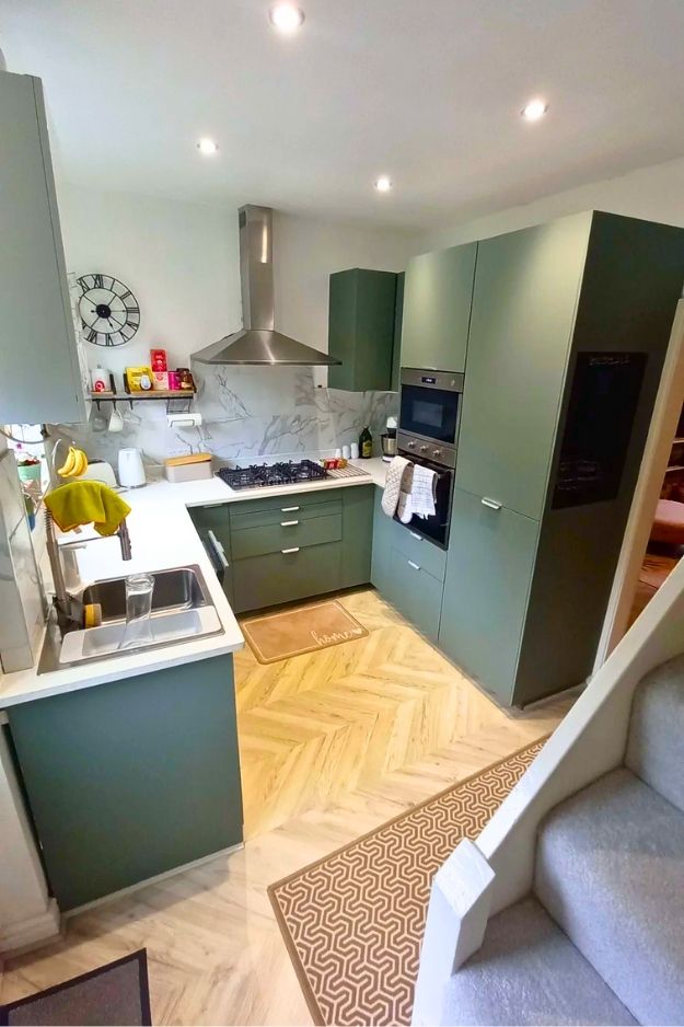
Yes, some counter space is sacrificed, but hiding the fridge in a tall unit and reorganizing storage makes the room feel calmer and more intentional. I really like the green tiles and cabinets paired with the lighter worktops, they soften the modern look and keep it from feeling sterile. It feels thoughtfully edited, not overstuffed. By jo242000
The layout itself didn’t need reinventing in this remodel. Everything stays within easy reach, which is exactly what you want in a narrower kitchen. The real magic is in the styling.
The deep navy lower cabinets ground the space, the lighter uppers keep it from feeling heavy, and that black range is doing a lot of visual heavy lifting in the best way possible. I also love how the rug softens the galley walkway instead of making it feel like a bowling lane. Small detail, big payoff.
Bonus


I work in tech, but my taste in design is straight out of a slow European village. Give me arches, aged brass, and a room that smells like books and coffee. That’s my kind of home.