Putting decor above the toilet was such a simple move, but it completely changed the vibe. Like… Why did I wait so long to try this?
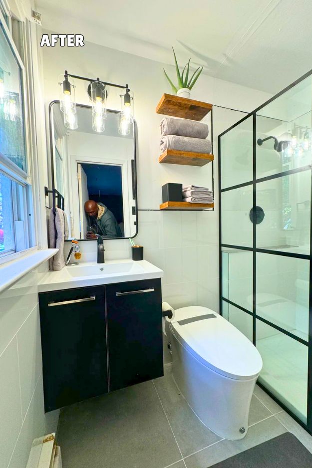
In the “before” pic, that wall above the toilet is basically dead space, just tile + stained upper wall, zero storage, zero style, and the eye goes straight to the ceiling damage and grime.
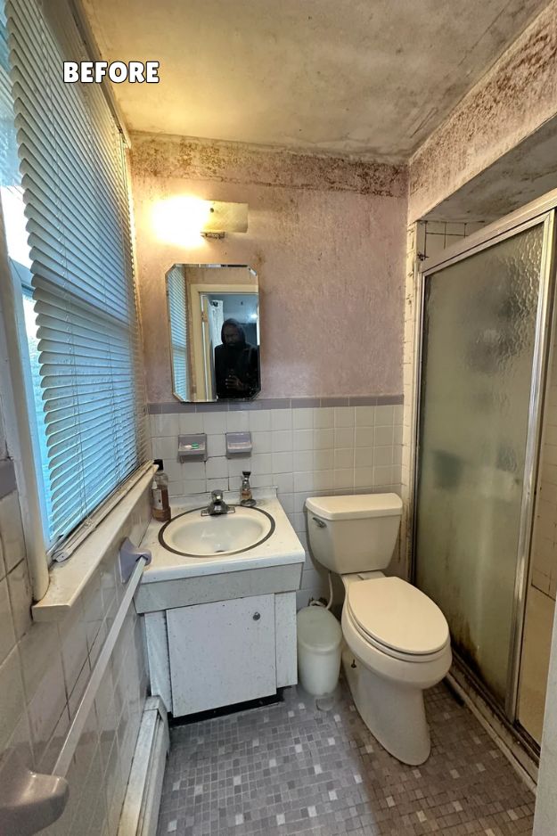
In the after, they completely flipped that weak spot into a feature: two thick rustic wood floating shelves + neatly rolled towels + stacked linens + a simple plant on top. It’s not just cute “styling,” it’s functional storage that makes the whole tiny bathroom feel cleaner, taller, and intentionally designed. Credits: T3SLABRO
The decor above the toilet is honestly the smartest part of this whole bathroom because it does function and looks styled without trying too hard. Those two chunky wood floating shelves give the perfect warm contrast against the crisp white tile and black accents, and I love how it’s layered: a simple plant up top (clean, spa vibe), then neatly rolled towels like a boutique hotel, plus a little “utility shelf” moment for extra linens. It’s minimal but not sterile, and it makes that awkward narrow wall feel intentional instead of forgotten.
This one is like the definition of “weaponized good taste,” because the whole makeover isn’t just pretty, it’s a statement. The star is that “Fuck You Pink” (Premier Paints Juicy Pink, with Beauti-tone Tickled Pink as a dupe), and I get why it works: it’s bold but still sophisticated when it’s paired with that gorgeous botanical wallpaper and warm, salmon-y tones pulled from it. By Jen_Itals
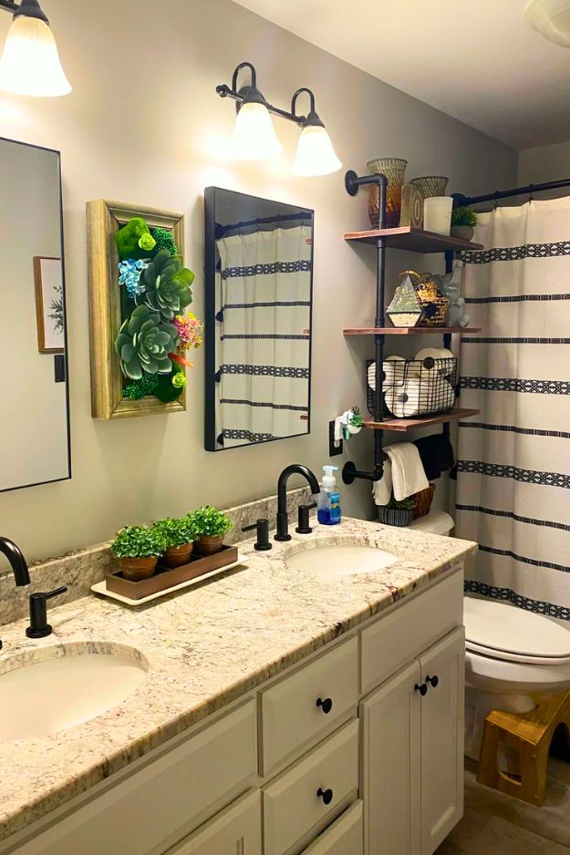
u/TheTiniestOffice basically proved you can make a bathroom feel like a cozy spa without doing anything dramatic. The real magic is the decor above the toilet: floating pipe shelves, plant-themed art (those iconic succulent frames everyone begged to link), and just enough cute objects to make it feel curated but not cluttered. People even called it an “Animal Crossing bathroom” in the best way, because it feels calm, fresh, and a little whimsical. Also, major points for keeping it functional (hello Squatty Potty + bidet).
The wall styling keeps the whole bathroom feeling soft and put-together without tipping into clutter. The two stacked botanical prints in light wood frames add that calm, “freshly cleaned but still pretty” vibe, and they quietly echo the floral shower curtain without competing with it.
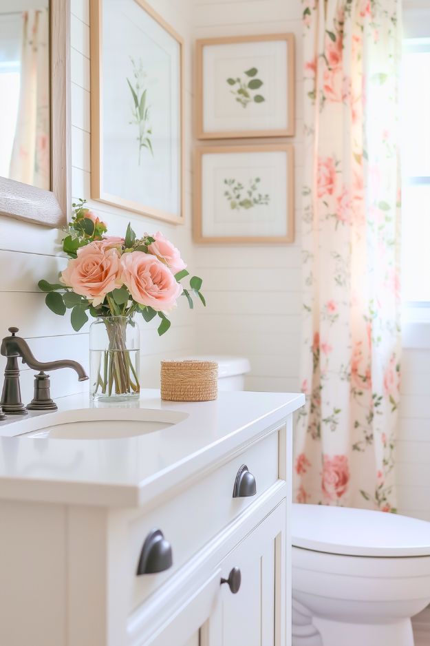
 Above the toilet, the decor nails that effortless cottage vibe without feeling overstyled. The two stacked botanical prints in light wood frames add a calm, “clean girl” focal point, and they flow beautifully with the blush floral shower curtain. The whole corner feels bright, airy, and softly romantic, like a tiny spring garden moment in bathroom form. I also love how the simple wall art keeps everything looking elevated, even in a small space. Feminine, fresh, and perfectly uncluttered.
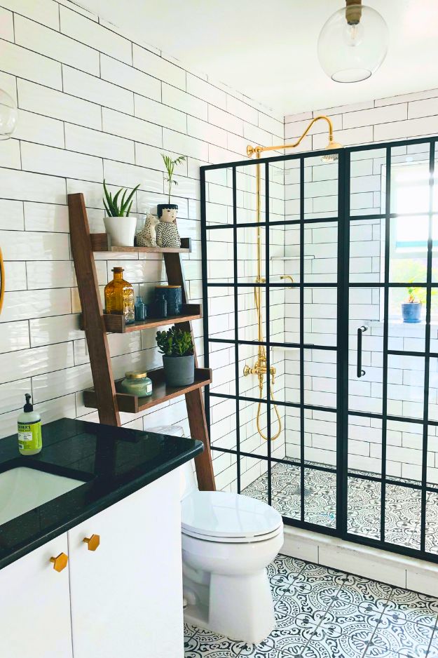
u/idrinkoranges’ DIY bathroom reno is peak black-and-white done right, because it’s crisp without feeling cold. The grid shower door is the obvious main character, it adds that “boutique hotel” structure and somehow makes even classic subway tile feel updated. Then behind the toilet, the ladder-style wood shelves were a genius move people didn’t expect to work, but they totally do, especially with a few plants to soften all that white. Practical note I’d actually steal: tossing a thin waterproof layer under anything on the shelves so humidity doesn’t wreck the wood.
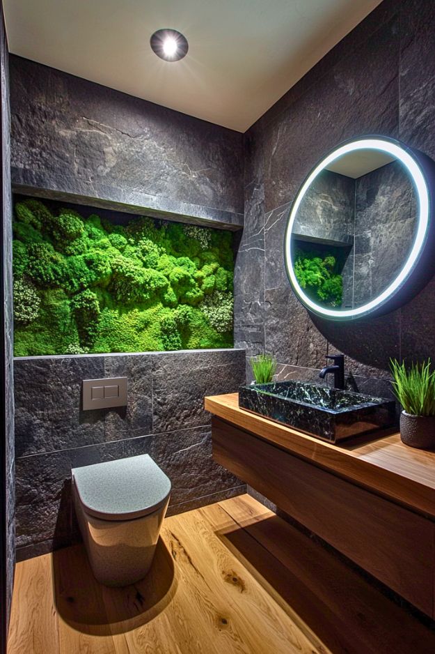
I can’t believe this actually worked. It’s basically “I love terrariums” energy… but makes it architectural and weirdly luxurious. The moss wall looks like a glowing mini jungle shrine above the toilet and I hate how much I love it.
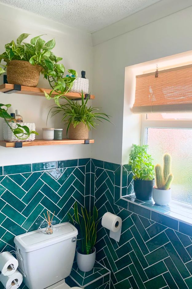
Jessica really said no more sad 90s vibes and went full mini-resort mode with that deep green tile. And somehow it doesn’t make the bathroom feel smaller at all (the white grout and half-wall tile trick is honestly genius). The toilet being moved out of the corner makes the layout feel way more open too… plus it created more room for plants, which is exactly the kind of bathroom logic I support.
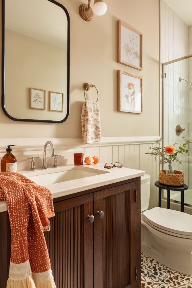
Like… that warm beige wall + soft white beadboard combo is such a quiet flex. And the dark wood vanity? It’s not even trying hard, it just looks expensive by existing. The black framed mirror adds just enough edge so it doesn’t turn into full-on farmhouse cosplay, and those two little framed florals are the kind of simple wall decor that actually works (no clutter, no random “live laugh toilet” energy).
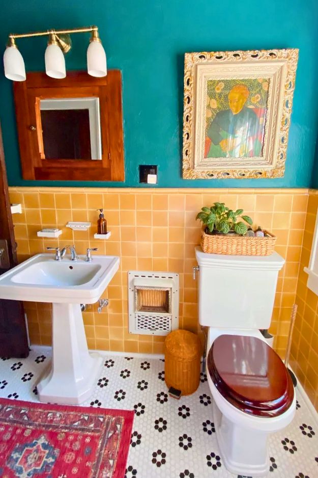
I’m sorry but this is the kind of bathroom that would make me take a longer-than-necessary restroom break. They could’ve gone with the usual “two floating shelves” situation… but nope. They fully leaned into character. The vintage gold tile becomes this built-in statement wall. The whole mood is warm, bold, and slightly chaotic in the best way, like an old house that decided to be cool again instead of getting bullied into millennial gray. By toxicshock999
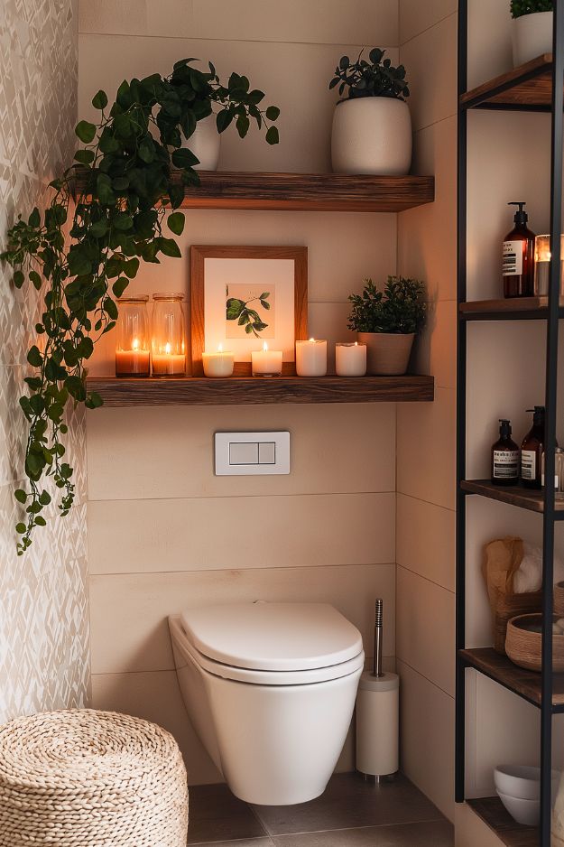
This space above the toilet isn’t functional,it’s therapeutic. The candles + trailing greenery make it feel like a mini spa nook where you’re supposed to breathe deeply and forget life exists for 10 minutes.
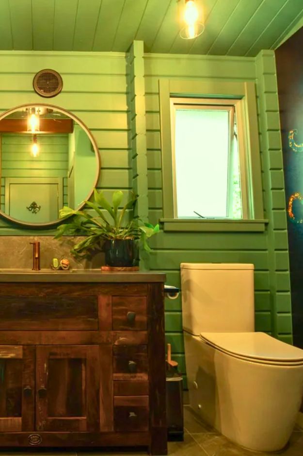
In u/RobDickinson’s bathroom reno, the space above the toilet is honestly such a smart flex. Instead of doing the usual floating shelves, they went with two windows, and it completely changed the vibe. It keeps the room feeling open and breathable, even with the bold green walls and that dramatic octopus moment.
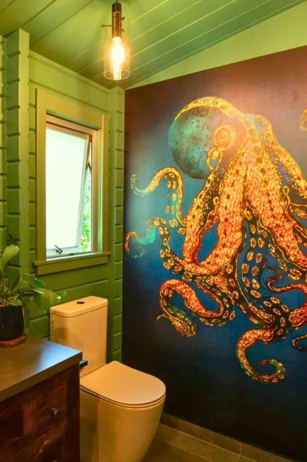
The natural light makes everything look cleaner, fresher, and way more “designed” without needing extra decor clutter. It’s proof that sometimes the best bathroom styling isn’t adding stuff… it’s letting the light do the work.
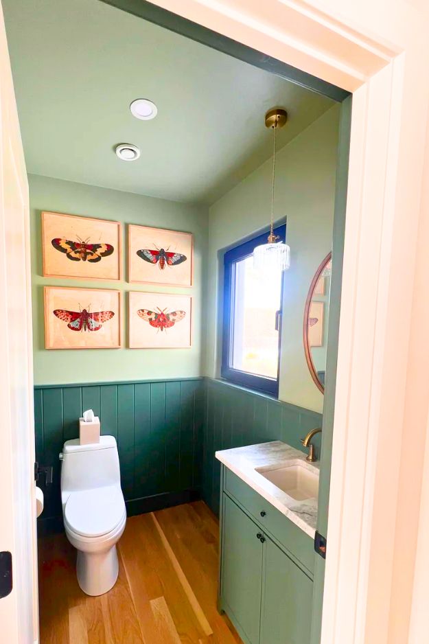
Some bathrooms are spotless and still somehow feel… soulless. This one isn’t. u/spellets nailed that rare balance where everything looks clean, organized, and intentional, but the space still has personality.
Centering the artwork above the toilet was such a smart move because it instantly makes the wall feel calm and “designed,” not random. And those deep greens (Benjamin Moore Caldwell Green + Saybrook Sage) are bold without being heavy, especially with the ceiling painted too. It’s tidy, elevated, and still has warmth. Credit: u/spellets
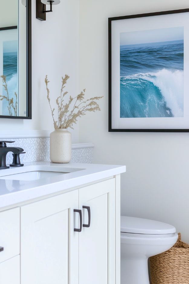
The white vanity + crisp countertop keeps it feeling fresh, while the matte black faucet adds just enough contrast to make it look modern and “finished.” And that large ocean print is honestly the secret sauce here: it brings in calm color and makes the space feel styled without needing shelves or clutter. Even the little vase of dried stems keeps the vibe soft and organic instead of showroom-cold.
Bathroom build is the kind of DIY that makes me squint at my own skills and whisper, “so we’re just casually building spa bathrooms now?” The biggest win is the full-height tile everywhere, not just in the shower, which instantly makes a tiny 5×9-ish room feel intentional and expensive.
Then the walnut vanity comes in like the main character, especially with the wood grain flowing across the drawer fronts and that clean floating look that’s easier to mop around. I’m also weirdly into the “non-bathroom” rug choice.
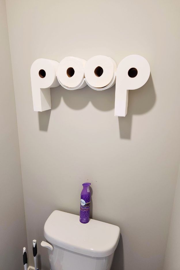 I can see why u/TheUnk311’s parents called it childish, but I’m sorry, a toilet paper holder that literally spells “POOP” is peak bathroom humor. It’s also weirdly sculptural, like dumb on purpose but designed. The only thing that bugs me is the obvious missed opportunity: why only two rolls when the word could’ve been four? Plus I’d want a smarter backplate so it still reads right when it’s empty, and maybe a little “aura” light or a darker paint behind it so it pops. “Childish and hilarious” can both be true.
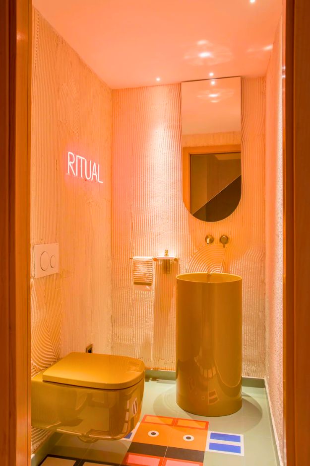
Walking into u/CotaPT’s “Ritual” bathroom feels like stumbling into a cool club restroom in the best way, a little retrofuturist, a little unhinged, and somehow it all clicks. The punchy neon sign plus that bold colored sink and toilet are doing the most, but the real brainy move is the upside-down arched mirror, it’s clever and actually practical for a tight space.
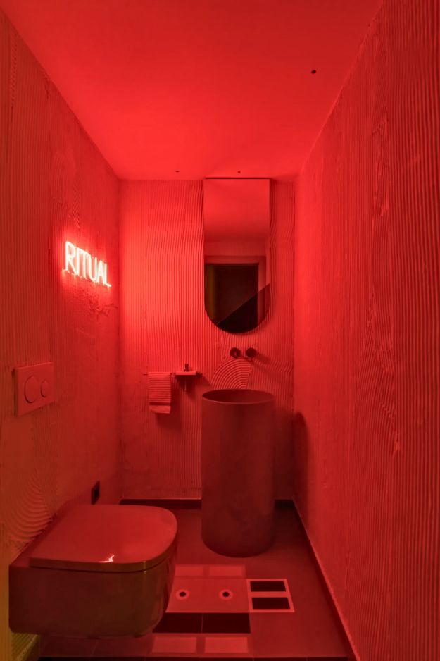
The textured, grooved walls are either the secret sauce or the future cleaning nightmare, no in-between, so sealing them feels non-negotiable. The floor pattern is weirdly perfect, like a pixel-art koi or little robot moment, and it keeps the whole room from feeling like a trend copy.
I get way too excited over soft lighting, thrifted finds, and rearranging furniture at 2am. I’m here for the cozy chaos, the little corners that feel just right, and making a home that feels like you. Not fancy. Just real.