There’s just something about vintage pieces that always pulls me in. I love the hunt, the history, and the quiet character that comes with thrifting, and spaces like this bathroom are exactly why. Small, layered with charm, and full of thoughtful details, it’s the kind of vintage-inspired bathroom that instantly makes me want to slow down and look a little closer.
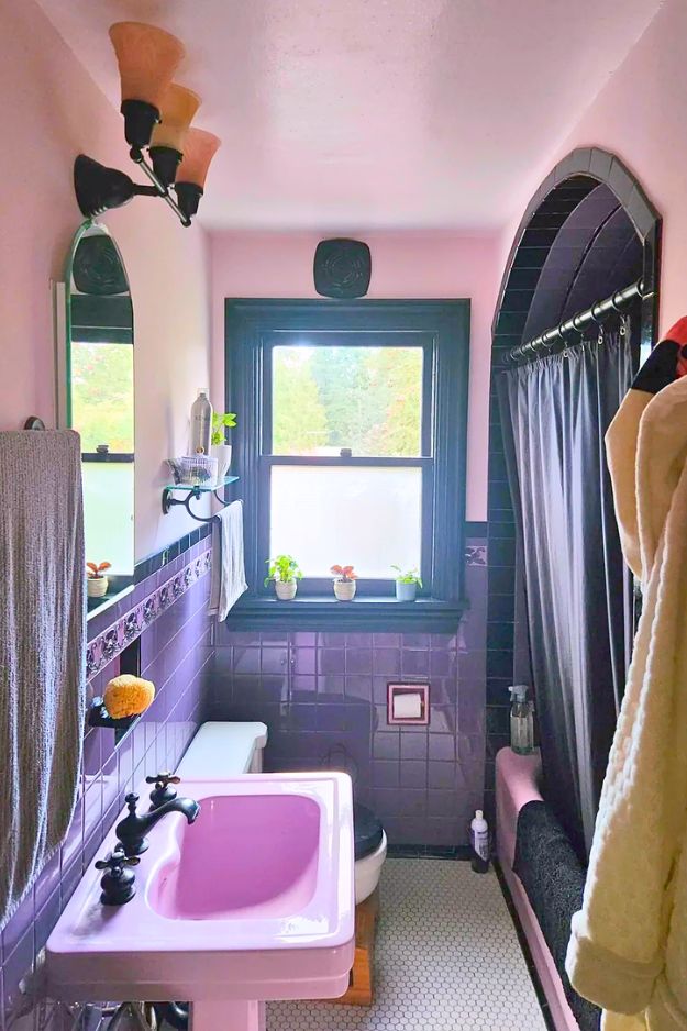
I’m not even a purple person, but u/Left_Adeptness7386’s 1928 Tudor bathroom could convert me. The whole thing feels weirdly period-believable even though it was redone in 1991, and that’s the magic: the lilac “Orchid of Vincennes” tub and pedestal sink read vintage, not trendy.

What makes it work is the bold pastel paired with crisp black lines and little green and pink accents, plus that tile arch and the arched mirror echoing the tub alcove. If I stole one idea, it’d be committing to an “unexpected pastel + black” combo and letting the tile do the talking.

Some bathrooms try so hard to be “spa” that they end up looking like every other Instagram reno, so u/guacamoleshawty’s blue moment felt like a real palate cleanser. The glossy blue tile is the star, but the smart part is how the warmer touches keep it from going icy, like amber-toned bulbs to pull the golds from the art and make the blues feel richer.

I get why the poster asked “how do I improve this,” but this is one of those bathrooms where the right move is basically: don’t fight it, style it. The swan tile and all that pink-green vintage work is irreplaceable, and any modern “start fresh” reno would just sandblast the personality right off. If I were doing a mini remodel, I’d start with the ugliest problem first: rip out that sheet vinyl and lay a period-friendly floor like white hex or penny tile (bonus points for a tiny wink of black or even pink/blue grout).

I genuinely got whiplash scrolling because I thought the mint-and-black tile got ripped out, and nope, thank god, the poster basically rescued this bathroom from that soulless 80s white hotel vibe. The mint tile feels super era-appropriate for a 1930s Dutch home, but the black accents and warm gold hardware keep it from looking like a time capsule in the bad way.
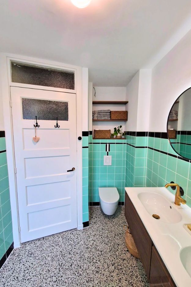
That terrazzo floor is the perfect bridge between playful and grown-up, and the wood vanity adds warmth so it doesn’t go cold or clinical.
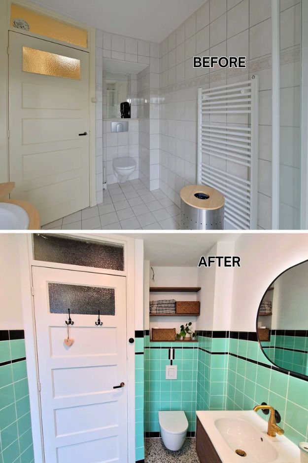
I’d steal the lighting idea too: budget fixture, but swapping in a quality low-voltage driver and a good LED is such a smart safety upgrade for humid spaces. By PotentialMain1478
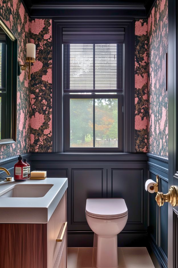
I’ll be honest, I never would have thought to choose black for a bathroom, but this space completely changed my mind. The deep inky paneling and trim feel rich and architectural instead of dark and heavy, and pairing it with that dramatic black-and-pink wallpaper makes the room feel intentional and almost gallery-like.
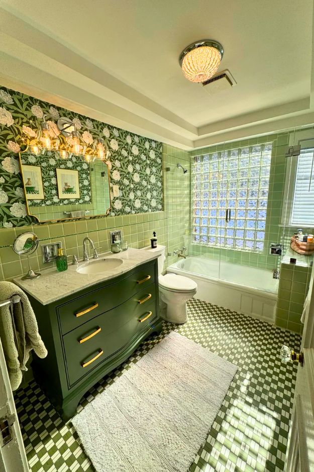
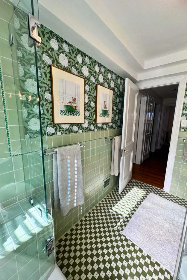
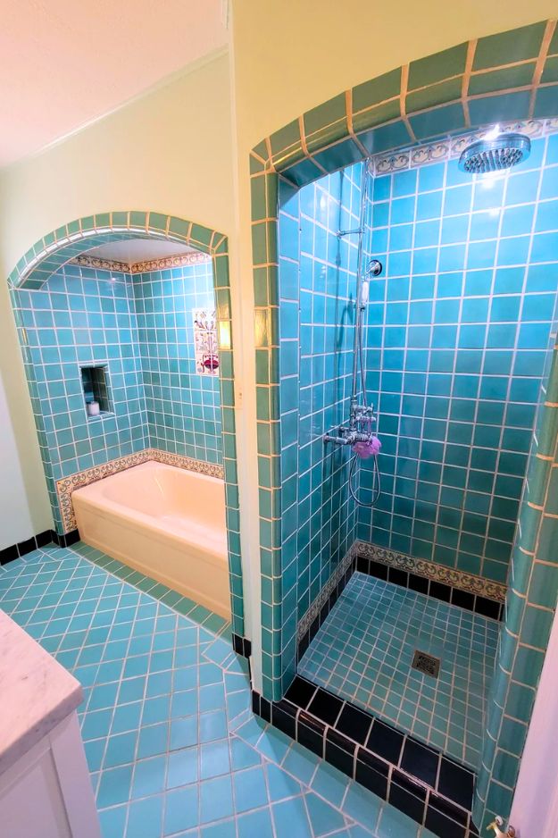
I’m obsessed with the “lean into it” energy here because it’s such a good reminder that not every century bathroom needs a full demo to feel fresh.
Keeping the retro green tile was the whole win, then everything else was chosen to make it look intentional: a custom glass shower enclosure instead of a floppy curtain, a new vanity and mirror to modernize the lines, and wallpaper up top that somehow makes the room feel bigger, not busier.

I’d steal the boring-but-smart move too, refreshing grout and resealing before styling anything.
Also, using a flush mount when ceilings are low is so practical, no one wants to clothesline a light with a towel.
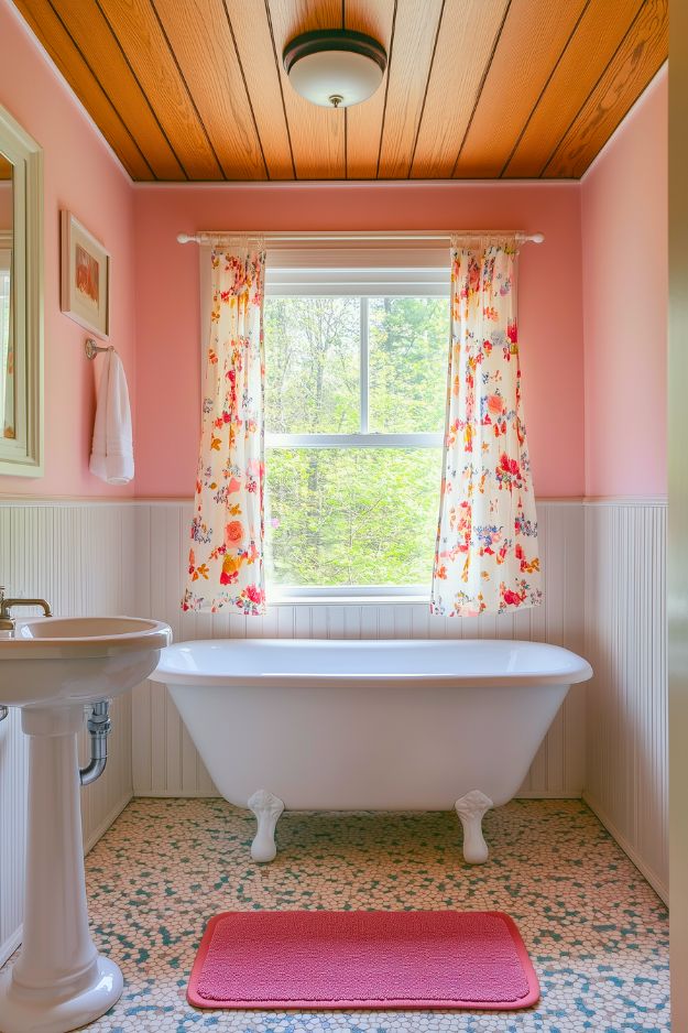
I usually run from pink bathrooms, but this one feels weirdly cozy and normal in the best way. The soft blush walls mixed with white beadboard and a pedestal sink keep things from getting too precious, and that clawfoot tub gives it that effortless old-house vibe. Floral curtains were a smart move too, they break up all the pink and make the space feel more layered instead of flat.
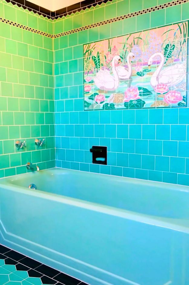
This one feels less like a bathroom and more like a little art installation you happen to shower in. The salvaged mural is obviously the star, but what really gets me is how obsessively well the tile work is done, all those rounded edges, clean transitions, and layered patterns lining up like they were always meant to live together. The mint-green fixtures hit that sweet spot between vintage and fresh, and I love that they rebuilt the room to honor the original era instead of recreating some bland “spa” look. I’d absolutely steal this mindset: if you’re going bold with tile, commit fully and let craftsmanship be the flex.
I’m gonna be honest, I never would’ve thought “black” belonged in a bathroom like this… and then u/IntentionLeather7806 goes and proves me completely wrong.

The before was giving peak 90s chaos, but the after feels like the bathroom this 1925 Craftsman always deserved. That crisp black detailing with the white tile is basically a tuxedo moment. It looks period-correct, but still fresh.

And the arched tub surround is the kind of detail that makes people argue in the comments while everyone secretly admits it looks expensive. Bonus points for keeping the built-ins and doing it without turning the whole room into a sad grey box.
This one sent me into a full internal debate about preservation versus real-life livability. I get why people mourn the green tile and vintage sinks, but I also understand wanting a bathroom that actually functions for a family.

What stands out most is the intention behind it all, enlarging a tiny bath, fixing awkward layouts, upgrading plumbing and electrical so hair dryers don’t kill the house, and choosing solid wood vanities for storage and durability.
It may not be a purist restoration, but it feels honest about modern needs. I’d steal the takeaway of investing in good cabinetry and planning layouts first, then worrying about style.
I’ll be honest, I never thought I’d be into a bold, colorful Art Deco bathroom like this. I’m usually drawn to calmer, safer palettes. But the homeowner completely won me over. Saving that weird-but-gorgeous yellow tub and building the entire palette around it feels both brave and really smart.

The handmade blue tile, the arches, the little alcoves… it all feels joyful instead of loud.

You can tell the poster agonized over every color and detail, and it shows in the best way. It doesn’t feel trendy or forced. It feels like a bathroom that belongs in this house, in this era, and was made with a lot of care. Honestly, this one makes me rethink playing it safe with color.
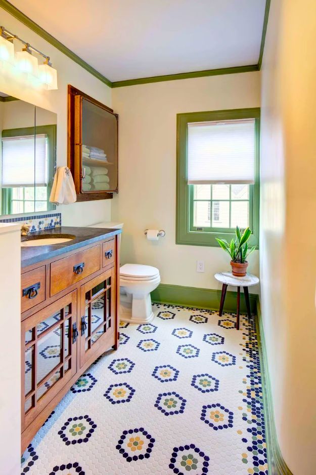
I usually play it safe with bathrooms, but this one makes a really strong case for trusting your gut and choosing color anyway. The green wainscoting with that calm blue above it feels playful but still grounded, and the blue-and-white mosaic floor is such a good twist on a classic pattern. Restoring the hidden laundry chute is the kind of old-house win I live for, and I love that function was clearly part of the design, from the huge shower shelf to the mirrored medicine cabinet for storage.

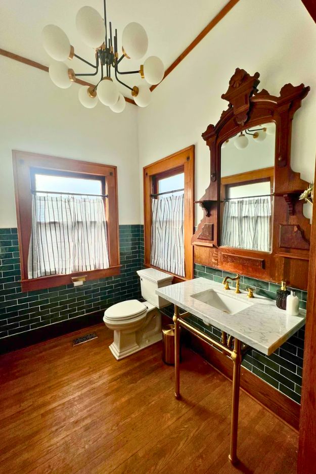
u/tubawooba’s 1920s foursquare bathroom update nails a “period-inspired, not period-costume” look. The standout is the bold hex-and-border floor from American Restoration Tile, paired with Fireclay wall tile and warm brass fixtures that feel classic without looking dated. They hired pros mainly to avoid a year-long DIY marathon and costly tile-learning mistakes, noting labor (especially tile work) was the biggest expense.
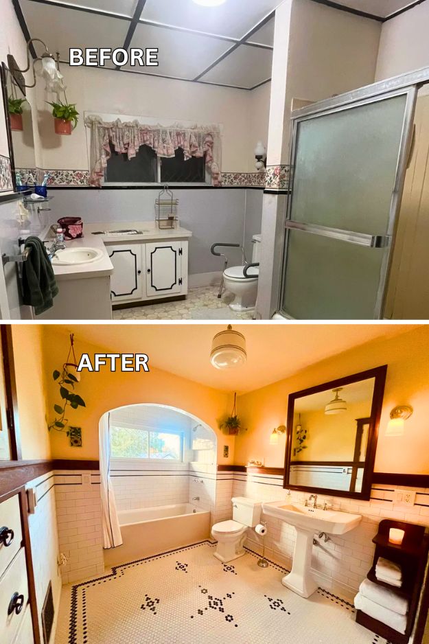
OP (u/gggvuv7bubuvu) shared a DIY remodel of a 1918 “century” bathroom that took nearly a year and a half, aiming for a period-inspired look. The biggest change was removing an oversized vanity, adding a small console sink, and opening a wall to create built-in shelves, which made the tiny room feel much larger while keeping storage.

She originally shared a photo where the penny tiles literally spelled out “go piss girl,” and for a hot minute I thought she was actually committing to it. Turns out it was just Photoshopped, which feels like a tiny betrayal… because honestly? I kind of loved that version.

It had so much chaotic charm, and I’m not mad about admitting I preferred the “go piss girl” floor. By Betty_Wight_

I clicked into u/Ruairicoin’s “Bathroom Remodel” fully expecting a makeover, and instead found a room everyone was desperately trying to save. The original American Standard sink, pink-and-green tile, and real chrome fixtures feel like a tiny time capsule that already works. Nothing about it feels broken or outdated, just full of personality in a way modern gray-and-white bathrooms rarely are. If I changed anything at all, it’d be small and reversible. Maybe a wallpaper that ties the colors together or period-style light shades.

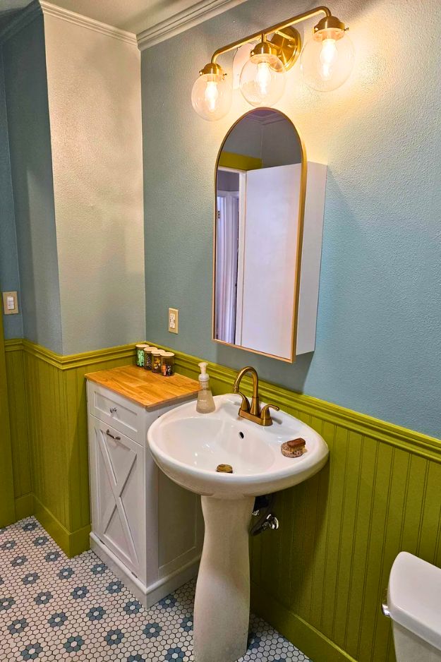
This 1925 Craftsman half bath instantly feels like it belongs to the house. The deep green Bedrosians Cloe tile paired with warm wood trim creates such a rich, grounded look, and that oversized period mirror quietly becomes the star of the room.
What really sticks with me is how it proves you don’t need rare or custom materials to achieve an authentic, era-appropriate result. Everything feels intentional without trying too hard. It’s timeless, slightly bold, and exactly the kind of powder room that makes a strong first impression. By dcritser25

When I saw u/beaulogna0 rip out a boring contractor-grade bathroom and replace it with flamingo wallpaper plus a vintage pink toilet and sink, I knew this one was going to be divisive in the best way. It’s loud, playful, and unapologetically colorful, but somehow still feels cohesive instead of chaotic.I love that the pink fixtures were sourced from Facebook Marketplace and paired with clashing patterns that actually work together.
After the homeowners removed a leaking “coffin shower”, the space was thoughtfully rebuilt with a custom 1-inch hex mosaic floor using DalTile colors, a quarter-sawn white oak Amish vanity, and a honed Jet Mist granite countertop.

Little details make it extra special, like the tri-fold Kohler Verdera medicine cabinet, handmade towel knobs, and a recessed cabinet crafted from leftover vintage plumbing parts. They even kept the original curved plaster wall because it had too much character to lose. Designed by Tracey Stephens Interior Design Inc.

This home owner basically proved you don’t need a “demo everything” budget to get a powder room with real personality. They kept the original 37-year-old floor tile (still in great shape), left the plumbing layout alone, and poured the money into the wow factor: that dark, moody palette and the Gardens of Jaipur wallpaper from MindTheGap. The best part is they skipped a $2,200 install quote and DIY’d the wallpaper anyway, imperfections and all, because honestly, nobody’s staring at your seams in a powder room.

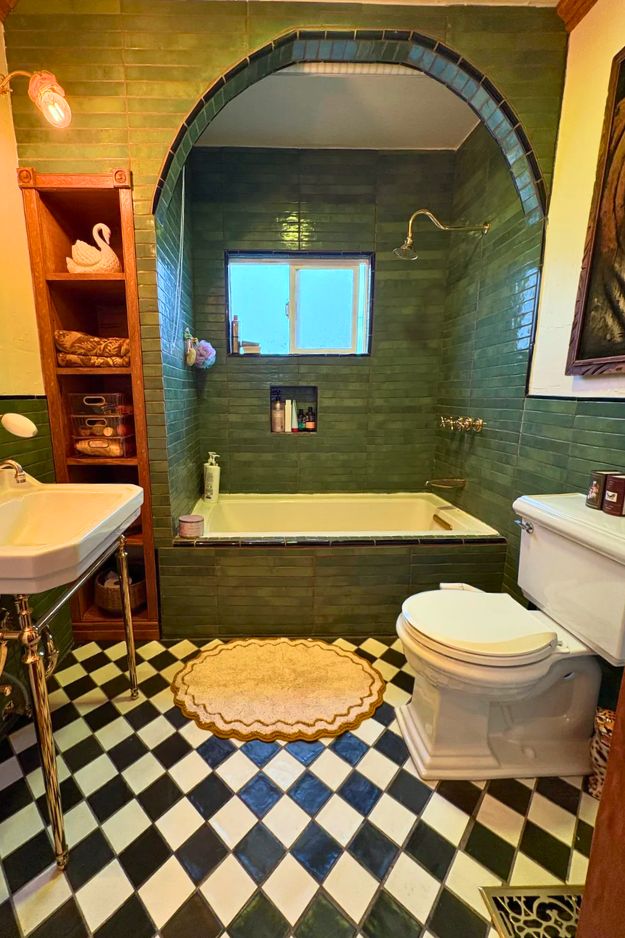
I keep coming back to this one because it feels quietly confident in its choices. That deep green subway tile wrapped around the tub alcove is bold, but the warm wood arch and trim soften everything and make it feel timeless instead of trendy. The arched opening alone adds so much character, like the bathroom has its own little stage.
I get way too excited over soft lighting, thrifted finds, and rearranging furniture at 2am. I’m here for the cozy chaos, the little corners that feel just right, and making a home that feels like you. Not fancy. Just real.