I can always tell summer camp is hitting its stride the second these boards start undergoing their massive, neon transformations. Everything gets louder and more chaotic in the best way possible.
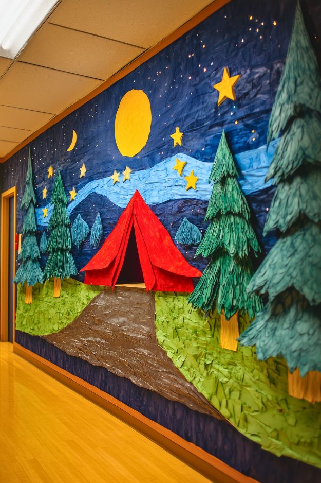
The texture on this board is insane. Crumpling up paper for the sky and grass gives it a depth you rarely see on bulletin boards. I’m completely stealing the idea of integrating actual fairy lights into the background; it makes the starry night feel so much more alive. That red paper tent is the perfect bold focal point against the deep blue and textured green. It feels totally custom and artisanal, which I love.
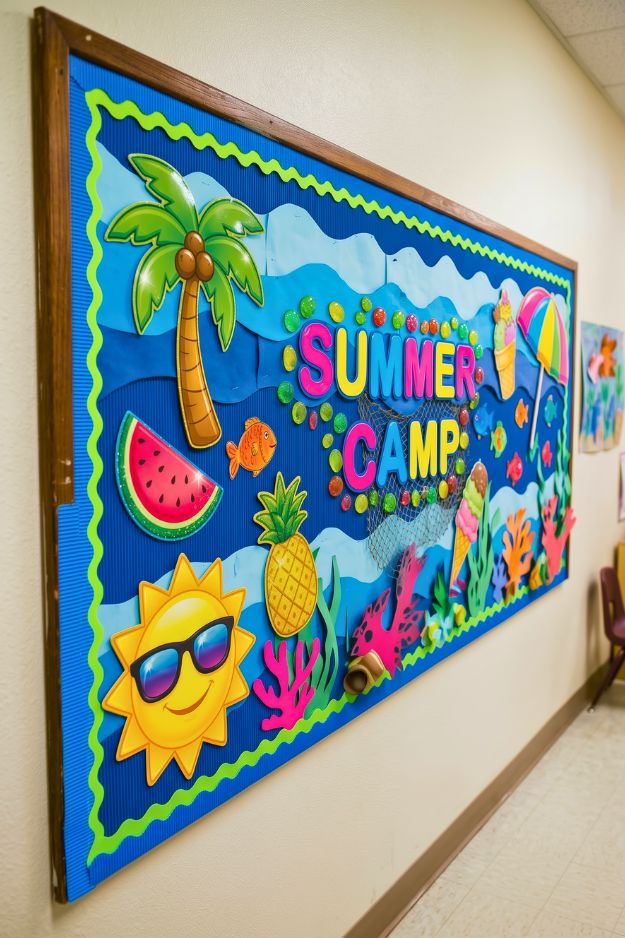
This one leans bright and playful right away. The colors are loud in a good way, and the layered waves give it a bit more depth than a typical board.
I like how everything ties back to that beach theme without overthinking it. The fruit, the sun, the ocean pieces all feel intentional but still easy to pull off.
I’d steal the layered background idea here. It’s simple, but it makes the whole board feel more put together.
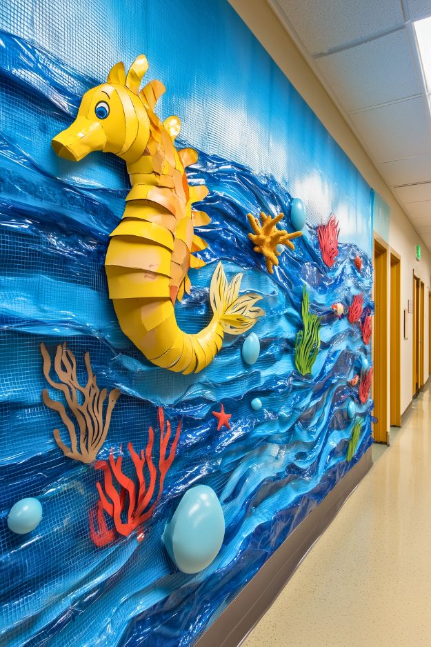
I’m genuinely obsessed with the way that layered yellow paper adds a serious sculptural quality to the seahorse. Overlapping the scales makes the whole character feel like a bespoke gallery piece rather than a school project. The real genius here is that crinkled translucent material used for the waves. Incorporating iridescent film adds a glassy, wet look that you just can’t get with flat construction paper. I’d steal the idea of using half-inflated blue balloons for bubbles to create instant texture. This is such a smart, budget-friendly way to fill a massive hallway wall.
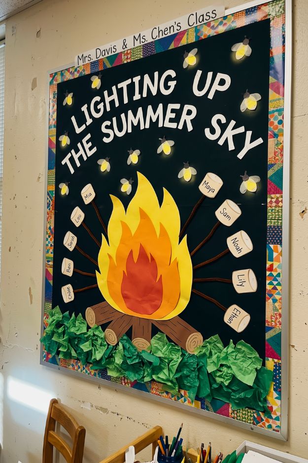
It leans more into that cozy campfire vibe. The dark background really helps the fire and little fireflies stand out without feeling busy. The marshmallows as name tags are such a smart touch. It keeps things interactive but still fits the theme naturally.
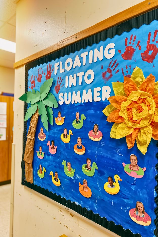
The handprints at the top add a raw, authentic layer to the more polished paper crafts. I’m particularly obsessed with that massive sun made of layered tissue paper because the dimension is incredible.
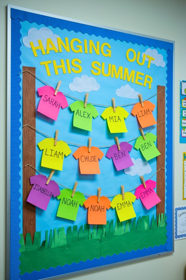
I love how the t-shirt cutouts make the student names feel like a design element rather than just a list. I’d steal the idea of drawing those wood-grain swirls on the posts with a simple brown marker to ground the whole scene.
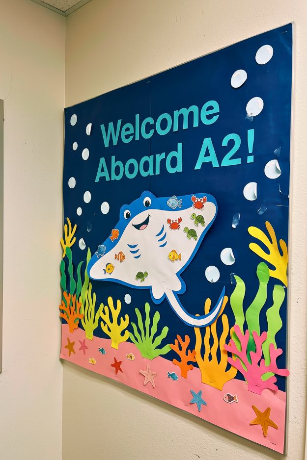
The underwater theme feels fun without trying too hard. That deep blue background does most of the work, and everything layered on top just pops naturally. I like how the stingray becomes the main character here. It’s simple, but adding the small sea creatures on top makes it more playful without overcrowding the space. I’d steal the bottom section idea. The coral and sand layering adds just enough detail to ground the whole board without making it feel busy.
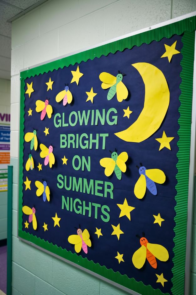
This layout is a masterclass in using negative space to create a mood. That oversized crescent moon grounds everything while those little fireflies lead your eye right across the text. I’m honestly obsessed with the textured green border because it adds just enough weight to frame the night sky perfectly. If I were setting this up, I’d use 3D foam tape to pop the wings out from the board. Creating that tiny bit of shadow makes the paper insects feel like they’re actually fluttering off the wall.
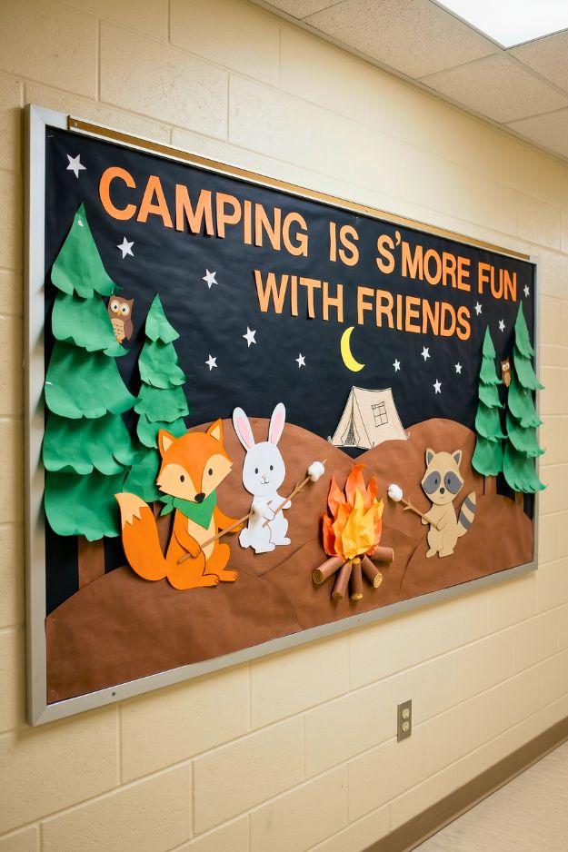
These little forest animals roasting marshmallows have the best personalities. The way the fire is built with layered orange and yellow paper makes it look like it’s actually flickering. You can try to use real cotton balls for the marshmallows to add a soft touch of realism.
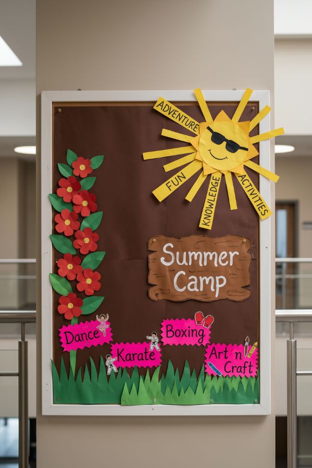
I’m actually obsessed with the decision to use a chocolate brown backdrop here. It creates such a sophisticated, earthy base that makes those neon pink activity bubbles feel electric. If I were recreating this, I’d steal the idea of using high-contrast colors for the most important information to make it readable from the other end of the hall.
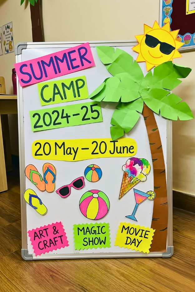
This one feels more like a sign you’d actually stop and read. Everything is clear, bold, and easy to follow without losing that fun summer vibe.
I like how the text is broken into bright blocks instead of one big chunk. It makes the info stand out right away. The palm tree and little icons keep it playful without distracting from the details.
I’d steal the layout here. Big readable sections first, then decorate around it. It keeps things clean but still interesting.
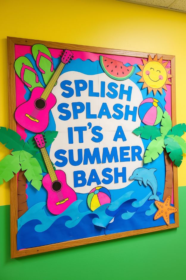
This board is a total tropical party in a frame. The guitars and the smiling sun create such a happy, musical vibe that I find totally infectious. I love the dolphin jumping over the waves; it’s such a fun, playful detail. I’d definitely add some real tropical flower leis draped over the corners of the frame to give it a little more 3D personality.
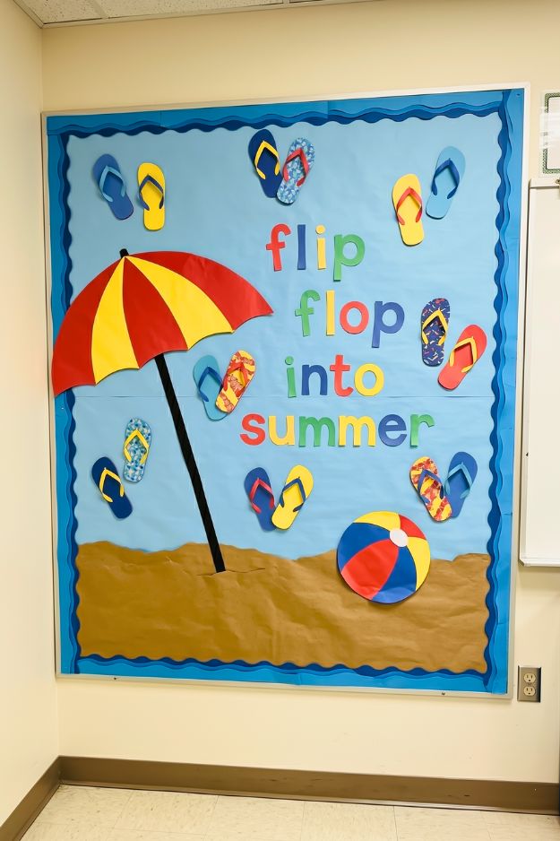
There’s something kind of funny about all those mismatched flip flops flying around. It shouldn’t work, but it actually makes the whole board feel more alive. I like how nothing is too coordinated. That slight chaos makes it feel more like a real summer, not staged.
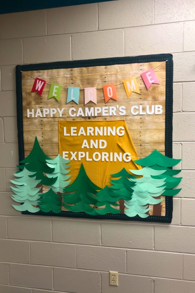
The wood-grain background gives this board a polished, cabin-chic vibe that I find incredibly grounding. The mix of green tones in the trees makes it feel more realistic. I wouldn’t try to match them too perfectly, the variation is what makes it work.
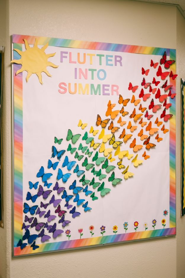
I love how efficient this design is for a large space. Batch-cutting the butterflies in various colors makes the setup feel manageable but high-end. I’d steal the idea of folding the wings upward to create those 3D shadows against the board.
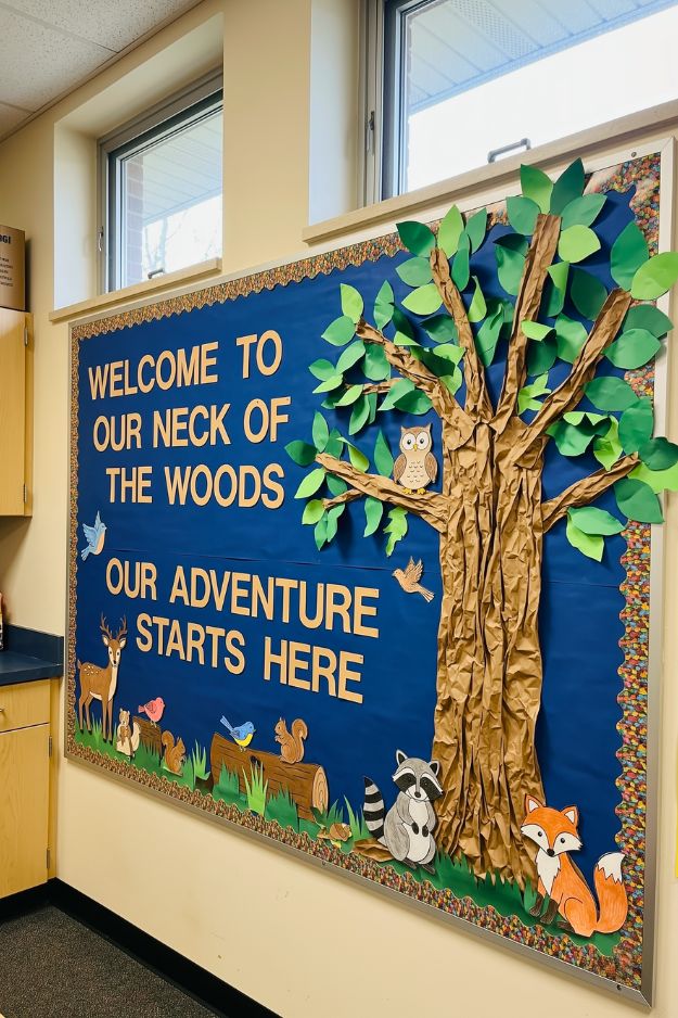
This board is like stepping right into a storybook forest, and I am here for it. The little raccoon and fox characters have so much personality and bring such a friendly vibe to the adventure theme.
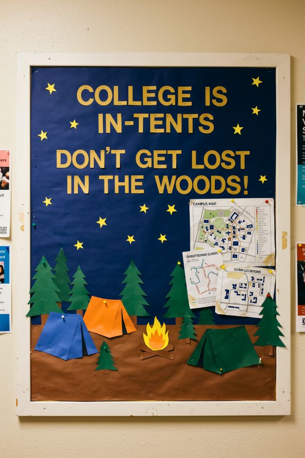
The message is a bit cheesy, but it works. “In-tents” is one of those puns you see coming, but it still fits the theme perfectly.
What I like is how direct it is. You don’t have to think too hard, it gets the point across fast.
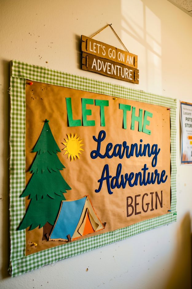
The message feels more warm than clever, and I like that. It’s not trying to be funny, just inviting. “Learning Adventure” stands out the most. It fits the camp theme without forcing a pun. I’d keep this kind of wording if I wanted something that feels calm and welcoming instead of loud.
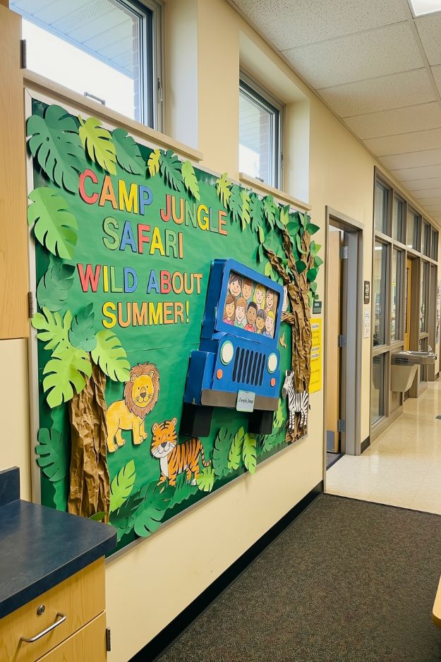
Okay this one actually feels like an experience, not just a board. The jungle theme is doing a lot, but it’s fun enough that you don’t mind. That 3D jeep sticking out is such a good idea. I’d 100% steal that instead of keeping everything flat.
And honestly, the safari theme just works for summer. It gives you way more to play with than the usual beach stuff.
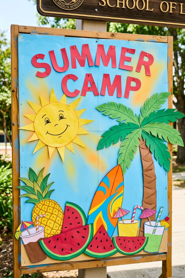
This one feels like summer hit max volume and didn’t bother turning it down. Bright colors, big shapes, everything right in your face. I like that it doesn’t try to be clever. Just “summer camp” and a full blast of visuals to match.
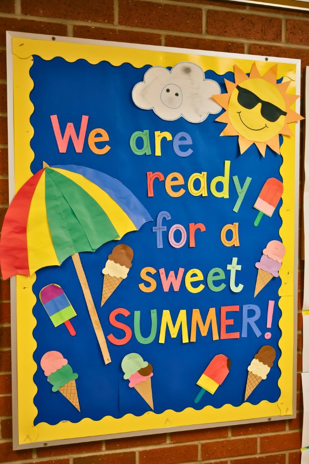
It’s a bit predictable, but not in a bad way. The message and visuals line up perfectly, which makes it easy to read and remember. Nothing feels out of place. Every piece reinforces that same “sweet summer” theme. I might not call it original, but it definitely does its job.
I get way too excited over soft lighting, thrifted finds, and rearranging furniture at 2am. I’m here for the cozy chaos, the little corners that feel just right, and making a home that feels like you. Not fancy. Just real.