School doesn’t exactly give summer vibes. Those plain walls, harsh lighting, and somehow you’re expected to turn that into a photo spot people actually care about. But a good summer backdrop doesn’t need a big budget. If you’re planning a school event, prom corner, or even just a classroom glow-up, these ideas are the kind that actually work, and still look good in photos.
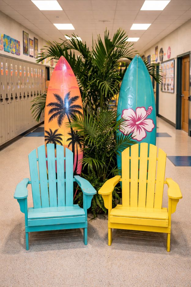
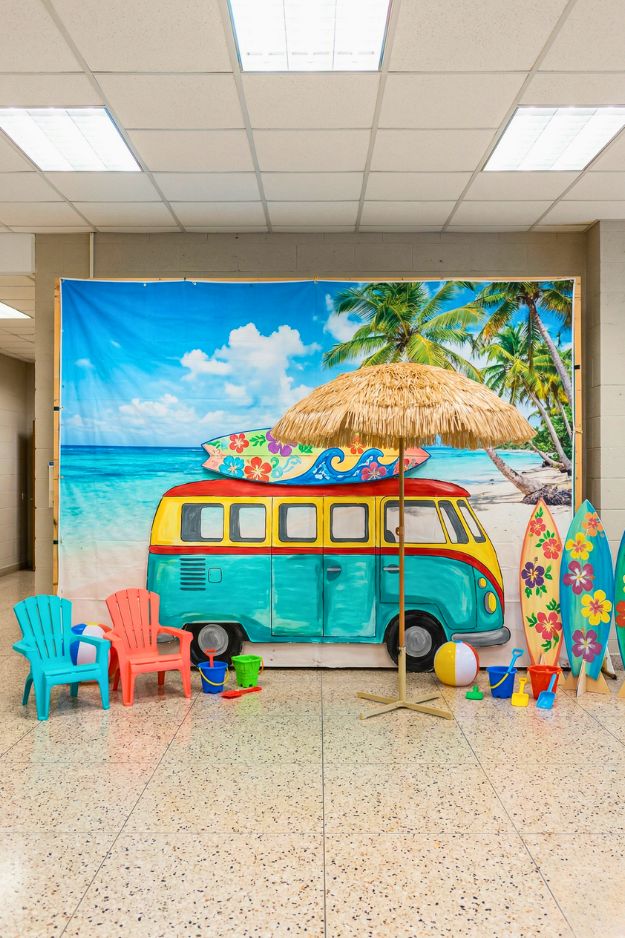
This is honestly the kind of setup that tricks your brain into thinking it’s already summer… even if you’re still stuck in school. Those bright Adirondack chairs and the surfboards with palm prints just sell the whole beach vibe without trying too hard. It’s playful, colorful, and just enough to make students mentally check out five minutes early.
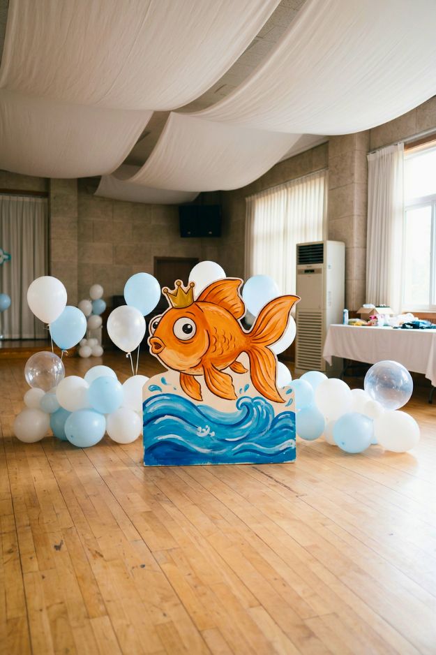
This goldfish backdrop is actually too cute… like it doesn’t even try to be over the top, and that’s exactly why it works. I love how it’s kept small and simple. Just one playful centerpiece, some soft blue and white balloons, and suddenly the whole space feels light, fun, and a little magical without being overwhelming.
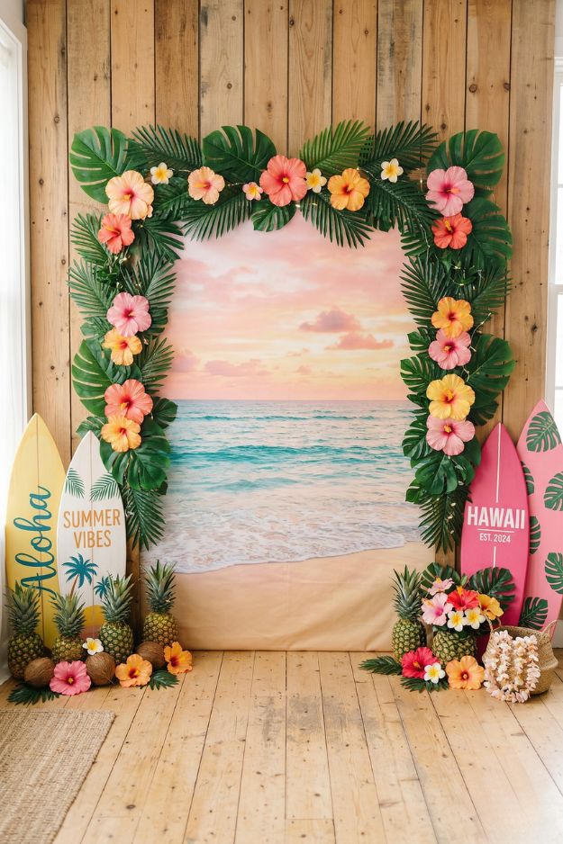
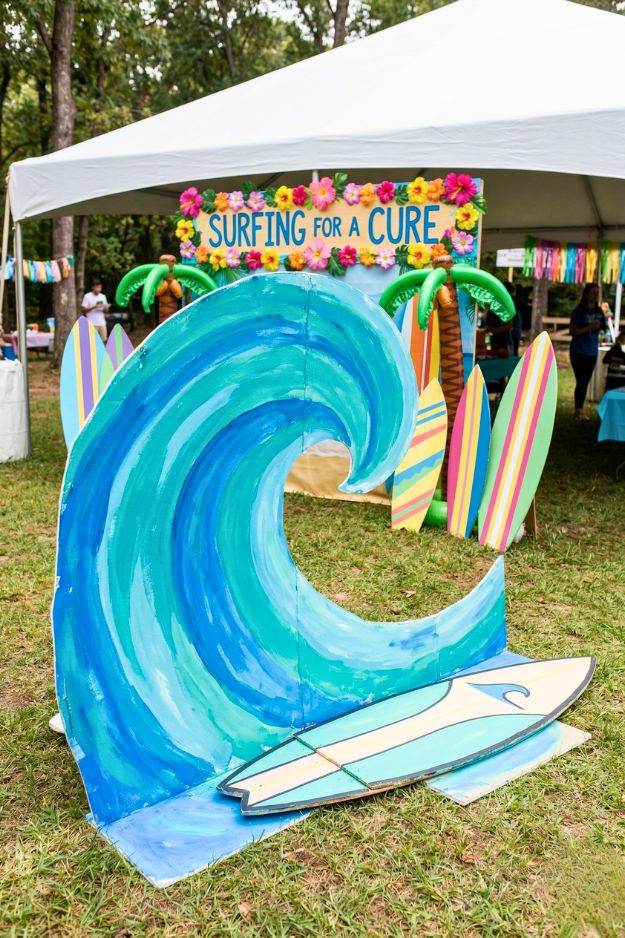
Okay this Aloha theme?? Yeah… this is the one that makes people stop and go “wait… where am I?” I love how it’s not just the beach, it actually feels tropical. The palm leaves and hibiscus framing that sunset backdrop makes it look like a little portal straight to summer. And those surfboards + pineapples on the side? That’s what makes it fun instead of just pretty.
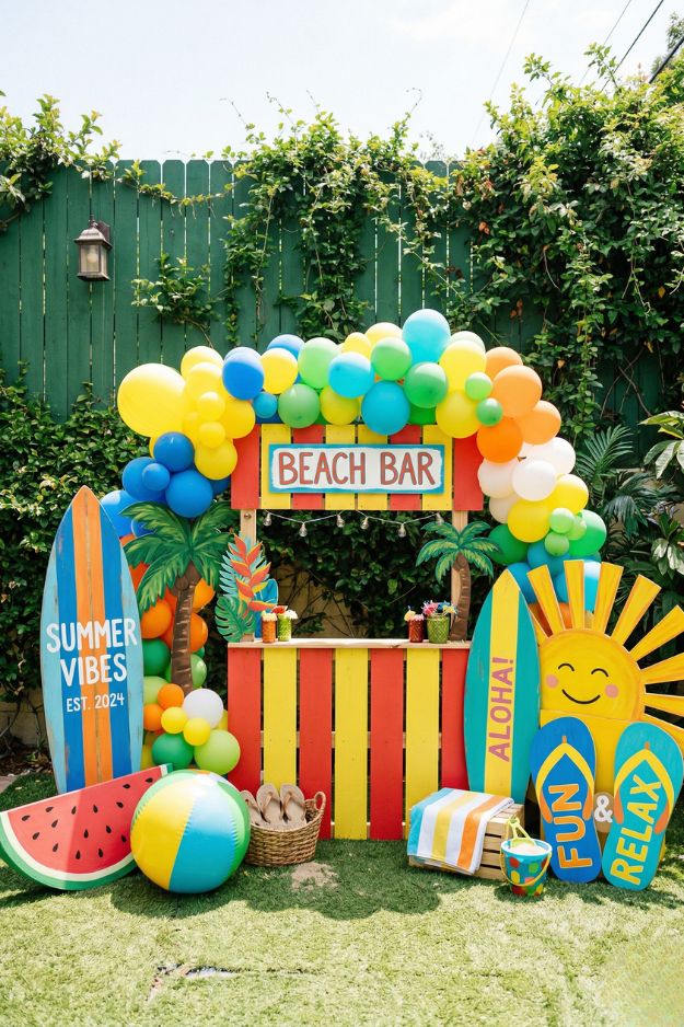
Okay this one?? This is summer turned all the way up. It’s loud in the best way, like you want people to walk in and instantly feel the vibe. And doing this in a backyard just makes it better. It’s playful, a little chaotic, but in that “everyone’s having fun, no one’s overthinking it” kind of way. Honestly, this is the kind of setup that turns a regular hangout into something people keep talking about after.
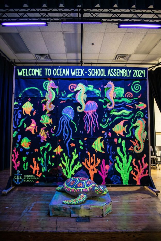
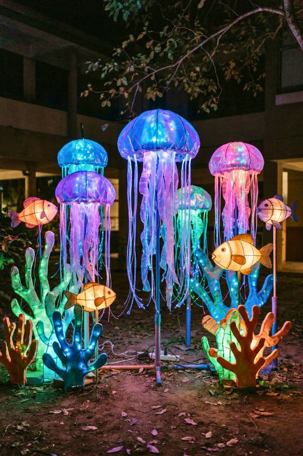
The neon colors against that dark background make everything pop so hard, it literally feels like you’re underwater at night. And that turtle in front? That’s the detail that makes it feel real, not just a backdrop.
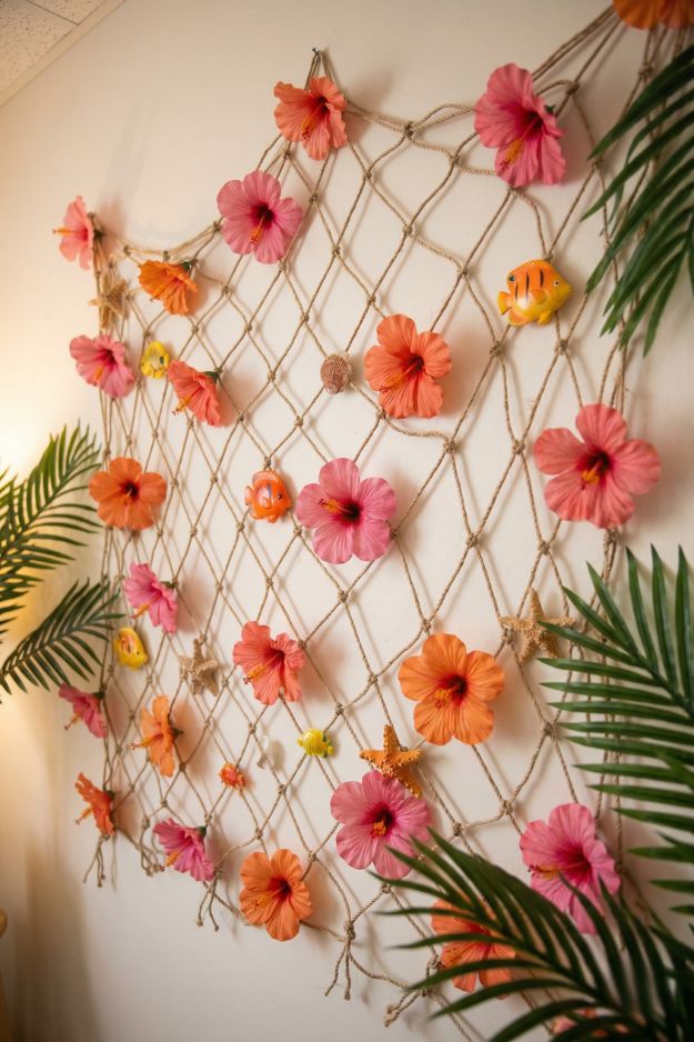
This feels like the grown-up version of all those summer themes… like same tropical energy, just way more subtle and put together. I love how it’s not loud. The net with those soft hibiscus tones and little sea details gives that beach vibe without screaming it. It’s the kind of backdrop that works at night too, especially with warm lighting, it would look so good once the sun goes down.
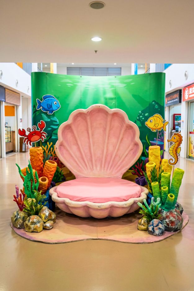
That giant shell seat alone makes it feel like you’re about to sit down and become the center of attention, no effort needed.
Ooh yeah… if a school pulled this off, I’d actually be jealous. This doesn’t even feel like a school setup anymore, it’s giving prom photobooth moment. And at night?? With the lighting?? Yeah, people would be lining up for photos the entire time. This is the kind of backdrop that makes prom feel like an actual event, not just a dance.
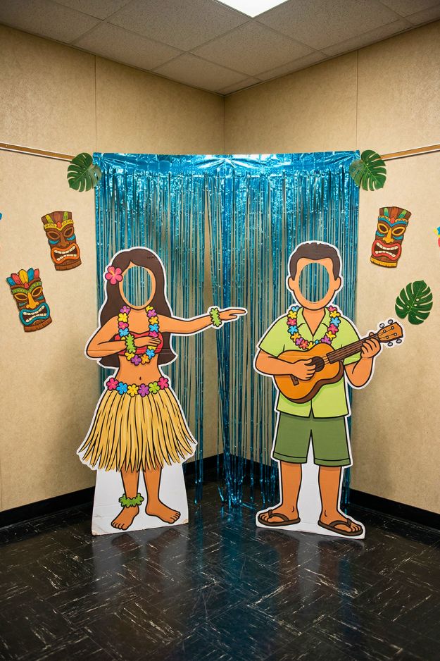
I love how simple it is. If done properly though, this is the kind of setup where everyone ends up with at least one chaotic, slightly awkward photo… and somehow those are always the best ones. But the face cutout part?? You really have to get that right. If the height or spacing is off even a little, people are gonna be crouching or standing on tiptoes trying to make it work.
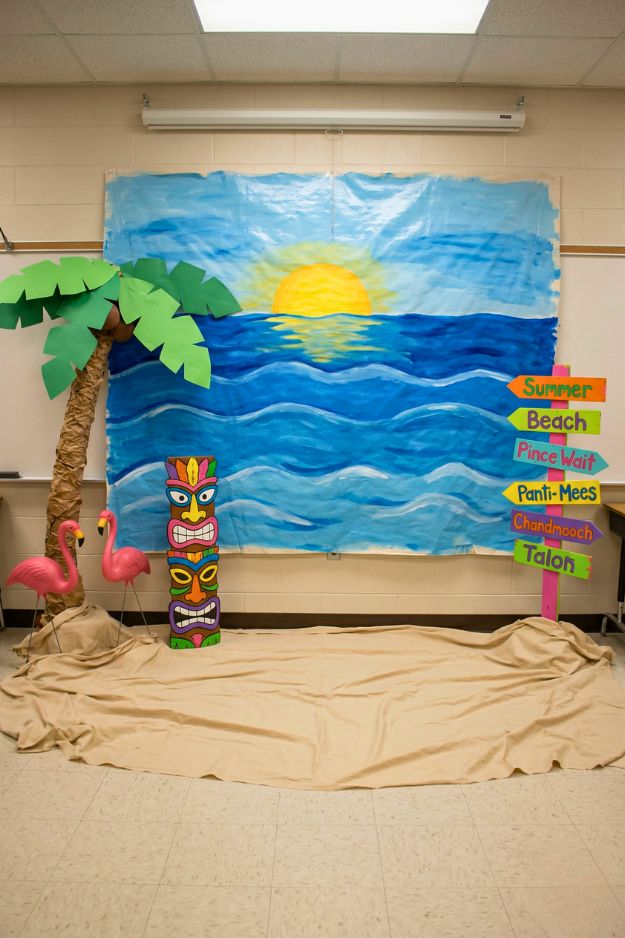
The hand-painted ocean backdrop actually carries the whole thing. It’s not perfect, but that’s what makes it work, you can tell real time and care went into it. Add the palm tree, flamingos, and that slightly chaotic signpost, and suddenly it’s giving full-on beach day energy in the most low-budget, high-heart way.
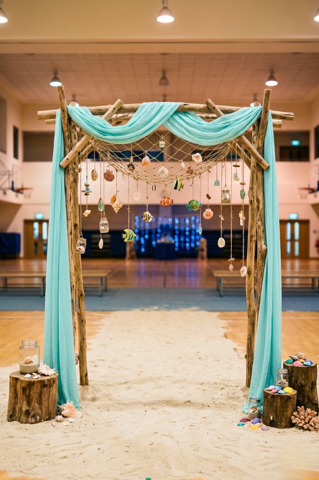
Okay yeah… no, this one would have people lining up all night. This isn’t even just a photobooth anymore, it’s like a whole moment. The driftwood frame, the soft blue drapes, the hanging shells and little fish details… it actually feels calm, like you just stepped into a beach at sunset instead of a school gym.
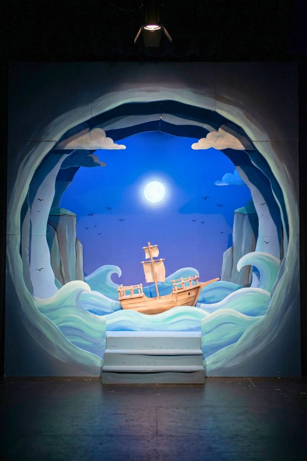
Okay this?? This is the kind of setup that would’ve lived rent-free in my head as a kid. And for kindergarten or preschool, this is perfect. It’s safe, simple shapes, soft colors, and just enough depth to feel immersive without being overwhelming.
Honestly this is less “photobooth” and more “main attraction.” People wouldn’t just take pictures and leave… they’d hang around, stare, take videos, drag their friends over like you need to see this.
Let me tell you, interactive setups like this always win. People don’t just take one photo and leave… they start posing, joking, trying different angles, dragging friends in and all.
Yeah this one is the definition of low effort, high payoff, and honestly… that’s why it works. Everything here is super easy to source. Printed beach backdrop, plastic chairs, surfboard props, a straw umbrella, kids’ sand toys… none of it is hard to find, but when you put it together, it instantly reads summer. No overthinking, no complicated builds.
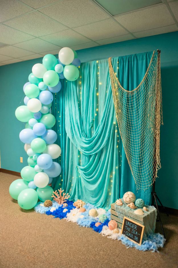
It’s clean, soft, and actually kind of elegant. The teal drapes, the subtle fairy lights, that balloon arch in ocean tones… it gives under the sea but in a calm, almost dreamy way instead of loud and childish. And I like how everything layers. The net, the shells, the little textures on the floor, it’s simple, but it doesn’t feel empty.
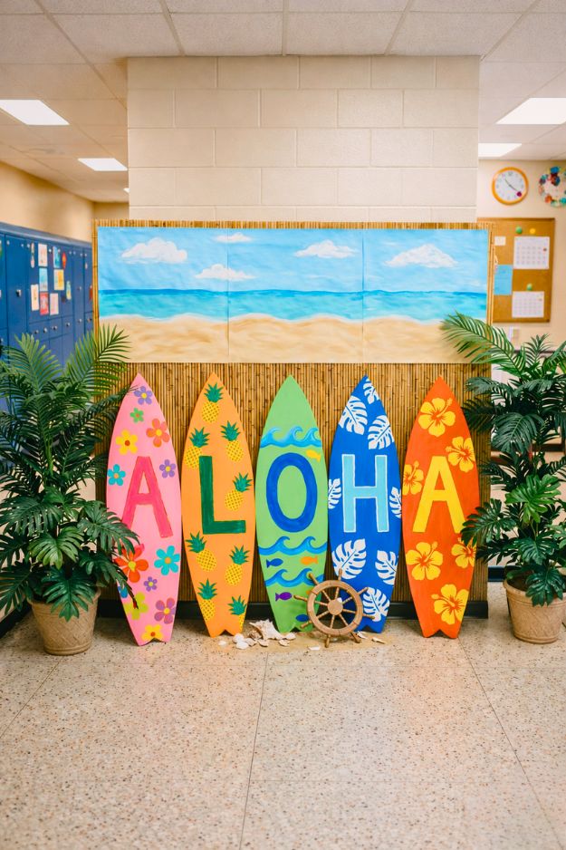
I love how each board has its own vibe, bright colors, little patterns… it feels playful without being messy. And I like how they grounded it with the plants and bamboo backdrop. This is one of those setups where you don’t need anything fancy. People will naturally stand in front of it, lean on the boards, take group pics, and it just works.
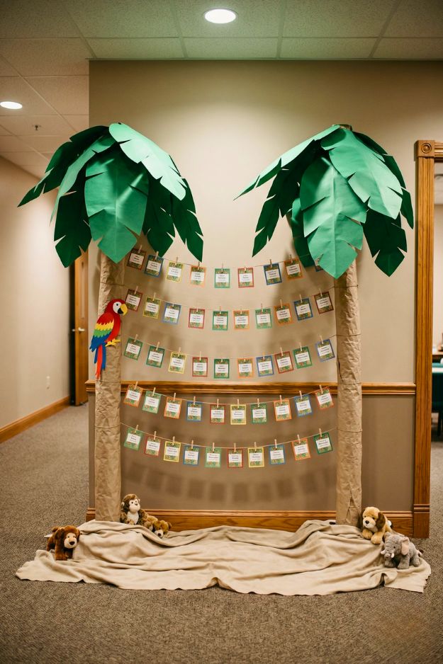
Yeah this one is all about the meaning, not the wow factor… and that’s exactly why it works. It’s not trying to be the most aesthetic setup, but it ends up being the one people actually stop and read. All those little cards clipped across the strings? That’s where the real value is. Names, messages, memories, and suddenly it’s not just decor, it’s something personal.
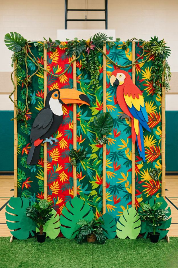
The colors are doing everything here. That bold tropical print with the red, green, and yellow just pops instantly, you don’t even need to read anything or get close, it already grabs attention from across the room.
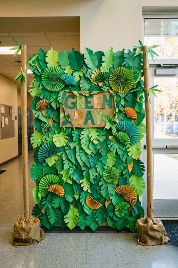
Okay this is literally how you rescue a boring hallway. It’s just paper… but the layering makes it feel alive. All those different shades of green, the folded fans, the overlapping leaves, it adds depth so it doesn’t look flat or cheap. Suddenly, that plain wall turns into a whole jungle corner.
I get way too excited over soft lighting, thrifted finds, and rearranging furniture at 2am. I’m here for the cozy chaos, the little corners that feel just right, and making a home that feels like you. Not fancy. Just real.