Cute kitchen color schemes can get chaotic when every pastel, pattern, and little accent is trying to be the main character. The ones I like most pick one clear moment — a cabinet color, backsplash, island, runner, or painted hutch — and let the rest of the kitchen stay usable.
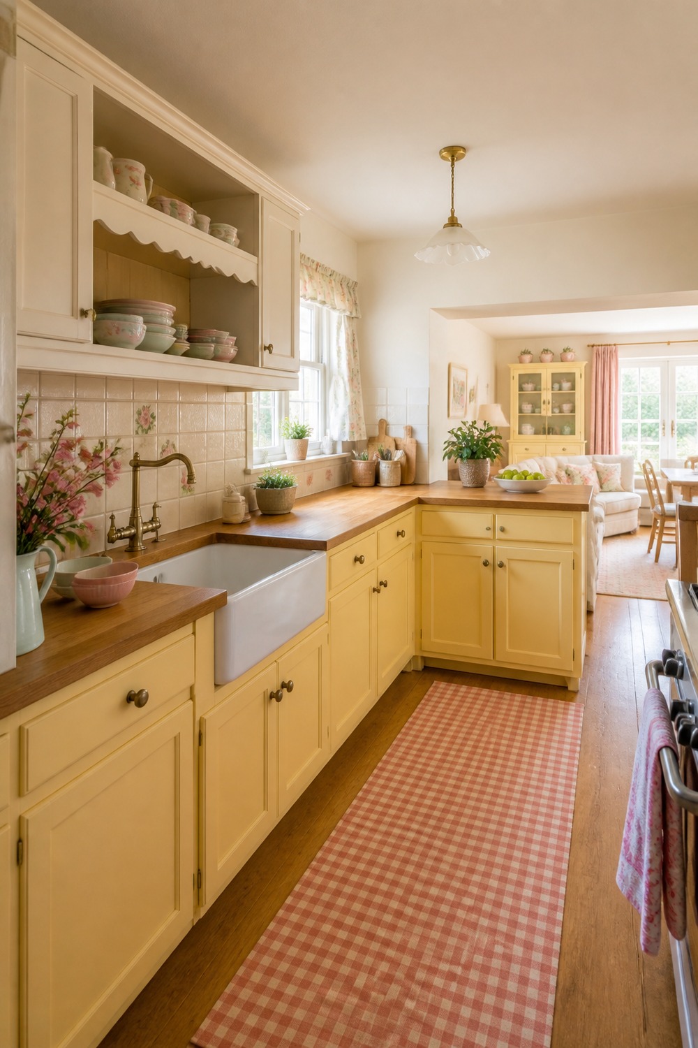
The butter-yellow cabinets give this kitchen that happy cottage look without making the counters feel childish. I like the way the warm wood floor, cream tile, and brass hardware calm the color down so the whole room still feels easy to cook in.
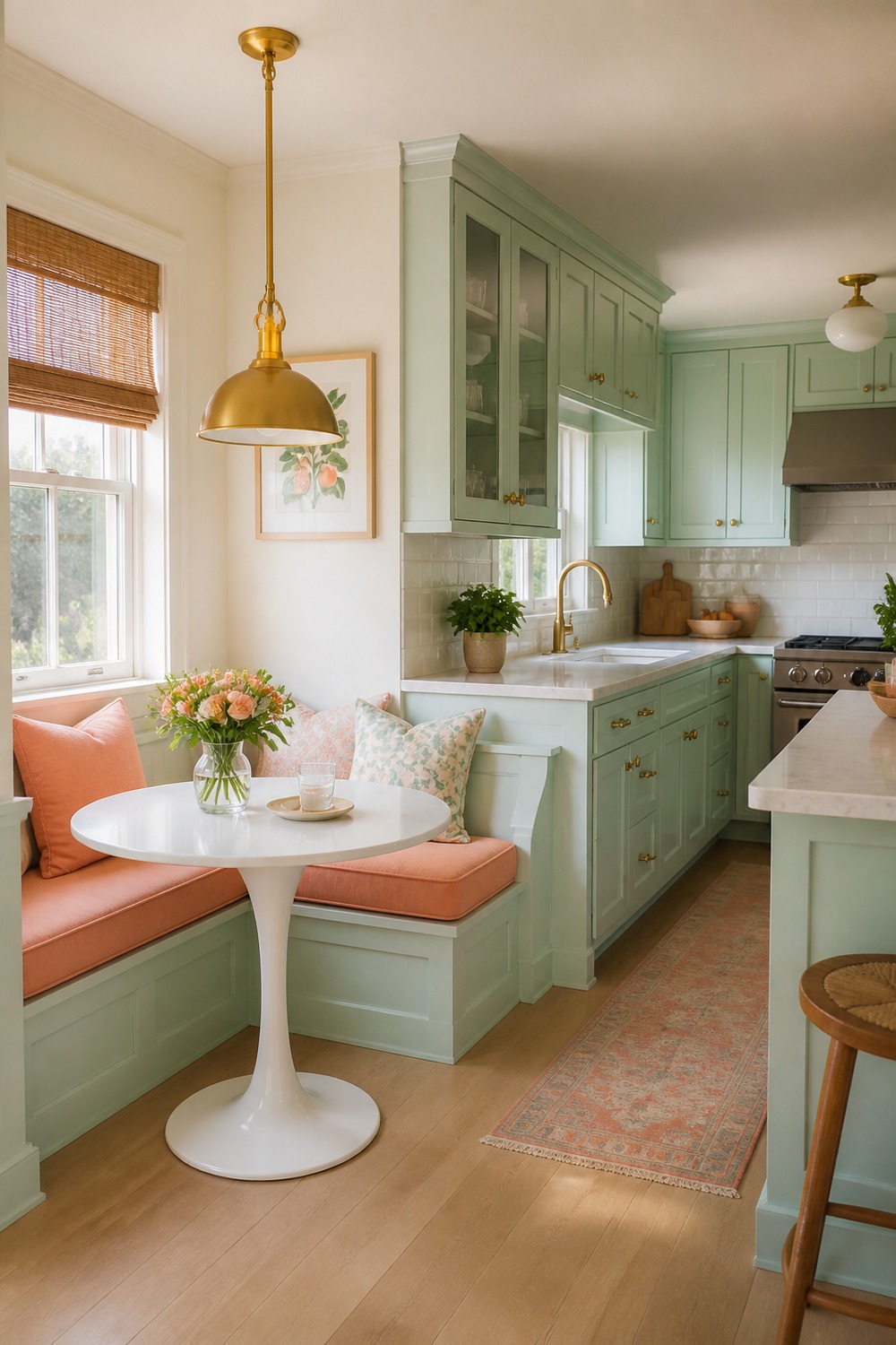
This mint breakfast nook feels sweet in a way that would make morning coffee more fun. The built-in bench keeps the color tucked into one clear zone, while the little table and window light make the kitchen feel useful instead of just decorated.
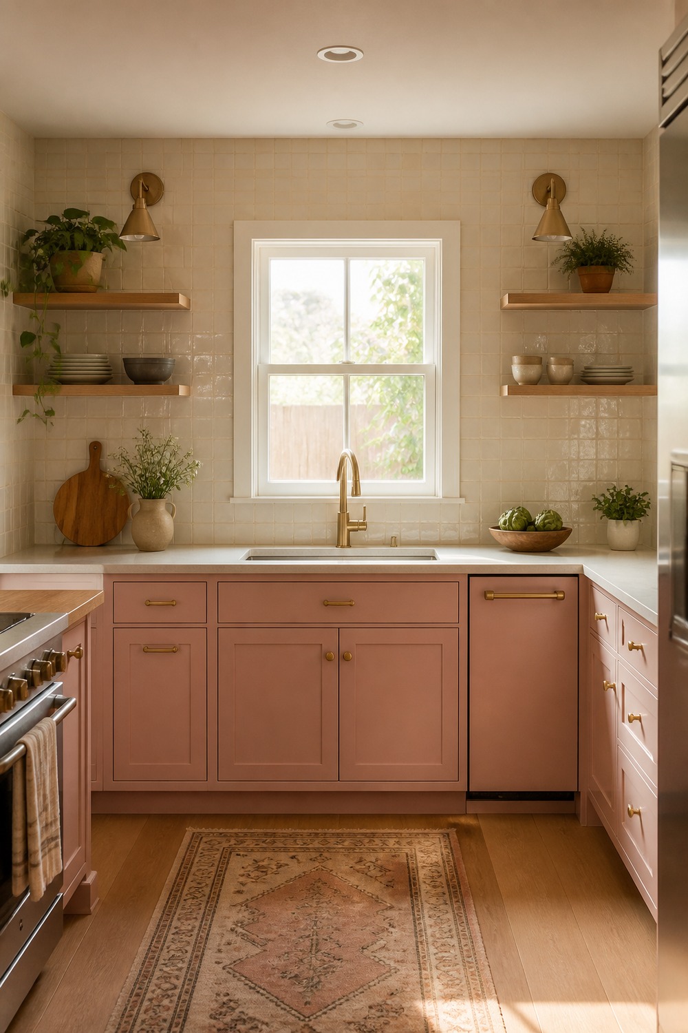
Pink lower cabinets can look too sugary fast, but the cream tile and natural shelves make this version softer. I like that the color stays below eye level, so the room gets personality without losing that clean, bright kitchen feeling.
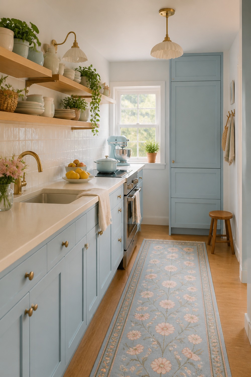
The pastel blue works especially well in a tiny kitchen because it makes the narrow layout feel intentional. The slim runner, simple uppers, and tidy counter line keep the space from looking crowded, which matters when every inch is visible.
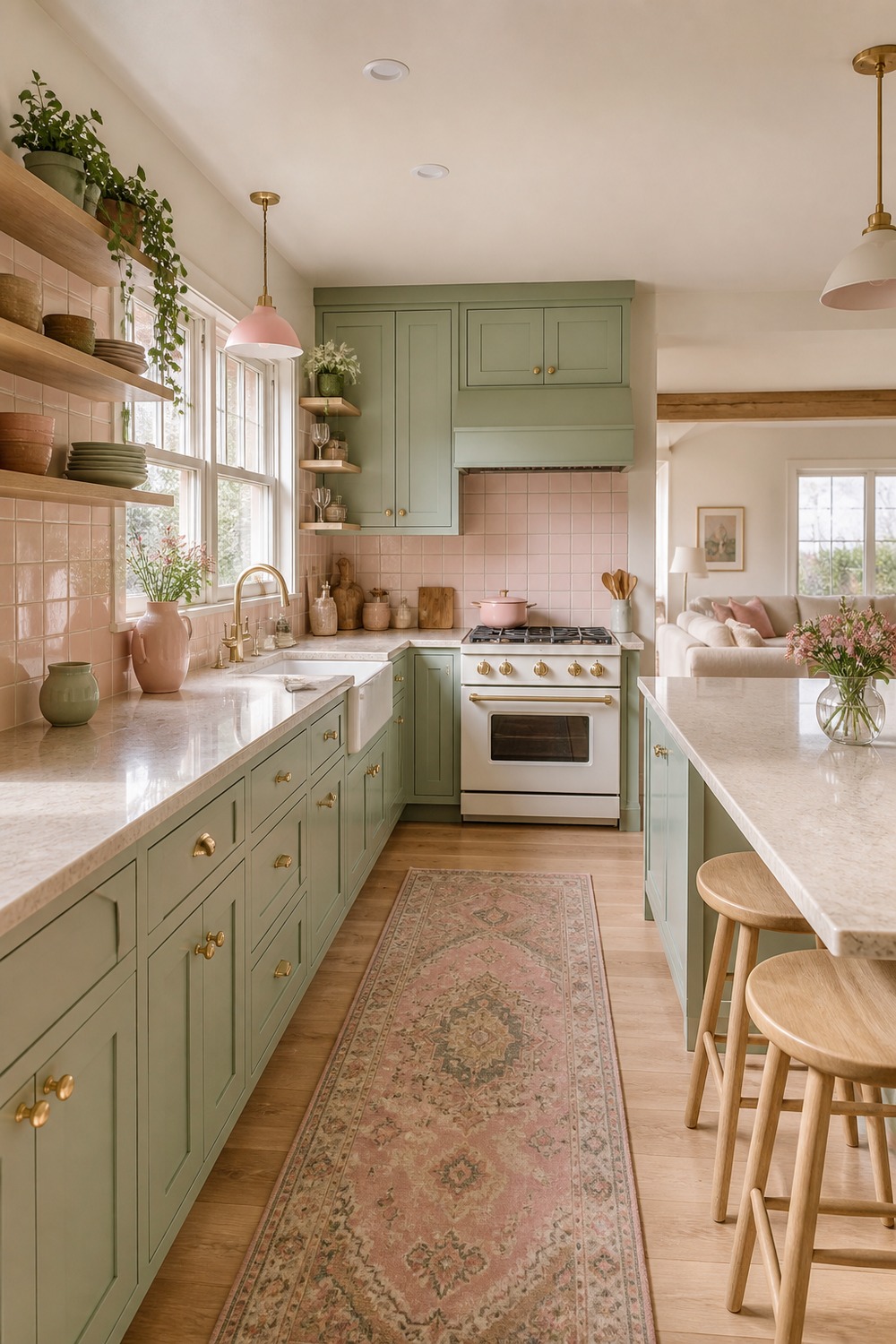
Sage and blush is one of those pairings that feels cute but still grown enough for an everyday kitchen. The green cabinets do the grounding, and the softer pink details add charm without asking every single piece in the room to be colorful.
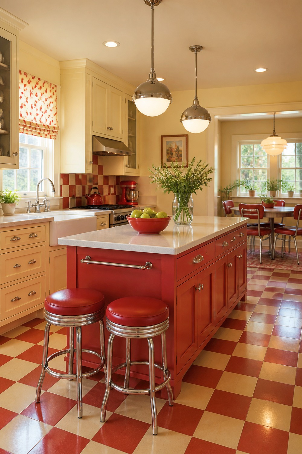
This red and cream kitchen has a little diner energy, but the palette still feels homey. The checkerboard floor, rounded island color, and warm wood touches make it playful without turning the whole room into a themed set.
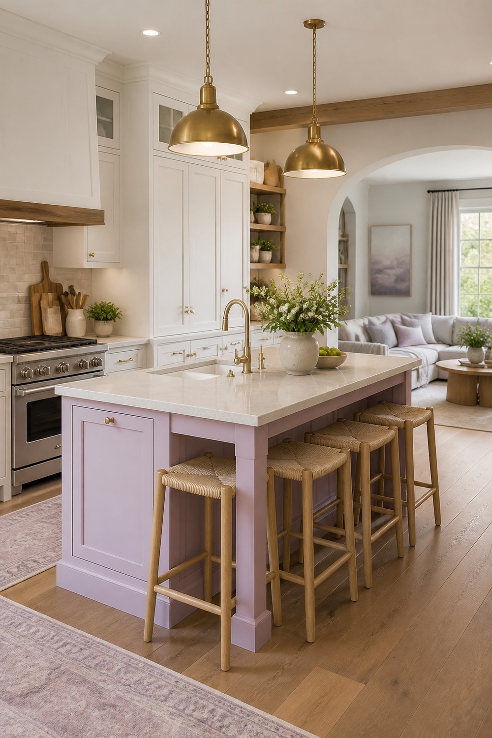
A lavender island is such a good way to try a cute color scheme without painting every cabinet. The surrounding cream cabinets keep the room calm, while the purple center gives the kitchen a clear focal point the second you walk in.
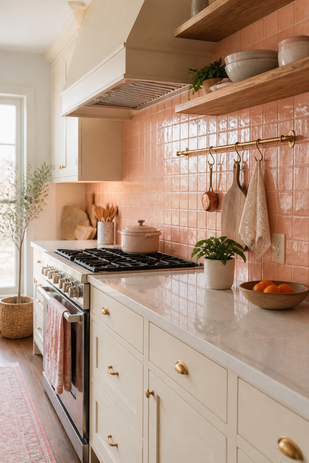
The peach backsplash is doing most of the work here, and I love that restraint. It gives the kitchen a soft glow behind the sink and shelves, but the white cabinetry and wood counter still leave plenty of breathing room.
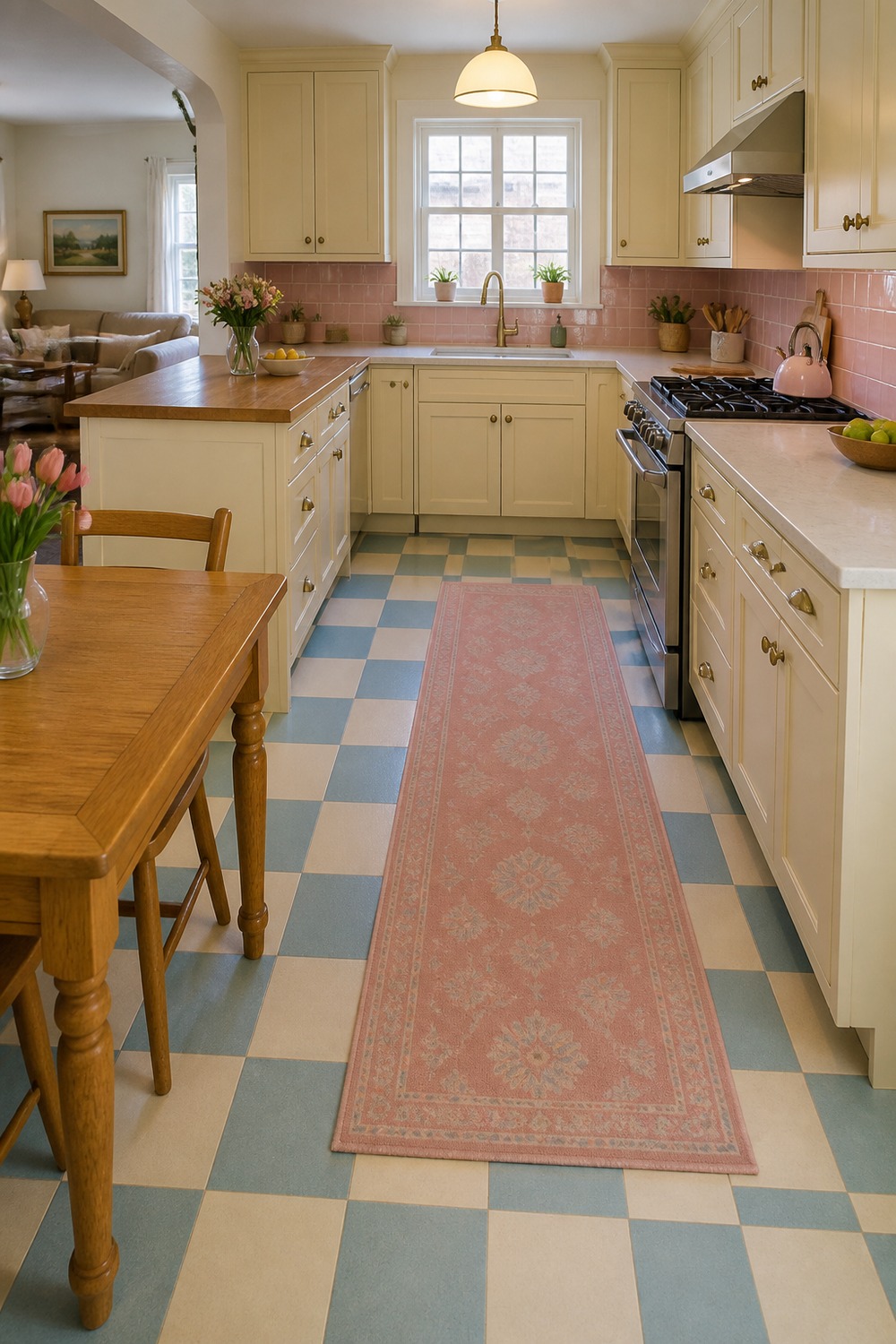
This checkerboard floor makes the whole kitchen feel more collected. Because the cabinets stay pale and the rug adds just a little color, the pattern feels charming instead of loud or hard to live with.
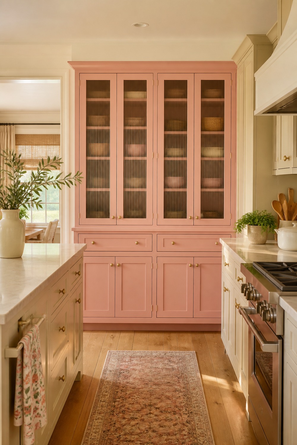
The strawberry-pink pantry wall is cute in a very specific, almost storybook way. Closed cabinets keep the busy pieces hidden, and the softer trim color makes the pink feel like a feature instead of a random accent.
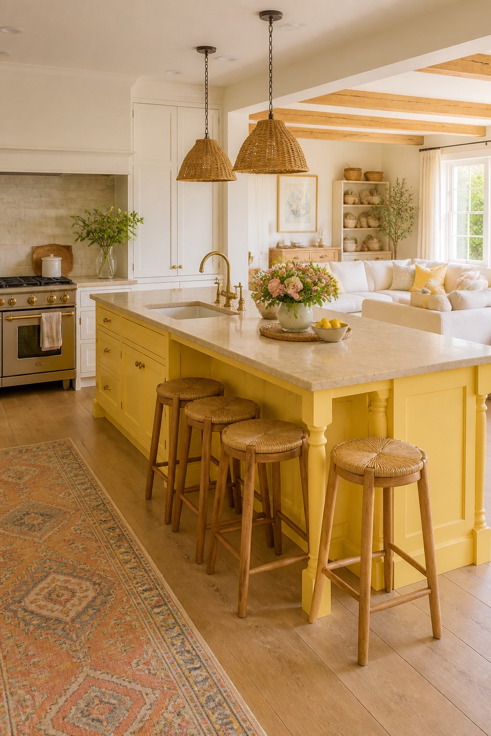
A sunny yellow island instantly makes this kitchen feel more cheerful. I like that the color is paired with quiet perimeter cabinets and simple pendants, so the island feels like the bright moment instead of competing with everything else.
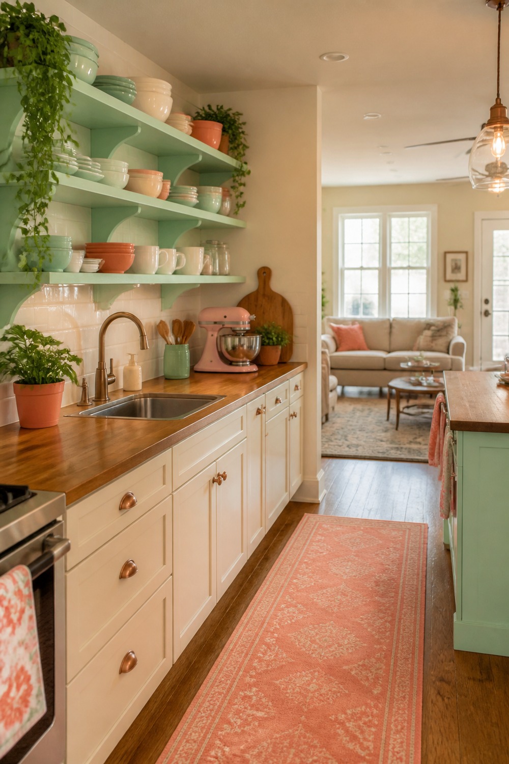
Mint and coral can feel risky, but this kitchen keeps it believable with warm shelves and everyday dishes. The open shelving gives the colors a place to repeat naturally, which makes the palette feel collected rather than pasted on.
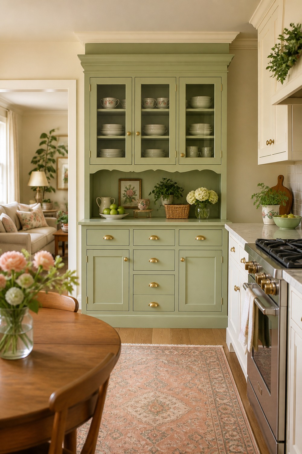
The green hutch gives this kitchen a softer furniture-piece feeling. It is a nice reminder that a color scheme does not always have to mean a full cabinet makeover; one painted storage piece can shift the whole mood.
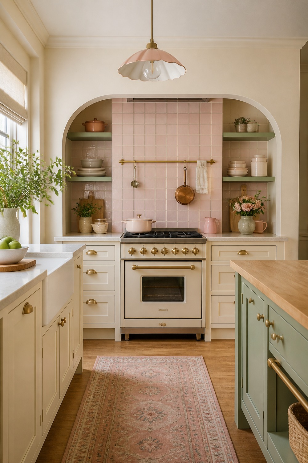
This range alcove feels cute because the pastel color is built into the architecture, not sprinkled around as clutter. The hood area, tile, and surrounding cabinets all work together, so the cooking wall becomes the prettiest part of the room.
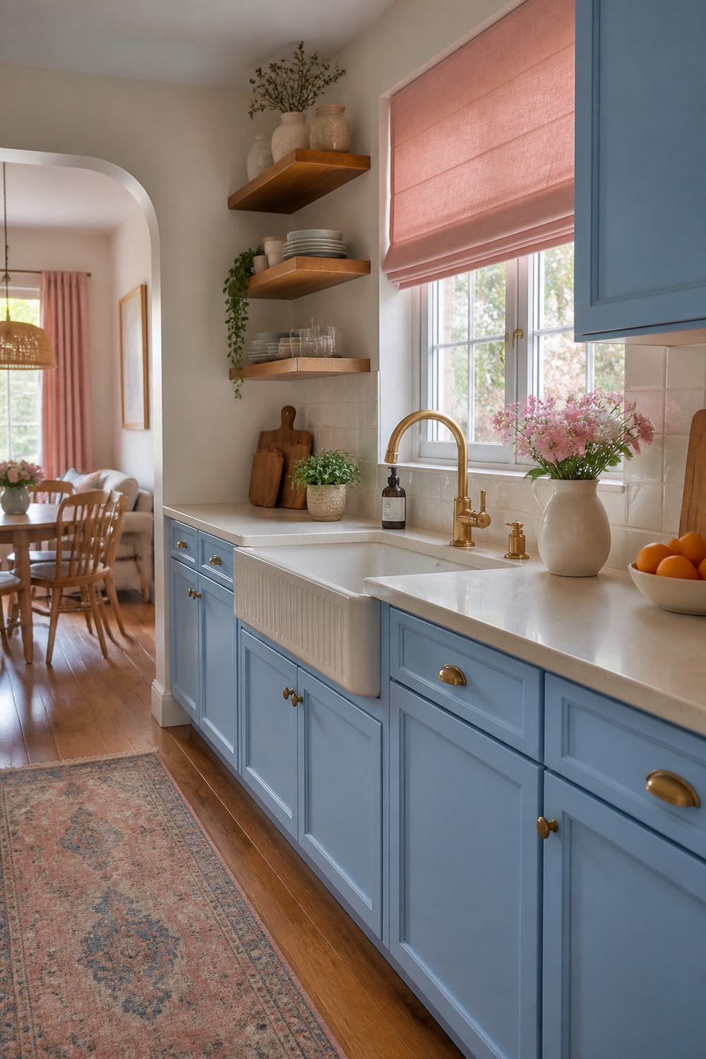
Blue cabinets with pink accents could go very wrong, but this corner keeps the balance soft. The window treatment, cabinet color, and small countertop details make it feel cheerful while the work surface still stays open enough to use.
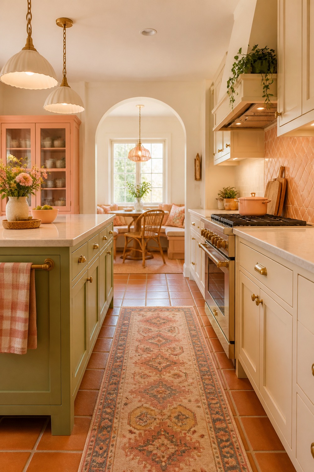
The terracotta and cream palette feels a little warmer than the pastel kitchens, which I really like. It has that cute collected look, but the earthy tones make the cabinets, tile, and wood floor feel settled instead of overly sweet.
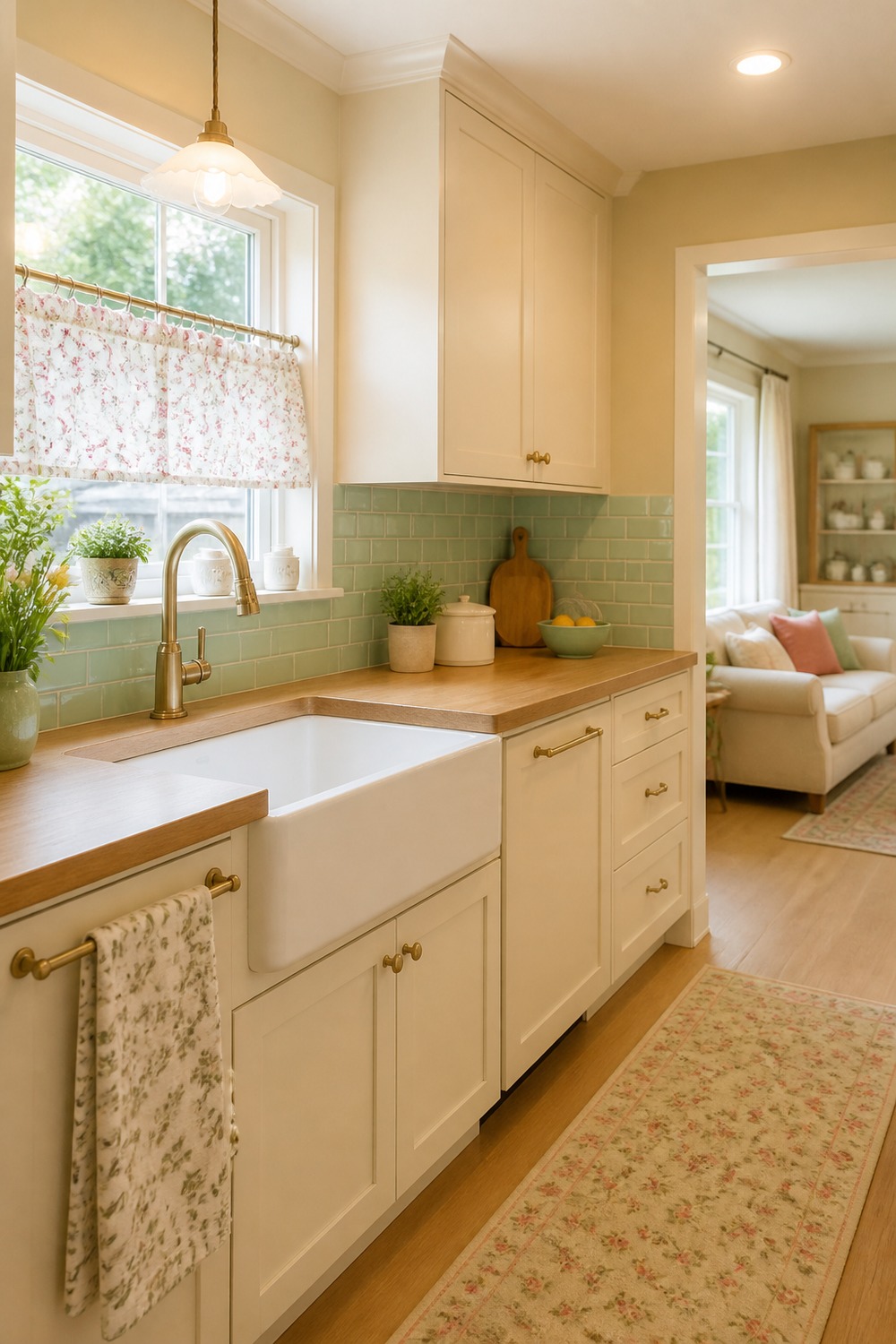
The cafe curtain is the small detail that makes this kitchen feel personal. Paired with cream cabinets, mint tile, and a wood counter, it adds softness around the sink without taking away storage or prep space.
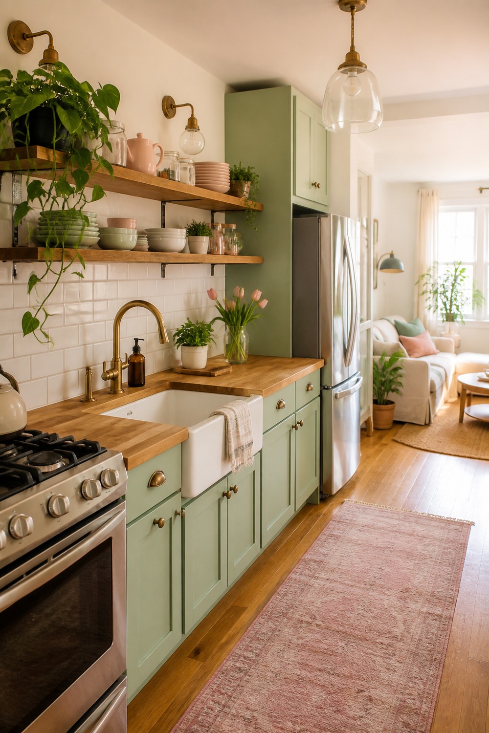
This small apartment kitchen uses color in a way that feels realistic for a compact space. The pastel green cabinets, butcher-block counter, and open shelves make the room feel cheerful, but nothing blocks the narrow walking path.
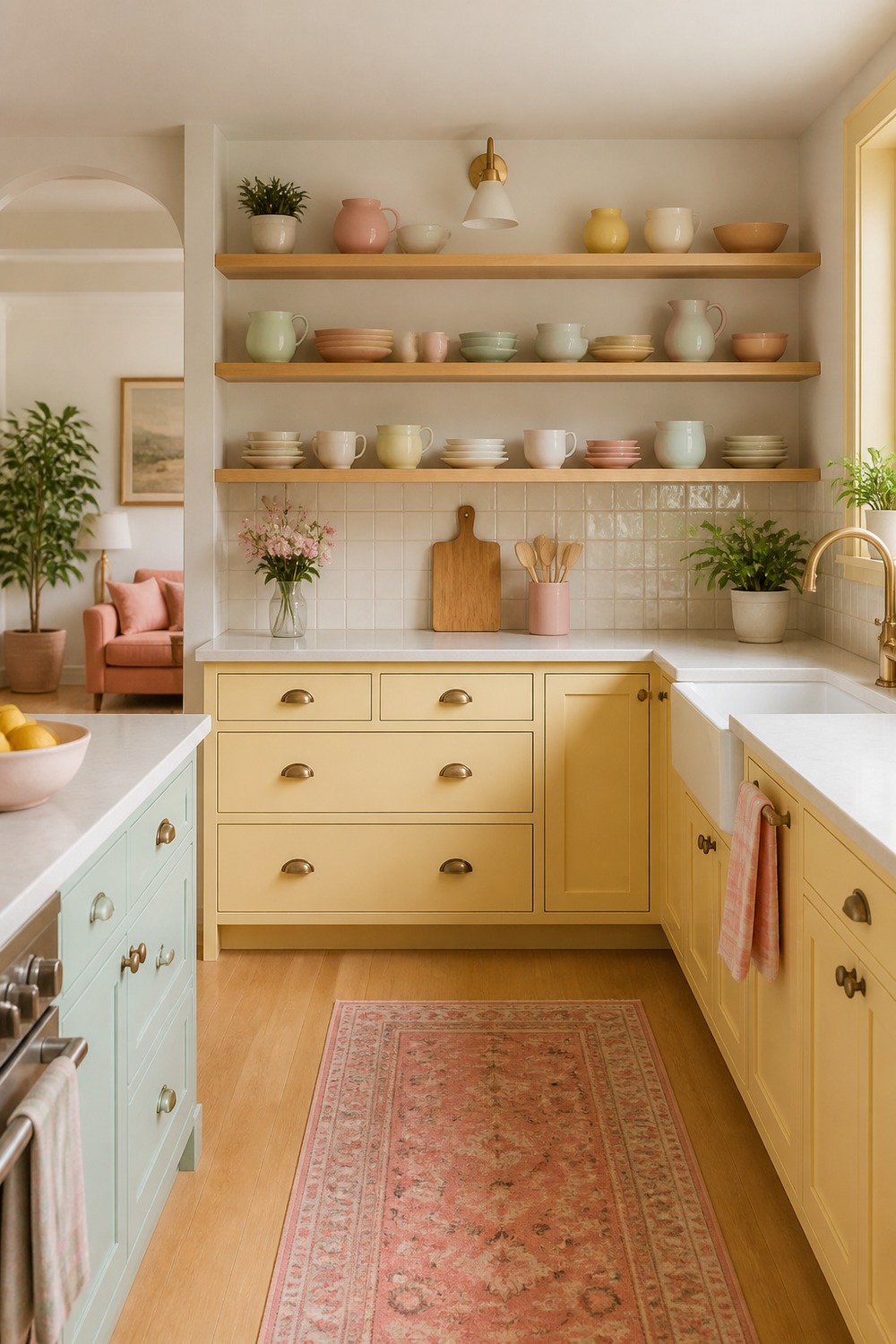
The open shelves bring in the color here without making the cabinets do everything. I like the mix of pottery, plants, and soft cabinet tones because it gives the kitchen a collected cottage look that still feels useful.
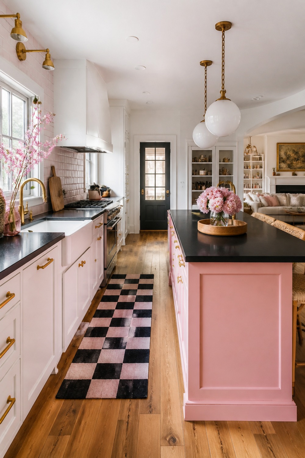
Black and pink gives this kitchen a bolder cute look, and the contrast keeps it from feeling too precious. The dark floor and accents sharpen the softer pink pieces, so the palette has a little edge instead of just sweetness.
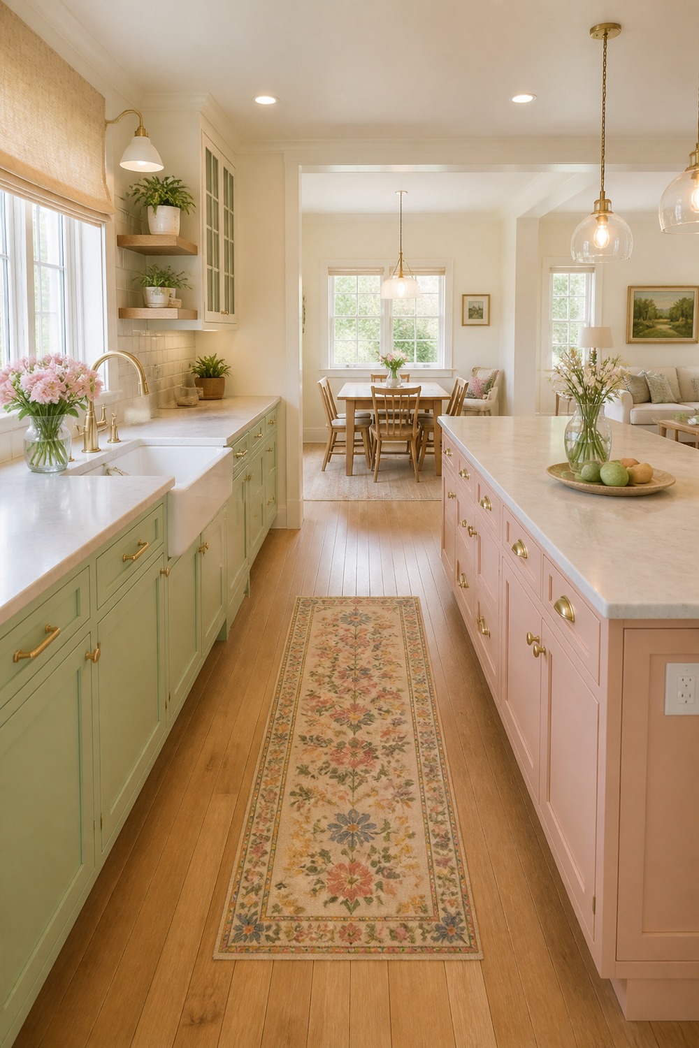
This last kitchen pulls several cute colors together but still gives each one space. The runner, cabinets, wall color, and warm lighting all feel layered, which is why the palette reads charming instead of chaotic.
The cute palettes that work best still leave room for real kitchen life. A little color goes a long way when the counters, shelves, lighting, and storage all have a job too.

I work in tech, but my taste in design is straight out of a slow European village. Give me arches, aged brass, and a room that smells like books and coffee. That’s my kind of home.