Neutral tile has its place, but a kitchen can handle more personality than another pale rectangle behind the sink. These ideas use cobalt floors, raspberry islands, ombré zellige, turquoise mosaics, and sharp color pairings while keeping the counters, walkways, and cooking zones believable.
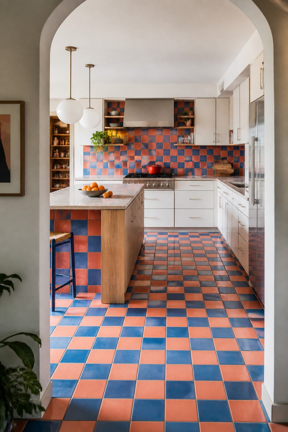
The cobalt-and-coral floor is not playing background here, and that is exactly why it works. Warm white cabinets give the checkerboard room to breathe, while the oak island keeps the palette connected to something natural.
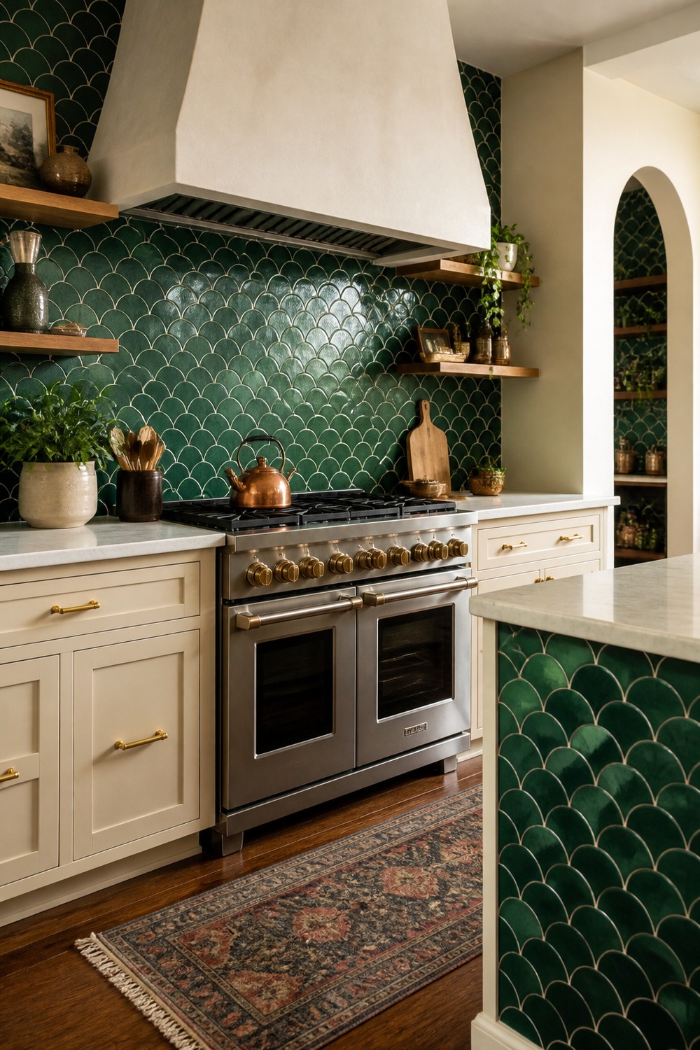
This emerald fan tile makes the range wall feel almost architectural. The curved pattern catches light differently across the wall, and the quieter cream cabinetry stops the deep green from swallowing the prep area.
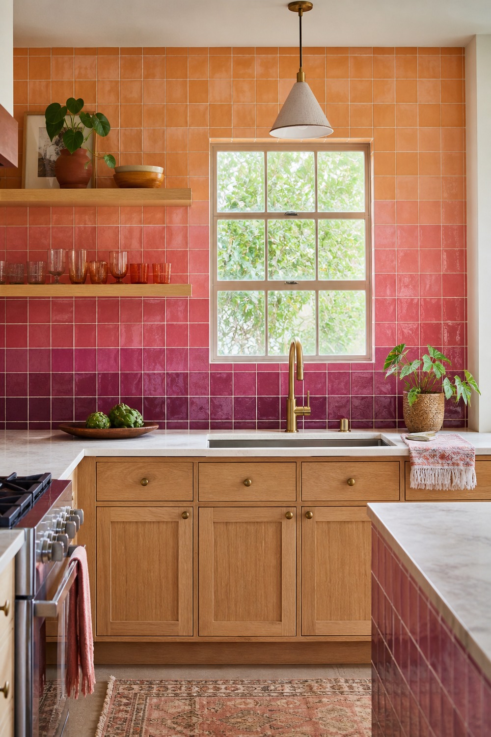
An ombré backsplash feels far more interesting than choosing one safe tile color. I love how the apricot moves into plum around a very simple sink wall, so the color shift becomes the decoration.
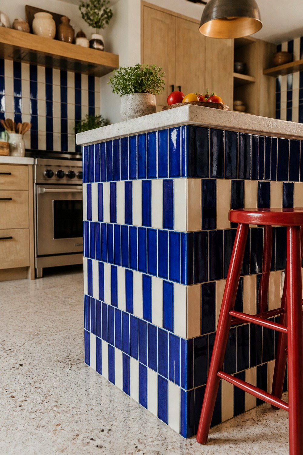
Tiling the island face is such a strong move when the rest of the room is clean. The cobalt stripes sharpen the island shape, and those tomato-red stools add contrast without covering the actual tile.
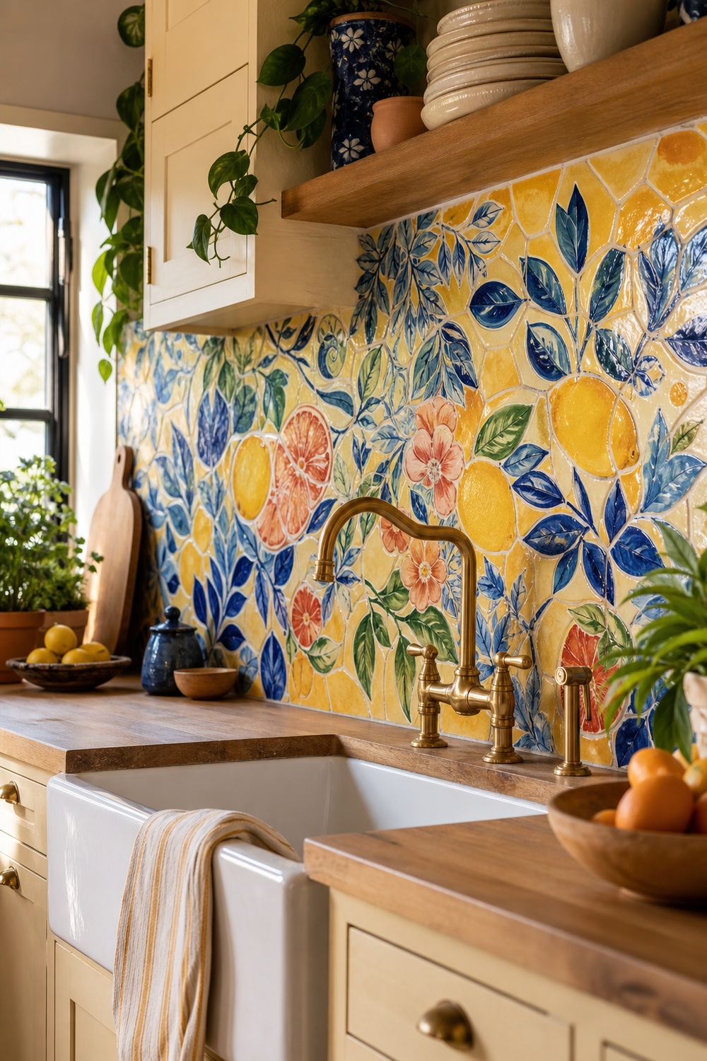
Hand-painted citrus tile gives this sink wall the energy of artwork without sacrificing a wipeable surface. The cobalt leaves and coral fruit break up all that yellow, while cream cabinets and oak keep the kitchen from tipping into theme territory.
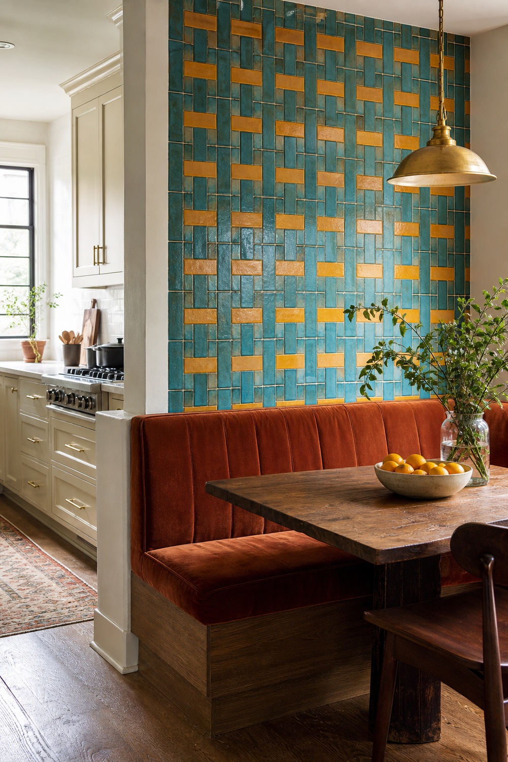
The oversized basketweave tile turns this breakfast nook into a real destination instead of leftover wall space. Turquoise and marigold have plenty of contrast, and the rust banquette ties them together without matching either one exactly.
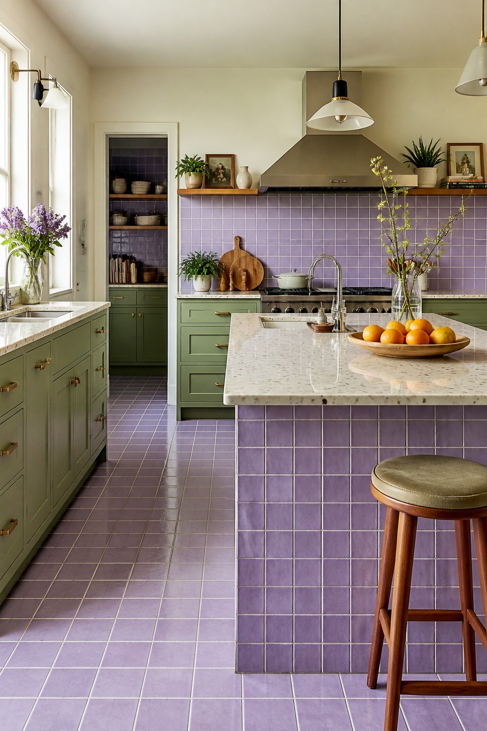
Lavender tile is unexpected enough to feel fresh, especially beside pistachio cabinets. Keeping the grid small and orderly lets both colors show up clearly without turning the island into visual noise.
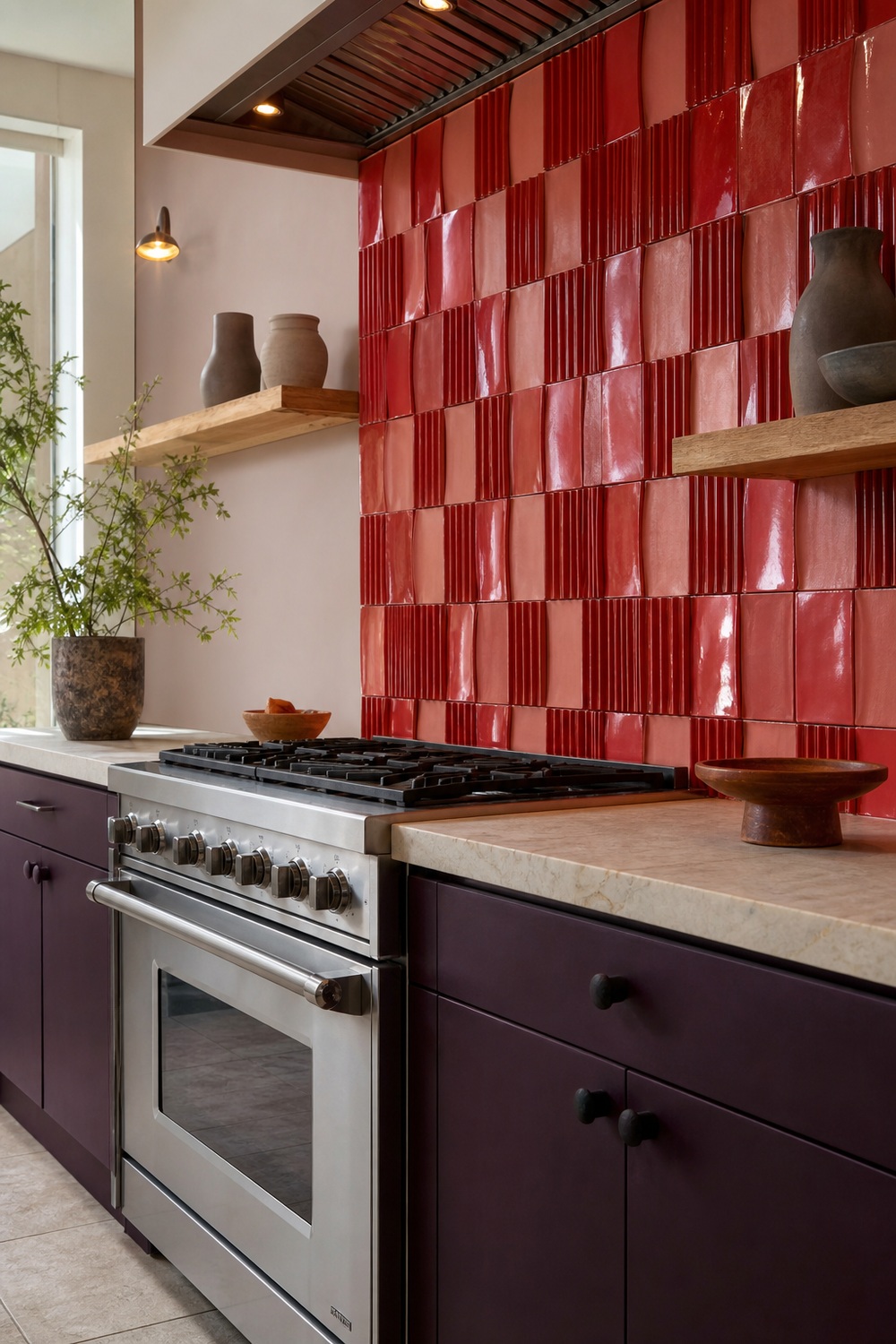
Flat subway tile would miss the point here. Fluted and curved pieces make the tomato-and-blush wall change as daylight moves across it, while aubergine lowers give the stainless range a much stronger frame.
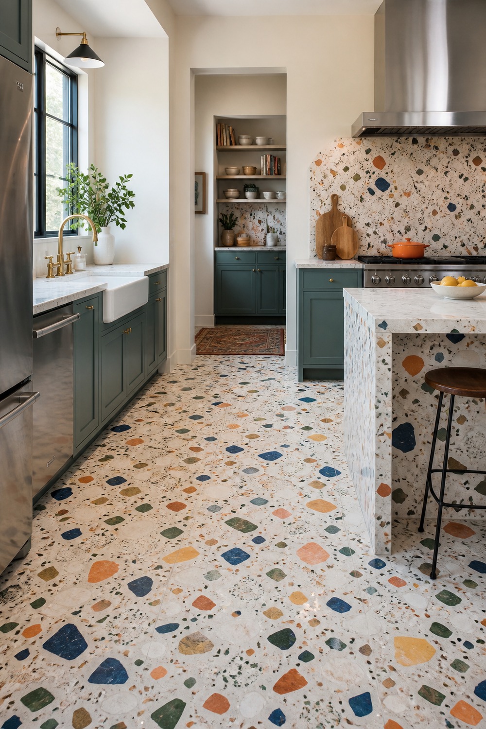
Terrazzo is doing the heavy lifting in this room. The larger colored chips connect teal cabinets, warm walls, and wood details, so the floor reads as a palette plan rather than random confetti.
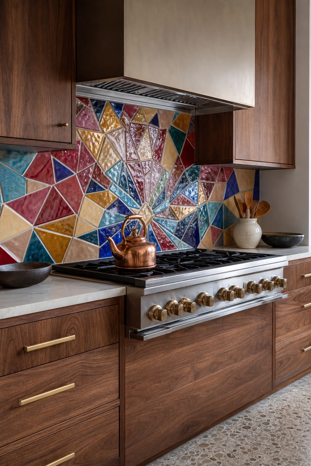
This jewel-tone mosaic feels a little like stained glass, but the walnut cabinets keep it firmly in kitchen territory. The radial pattern gives the range a focal point, and the pale terrazzo floor leaves the backsplash as the one deliberately busy surface.
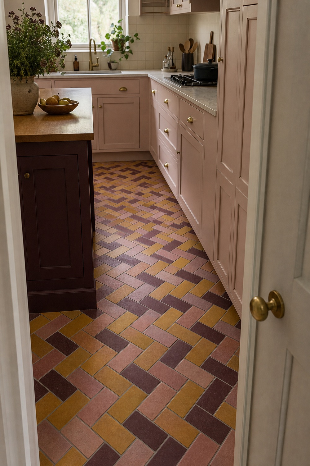
A multicolor basketweave floor has more movement than a plain hex tile, yet the small repeat still reads neatly down a narrow galley. Mustard lifts the darker plum pieces, and dusty rose connects the pattern to the cabinetry.
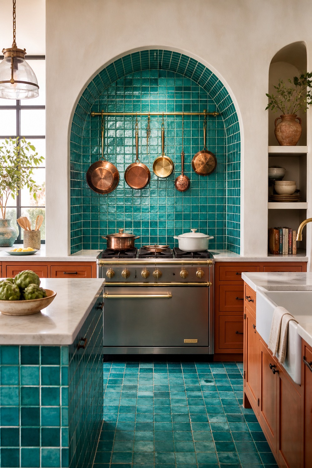
The turquoise mosaic inside the arch turns the cooking zone into the obvious focal point. Terracotta at the base adds warmth, and the cream plaster around it gives all those tiny blue pieces a clean frame.
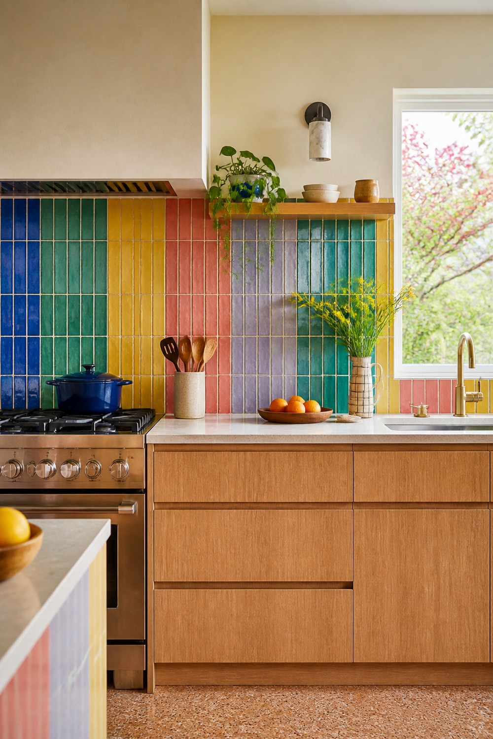
A slim rainbow stripe can be playful without looking childish. The oak cabinets keep the wall grounded, and the vertical pattern makes the backsplash feel taller while still leaving usable counter space.
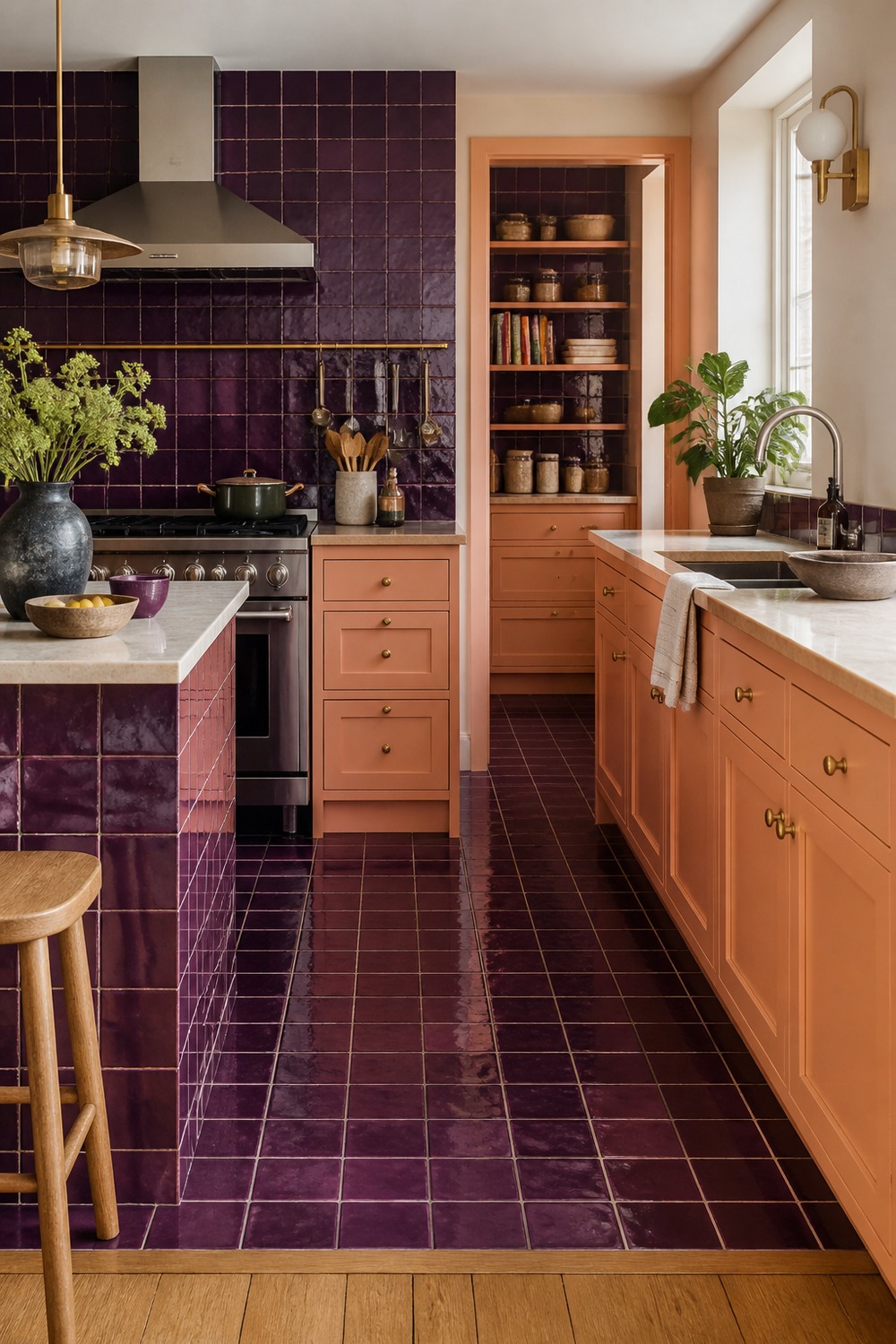
Aubergine tile has so much depth under real kitchen light. Peach cabinetry brings out the warmer undertones, while chrome and cream stone keep the combination from drifting into a dark jewel-box look.
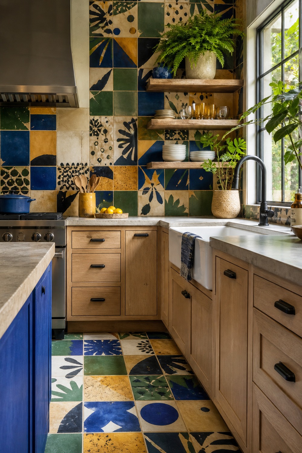
This pantry niche uses patchwork where a little visual complexity is actually welcome. The repeated cobalt and sage pieces make jars and appliances feel collected, not cluttered, against the pale cabinet fronts.
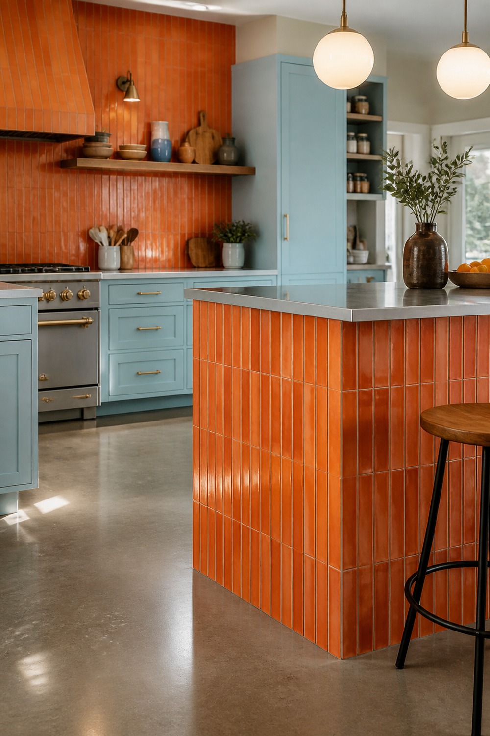
The orange tile makes the peninsula look like a piece of furniture instead of another cabinet box. Powder blue is a smart counterpoint, and the stainless top makes the whole setup feel ready for daily prep.
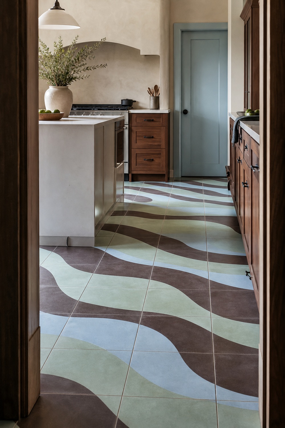
These square encaustic tiles connect into broad mint, chocolate, and pale-blue waves, so the floor feels fluid without being seamless. The grout grid keeps the installation believable, and walnut cabinetry repeats the darkest curve at eye level.
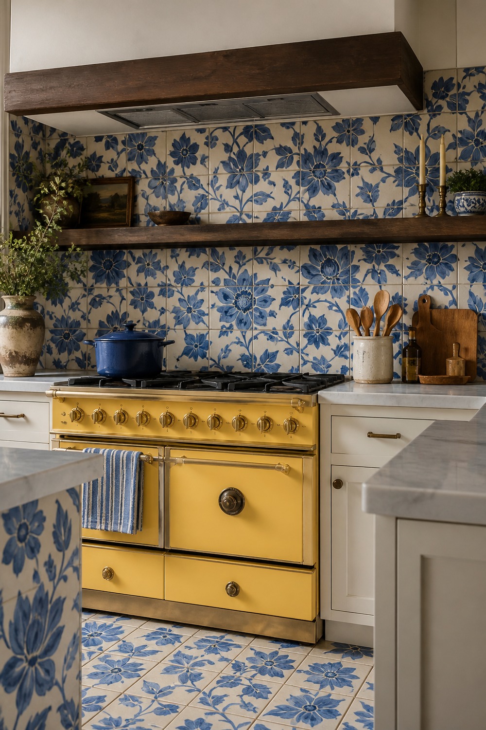
The blue floral tile gives this range wall detail without needing open shelves full of props. A yellow range sounds loud on paper, yet the crisp white cabinets make the pairing feel bright and surprisingly balanced.
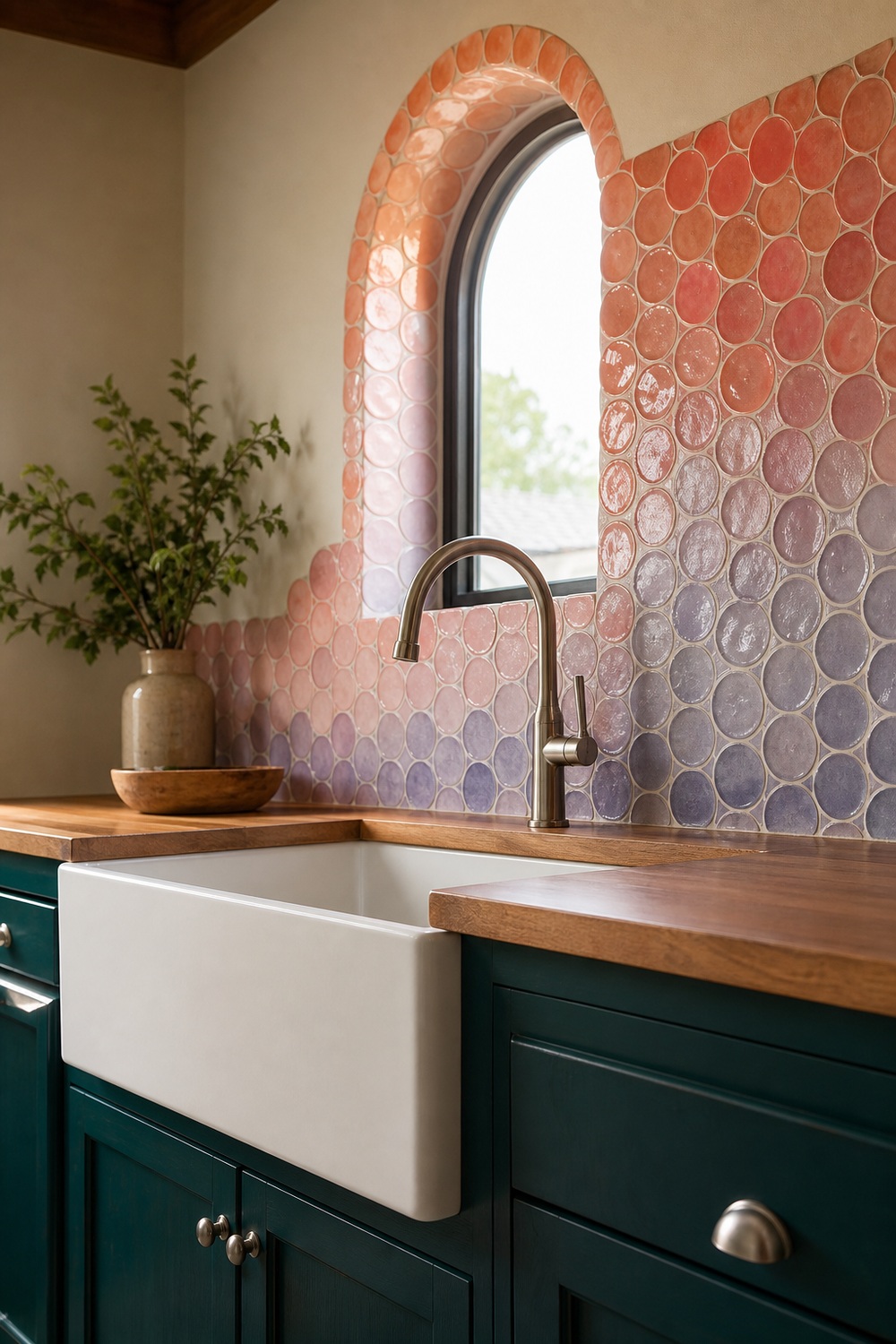
The round mosaic pieces fade from coral into lilac as they move down the wall, which makes the arched window feel built into the color story. Deep teal cabinets give the pale lower tiles definition, and the oak counter adds a quiet warm line.
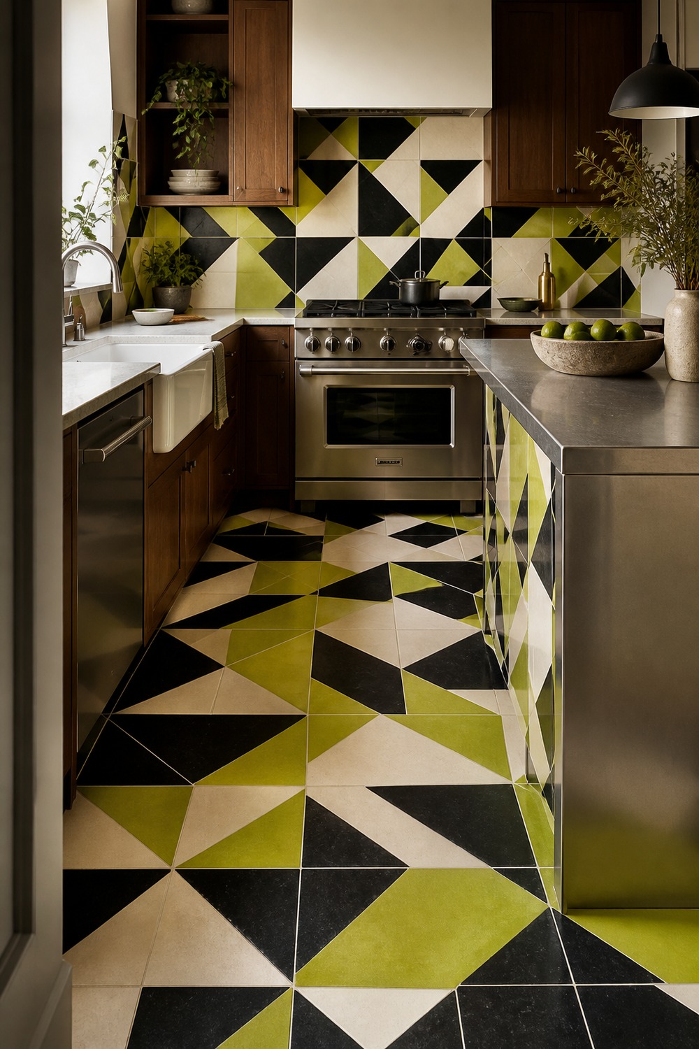
This geometric floor is the wild card of the group. Electric lime works because it appears in a controlled repeat with black and cream, while walnut and steel keep the room from feeling like a novelty set.
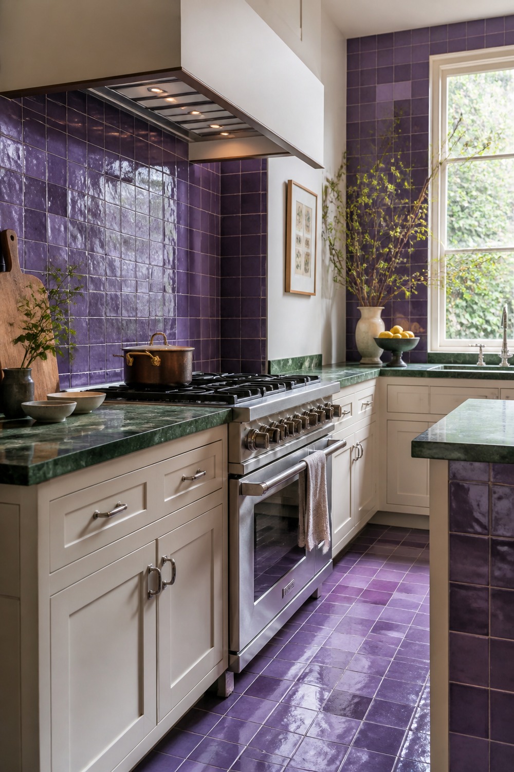
Violet tile and green marble should compete, but their natural variation makes them feel related. The white cabinets and nickel fixtures are quiet on purpose, giving those two materials the full spotlight.
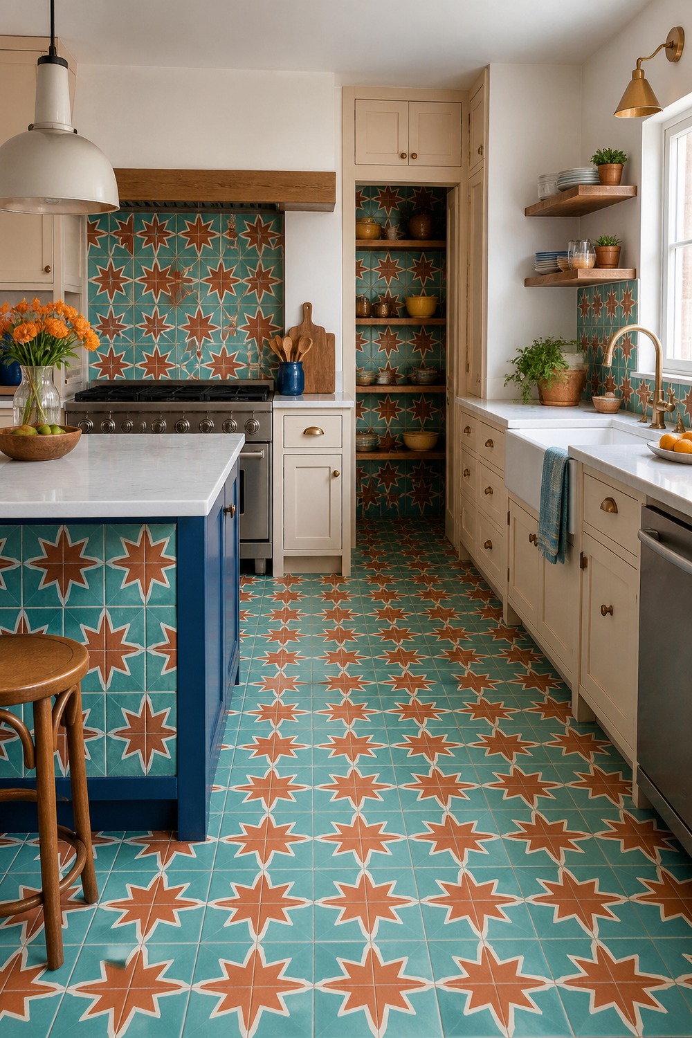
Star-and-cross tile already has movement, and turquoise with terracotta makes it even more alive. The cobalt island adds one solid color block so the patterned floor does not have to carry the whole room alone.
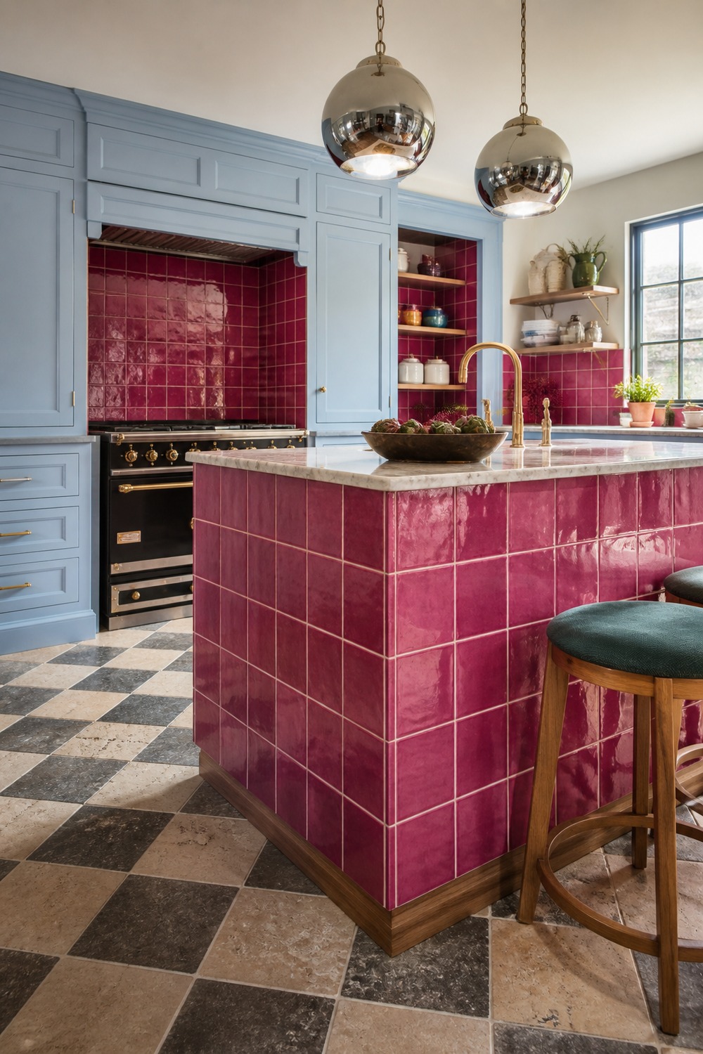
Wrapping an island in raspberry tile turns the center of the kitchen into the memorable part. Pale blue cabinetry cools down the pink, and chrome pendants bounce enough light across the glossy surface.
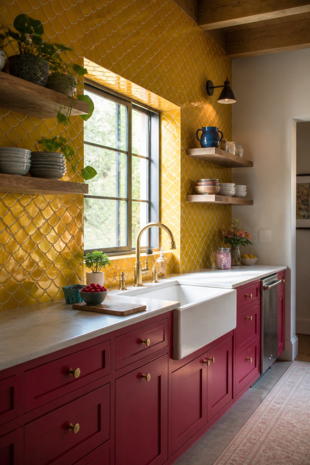
Ochre fish-scale tile has warmth without reading like another beige backsplash. Forest green cabinets deepen the palette, while the cream hood gives the range a clear, calm shape in the middle.
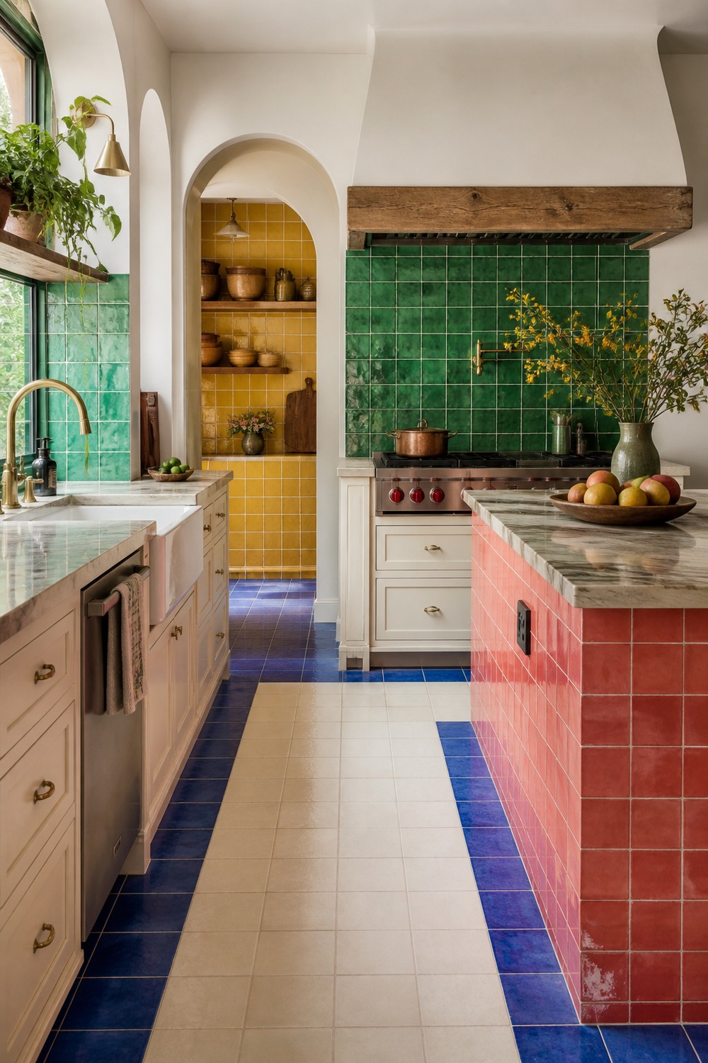
This room uses color in zones instead of mixing everything everywhere. The cobalt border, coral island, emerald range wall, and yellow pantry each have a job, with cream cabinetry acting as the pause between them.
The best part about colorful tile is that it can take on the visual work that would otherwise need piles of decor. One confident floor, backsplash, island face, or range wall is often enough to make the whole kitchen feel specific.

I work in tech, but my taste in design is straight out of a slow European village. Give me arches, aged brass, and a room that smells like books and coffee. That’s my kind of home.