Blue kitchens can go cold fast if everything is too glossy or too flat. I like the rooms where the blue has something warm beside it, like oak shelves, brass pulls, creamy tile, or a runner that makes the cabinets feel less showroom-perfect.
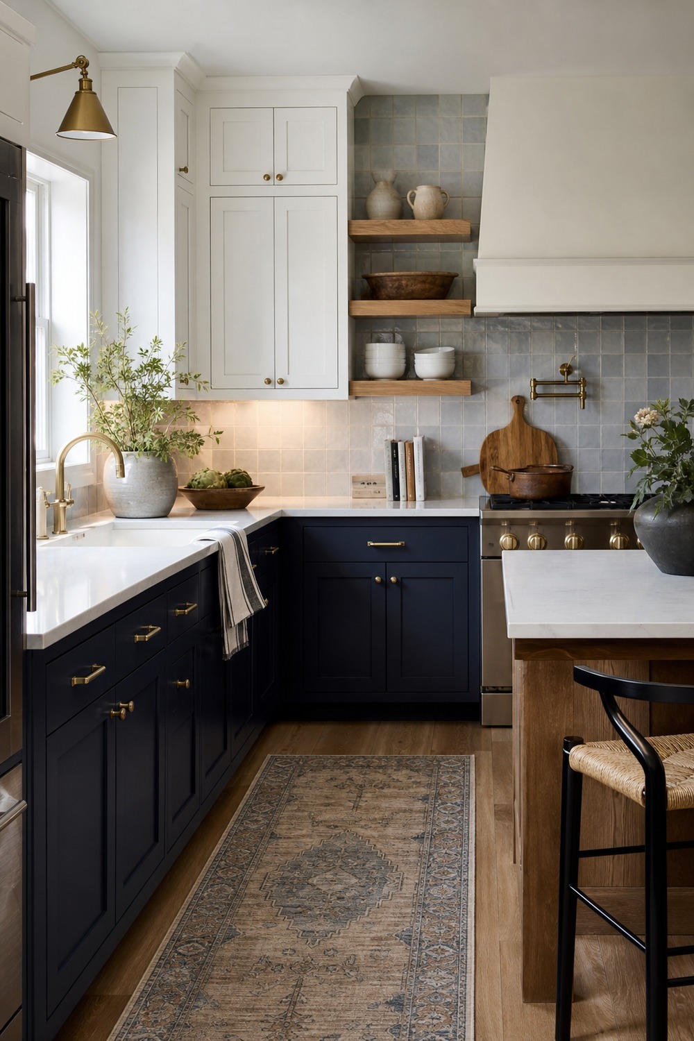
The navy lowers make this kitchen feel grounded right away, but the white upper cabinets keep the room from getting heavy. I especially like the oak shelves in the middle because they give the blue a warmer break and leave everyday bowls within reach.
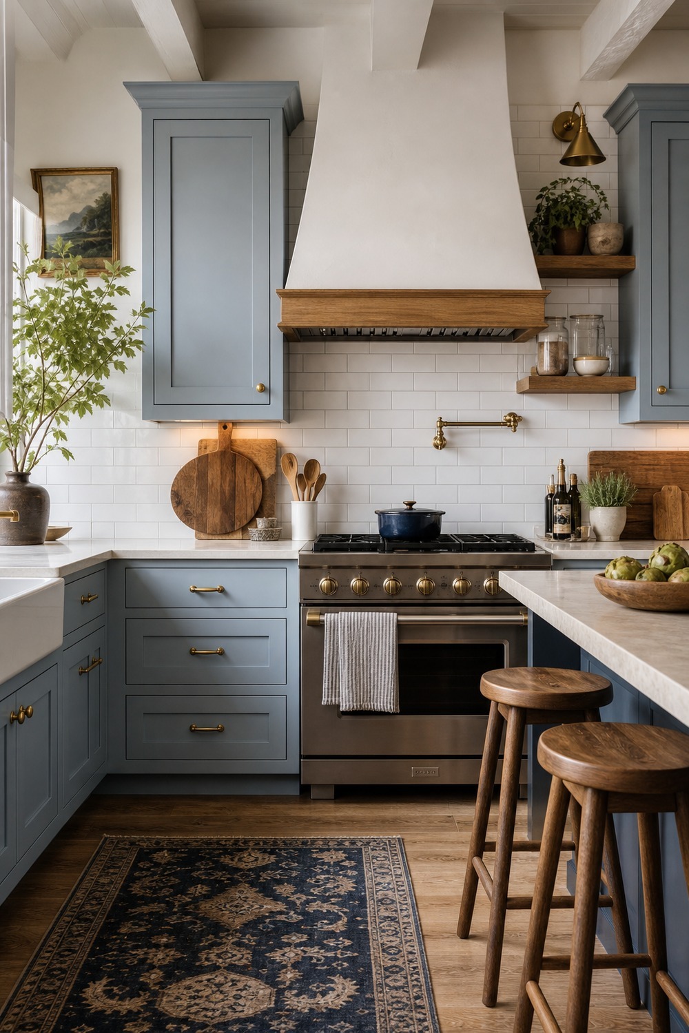
Pale blue can look a little nursery-soft if the rest of the kitchen is too sweet, but this version feels calmer than that. The simple shaker fronts, white subway tile, and oak stools make the color feel clean without stripping away all the texture.
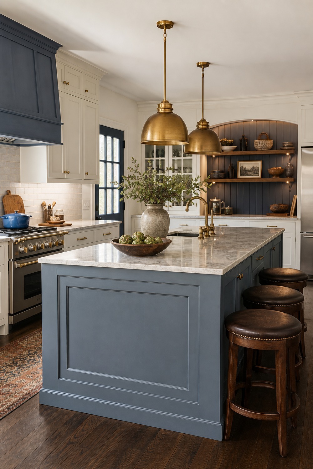
A blue-gray island is such an easy middle ground when full blue cabinets feel like too much. The brass pendants warm up the cooler paint, and the stools give the island that real gathering-spot feeling instead of just a pretty block in the center of the room.
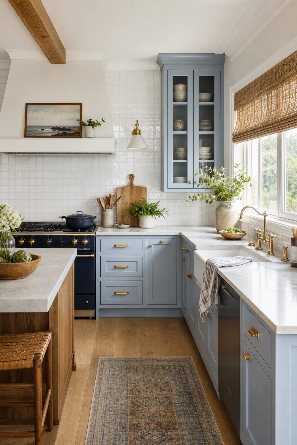
This coastal blue works because it does not lean too theme-y. The woven shade, white tile, and light oak floor keep the blue-and-white palette relaxed, like a kitchen that can handle breakfast dishes and beachy color without turning into a souvenir shop.
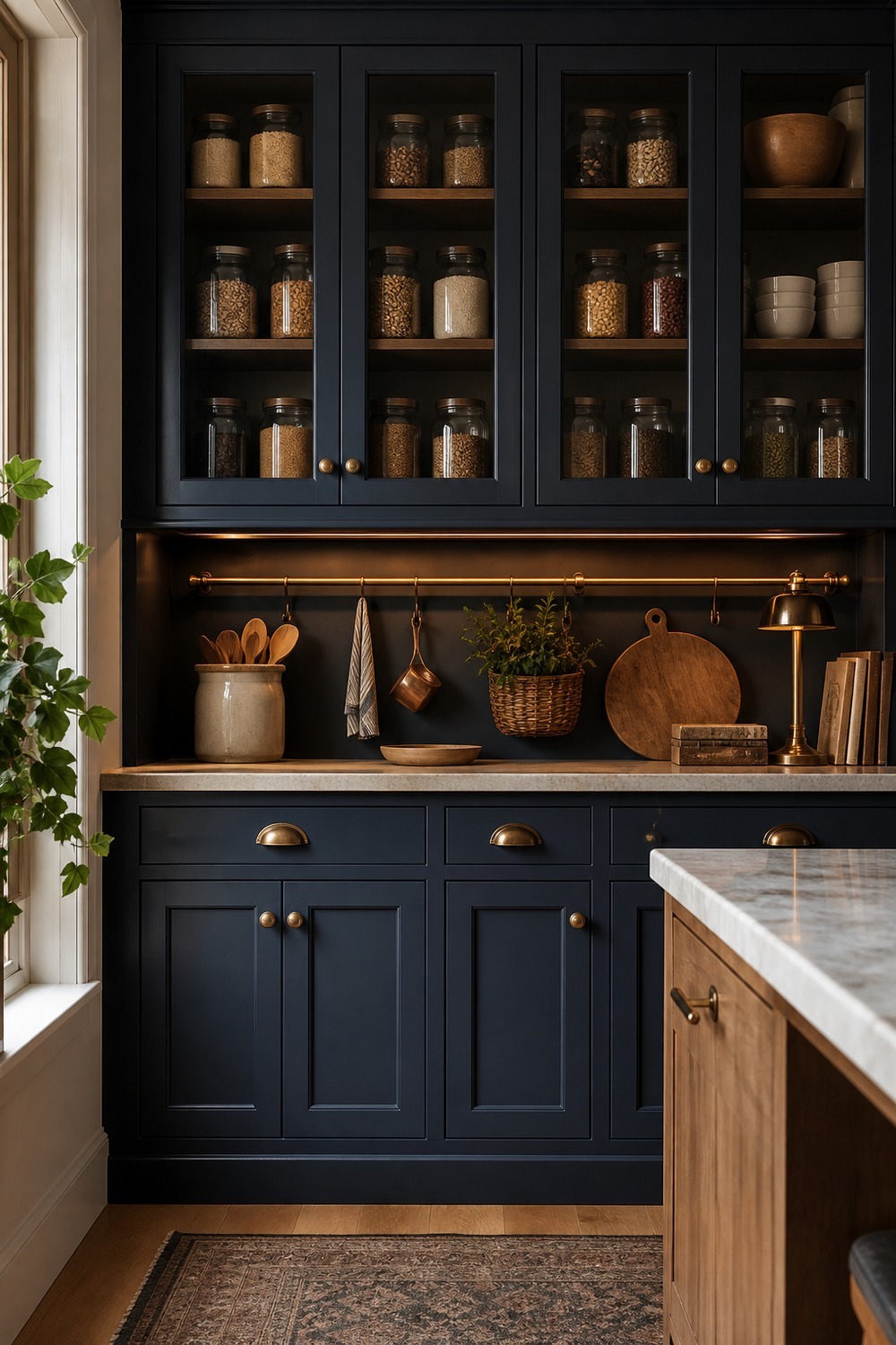
The pantry wall is the part I would notice first here. Deep navy cabinets can feel dramatic, but the glass doors, brass rail, and warm under-cabinet glow make the storage wall feel softer and more useful than a plain dark cabinet bank.
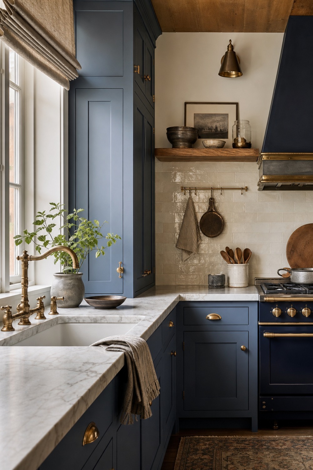
Dusty blue is a good choice when you want color but still want the kitchen to feel quiet. The marble-look counter and aged brass faucet add just enough polish, while the small plant and cream backsplash keep the whole corner from feeling too formal.
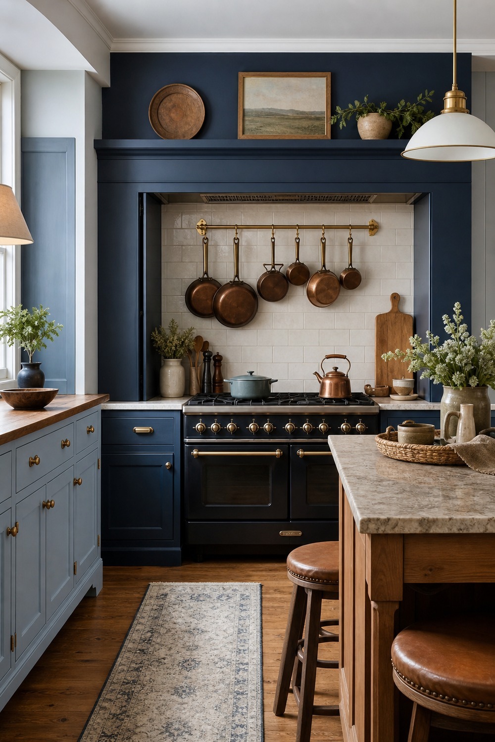
The range alcove makes the blue feel intentional instead of scattered around the room. I like the brass pot rail against the white tile because it gives the cooking zone a little structure, and the wood floor keeps the crisp tile from feeling cold.
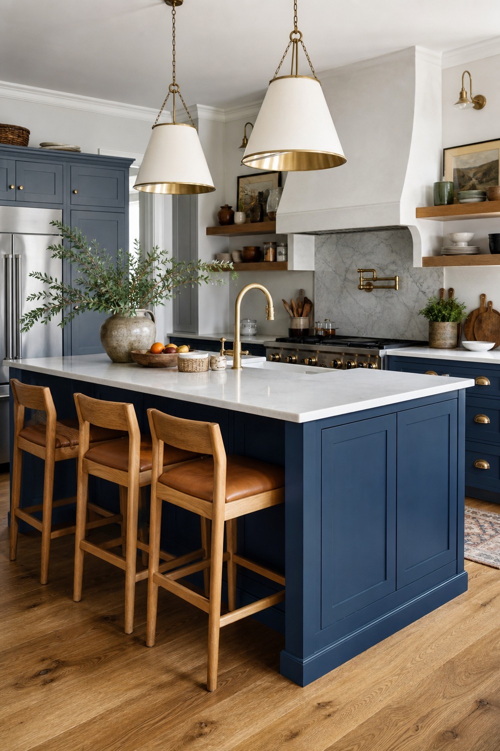
This is the kind of saturated blue island that can carry a mostly neutral kitchen. The oak stools matter because they soften the strong cabinet color and make the island feel like a place for coffee, homework, or someone keeping you company while dinner gets started.
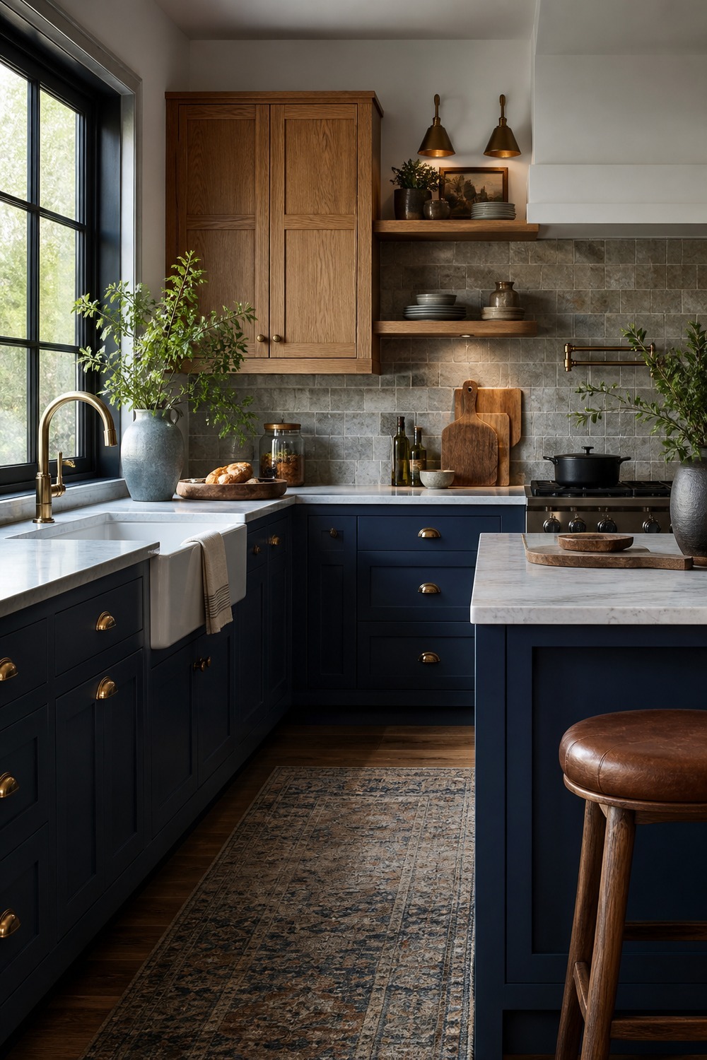
Blue and wood together almost always feels more forgiving than blue by itself. The base cabinets bring the color, while the natural uppers and stone backsplash make the kitchen feel layered, like it was collected over time instead of ordered from one matching set.
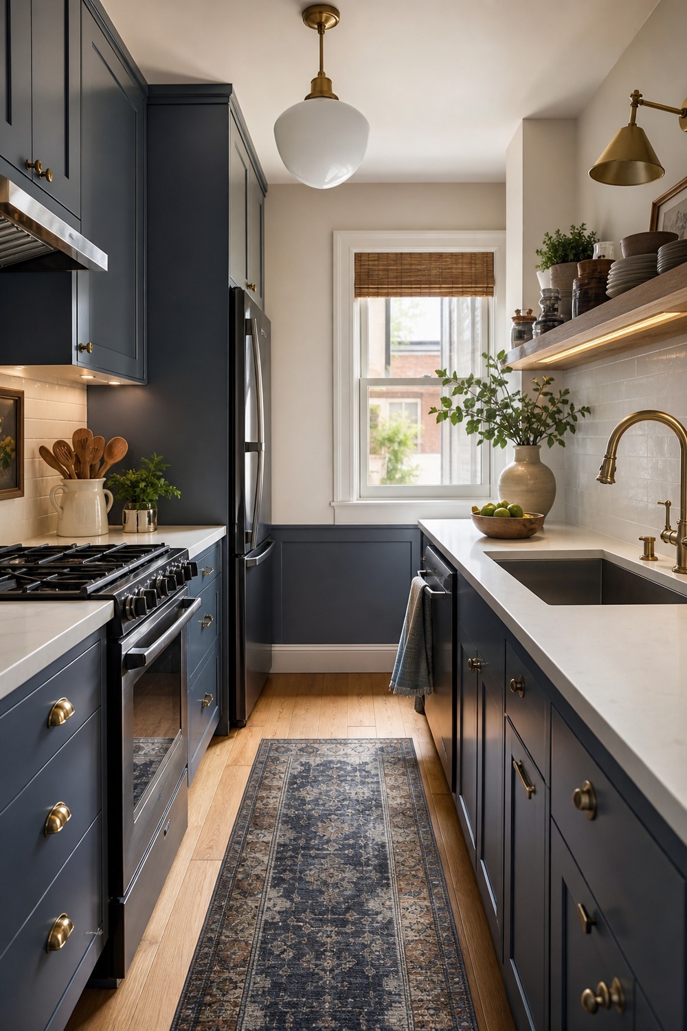
A small galley kitchen needs color that works hard without making the walkway feel tighter. The muted blue cabinets give this narrow space personality, and the open shelf plus under-cabinet light keep the counter area from feeling boxed in.
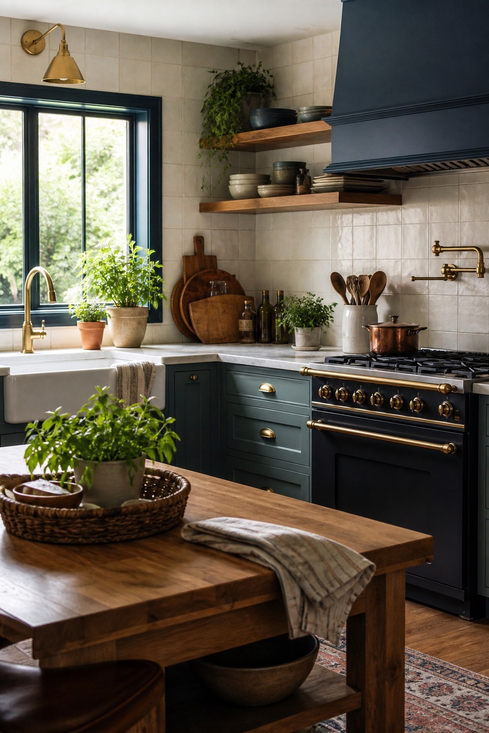
The blue-green cabinet color has a softer, almost garden-like feeling to it. Cream tile and butcher-block detail keep the palette earthy, and the little herb moment makes the kitchen feel active instead of too perfectly staged.
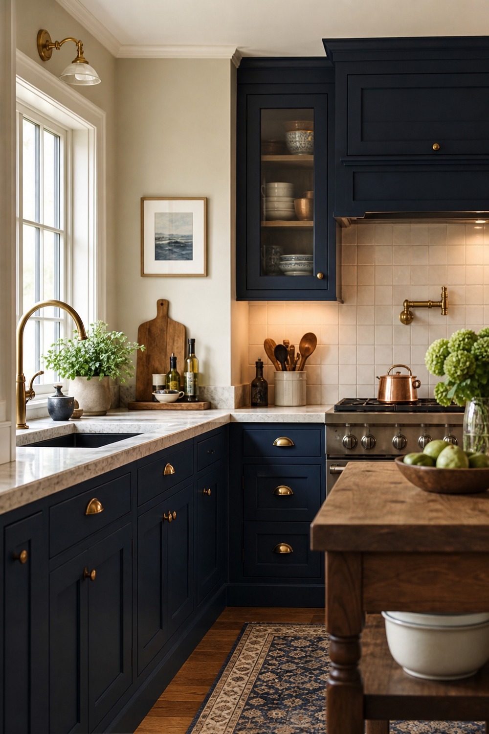
Navy with cream is one of those combinations that feels classic for a reason. The warmer wall color and stone counter stop the cabinetry from reading too stark, and the cutting board detail makes the space feel like someone actually cooks here.
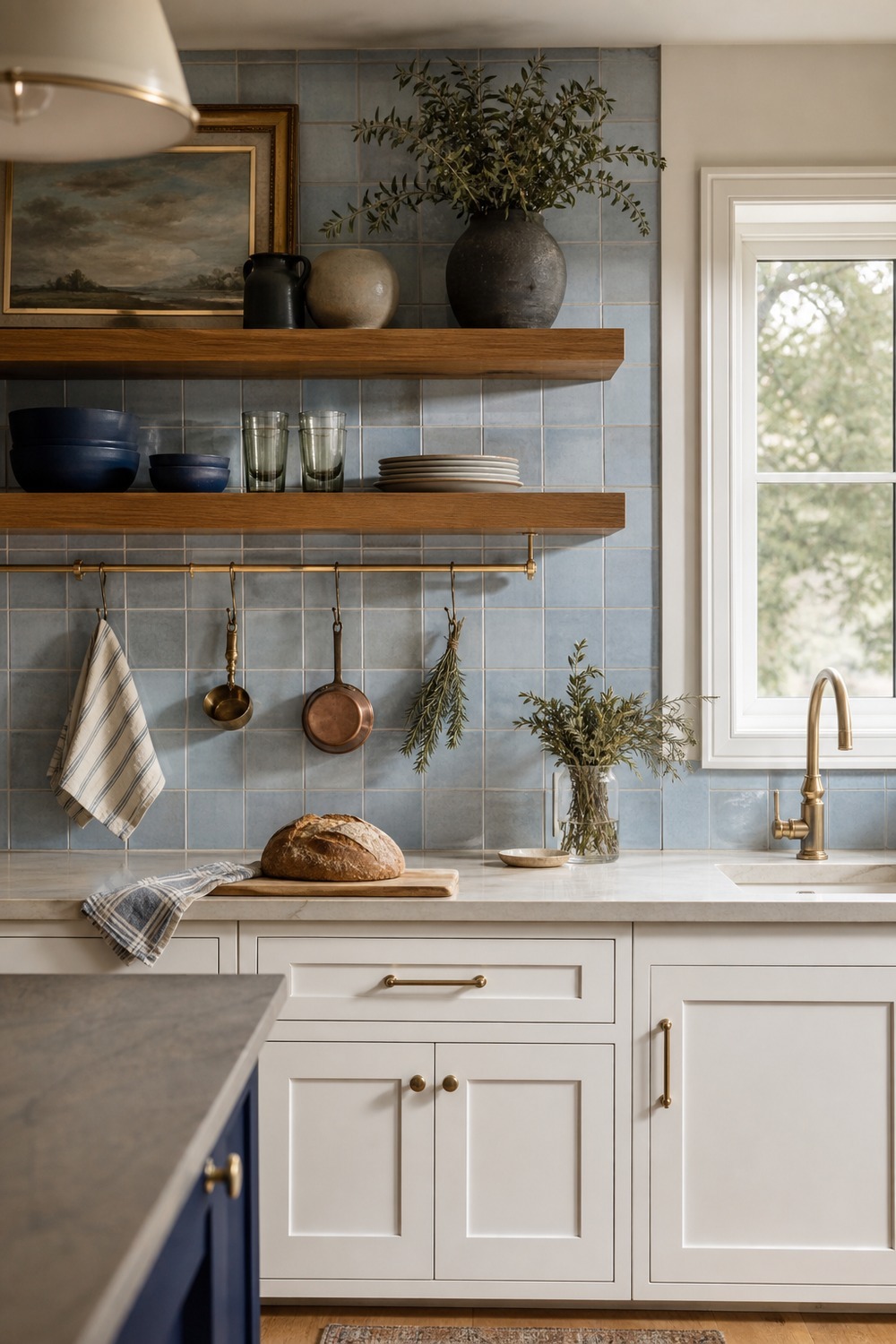
The backsplash is doing the color work in this one, which is a nice option if painted cabinets feel like too big of a commitment. Those handmade-looking light blue tiles add movement, while the white cabinets keep the room bright and easy to decorate around.
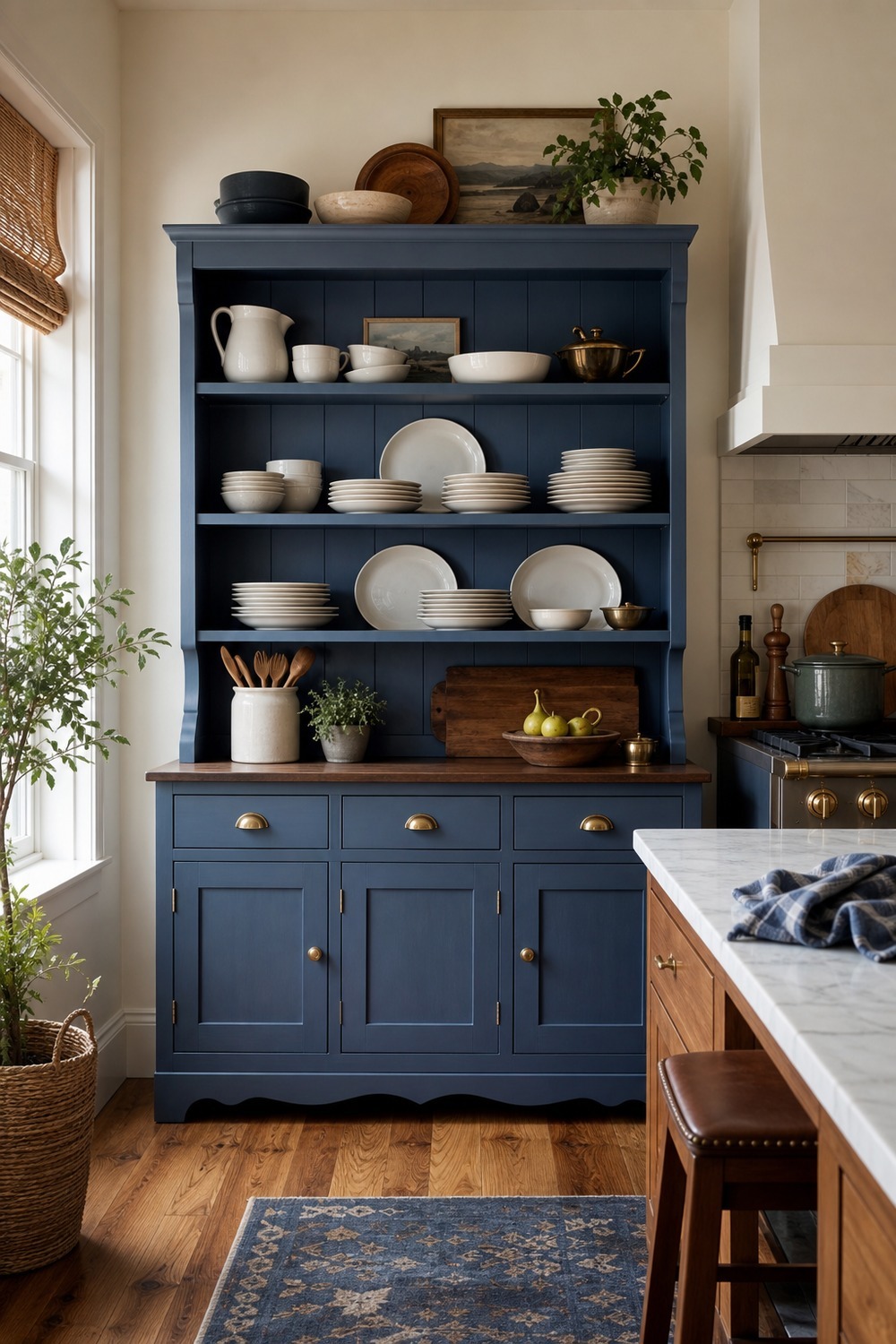
A painted hutch is a quieter way to bring blue into a kitchen color scheme. It gives dishes and serving pieces a home, adds that collected furniture feeling, and lets the main cabinets stay neutral if you do not want blue everywhere.
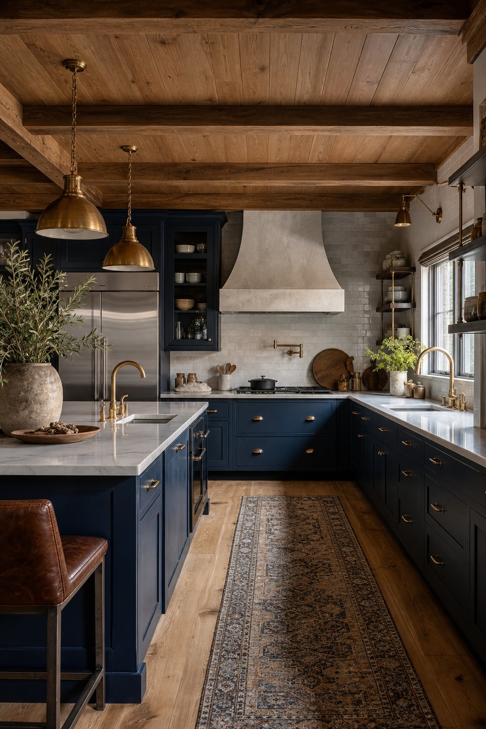
The warm wood ceiling changes the whole mood of this navy kitchen. Without it, the cabinets could feel severe, but the beams, brass lights, and runner make the darker blue feel rich in a way that still belongs in a real home.
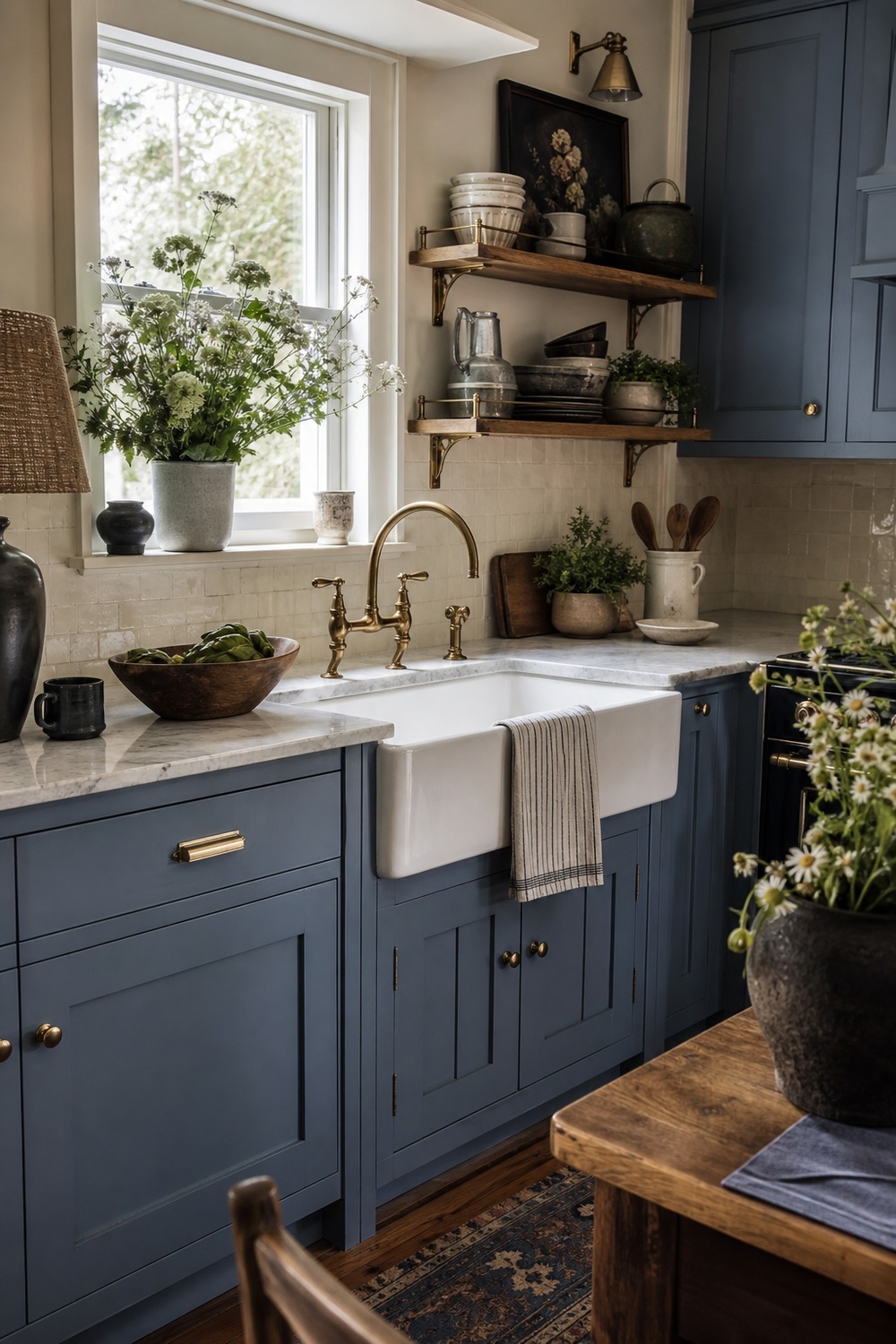
This soft cottage kitchen feels sweet without getting fussy. The paneled sink base and open shelves give the pale blue some old-house character, and the cream tile keeps the sink wall light enough for a small or shaded room.
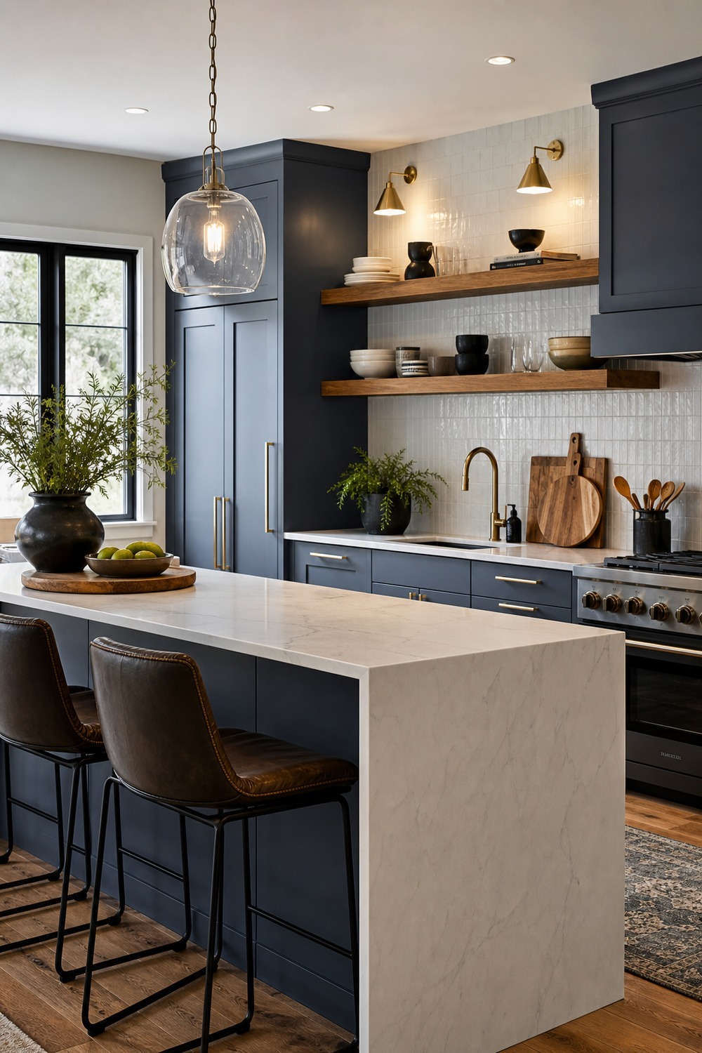
Slate blue works really well with cleaner cabinet lines because it adds color without fighting the modern shape. The white waterfall counter sharpens the room, while the wood shelves keep it from feeling like a showroom display nobody is allowed to touch.
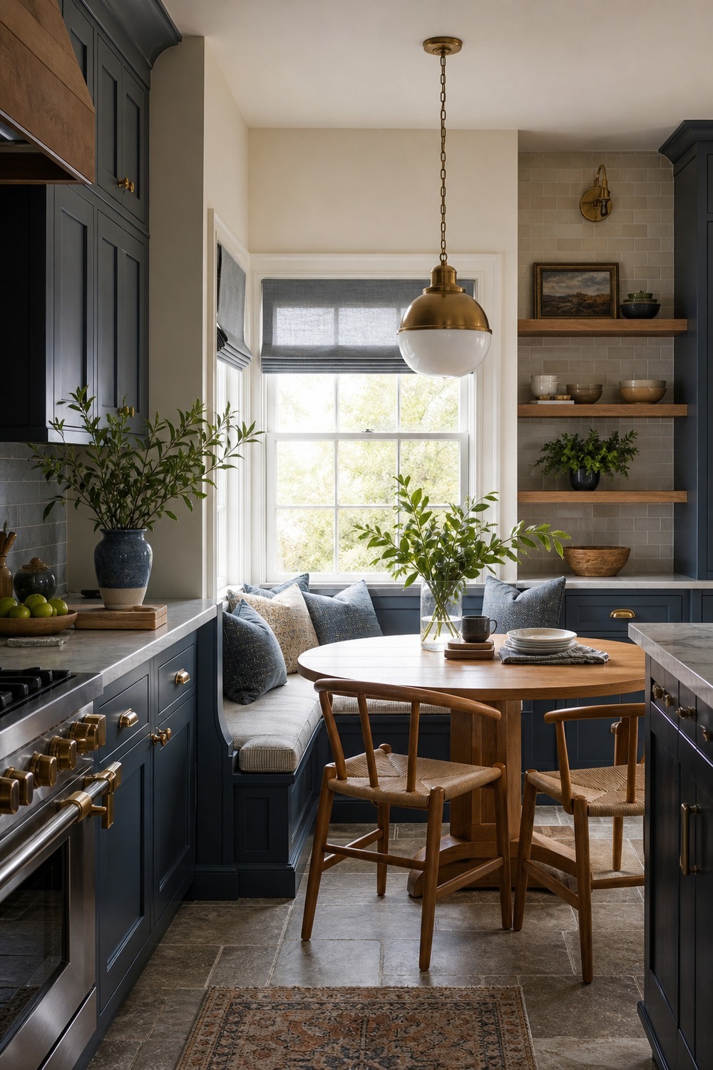
I like when the blue continues into a breakfast nook instead of stopping at the cabinet doors. The table, oak chairs, and pendant light make the color scheme feel connected to daily routines, not just the cooking side of the kitchen.
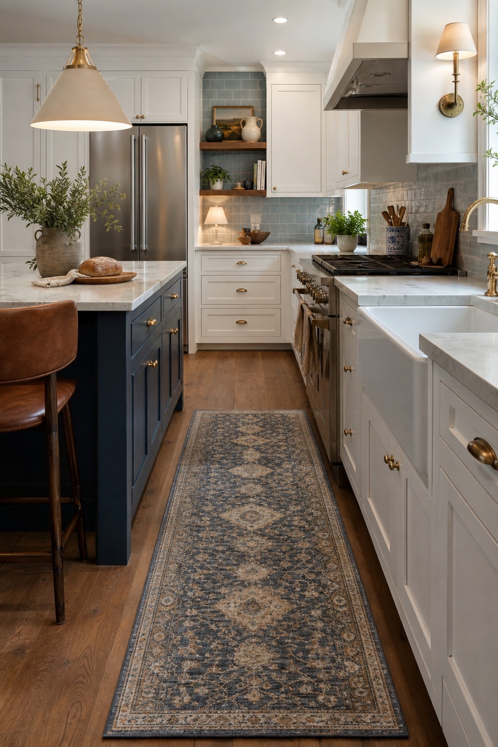
The patterned runner is what keeps this navy island from feeling too buttoned-up. It adds movement underfoot, breaks up the white cabinetry, and makes the blue feel a little more lived-in without cluttering the counters.
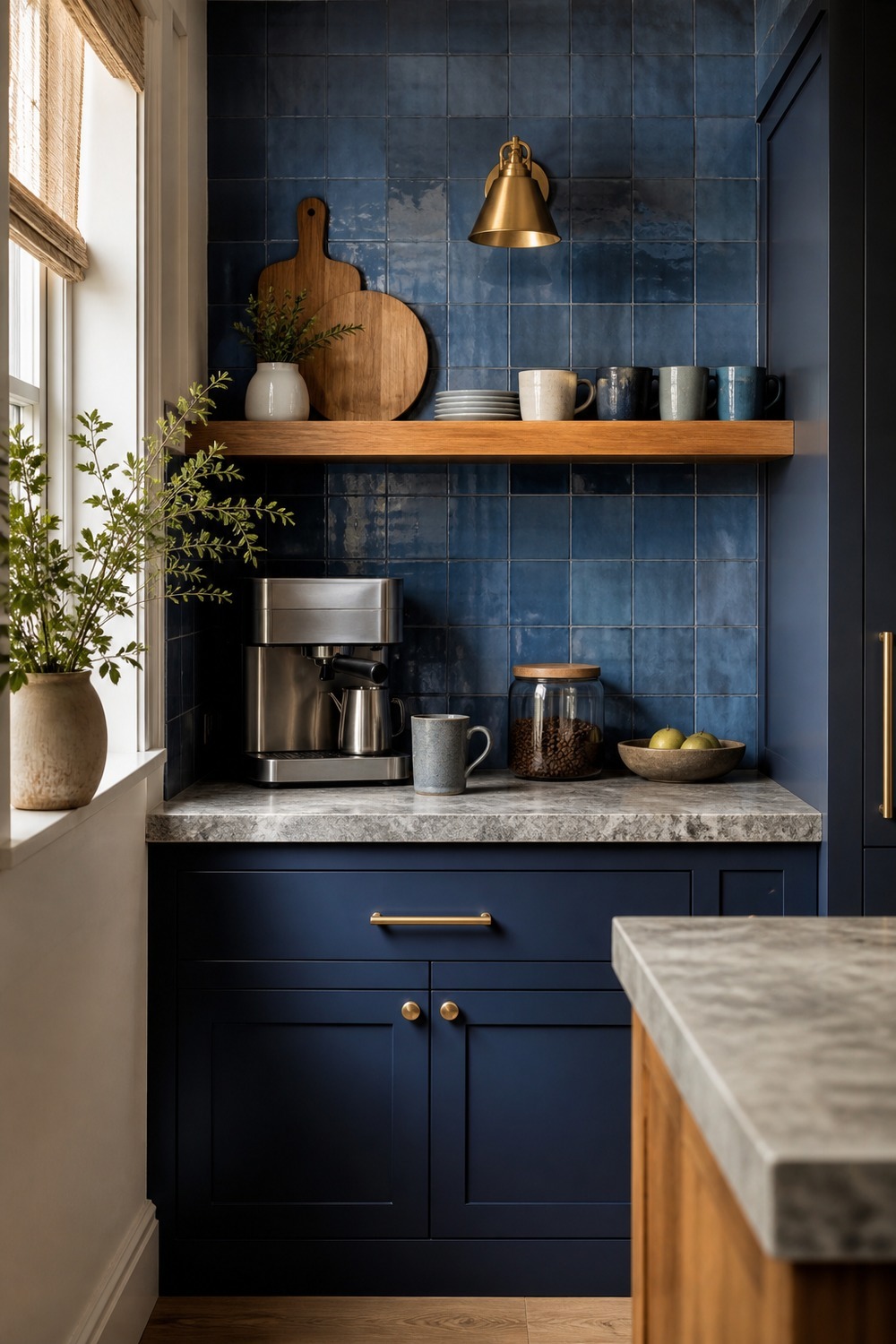
This little prep corner shows how blue tile can be useful even in a smaller zone. The backsplash gives the counter a clear stopping point, the wood shelf warms it up, and the tucked-away appliance keeps the area from looking like a random clutter spot.
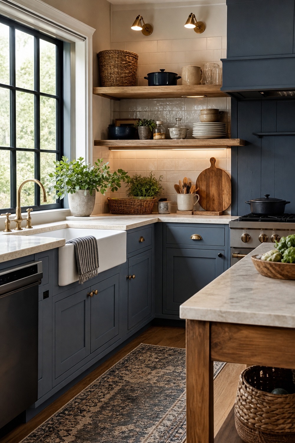
Muted blue feels especially good in a farmhouse kitchen when the other finishes are not too shiny. The apron-front sink, oak shelves, woven baskets, and cream stone make the color feel relaxed, almost like it has already been living in the room for years.
A blue kitchen color scheme feels best when the color has something real to work with. Cabinets, counters, tile, hardware, wood tones, rugs, and lighting all matter, because those little pieces are what keep the blue feeling layered instead of flat.

I work in tech, but my taste in design is straight out of a slow European village. Give me arches, aged brass, and a room that smells like books and coffee. That’s my kind of home.