A colorful backsplash should not need a paragraph to explain where the color is. I wanted these walls to hit harder—cobalt with tangerine, jewel-tone mosaics, rainbow zellige, magenta stars, sunset glass, and patterns that can carry an entire kitchen.
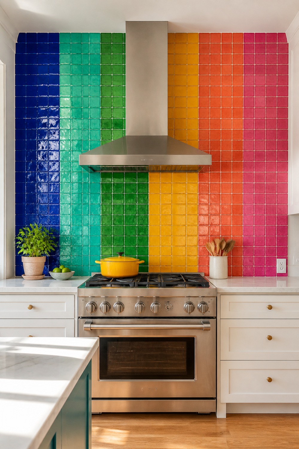
This is the kind of rainbow tile wall I actually mean when I say colorful. Breaking cobalt, turquoise, emerald, marigold, coral, and pink into broad blocks keeps the range wall graphic, while white cabinetry gives every shade enough room to stay crisp.
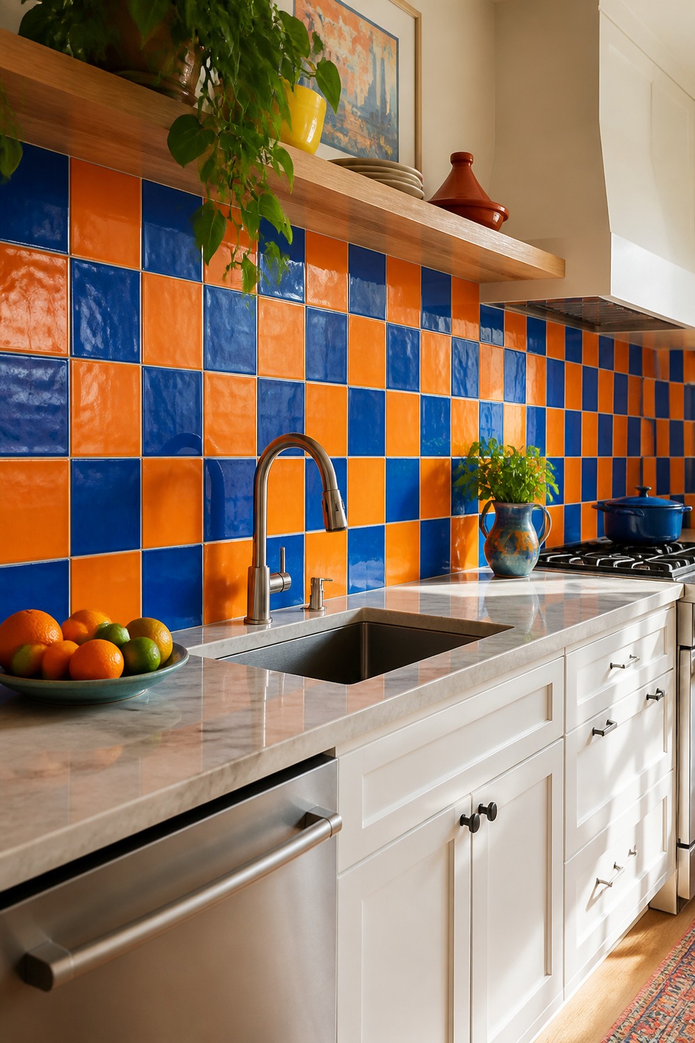
Cobalt and tangerine make a checkerboard feel energetic instead of retro-cute. The larger tile scale matters here: fewer grout lines keep the pattern readable, and the pale oak shelf gives everyday glasses and bowls a quieter place to land.
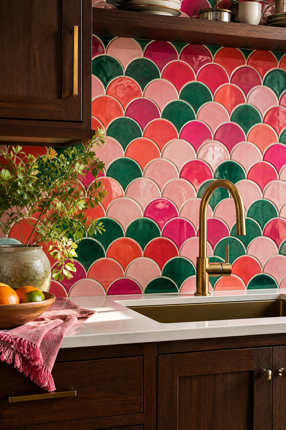
The scalloped shape adds movement before the colors even enter the picture. Emerald, coral, raspberry, and blush overlap like fan scales, and the dark walnut below gives the sink wall enough weight to handle that much saturated glaze.
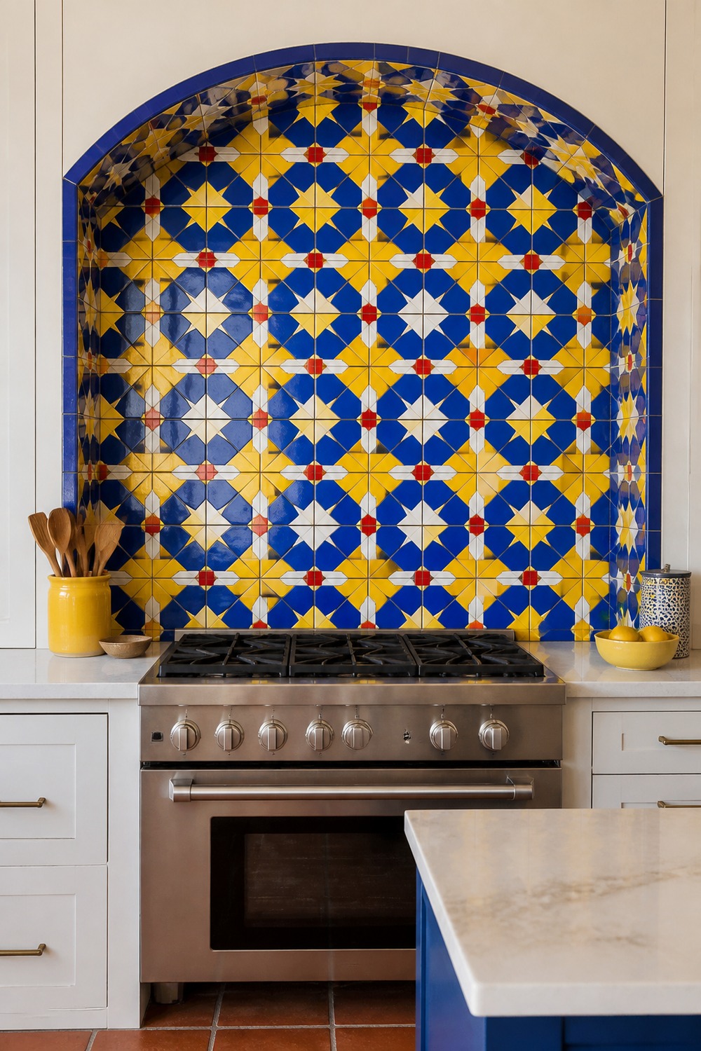
A deep range niche is a smart place for a high-impact geometric pattern. Electric blue and lemon yellow dominate from across the room, while the tiny red notes stop the scheme from feeling like a two-color sports palette.
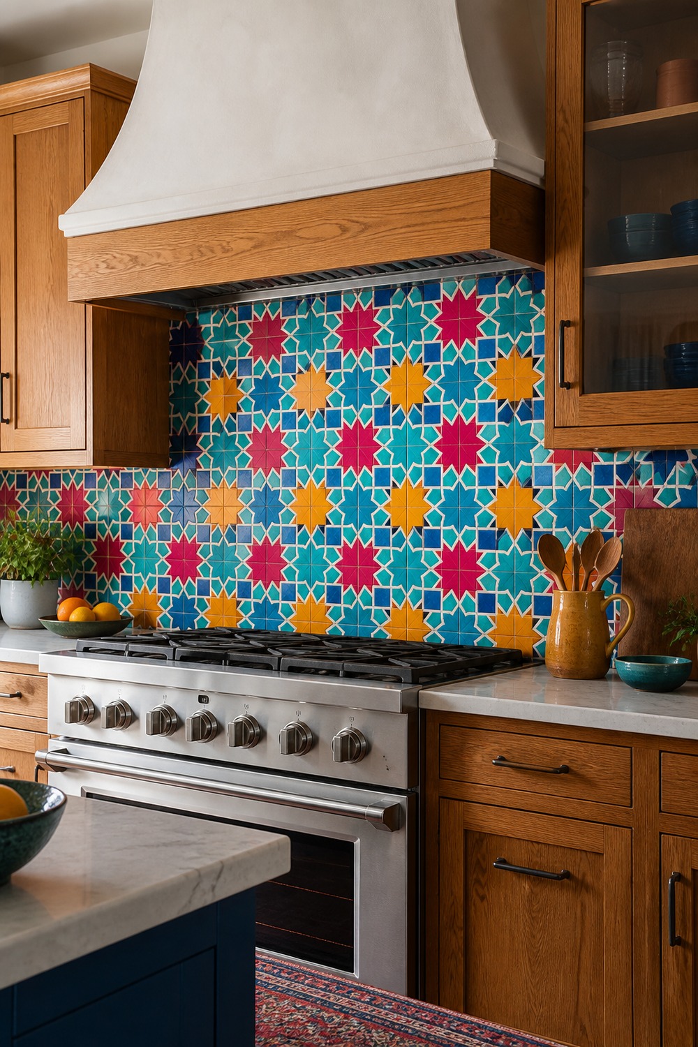
These star-and-cross tiles feel collected rather than perfectly matched. Turquoise and magenta do the loud work, saffron warms the white plaster hood, and the uncluttered counter prevents the intricate pattern from becoming visual static.
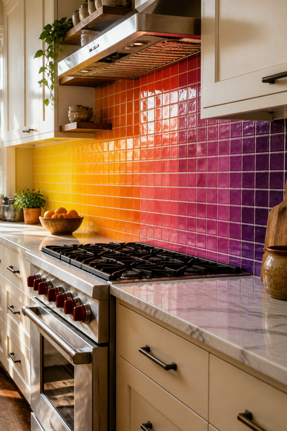
The sunset gradient turns a plain cabinet run into one long color story. Yellow near the bright end, fuchsia at the center, and plum toward the darker edge create real direction without needing a framed mural or decorative sign.
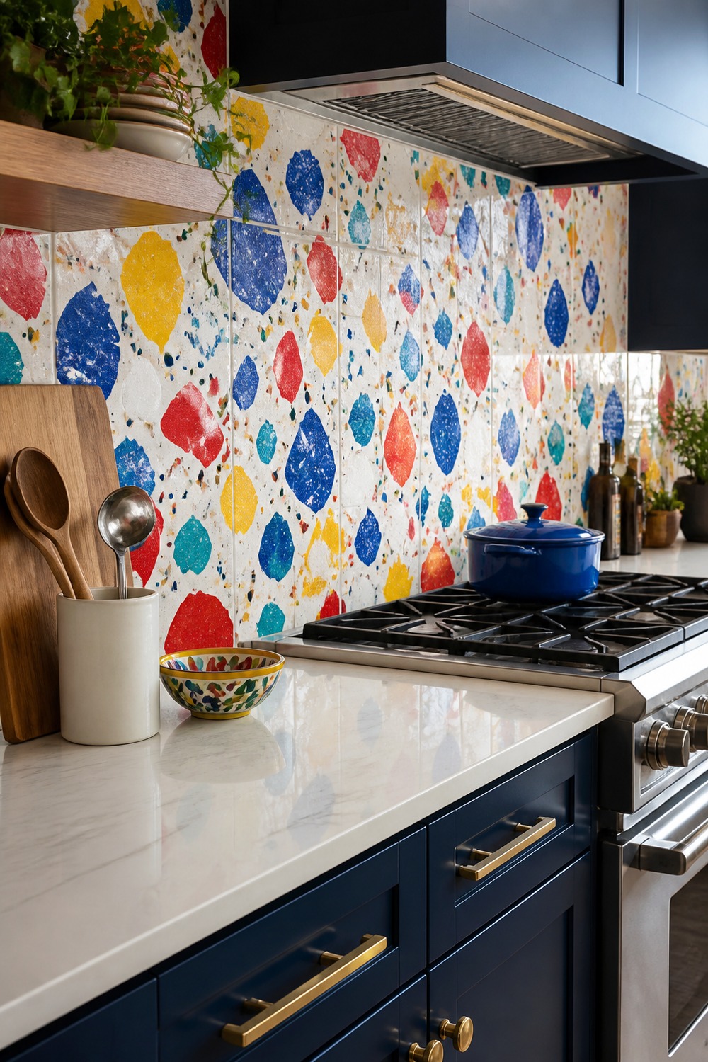
Oversized terrazzo chips are playful but still practical behind a prep counter. Navy cabinets sharpen the white ground, while cobalt, red, yellow, and turquoise fragments make splashes and everyday mess far less precious-looking.
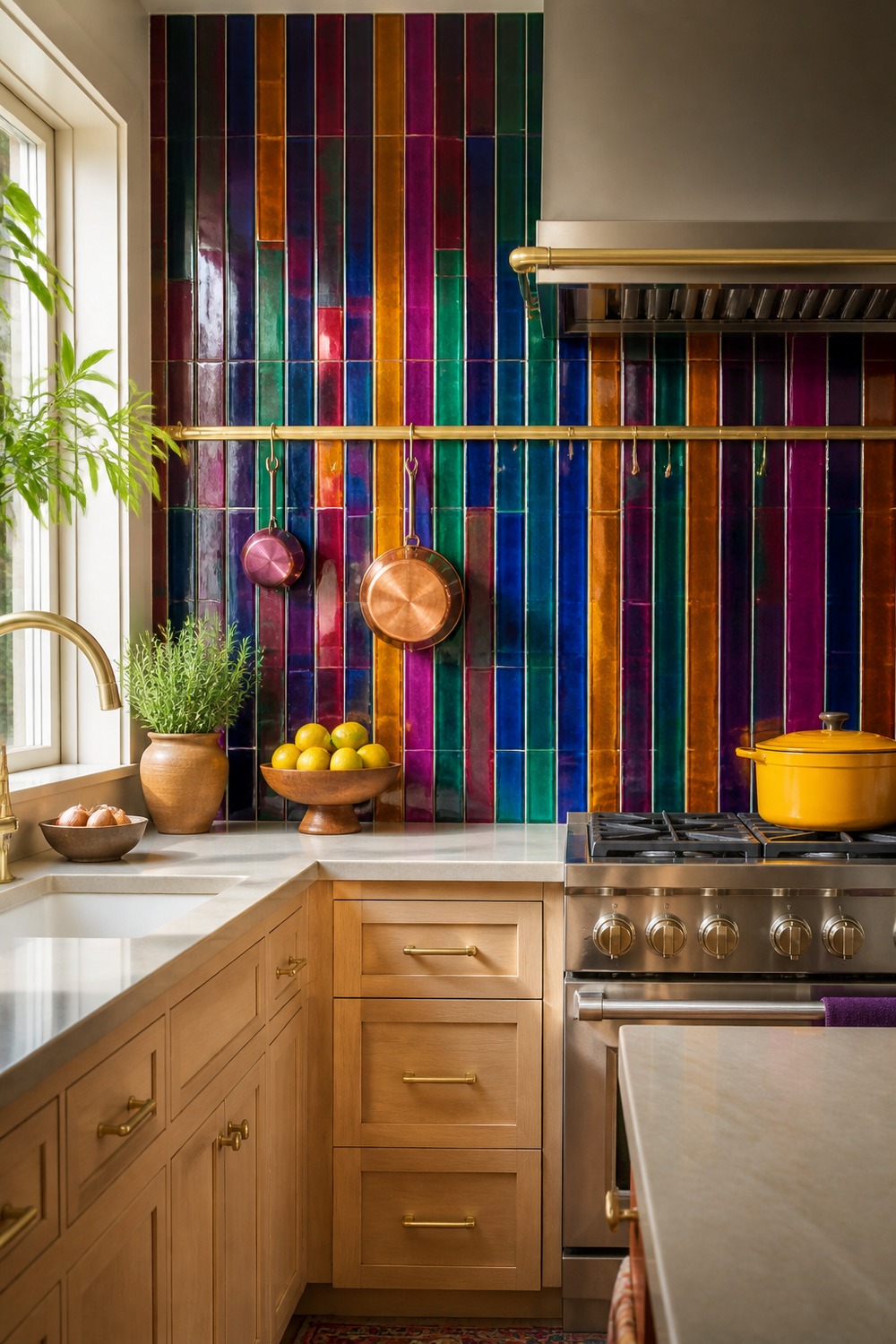
Slim vertical tiles let jewel tones flicker rather than sit in heavy blocks. Sapphire, emerald, ruby, amethyst, and amber catch light differently across the wall, which gives a simple pale-wood kitchen much more depth.
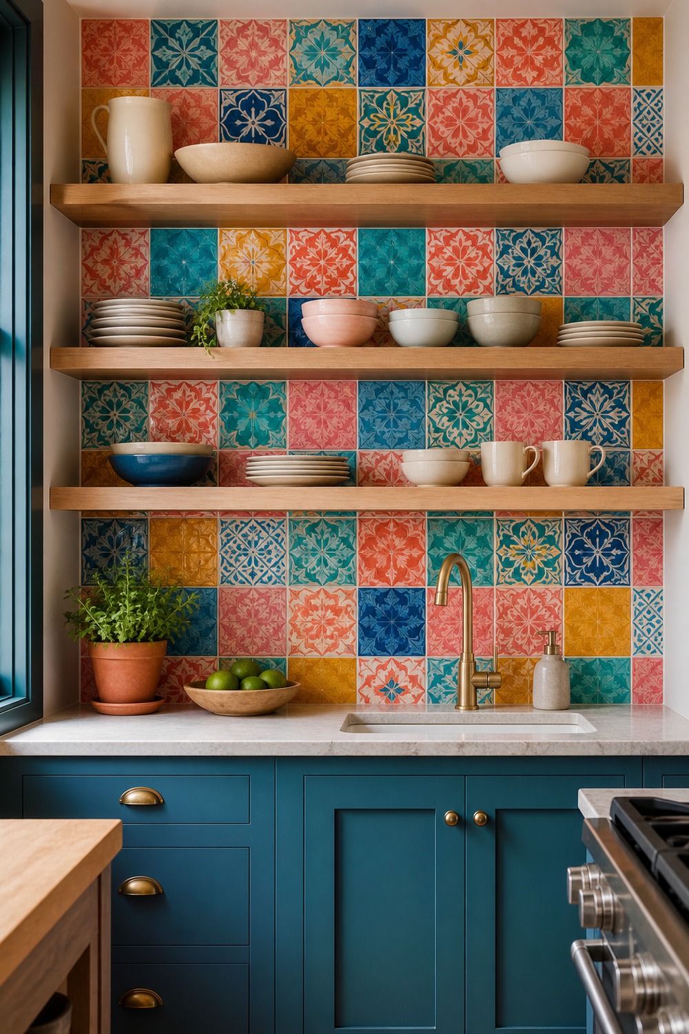
A pantry nook can handle more pattern than a whole open-plan wall. Coral, turquoise, cobalt, mustard, and pink make the small appliance zone feel intentional, while the oak shelves leave useful space for cups and jars without covering the tile.
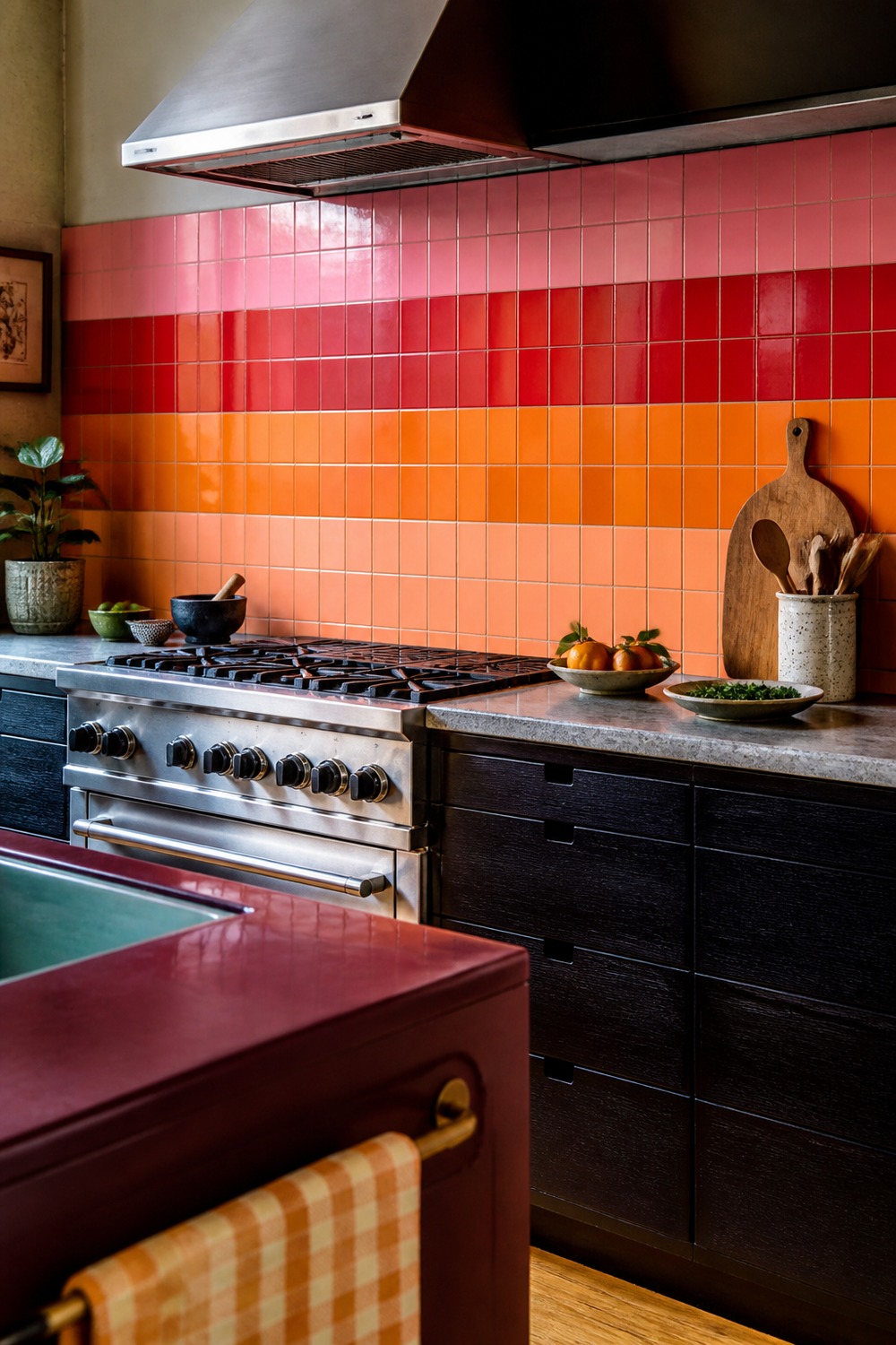
Wide horizontal stripes make this backsplash feel almost architectural. Pink, red, orange, and peach pull the eye along the counter, and the burgundy edge nearby anchors those brighter bands so they do not look like random samples.
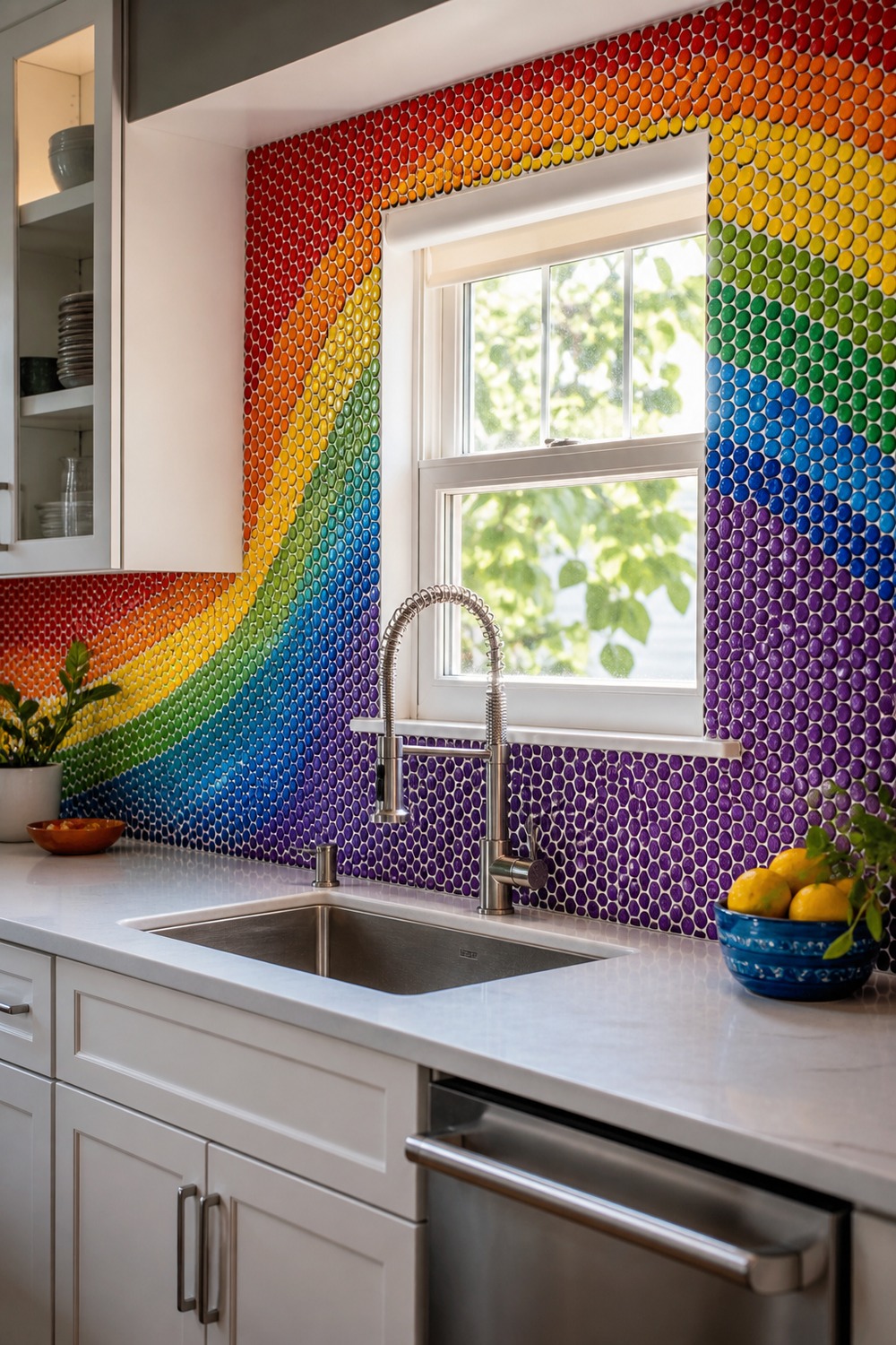
The rainbow penny rounds curve around the sink like moving bands of color. Crisp white cabinets keep the tiny mosaic from becoming muddy, and the window light makes the glassy red-through-violet transition especially clear.
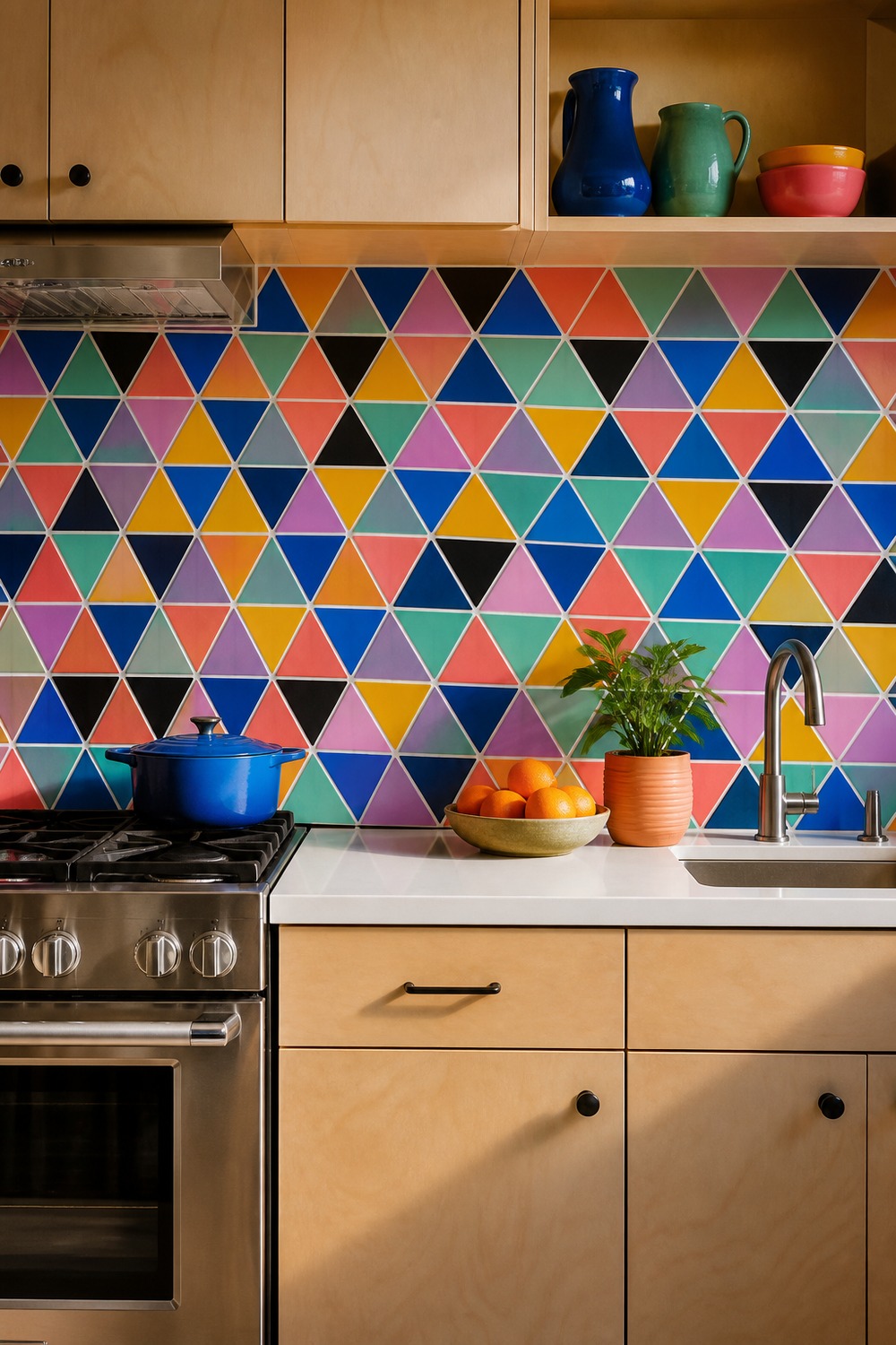
Triangle tiles give this kitchen a sharper, more modern kind of color. Cobalt and coral form the strongest contrast, mint and lilac soften the joins, and small black accents make the geometry read cleanly at a distance.
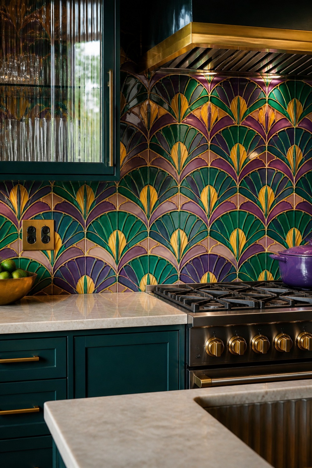
Amethyst, emerald, and gold have a proper jewel-box mood here. The fan pattern feels glamorous without taking counter space, while deep teal cabinets turn the prep area into one rich color family instead of a bright wall floating over neutral storage.
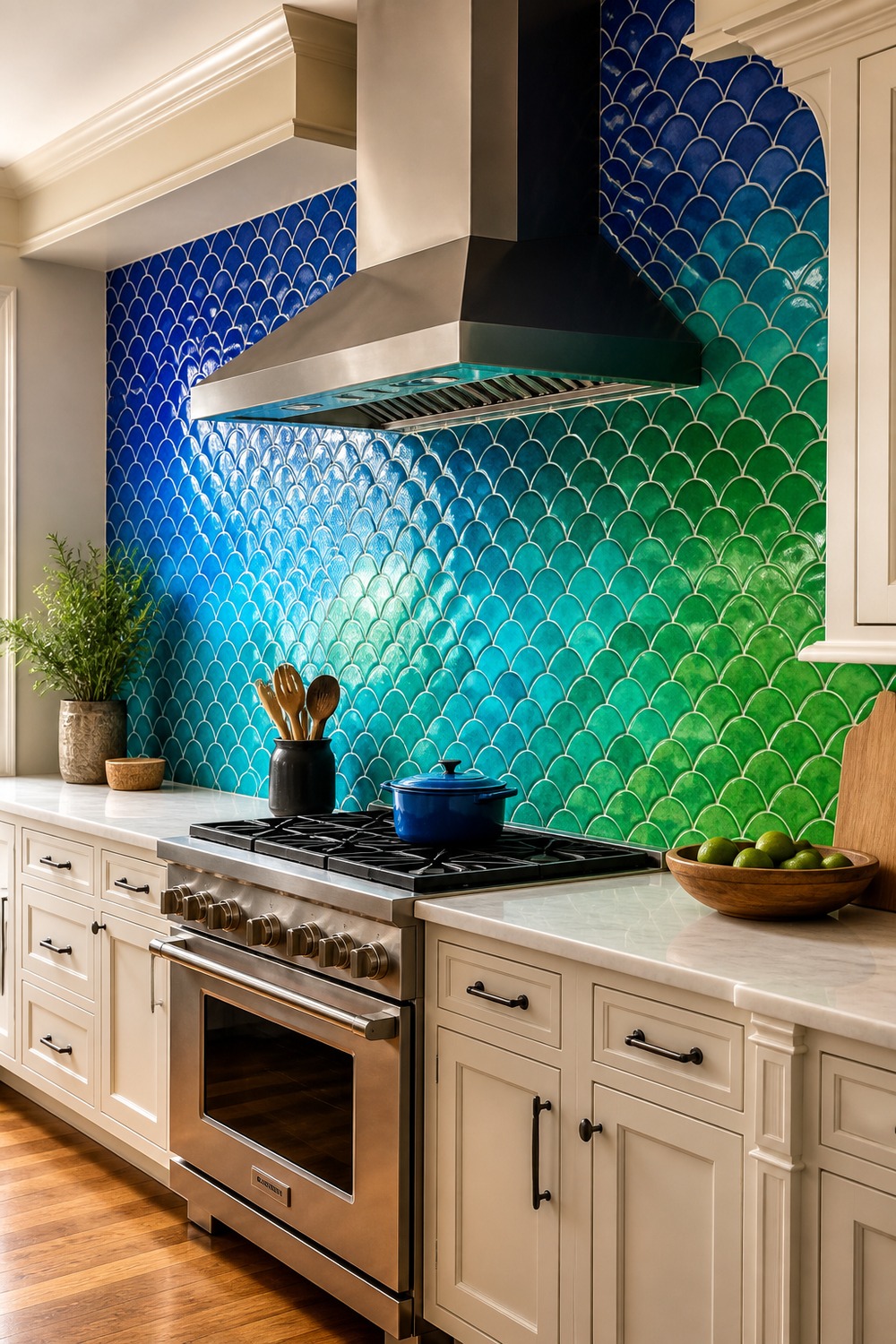
This blue-to-green ombre is bold, but it also solves a practical layout problem by tying the range and prep zones together. Royal blue grounds the cooking area, turquoise brightens the middle, and emerald carries the color toward the window.
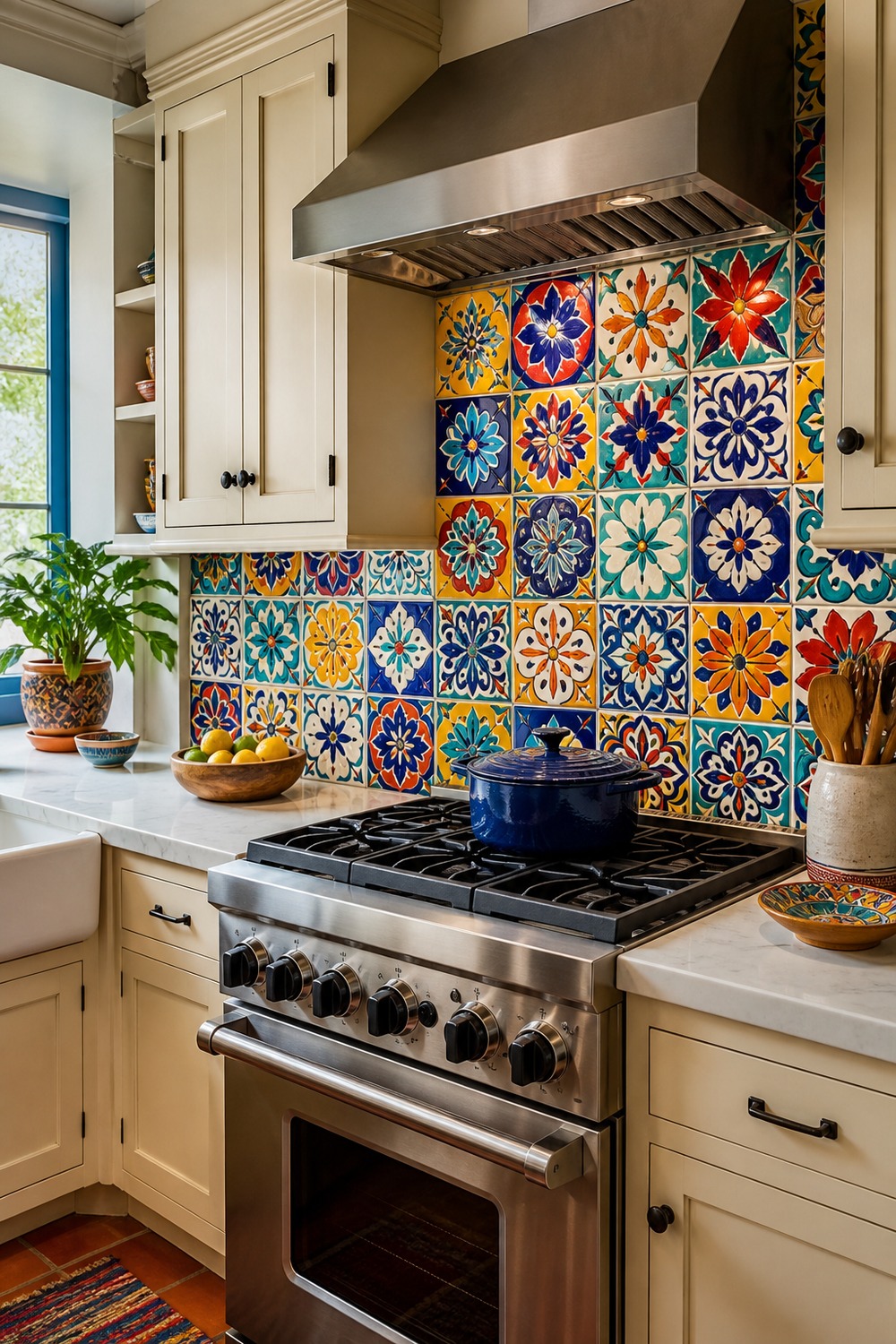
A mixed-tile wall can feel chaotic, but repeating cobalt, yellow, coral, and turquoise across different original motifs creates a rhythm. Cream cabinetry and a simple plaster hood do exactly what they should: frame the tile and stay out of its way.
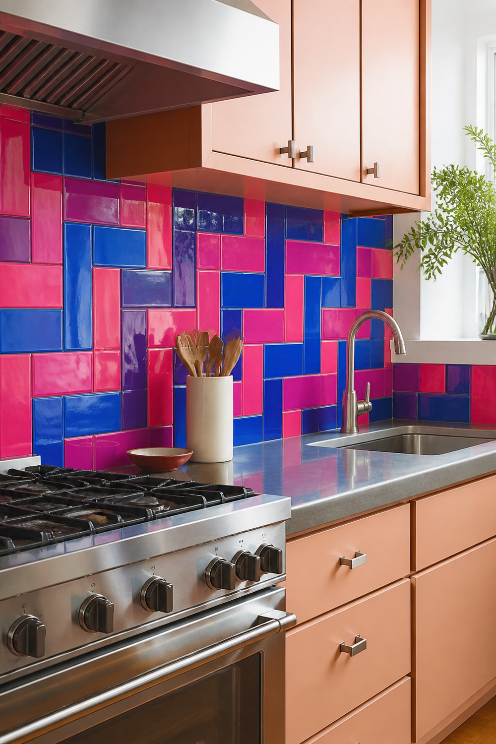
Hot pink and cobalt are already strong; laying them in a basket weave makes the combination much more surprising. Pale peach cabinets bridge the two colors, and the stainless counter edge keeps the working surface crisp and durable.
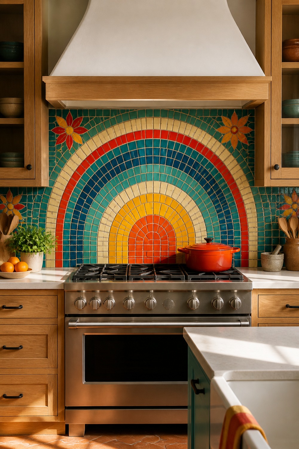
The sunrise arch gives a small mosaic wall one decisive focal point. Marigold radiates from the center, teal and vermilion add contrast around it, and the plain white hood leaves the tile shape completely visible.
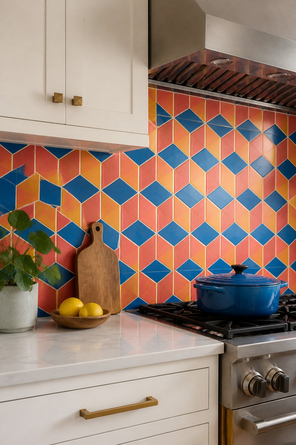
These coral, cobalt, and yellow diamonds create a cube illusion without relying on fake depth. Careful grout lines keep the pattern believable, while matte white cabinets stop the dimensional effect from fighting with handles and shelves.
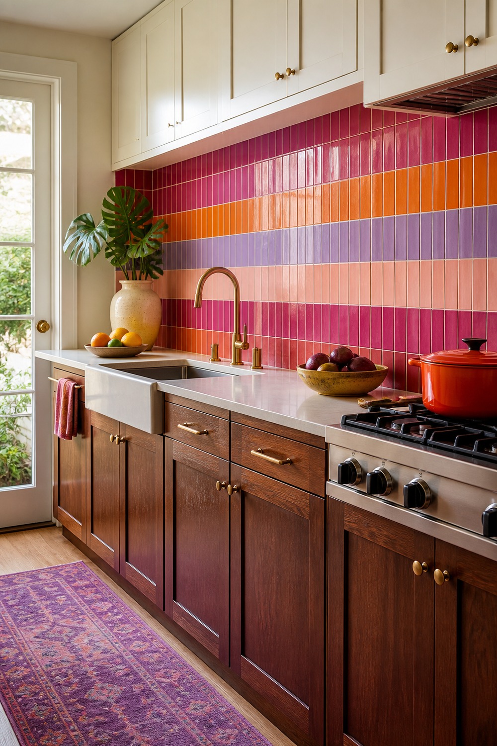
Vertical raspberry, orange, lavender, and blush bands make the ceiling feel taller. Walnut lowers bring the saturated tile back down to earth, and cream uppers reflect enough light for the darker raspberry sections to stay lively.
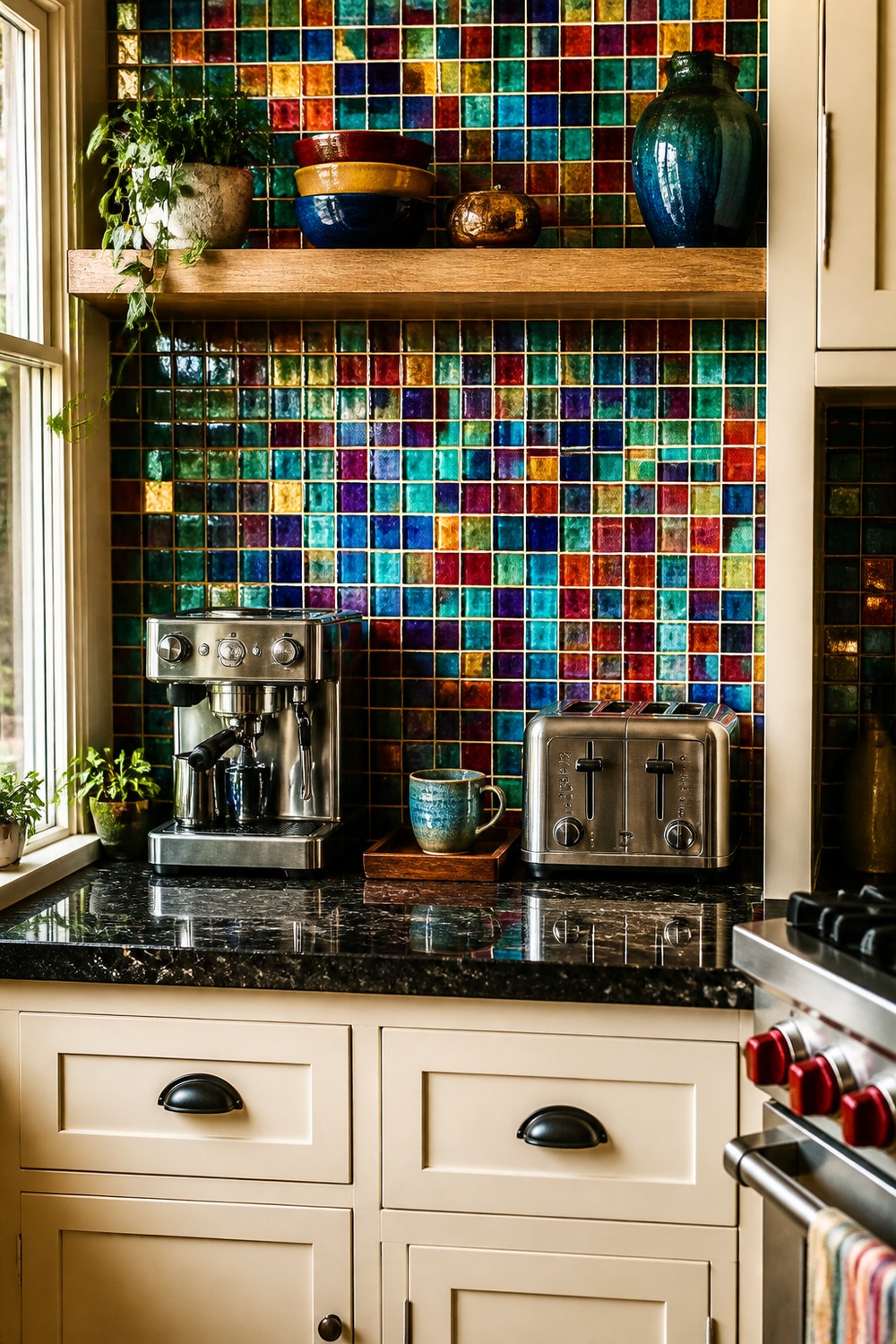
A tiny jewel-tone mosaic makes this coffee zone feel like a built-in feature rather than leftover counter space. The oak shelf holds the everyday pieces, but plenty of emerald, ruby, sapphire, amber, and violet remains visible around it.
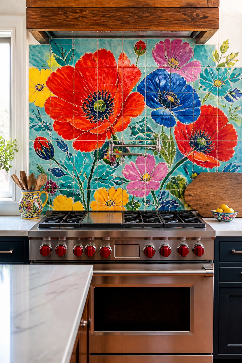
The oversized floral mural is brave, and that is exactly why it works. Poppy red and cobalt define the main petals, turquoise and yellow keep the background lively, and leafy green connects the artwork to the rest of the kitchen.
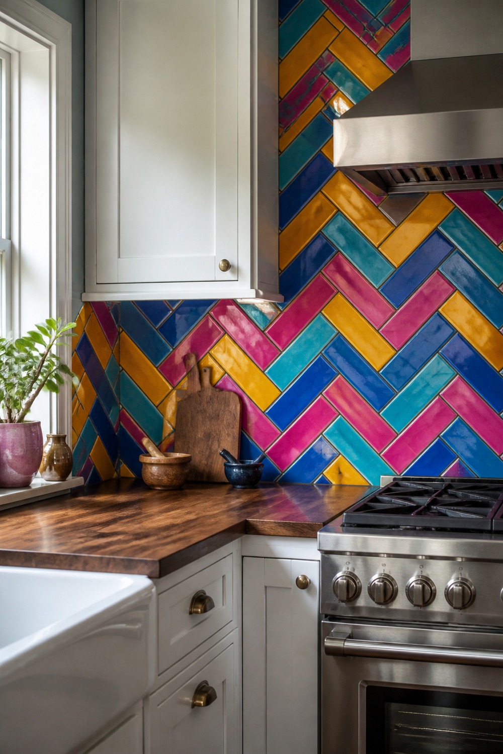
Herringbone looks completely different when the colors change by run instead of every single tile. Mustard, cobalt, raspberry, and turquoise create long zigzags that feel deliberate, while walnut details warm the hard ceramic surface.
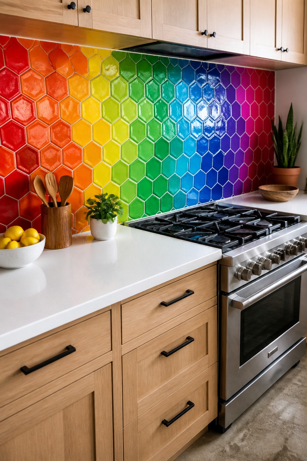
The hexagons move through the whole color wheel in clustered patches rather than a perfect rainbow line. That makes the backsplash feel more organic, and the pale oak cabinets provide practical storage without introducing another competing finish.
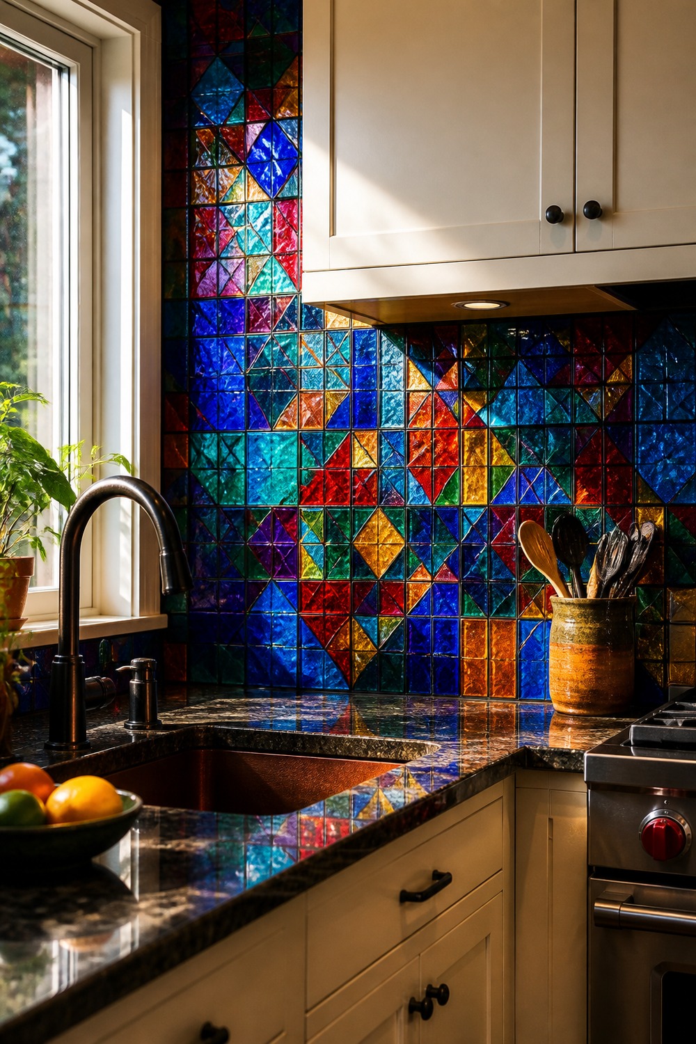
Dark grout gives this stained-glass-inspired mosaic real structure. Sapphire, ruby, emerald, amber, and violet glow in side light, but the cream cabinetry and straightforward sink layout keep the kitchen functional instead of theatrical.
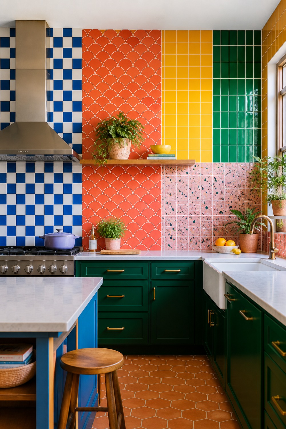
This final wall goes fully maximalist, but each tile family owns a clean zone. Cobalt checker, coral scallop, marigold square, emerald vertical, and pink terrazzo all read separately, so the room feels creative rather than like a box of random leftovers.
Strong color is easier to live with when it has a clear boundary, and a backsplash gives it exactly that. Keep the counters usable, let the grout support the pattern, and choose the tile combination you still want to look at when the kitchen is full of normal weekday mess.

I work in tech, but my taste in design is straight out of a slow European village. Give me arches, aged brass, and a room that smells like books and coffee. That’s my kind of home.