A modern backsplash should do more than swap one square tile color for another. These kitchens use scale, relief, metal, glass, terrazzo, strong grout lines, corner wraps, tiled hoods, and a few fearless colors to make the wall feel like part of the architecture.
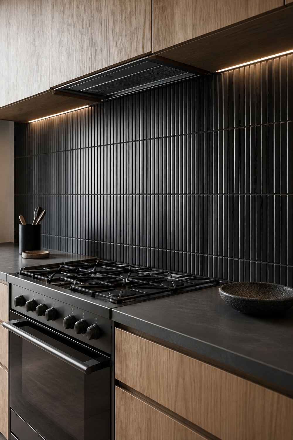
Raking light is what makes these black fluted modules work. Every rib catches a different highlight, and the pale oak below stops the cooking wall from becoming one flat dark block.
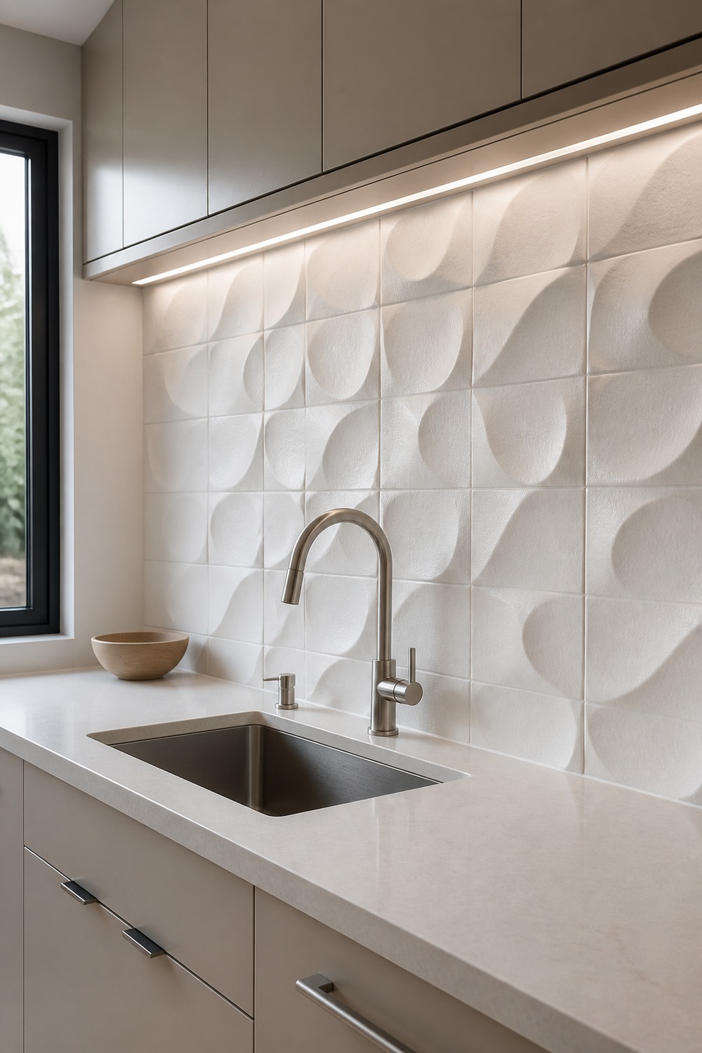
This warm-white backsplash earns its place through shadow rather than color. The folded relief has real depth beside the sink, and the mushroom cabinetry keeps the whole palette soft without looking generic.
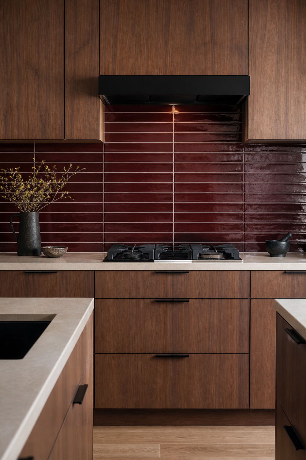
Oxblood feels especially current in this long horizontal format. Walnut brings out its warmer undertones, while the creamy counter gives the saturated wall a clean visual break where the actual prep happens.
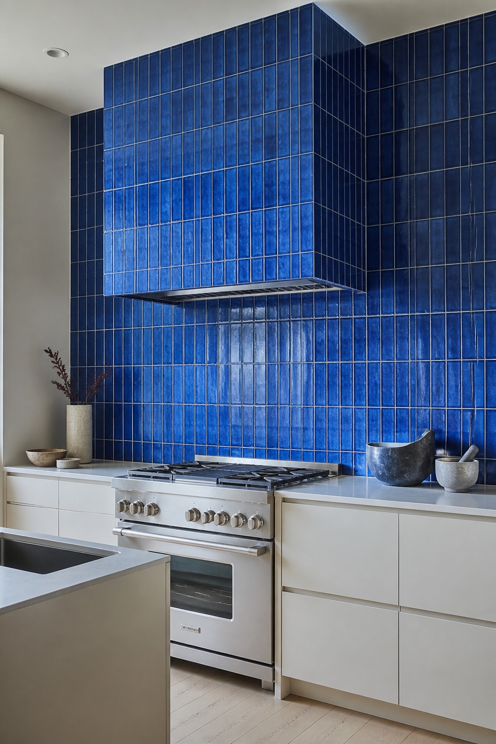
Wrapping the hood in the same cobalt tile turns the entire cooking wall into one confident feature. The stainless range gives the blue a crisp industrial counterpoint instead of another rustic accent.
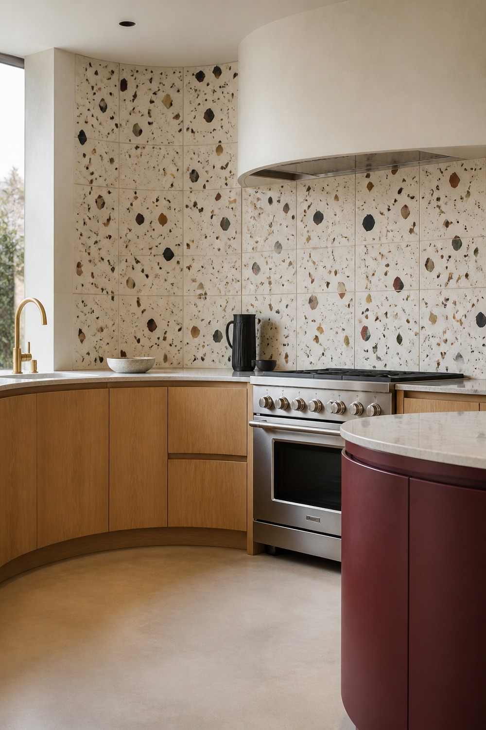
Terrazzo is more convincing here because the aggregate repeats colors already present in the room. The curved oak cabinet run also breaks up the usual boxy backsplash composition and makes the joints follow a real architectural line.
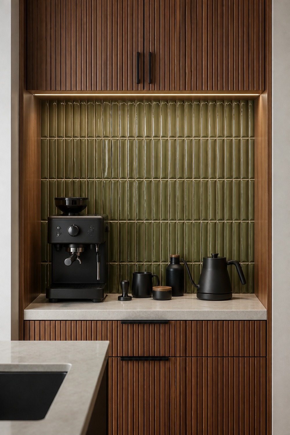
A compact niche can handle a tighter tile scale without overwhelming the kitchen. Olive kitkat tile adds texture behind the machine, and the ribbed walnut doors hide the small clutter when the station is not in use.
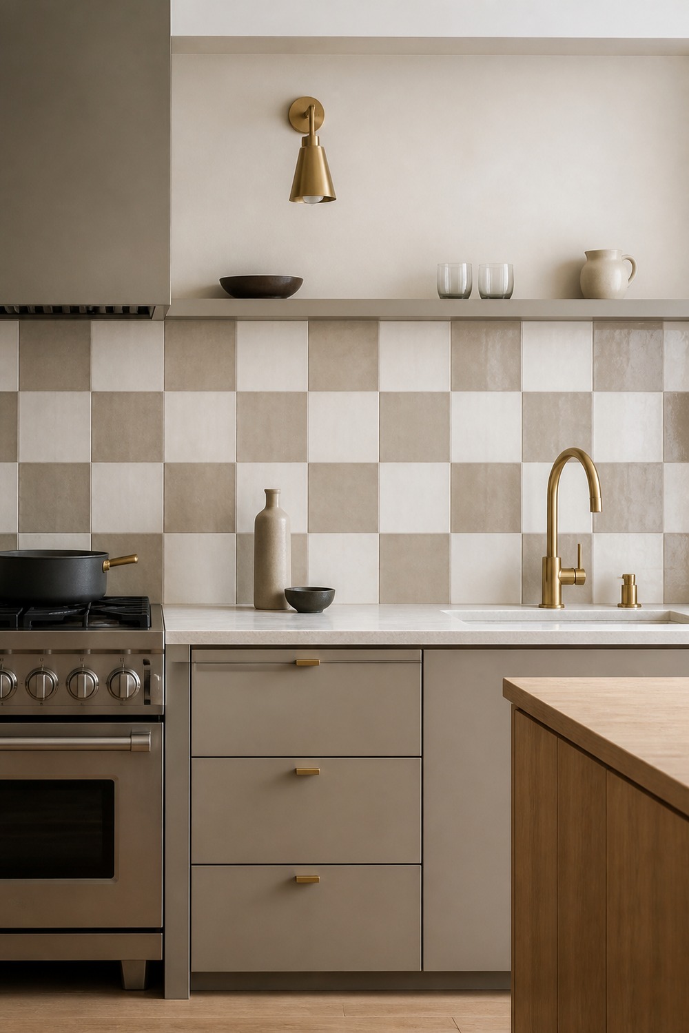
This checkerboard is graphic but not loud. Cream and taupe tiles give the sink wall enough rhythm to stand out, and the flat cabinet fronts keep it from drifting into a vintage-country look.
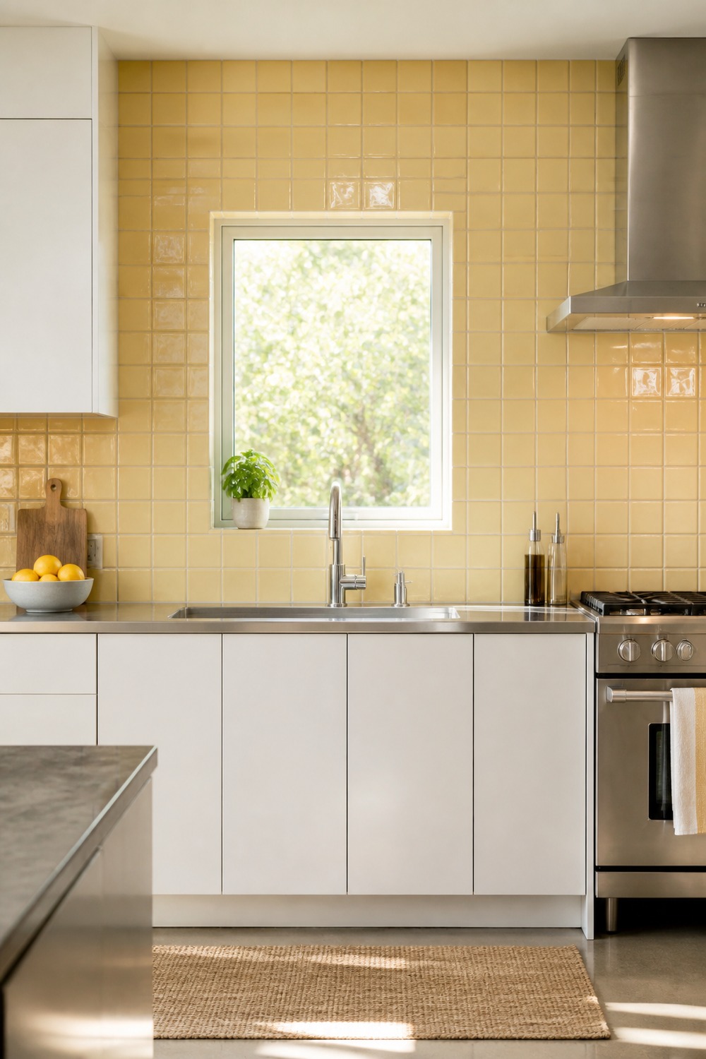
Butter yellow looks much sharper in a strict grid than it does in a busy cottage kitchen. Stainless and chrome cool the color slightly, while warm-gray grout makes each tile readable from across the room.
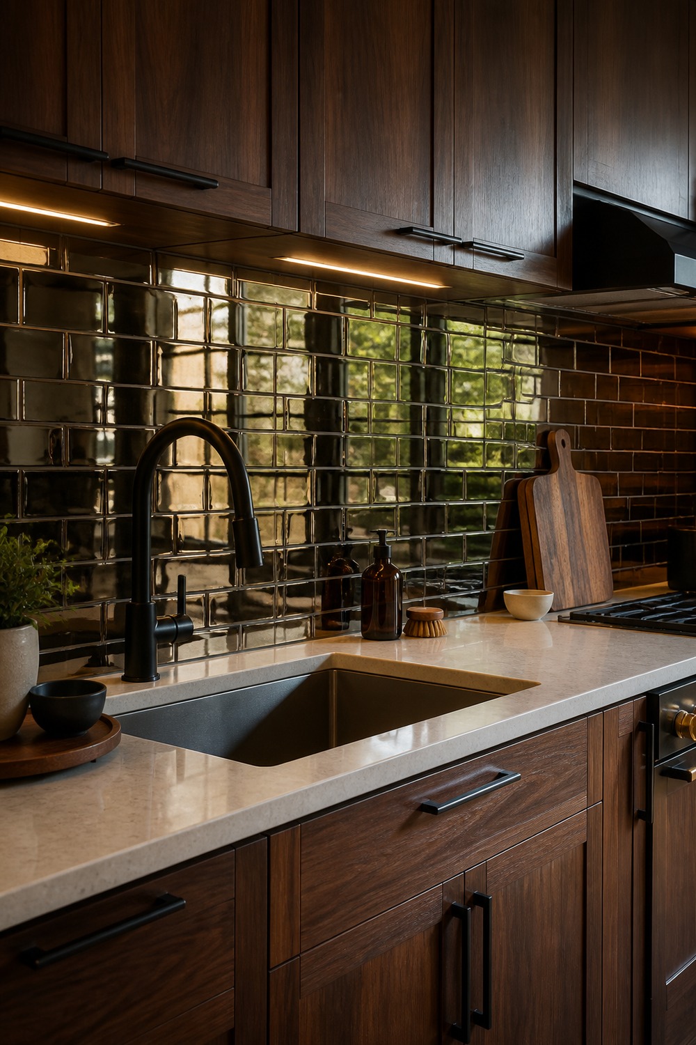
Smoked bronze mirror tile gives the sink wall depth without making the kitchen feel flashy. The staggered joints keep it reading as installed tile, while the walnut cabinets and black faucet ground all that reflection.
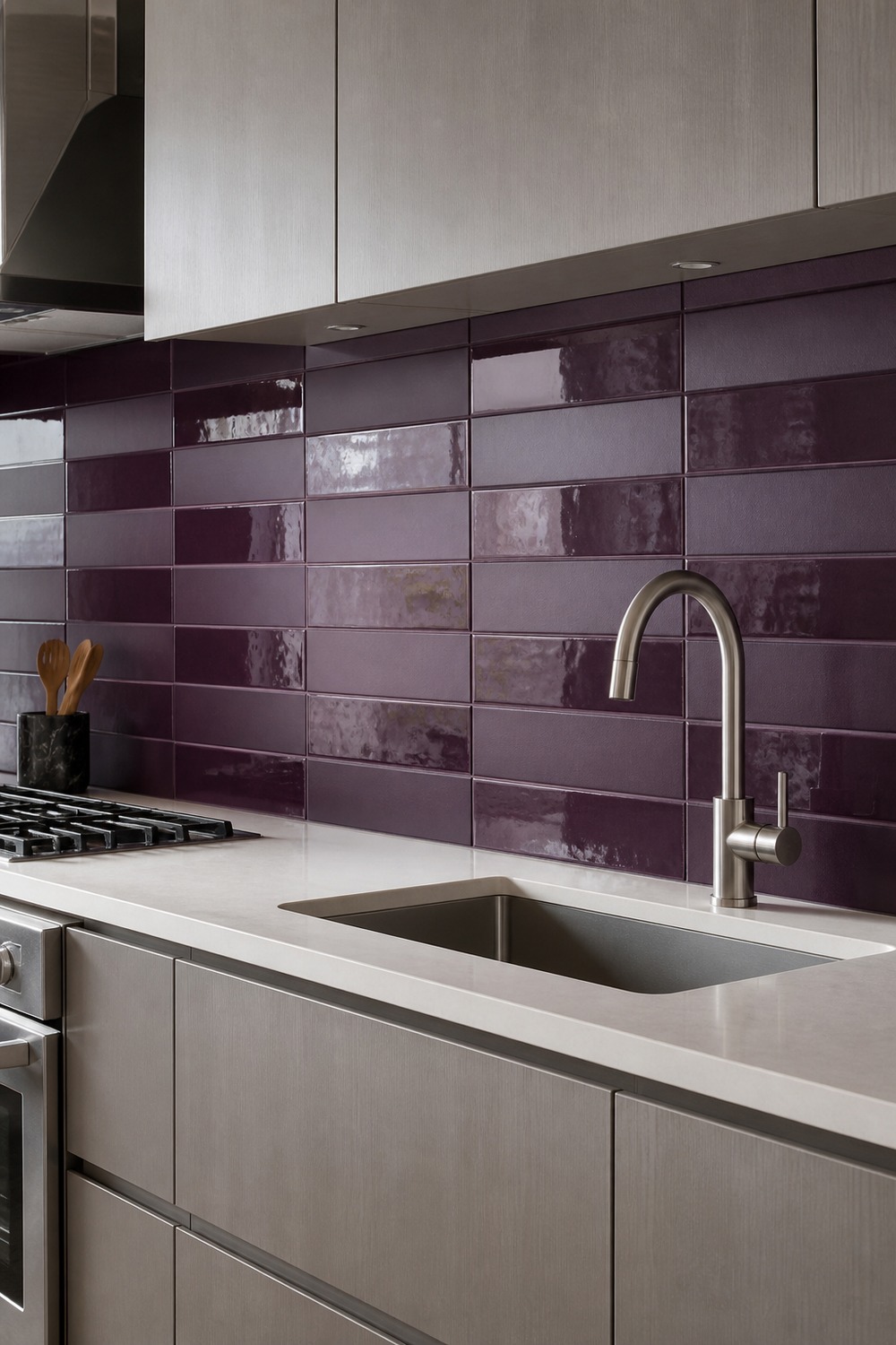
Using matte and gloss in the same aubergine color creates a pattern only when light moves across it. That subtle shift feels far more modern than adding another shape or a shelf full of props.
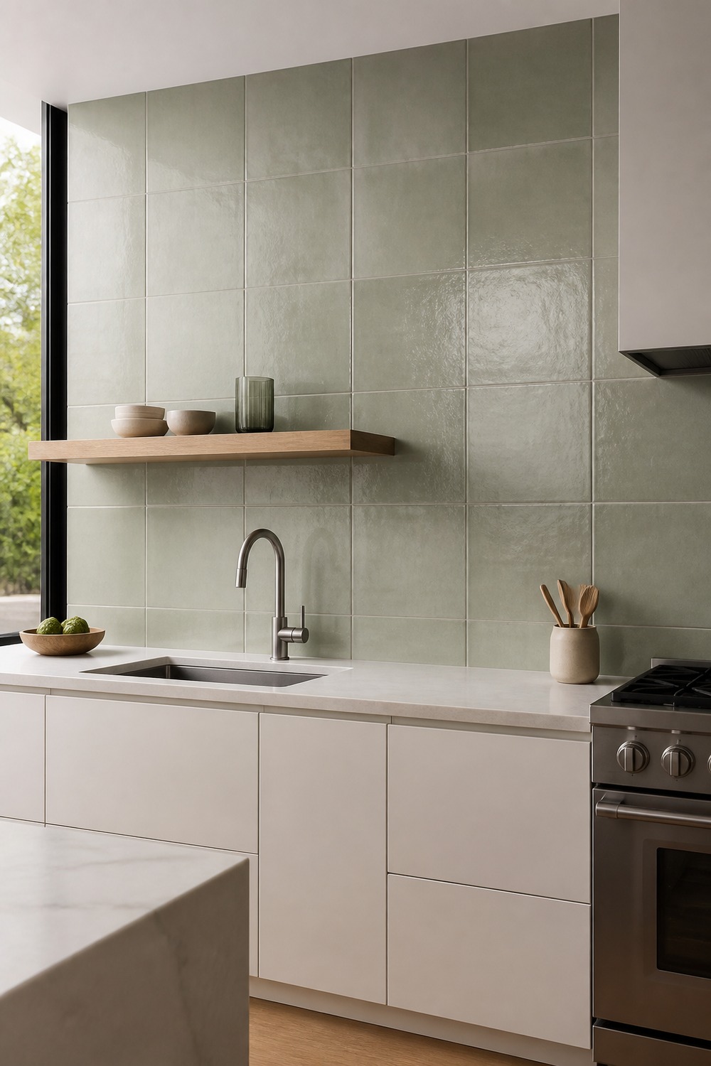
Taking the sage grid all the way to the ceiling makes the sink wall feel taller and more intentional. One pale-oak shelf is enough for daily pieces, so the tile still reads as the main surface.
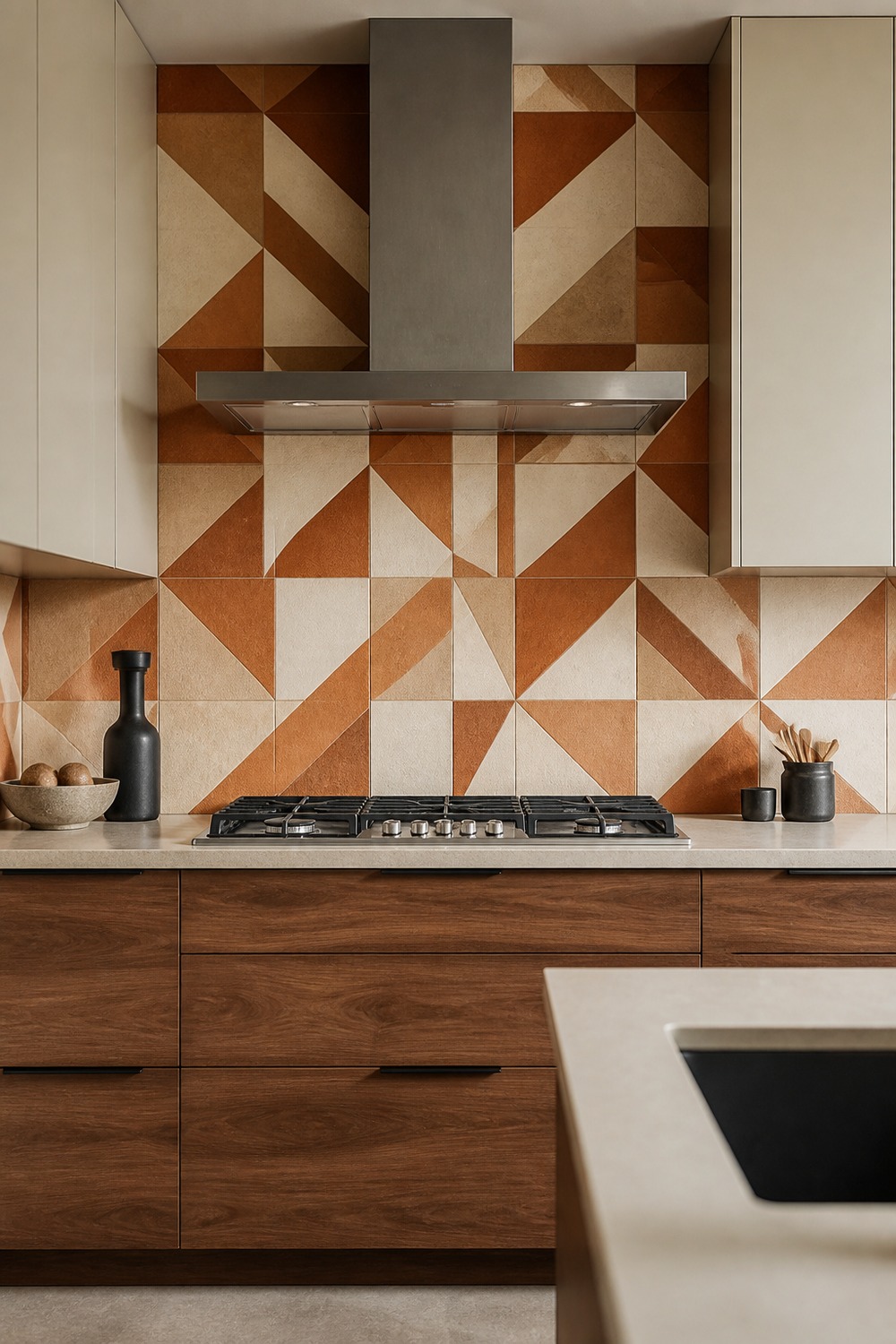
The asymmetrical geometry has real energy, but the limited rust-and-cream palette keeps it controlled. Walnut below ties into the clay tones, while the cream uppers let the pattern end cleanly.
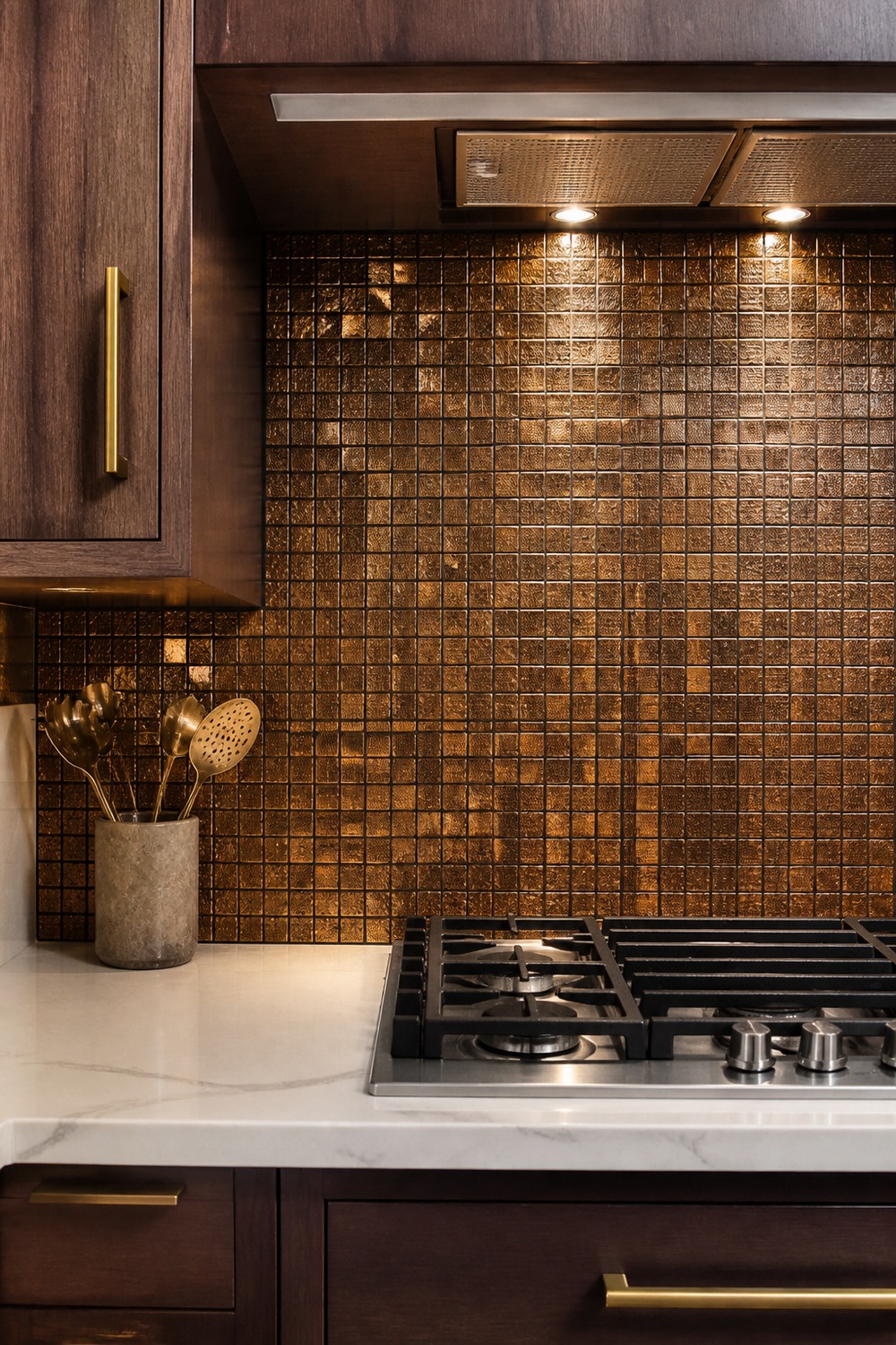
This bronze micro-mosaic works because it is confined to one useful prep niche. Task lighting pulls out the metallic variation, while the cream counter keeps the tiny pattern from looking muddy.
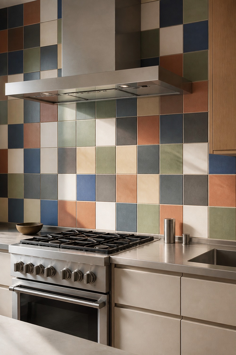
The multicolor grid is bold, but every shade is muted enough to live beside steel and sand-colored cabinetry. It feels collected rather than random because the modules stay large and the spacing stays disciplined.
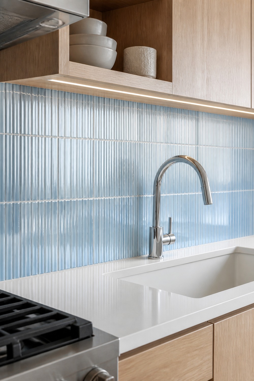
Ribbed glass tile has a watery quality that flat blue ceramic cannot quite match. Side lighting reveals the texture, while white oak and chrome keep the sink wall bright and precise.
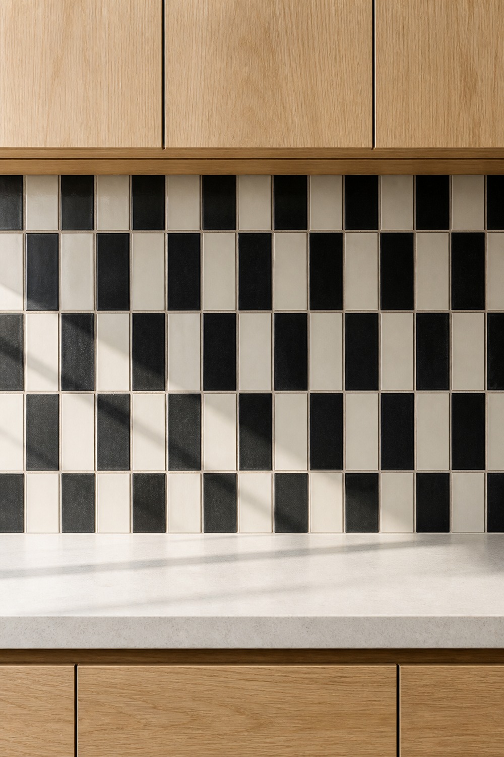
A black, cream, and soft-gray geometric grid gives the range wall crisp movement without relying on extra decor. The pale wood cabinetry softens the contrast, while the clear square modules keep the pattern reading as installed tile.
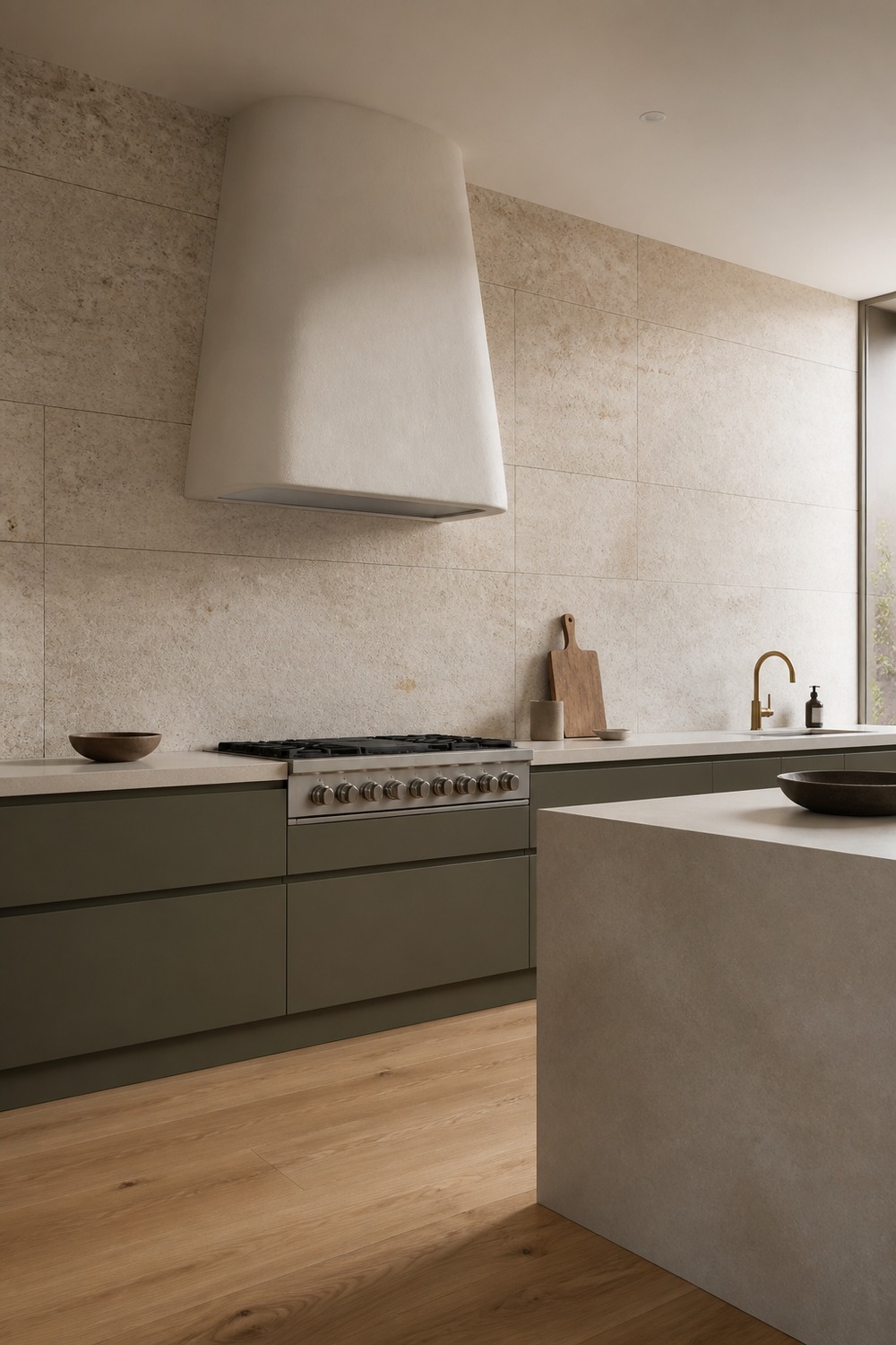
Large sandy porcelain tiles make the wall quiet without making it blank. Sparse joints, olive-gray cabinetry, and the sculptural hood create an architectural backdrop that still feels warm in daylight.
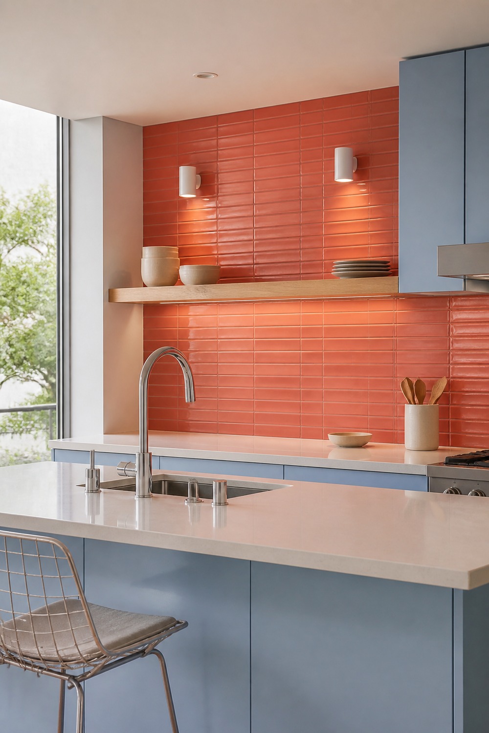
Coral tile and pale blue cabinets make this kitchen memorable before any accessories arrive. The over-peninsula angle shows how the backsplash relates to the working layout without letting the foreground cover it.
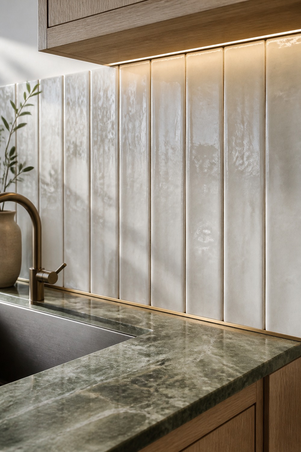
This close sink view makes the narrow vertical modules easy to study. Dark joints sharpen the ribbed rhythm, while the pale counter and simple faucet keep the small backsplash zone useful instead of overworked.
The strongest backsplash does not need a shelf full of decor to explain itself. When the tile scale, grout, edges, lighting, and surrounding cabinet lines are doing their jobs, the whole kitchen feels more finished before anything lands on the counter.

I work in tech, but my taste in design is straight out of a slow European village. Give me arches, aged brass, and a room that smells like books and coffee. That’s my kind of home.