Colorful kitchen ideas can go wrong when every cabinet, tile, rug, and little accessory is trying to be the main thing. I like the kitchens where the color has a clear job, like a painted island, a bold backsplash, or one happy cabinet wall, while the counters still look usable.
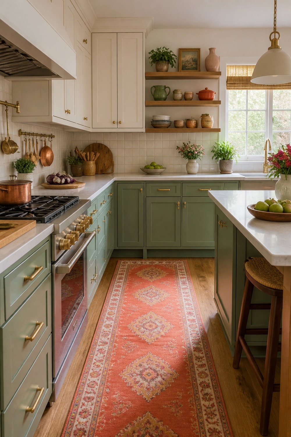
The sage green cabinets keep this kitchen calm, but the coral runner makes it feel awake. I like that the color sits low in the room, so the counters and shelves still have space to breathe.
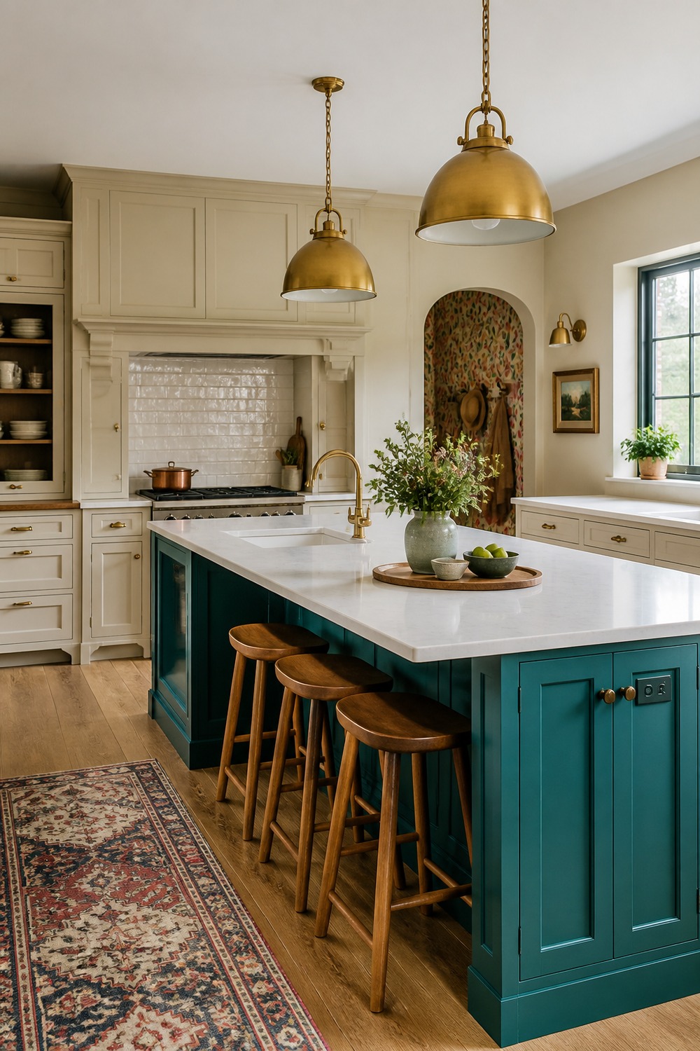
A deep teal island is such an easy focal point here. The brass pendants warm it up, and the plain perimeter cabinets keep the whole kitchen from turning into a color fight.
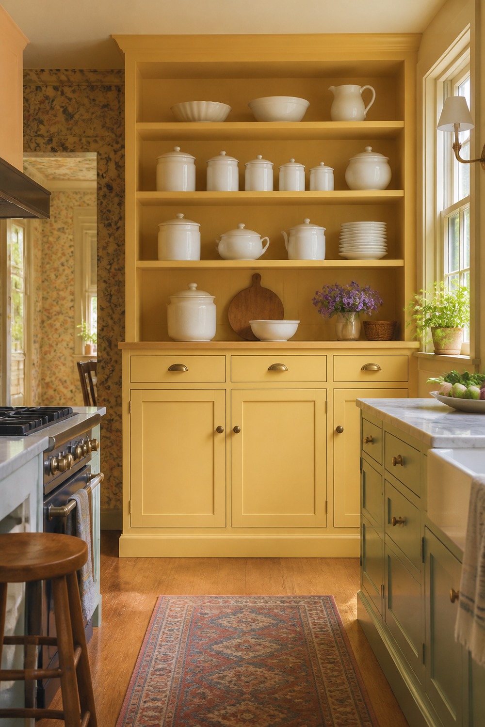
This buttery yellow pantry wall feels cheerful in a very usable way. Closed storage does most of the work, while the warm paint makes the everyday pantry corner feel intentional instead of forgotten.
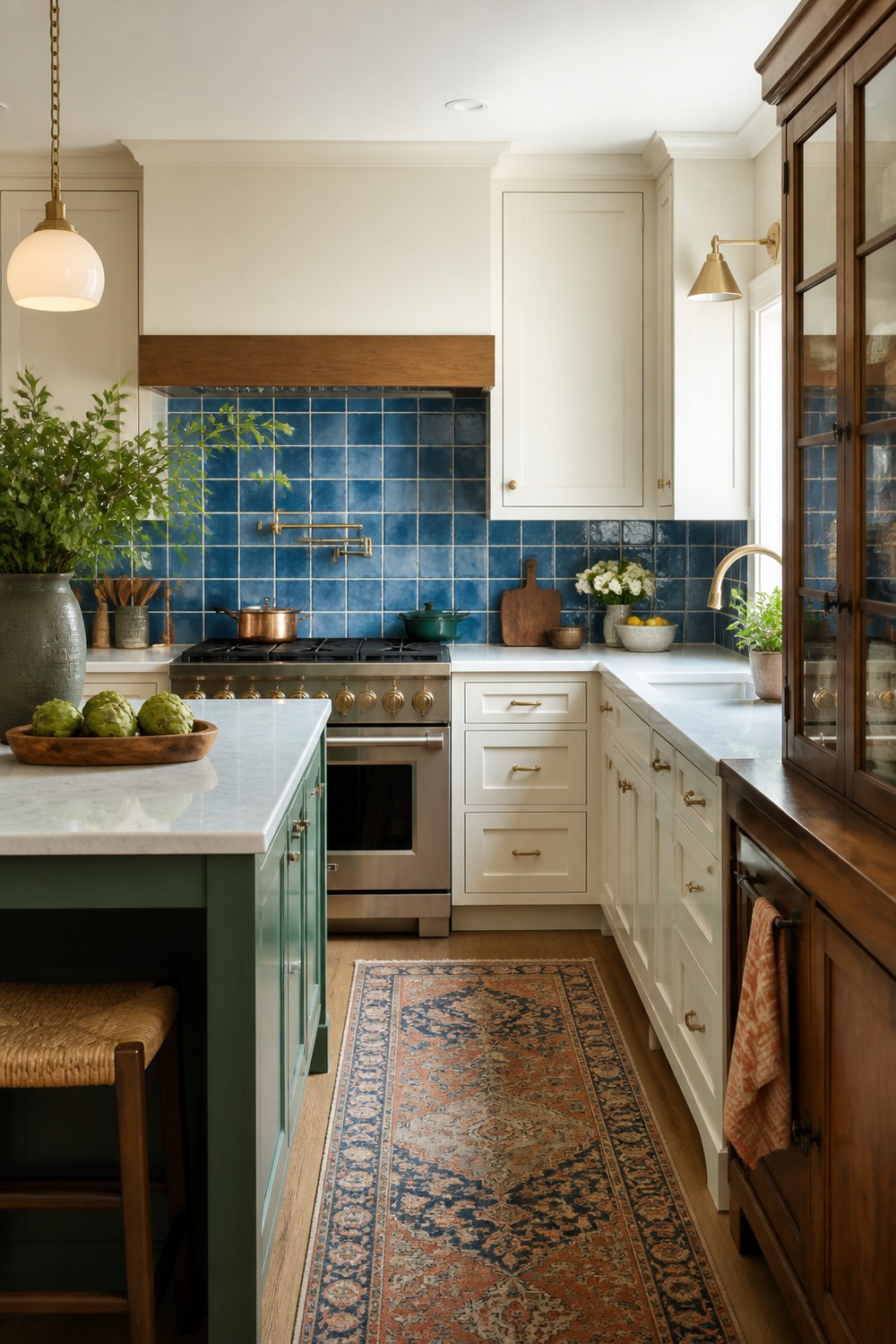
The blue zellige backsplash gives this kitchen that handmade, glossy color moment without taking over every surface. It works because the cabinets stay simple and the shelves leave room for real dishes.
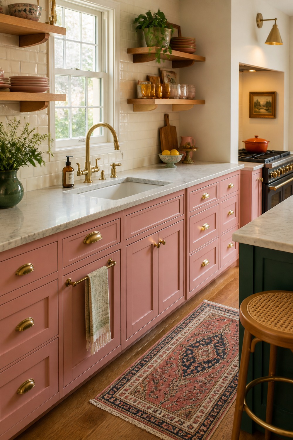
Pink lower cabinets can get too sweet fast, but the marble counter makes this version feel more grown-up. I like the way the color is grounded under a clean work surface instead of scattered everywhere.
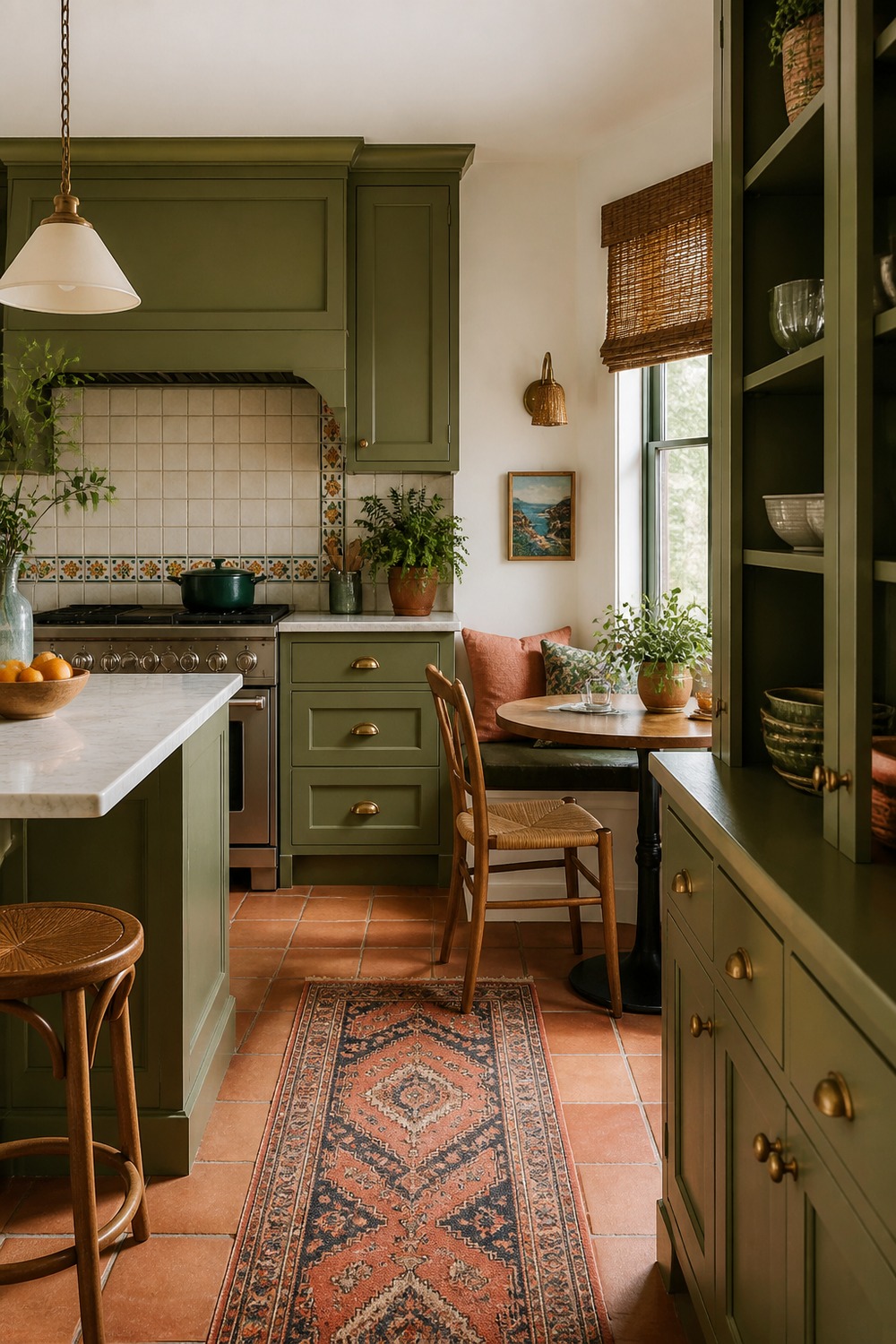
This olive and terracotta nook has the kind of color that feels collected, not random. The built-in seating, patterned cushion, and warm wood table make it feel like a real breakfast spot, not just a pretty corner.
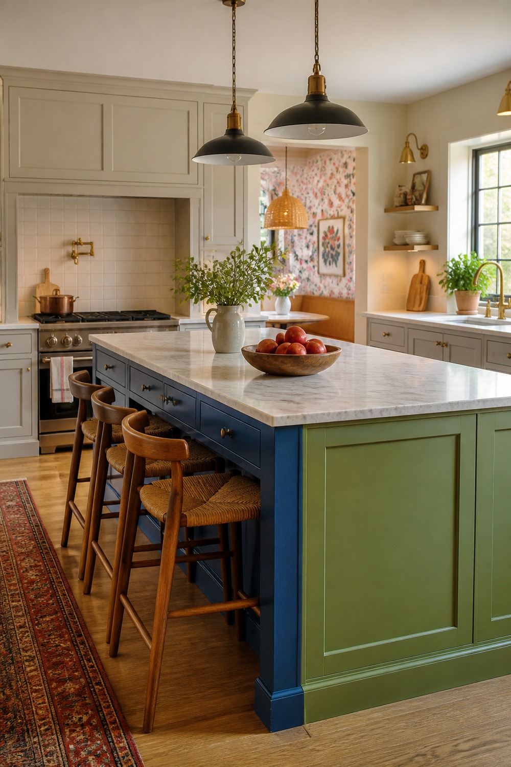
A color-blocked island is bold, but this one still leaves the kitchen feeling practical. The stools, clear counter edges, and simple cabinet lines keep the room usable even with the stronger palette.
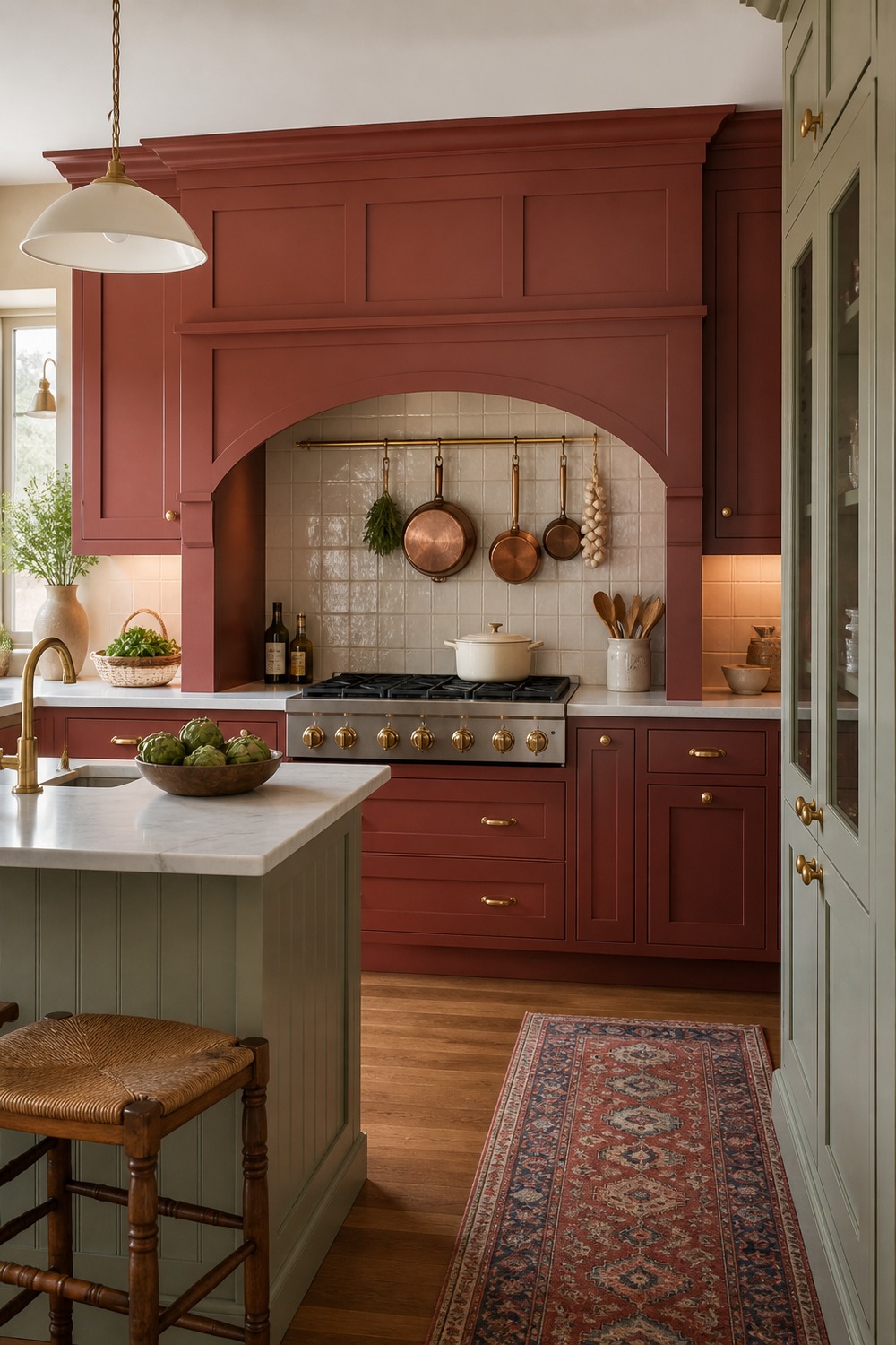
The red range alcove gives the whole kitchen a little restaurant energy. Because the red is concentrated around one hardworking zone, it feels confident instead of loud.
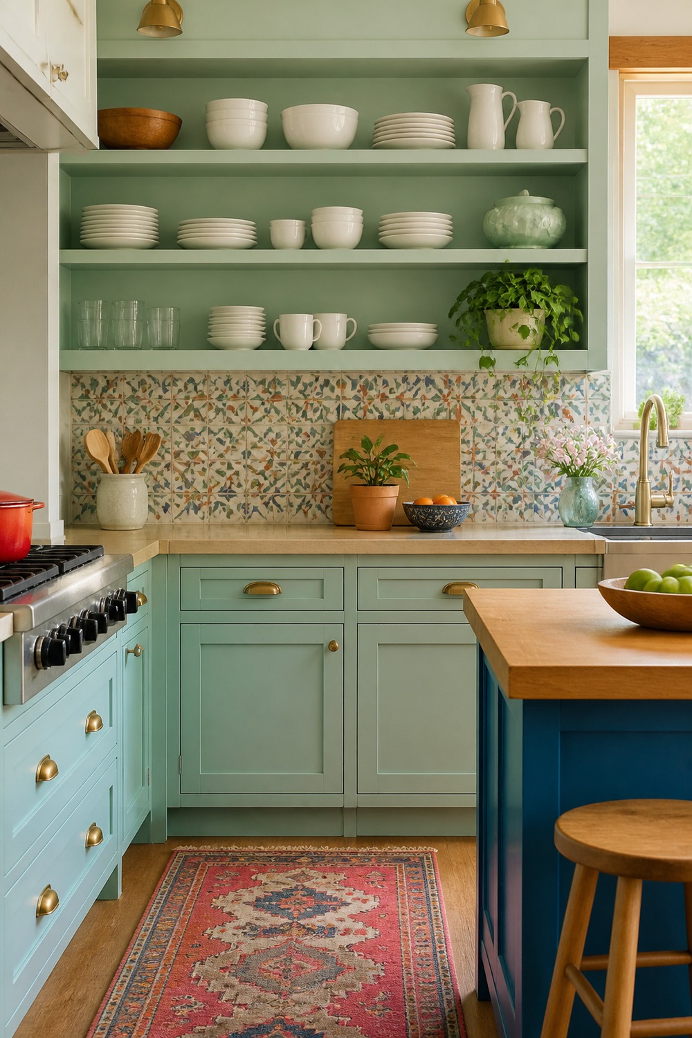
Mint shelves with patterned tile make this kitchen feel playful without losing storage. I like how the open shelves show color in smaller doses, so the backsplash can be fun without overwhelming the room.
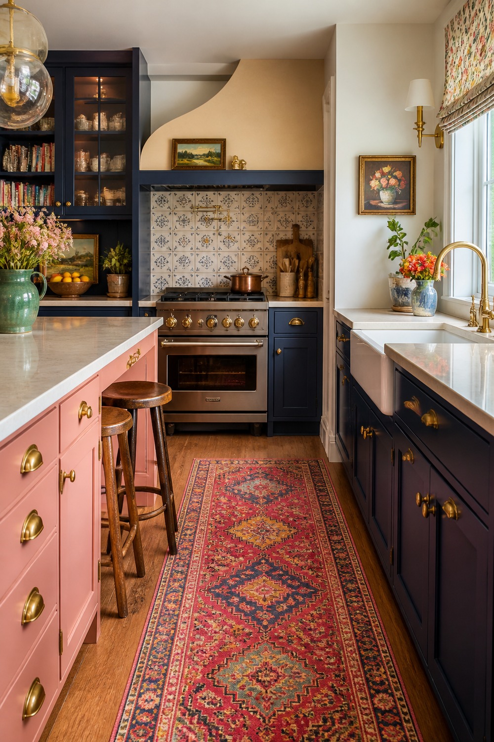
Navy cabinets are a good anchor when the rug brings in extra color. This setup works because the darker base keeps the kitchen grounded, while the runner adds movement through the narrow floor space.
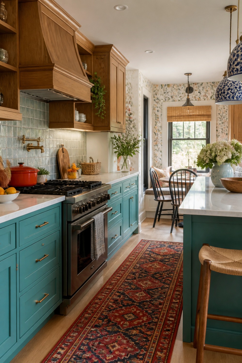
The aqua and oak cabinets make the room feel bright but still warm. The wood tones matter here because they keep the cooler paint color from feeling flat or too glossy.
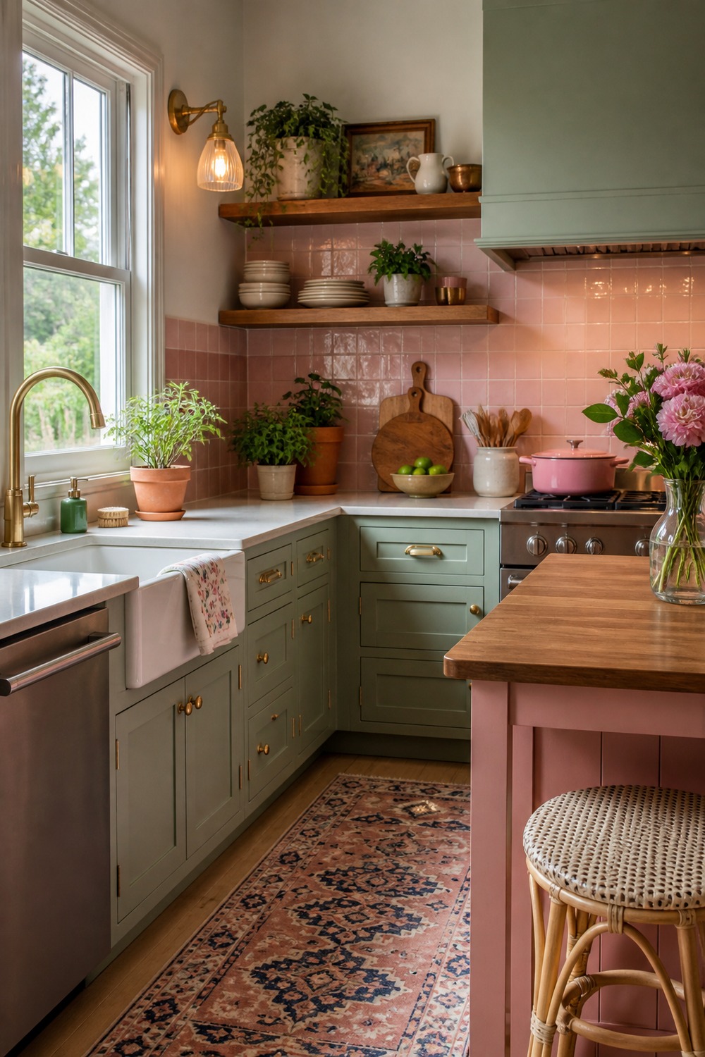
Green and pink can feel risky, but this corner uses them in a soft, almost vintage way. The simple counter, small plant details, and light walls make the color pairing feel more charming than chaotic.
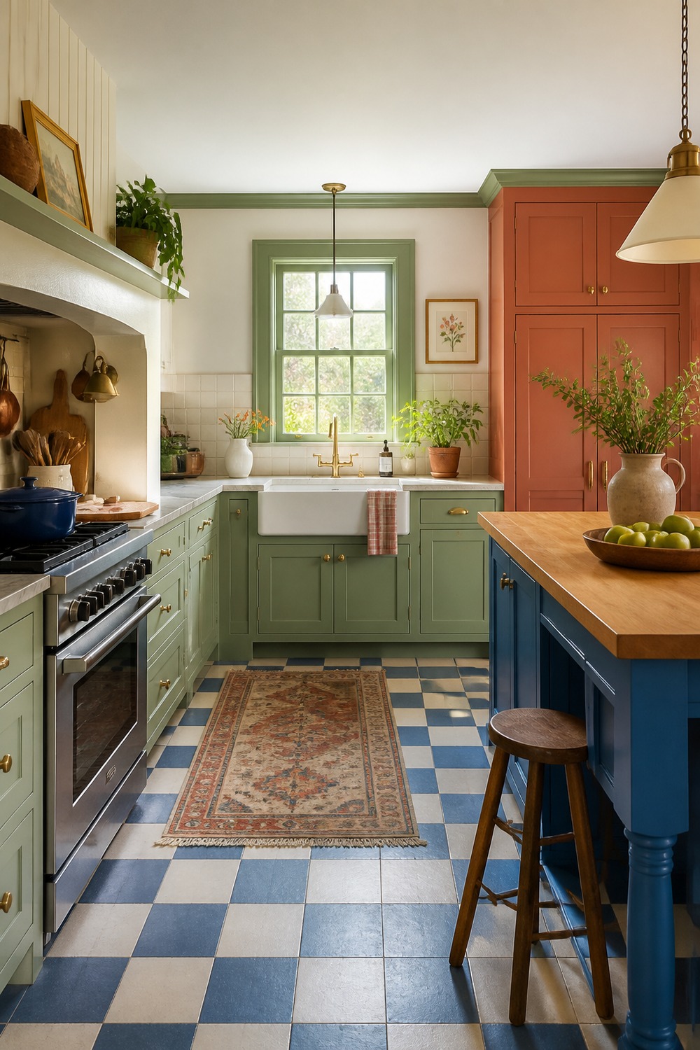
That checkerboard floor is doing a lot of the personality work. I like how the cabinets stay cleaner above it, because the pattern already gives the kitchen plenty of rhythm.
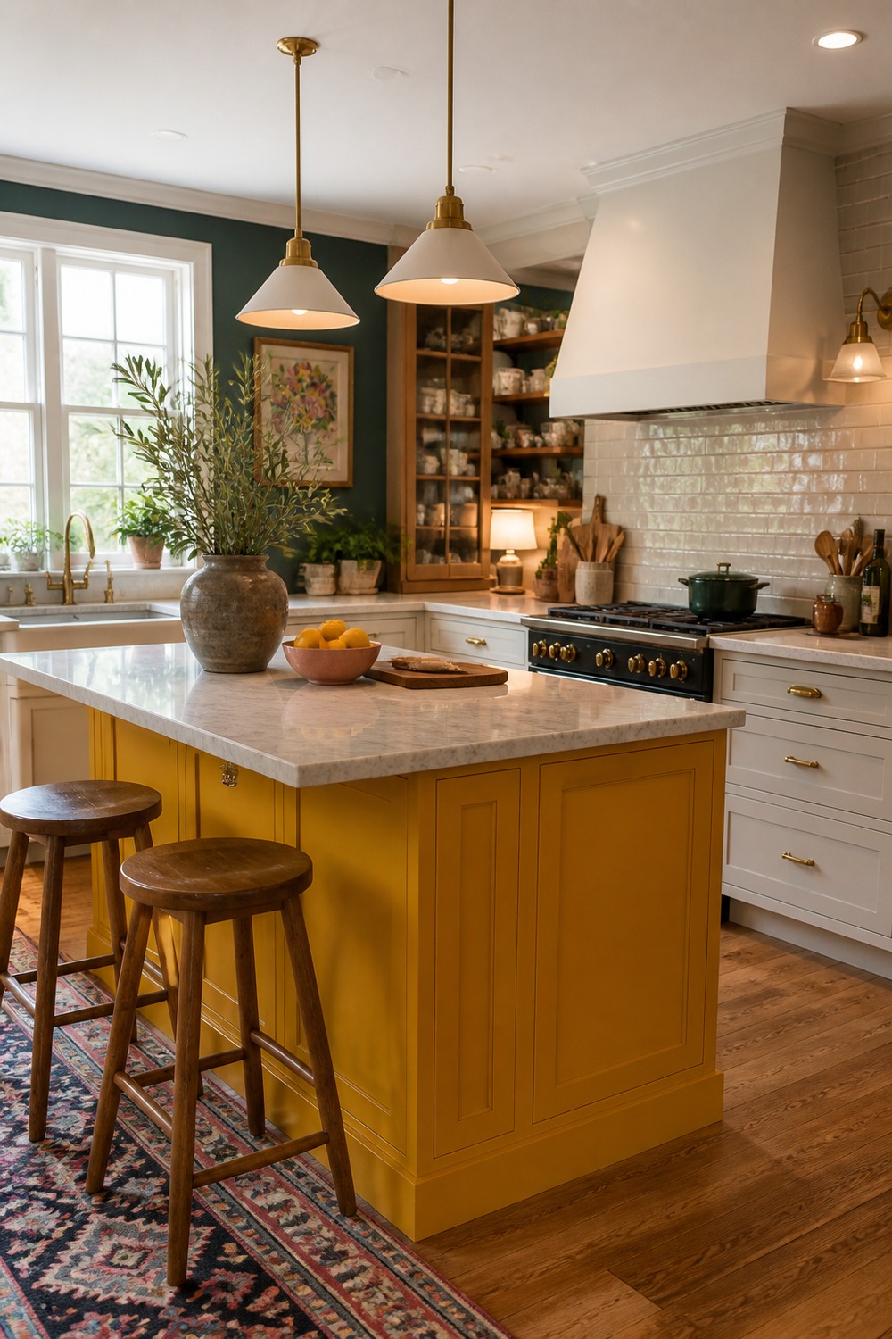
A mustard yellow island instantly makes the kitchen feel happier, especially against lighter cabinets. The color works best here because it is tied to one big furniture-like piece instead of every wall.
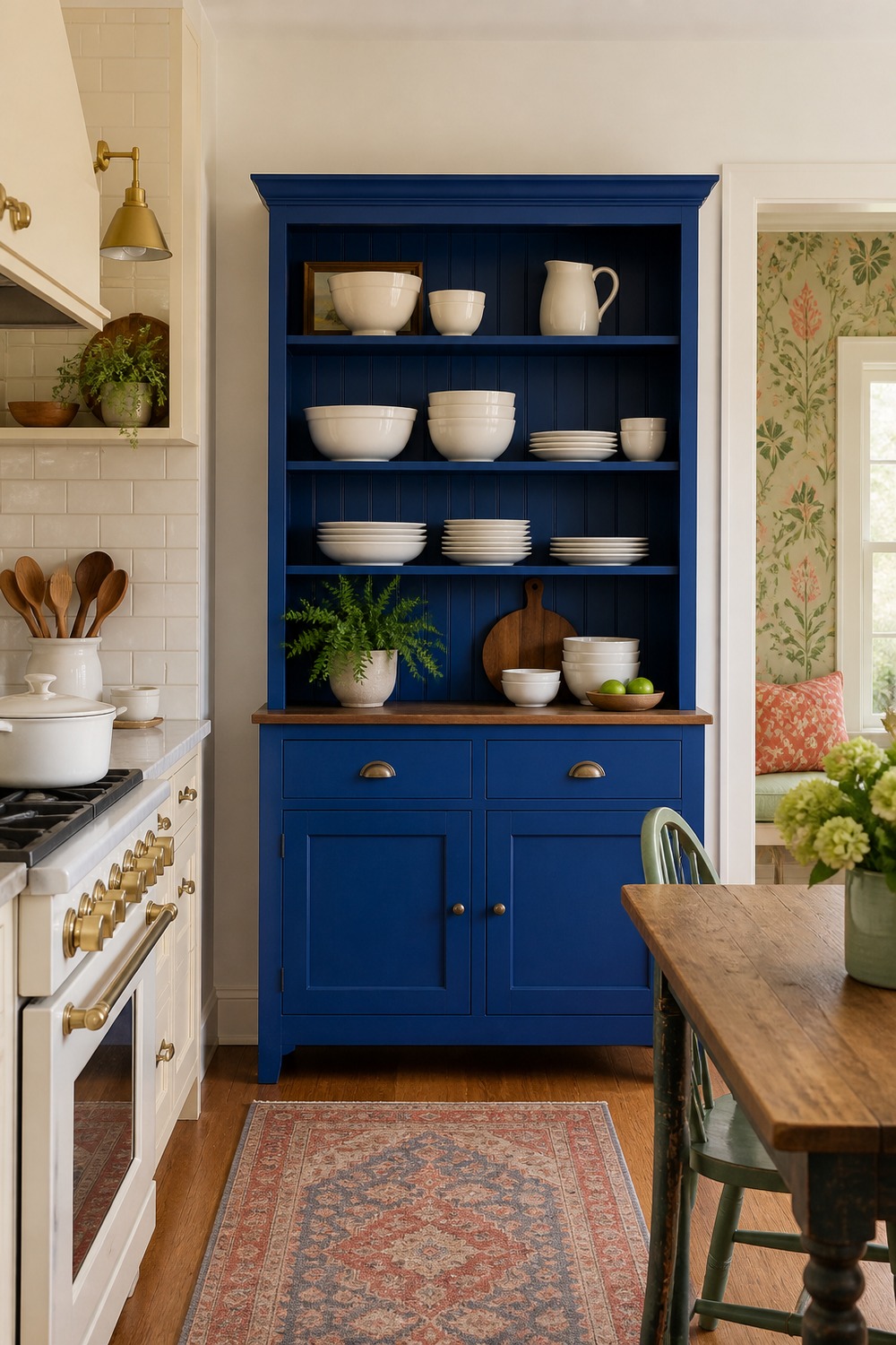
The cobalt hutch is such a good idea for anyone who wants color without repainting the entire kitchen. It adds a strong focal point and extra dish storage at the same time.
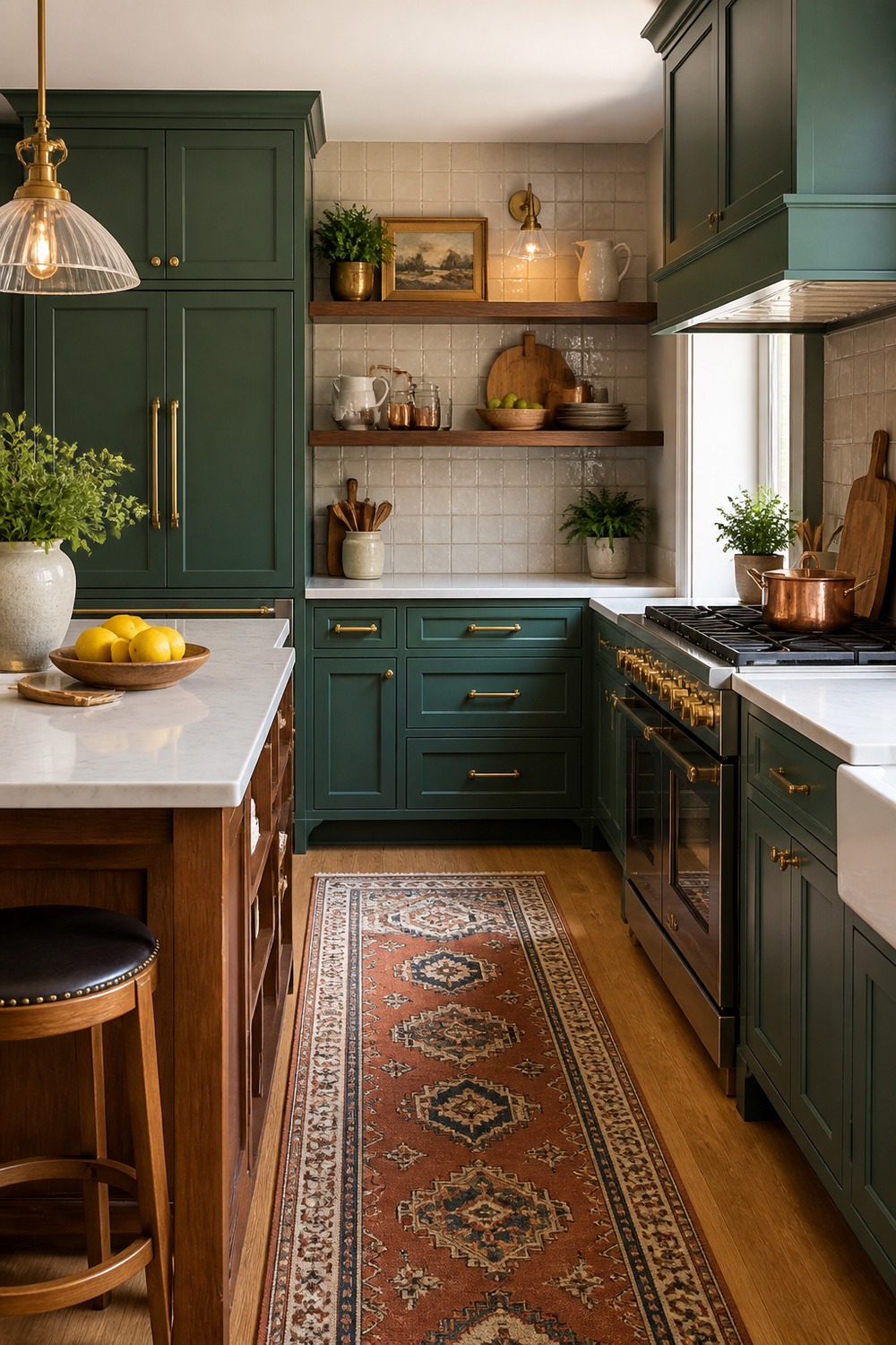
Emerald cabinets with warm wood always feel rich to me. The shelves and natural tones soften the saturated green, so the kitchen still feels welcoming instead of overly formal.
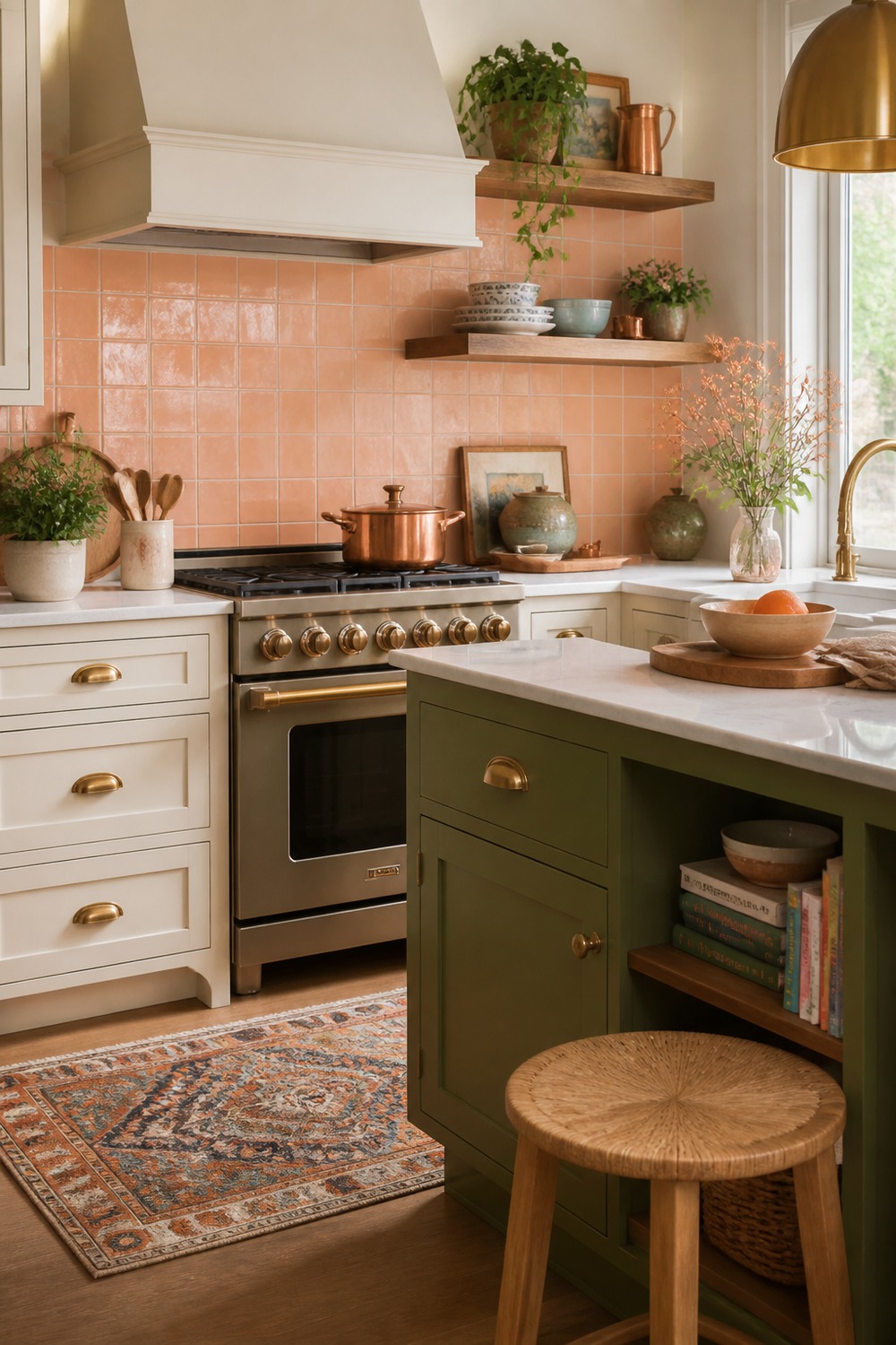
This peach tile backsplash is a softer way to bring in color. It adds warmth around the prep area, but the rest of the kitchen stays light enough for the tile to feel fresh.
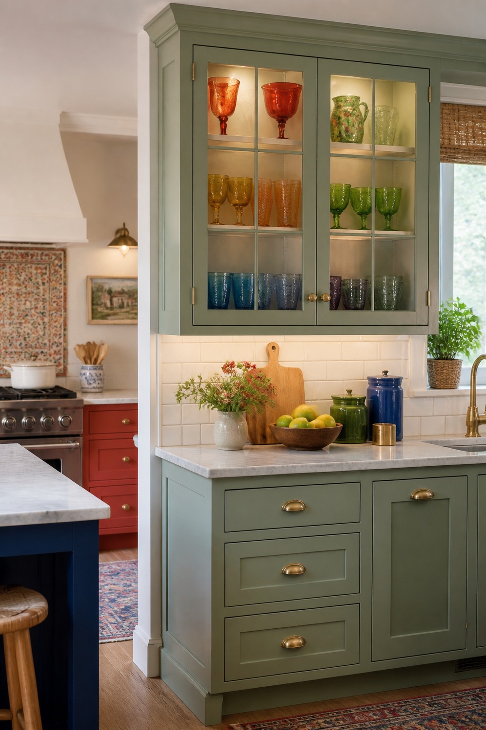
Colorful glass inside cabinet doors is a nice small-dose option. It gives the kitchen sparkle and personality without stealing counter space or forcing a huge renovation.
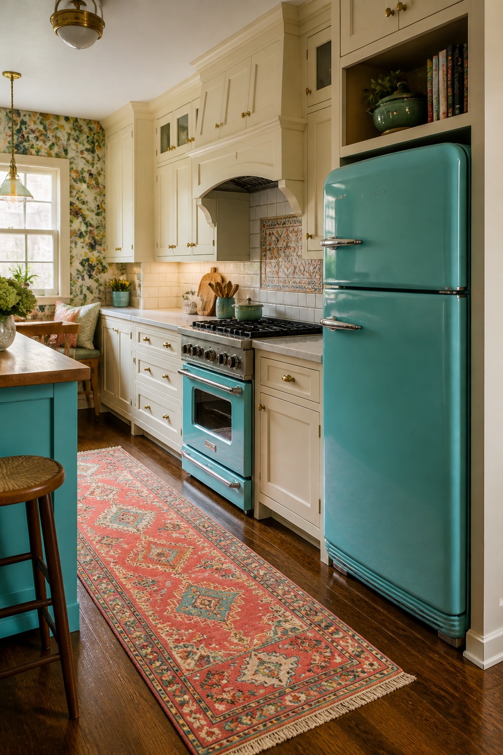
The turquoise appliance gives this kitchen a vintage little wink. I like it most because the surrounding cabinets stay quiet, so the retro color feels like the feature instead of visual clutter.
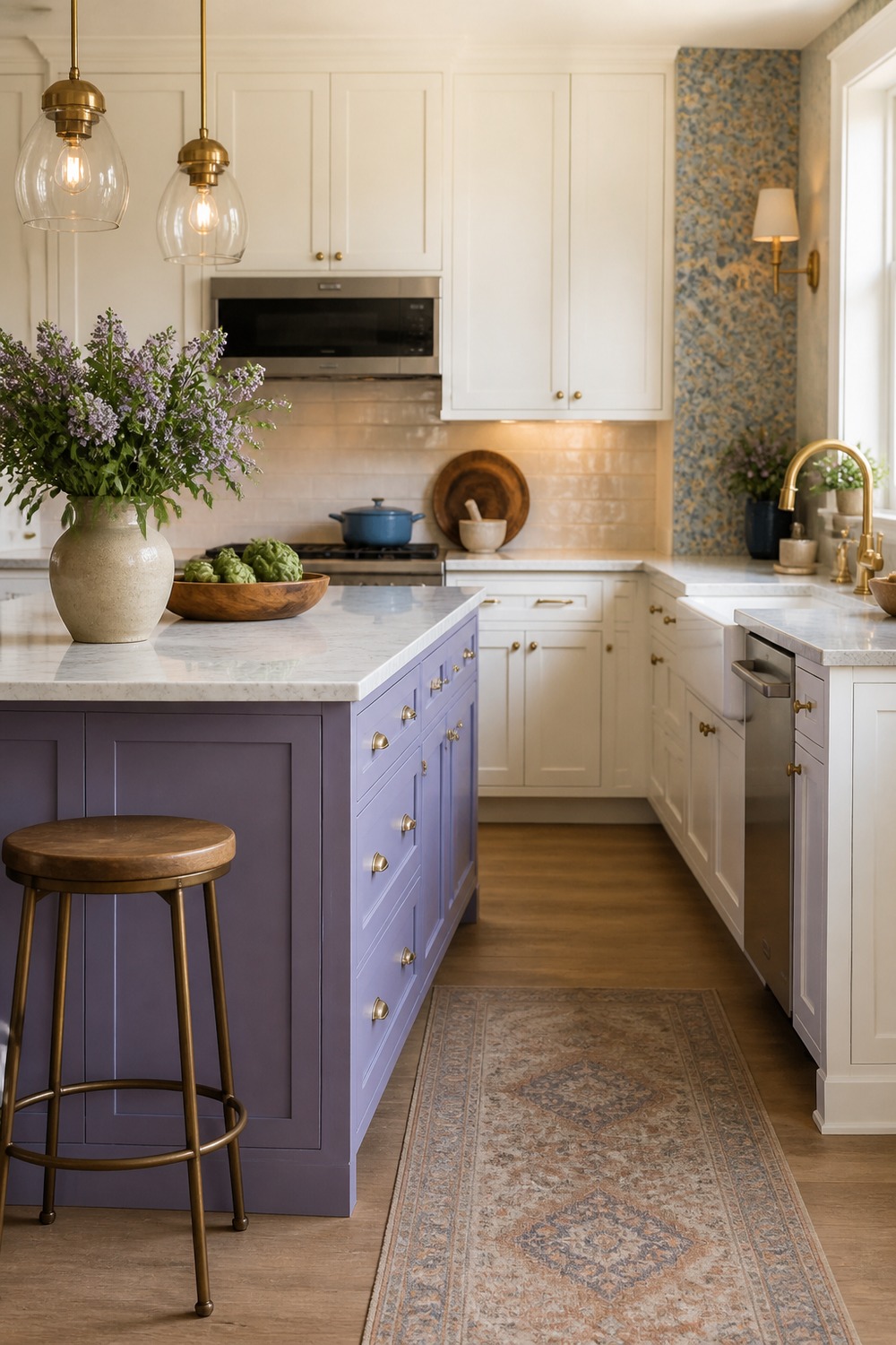
A lavender island feels unexpected in the best way. The pale stone counter and brass pulls keep it polished, while the purple adds just enough personality to make the kitchen memorable.
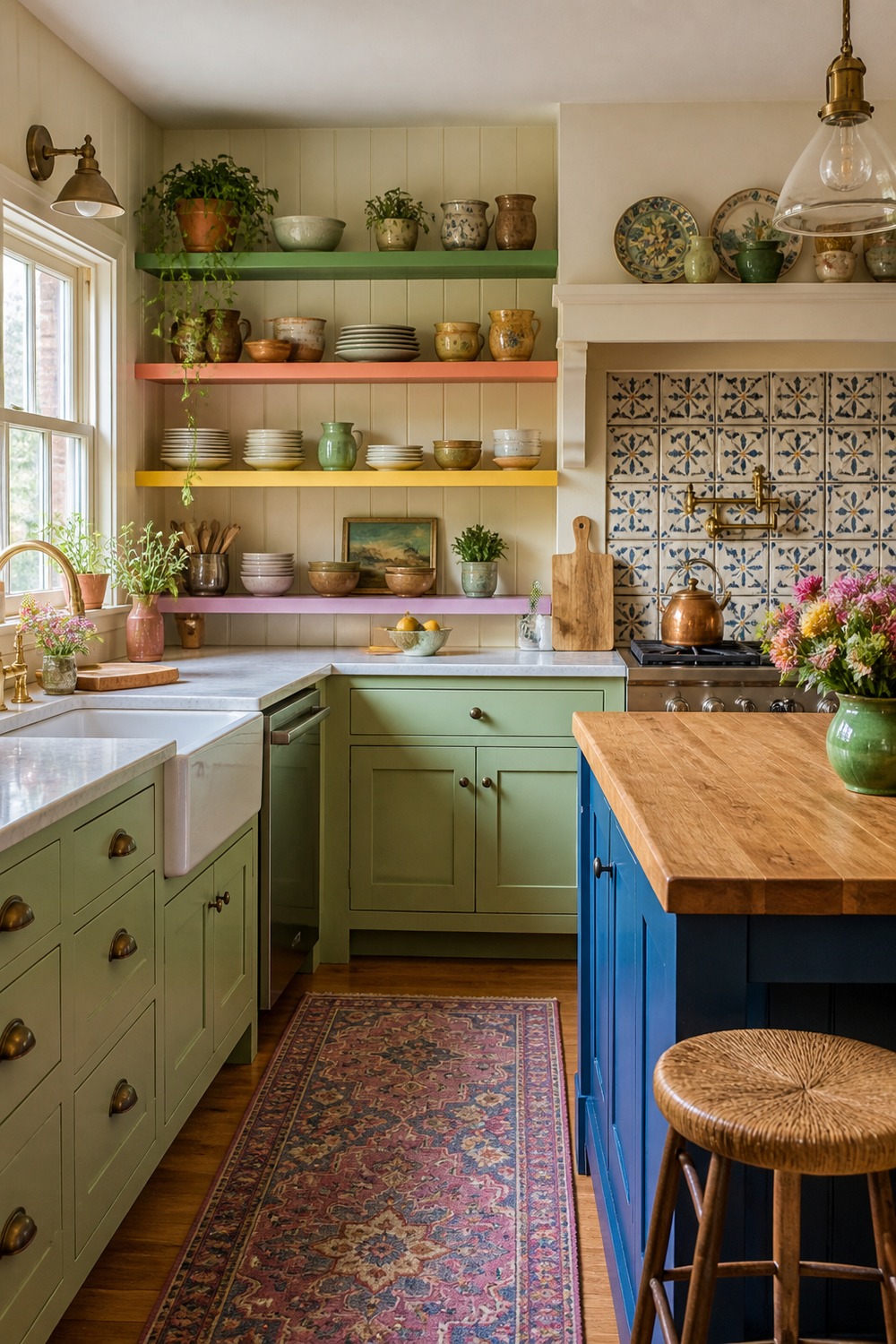
These cottage shelves make color feel layered and lived-in. Painted cabinets, clay pots, and a patterned runner all show up, but the styling still leaves room for everyday dishes and cooking mess.
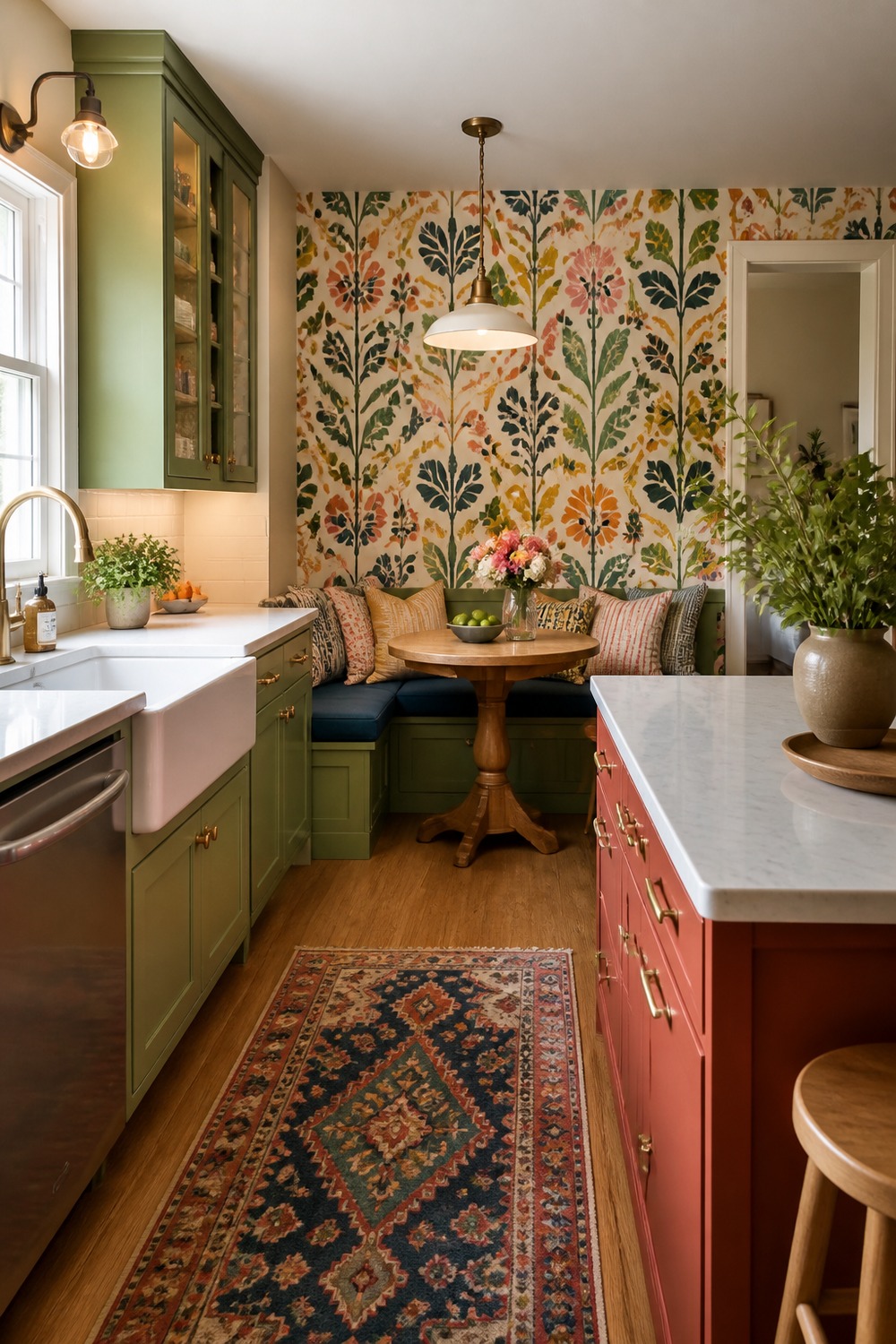
Wallpaper in a breakfast nook is a smart place to go bold. It gives the seating area its own mood, while the main kitchen can stay simpler and easier to maintain.
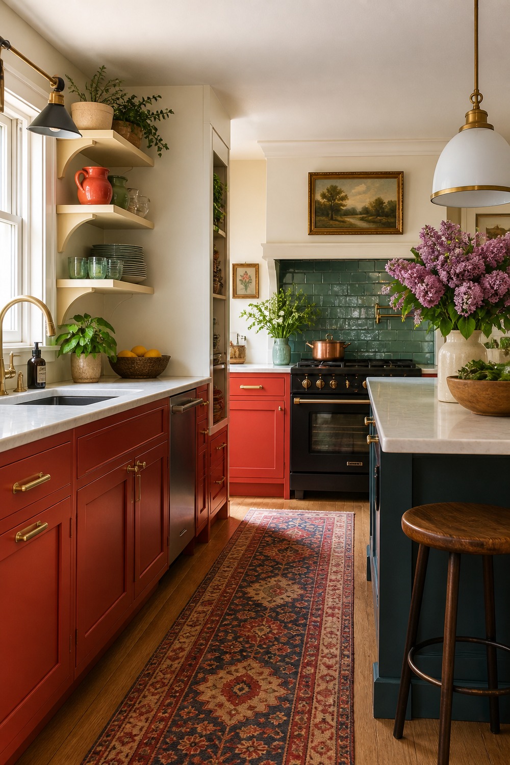
Tomato red lower cabinets make this kitchen feel energetic from the floor up. The cream uppers keep the room from feeling heavy, and the red gives the working side of the kitchen a clear point of view.
Colorful kitchens work best when the bold moments have a little restraint around them. A painted cabinet run, patterned floor, saturated island, or bright tile wall can make the room feel happy while the storage, counters, and lighting still do their everyday jobs.

I work in tech, but my taste in design is straight out of a slow European village. Give me arches, aged brass, and a room that smells like books and coffee. That’s my kind of home.