A kitchen island can handle a stronger color, but it still has to make sense with stools, prep space, pendants, and the cabinets around it. I like island kitchen color schemes where the island feels like the anchor of the room, not a random painted block in the middle of the floor.
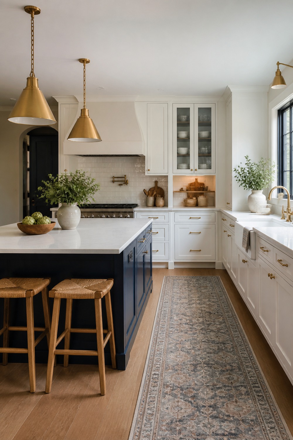
The navy island gives this kitchen a real center of gravity without making the whole room feel dark. White perimeter cabinets keep the walls light, while the oak stools and brass pendants warm up the blue so it feels usable for everyday cooking.
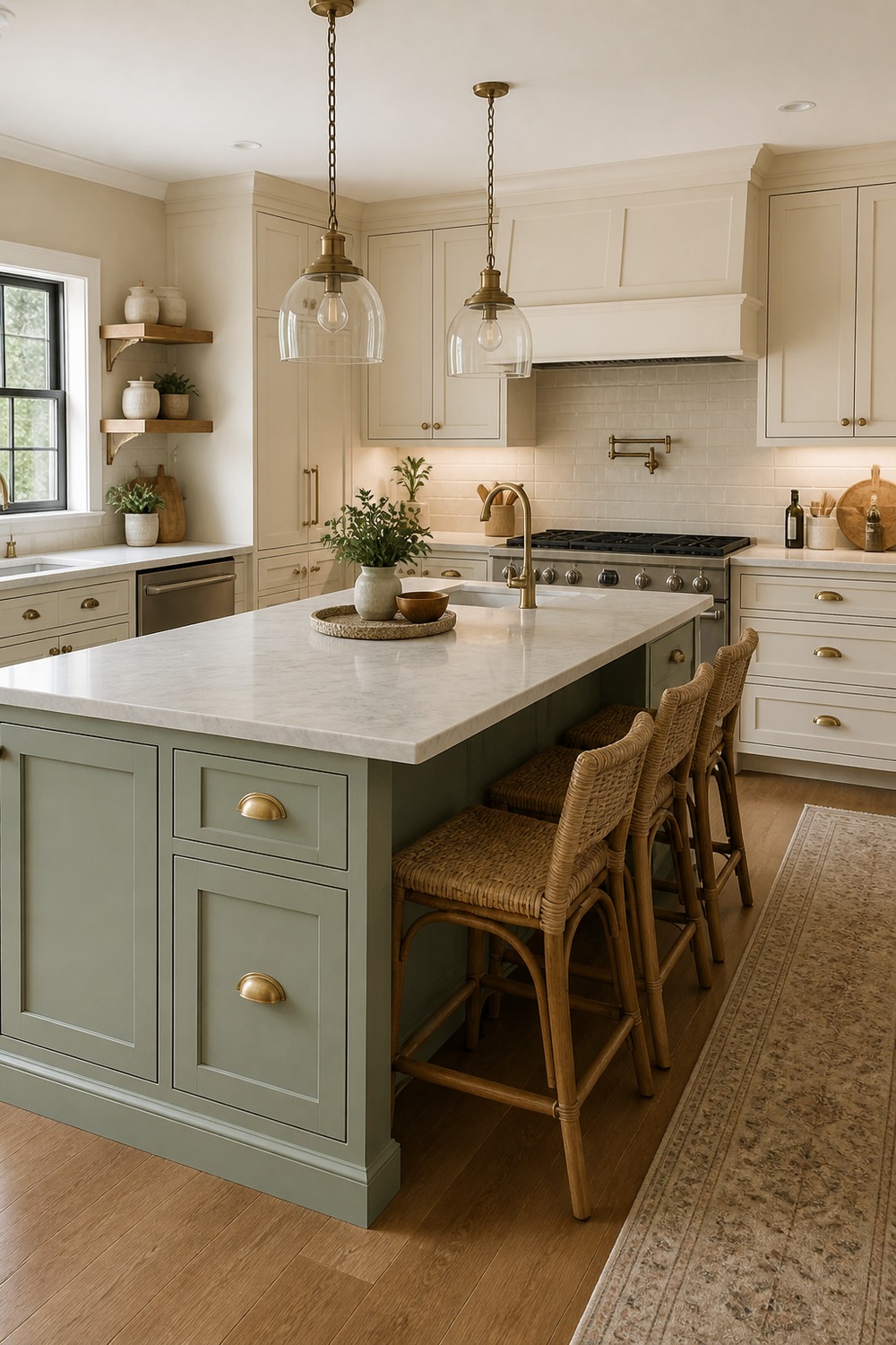
This sage green island feels soft but still intentional. The cream cabinets, pale counter, and brass hardware make the color look calm instead of trendy, and the island still leaves enough room for stools and prep space.
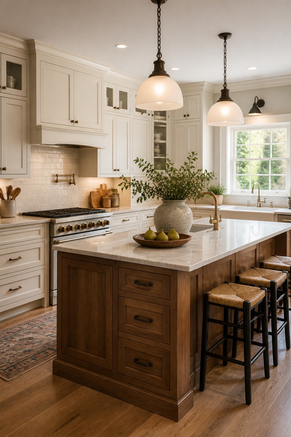
A walnut island is such a good option when you want color variation without committing to a painted cabinet shade. The warm white cabinets make the wood grain stand out, and the darker hardware keeps the palette from looking too sweet.
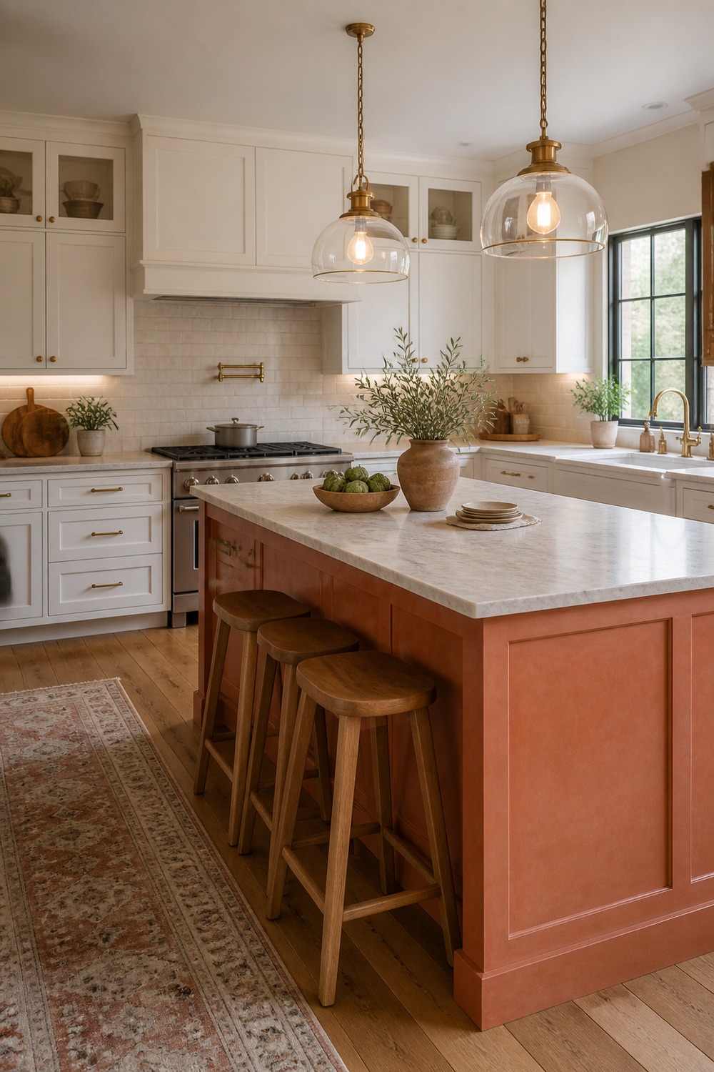
The terracotta island makes this kitchen feel warmer right away. I like how the plaster-white cabinets and wood stools keep the color grounded, so the island feels earthy and collected instead of loud.
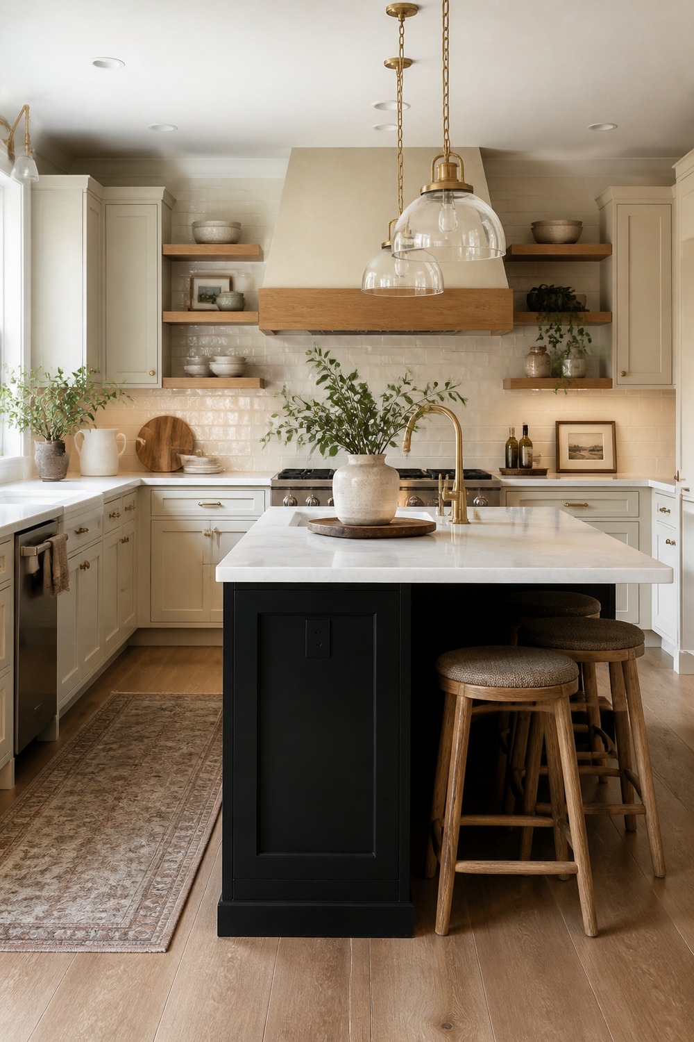
A black island can look harsh if everything around it is too cold, but the oak accents soften this one. The open shelving, creamy cabinets, and pale counter give the dark island contrast without making the kitchen feel heavy.
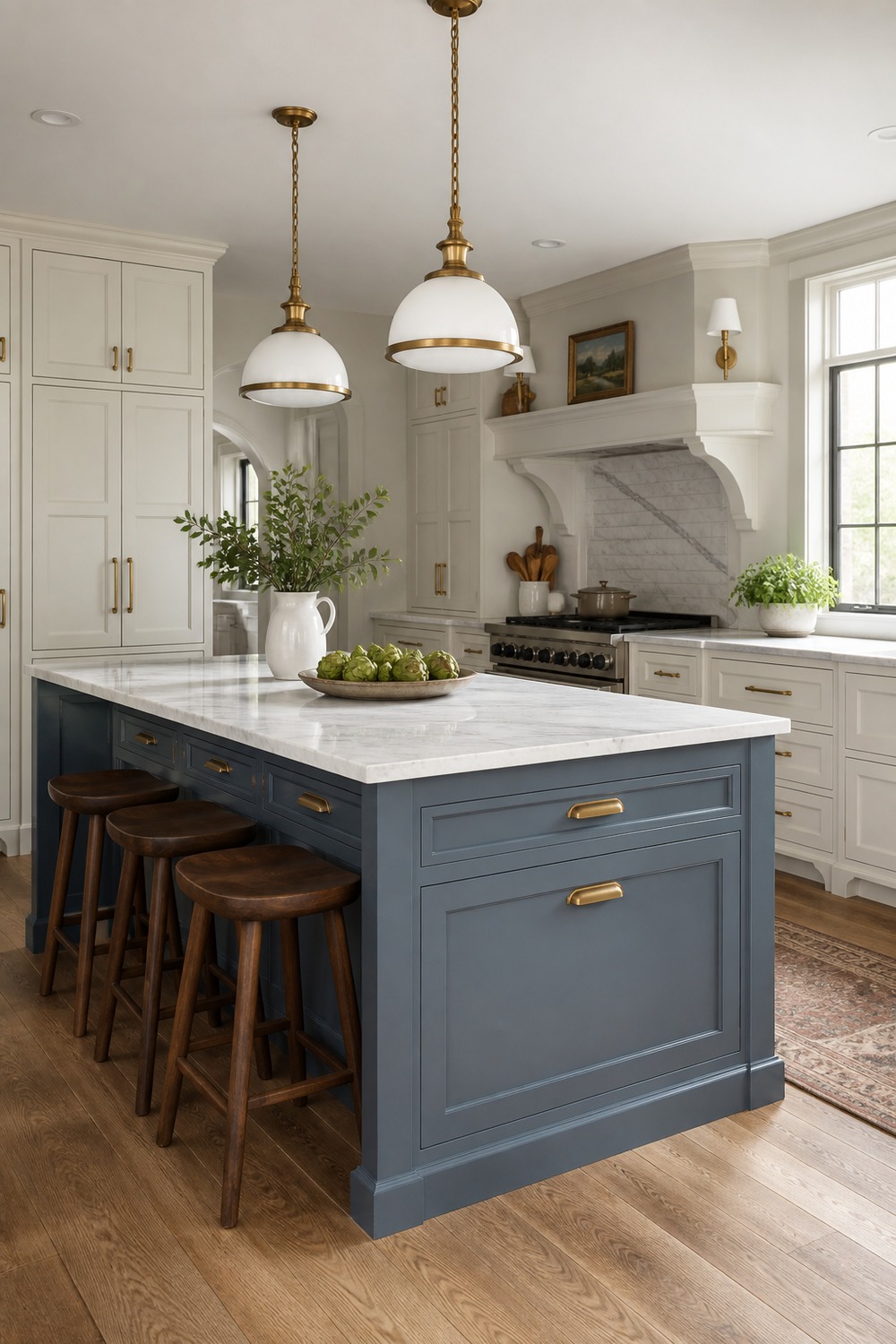
This blue-gray island sits in that nice middle place between colorful and classic. The brass pulls add just enough shine, while the white cabinets and marble-look counter keep the whole scheme clean and easy to live with.
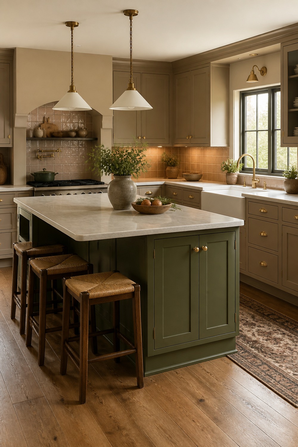
The olive island works because the rest of the kitchen leans earthy too. Clay tile, taupe cabinets, and warm wood tones make the green feel connected to the room instead of looking like a one-off accent.
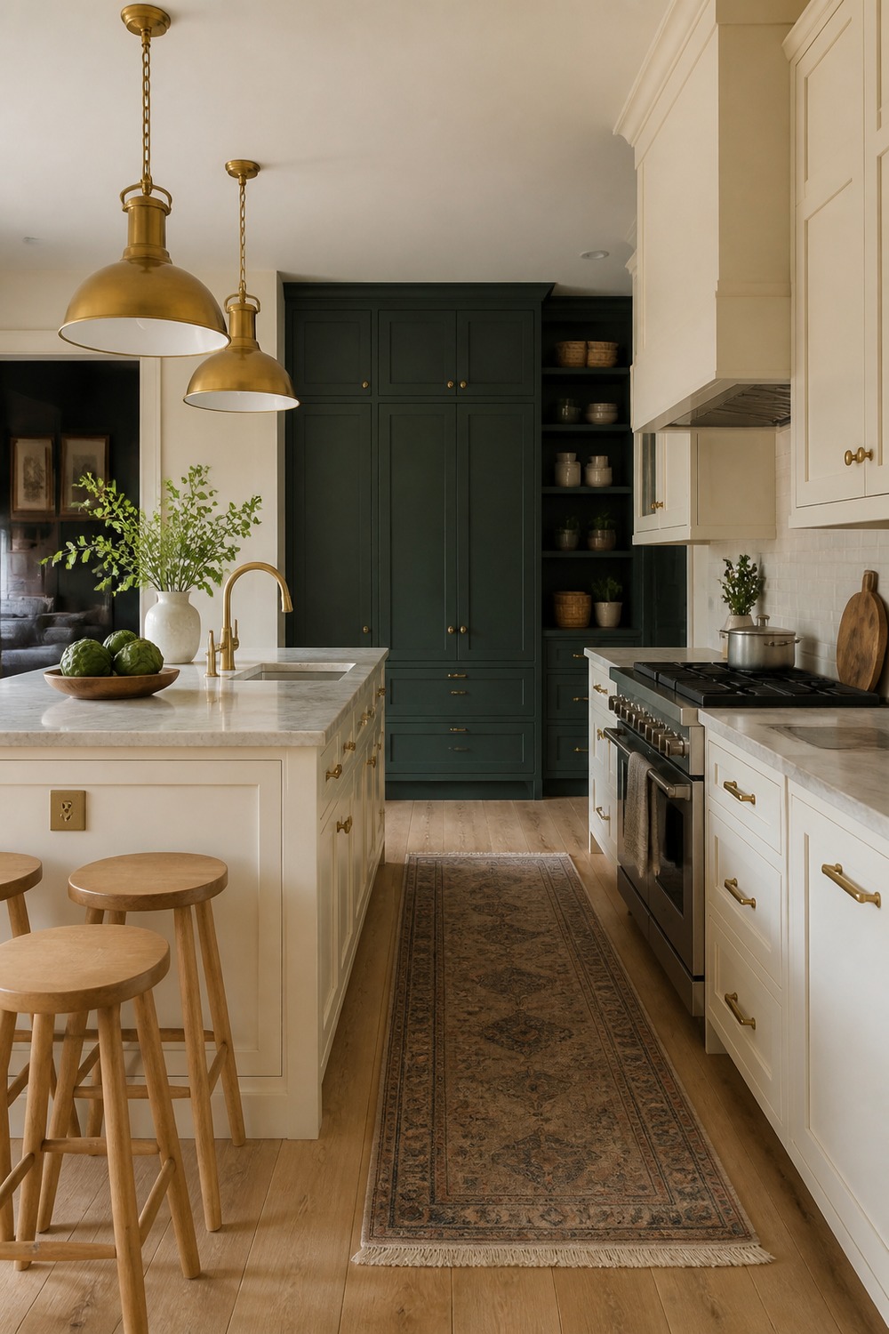
This is a quieter island color scheme, but it still has contrast. The cream island keeps the prep area bright, while the dark pantry wall behind it adds depth and makes the brass pendants feel a little more special.
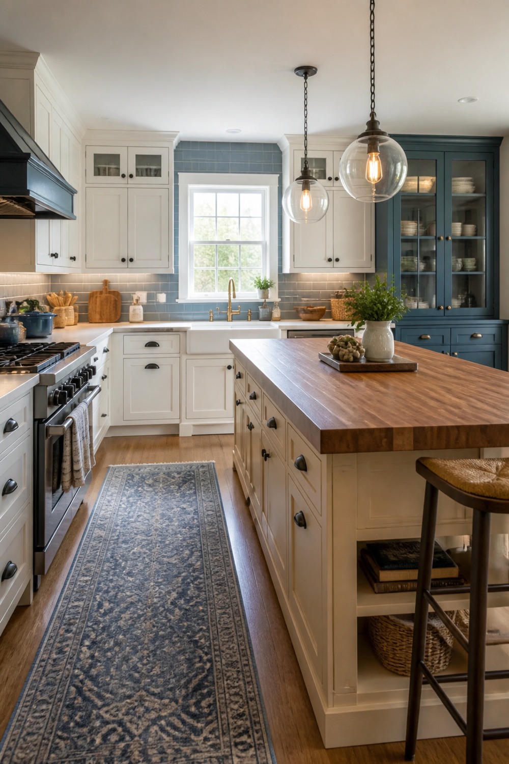
The butcher-block top changes the whole feeling of this painted island. It adds a practical work-surface look, and the warm beige base keeps the kitchen from feeling too crisp or showroom-perfect.
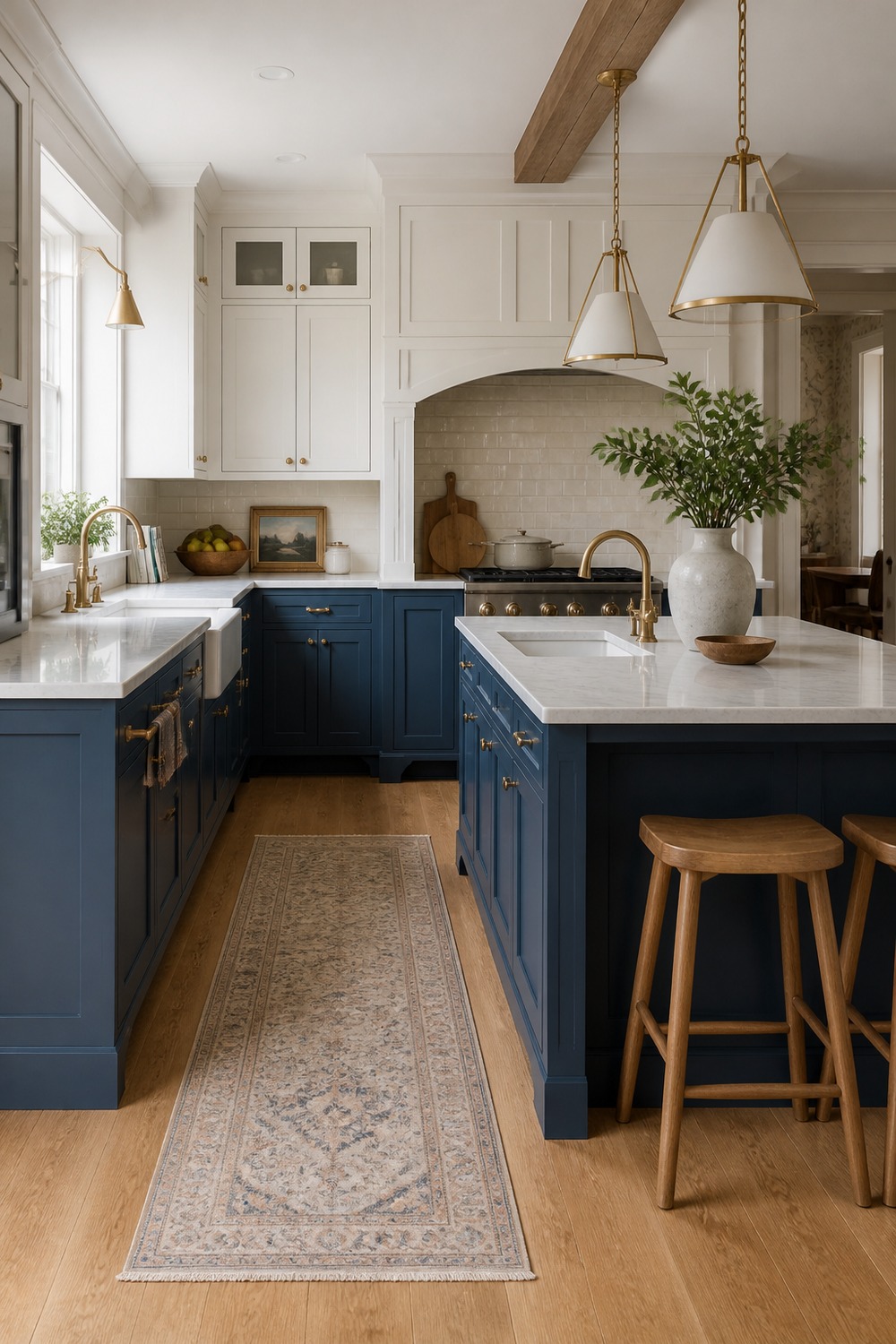
Matching the island to the lower cabinets gives this kitchen a pulled-together look without making every cabinet the same. The white uppers keep the room open, and the cream backsplash softens the deeper blue so it does not swallow the space.
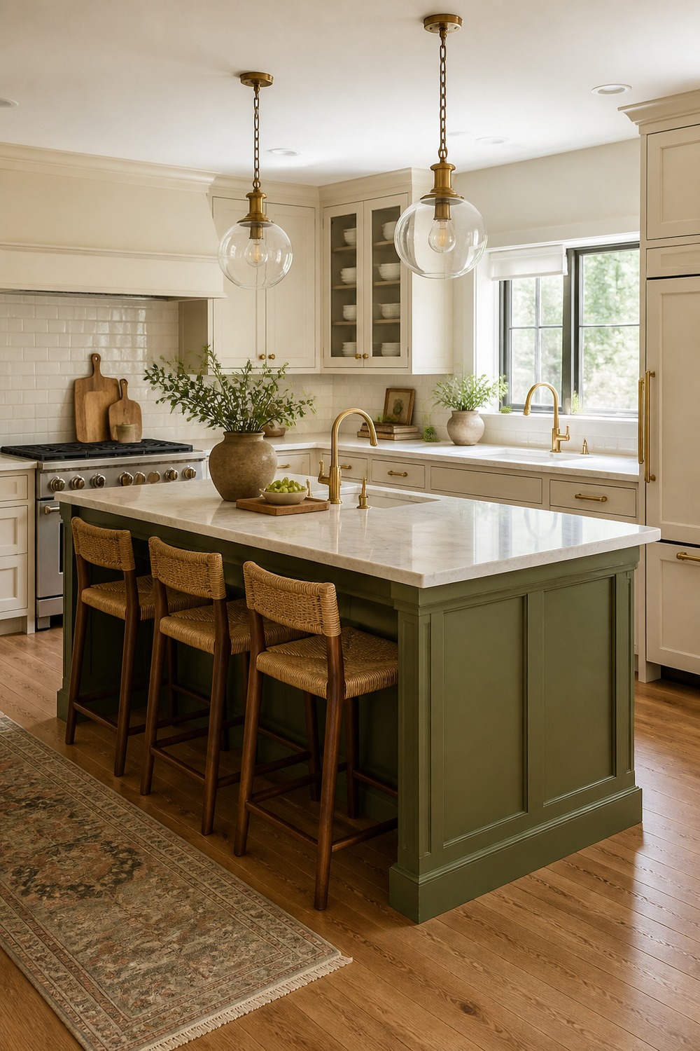
This green island feels especially practical because the seating is part of the color story. The cream cabinets, pendant lights, and clear overhang make the island look pretty, but still like a place where breakfast, homework, and prep could actually happen.
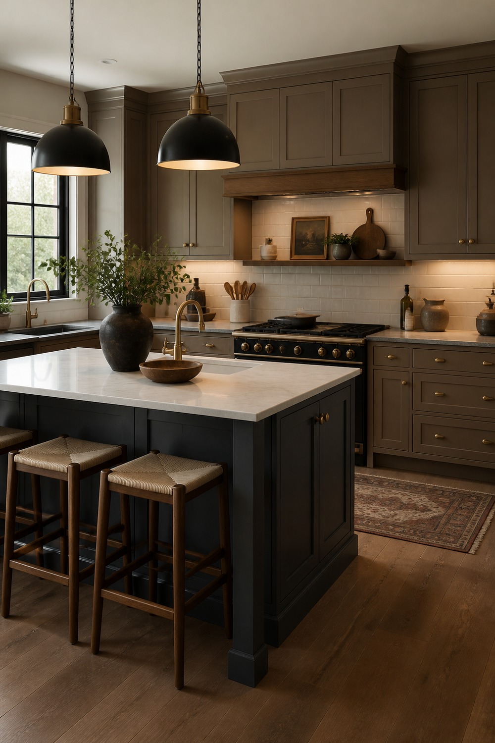
The charcoal island gives this kitchen a moodier edge without turning it into a dark cave. Mushroom cabinets and a white stone counter keep the contrast balanced, while the darker pendants make the island feel deliberately framed.
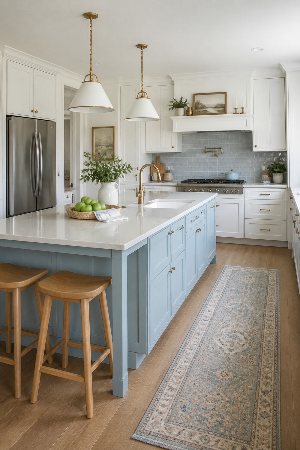
A pale blue island is a softer way to bring color into a kitchen. The white cabinets and light tile keep everything airy, and the island shade feels fresh without competing with the counters or lighting.
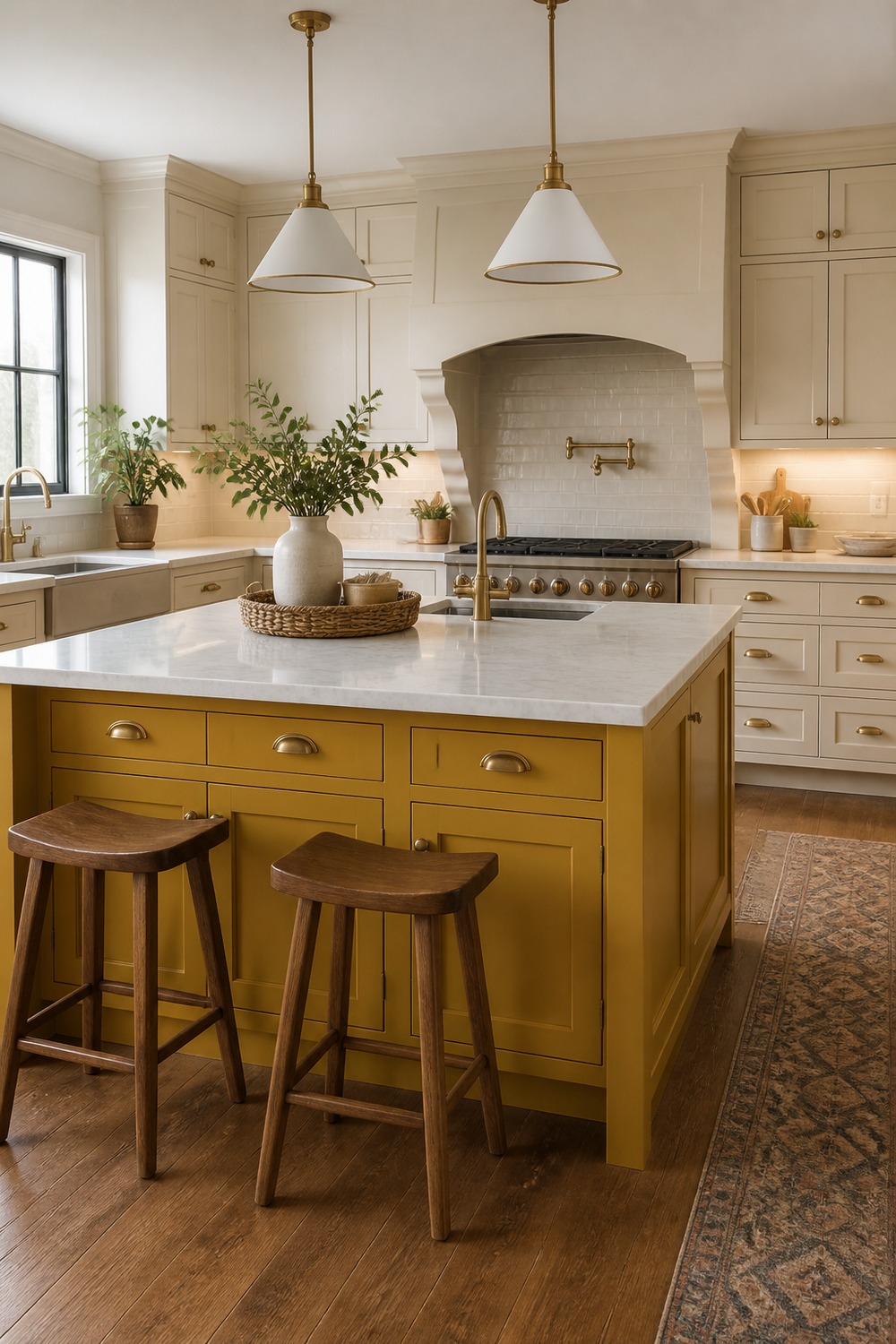
The mustard island is bold, but the neutral cabinets make it feel less risky. Warm wood stools and brass pulls help the yellow read as cozy and layered instead of too bright or novelty-looking.
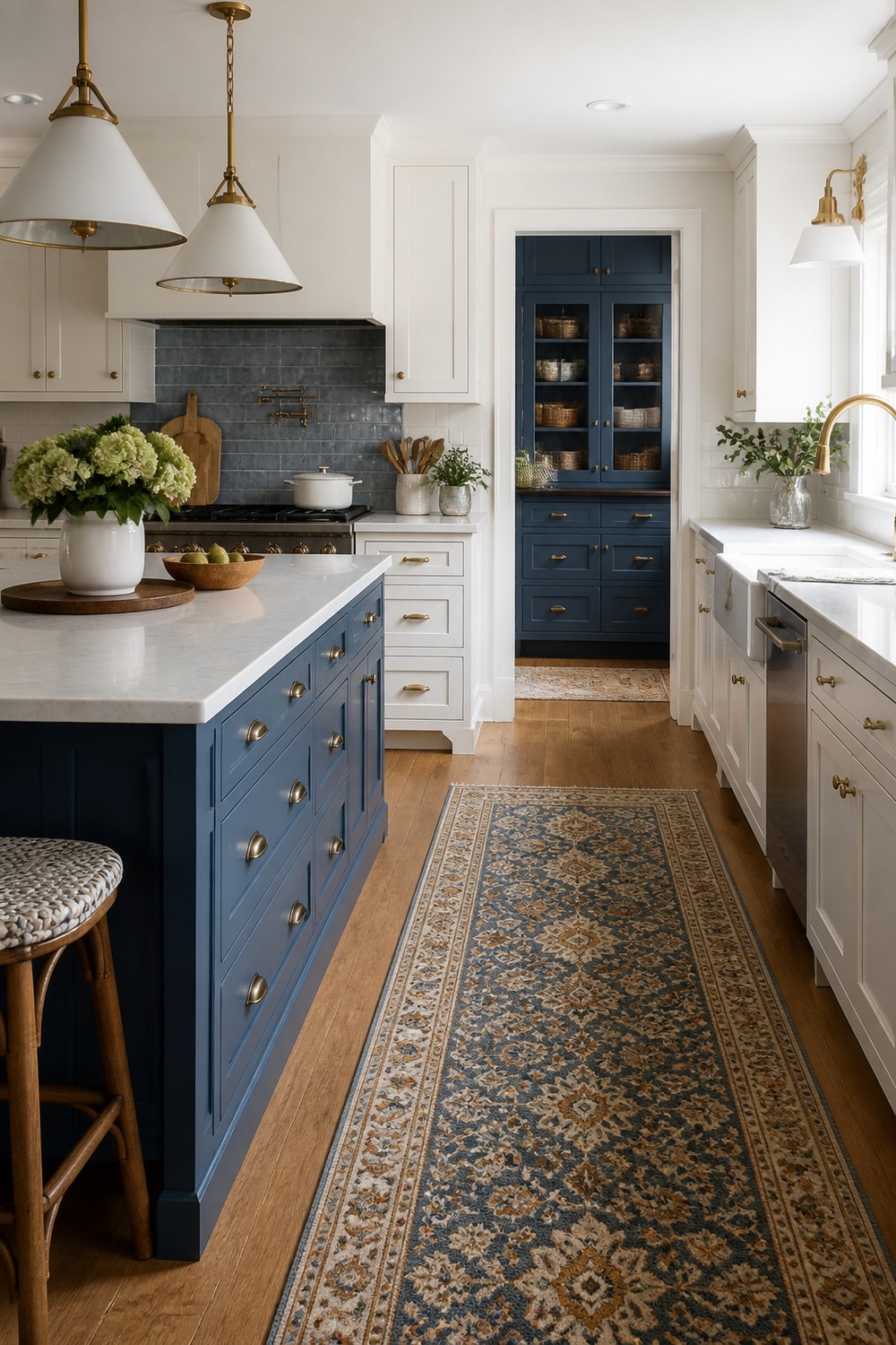
This one is a good reminder that the floor can affect the island color too. The patterned runner pulls extra color into the room, while the painted island and white cabinets keep the main palette clear.
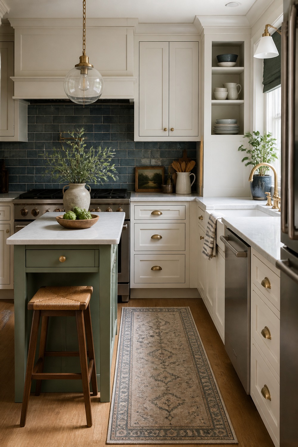
A small island still deserves a real color plan. The compact sage work table gives the kitchen a focal point, and the tucked stool makes the setup feel useful instead of like furniture squeezed into a tight corner.
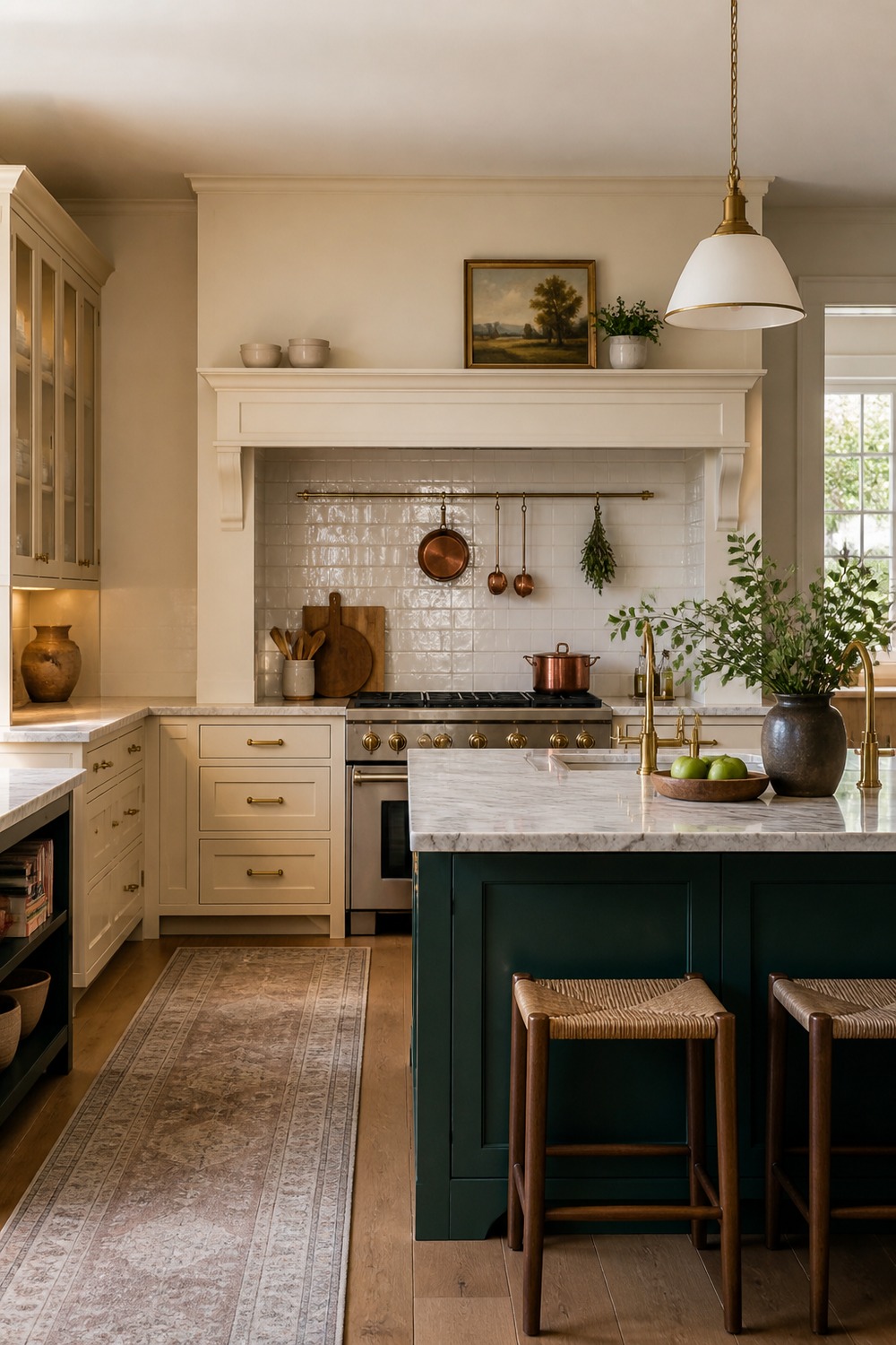
The deep green island and cream range wall make a nice two-zone color scheme. I like that the island is strong, but the range wall still has enough presence through the brass rail and warm neutral cabinetry.
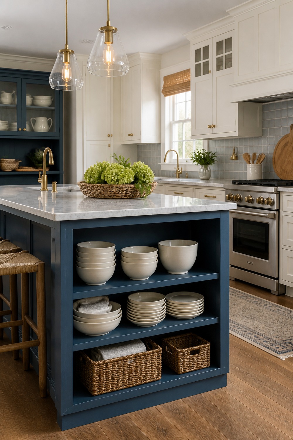
Open storage on the island makes the color feel more relaxed. The blue base, cream dishes, baskets, and white perimeter cabinets create a layered look while still leaving the island useful for dishes and everyday kitchen clutter.
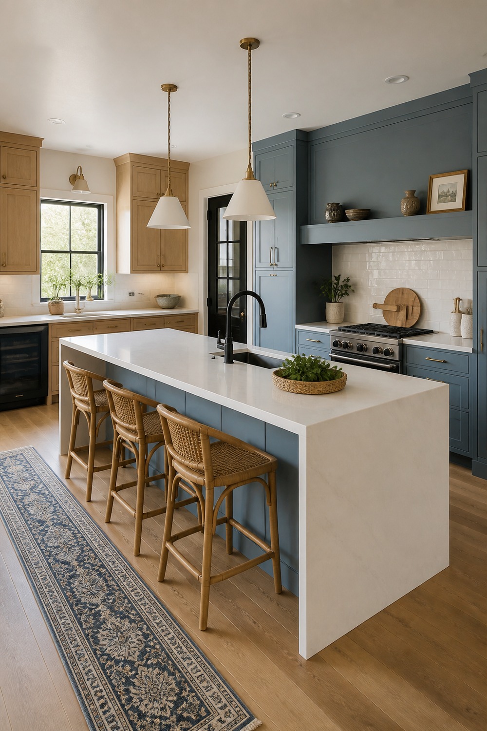
This modern flat-panel island keeps the color scheme cleaner and more streamlined. Pale oak cabinets and a white waterfall counter stop the taupe-blue island from feeling too flat, which matters in a simpler kitchen without much trim.
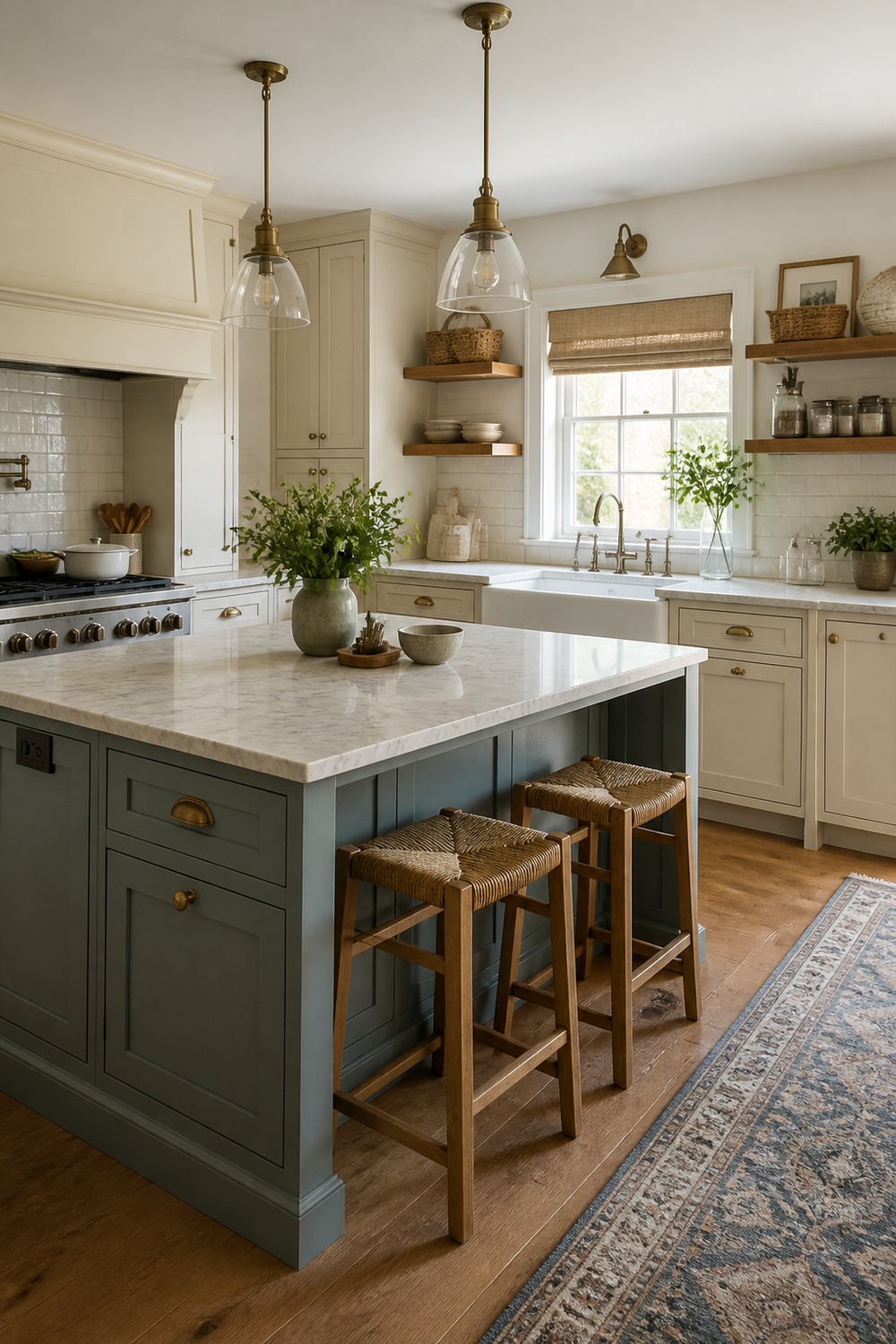
The gray-green island fits the farmhouse details without making the kitchen feel overly themed. An apron-front sink wall, oak shelves, and soft cream cabinets give the color enough company to feel natural.
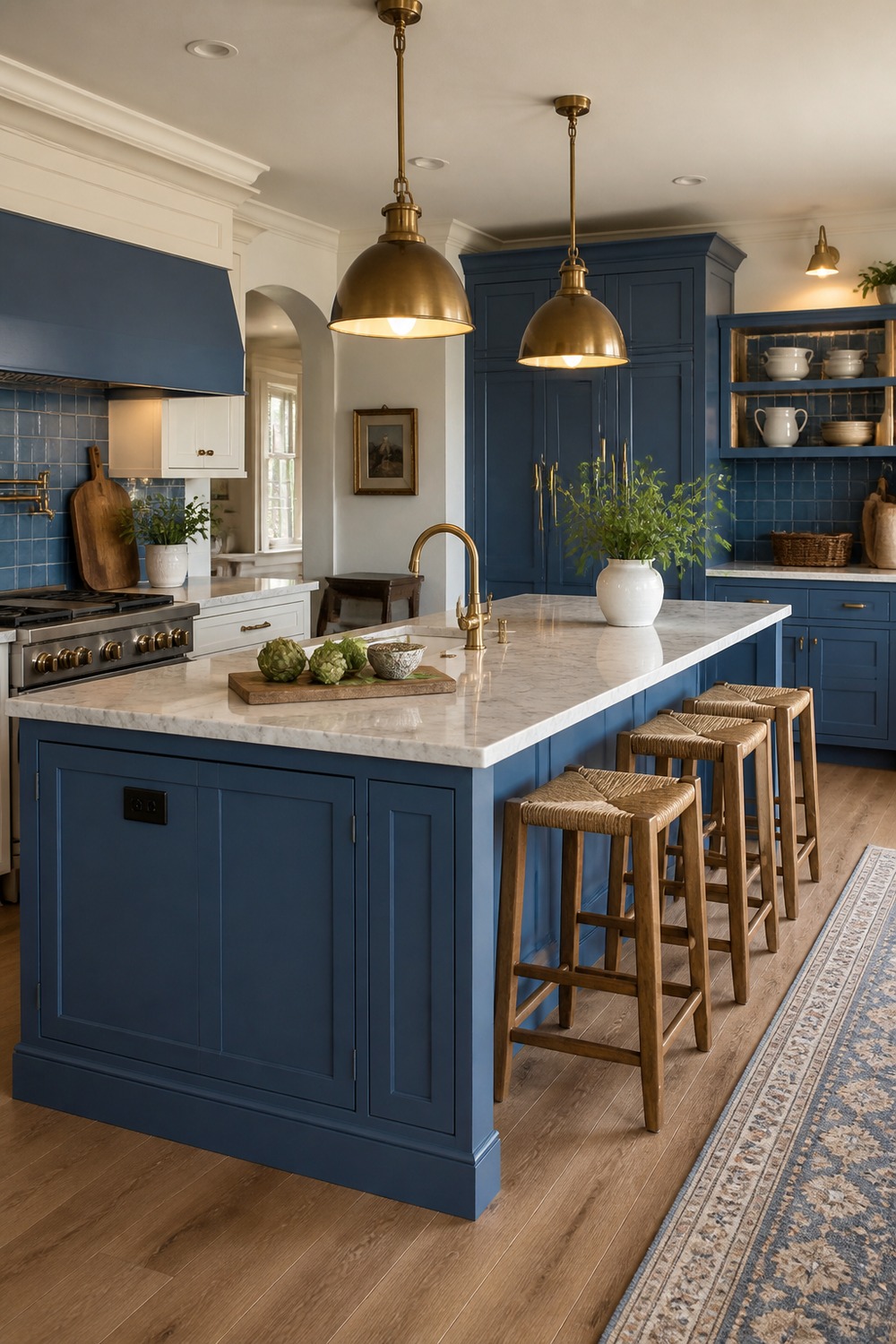
This last island scheme feels settled because the lighting, stools, and cabinet color all work together. The deeper island shade gives the room structure, while the clear counter zones keep it from feeling too styled to use.
An island color scheme works best when the island feels connected to the rest of the kitchen. The stools, lights, cabinet colors, counter material, and walking space all matter because the island is usually where real life lands first.

I work in tech, but my taste in design is straight out of a slow European village. Give me arches, aged brass, and a room that smells like books and coffee. That’s my kind of home.