Oak cabinets can go either way really fast: warm and grounded, or a little too yellow if everything around them fights the wood. I like these kitchen color schemes because they work with the grain instead of trying to erase it, using soft wall colors, tile, counters, hardware, and lighting to make the oak feel intentional.
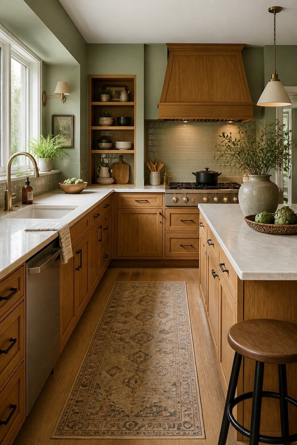
Sage walls are one of the calmer ways to cool down golden oak without making the kitchen feel cold. The green gives the cabinets a softer backdrop, while cream counters and simple hardware keep the wood grain looking warm instead of dated.
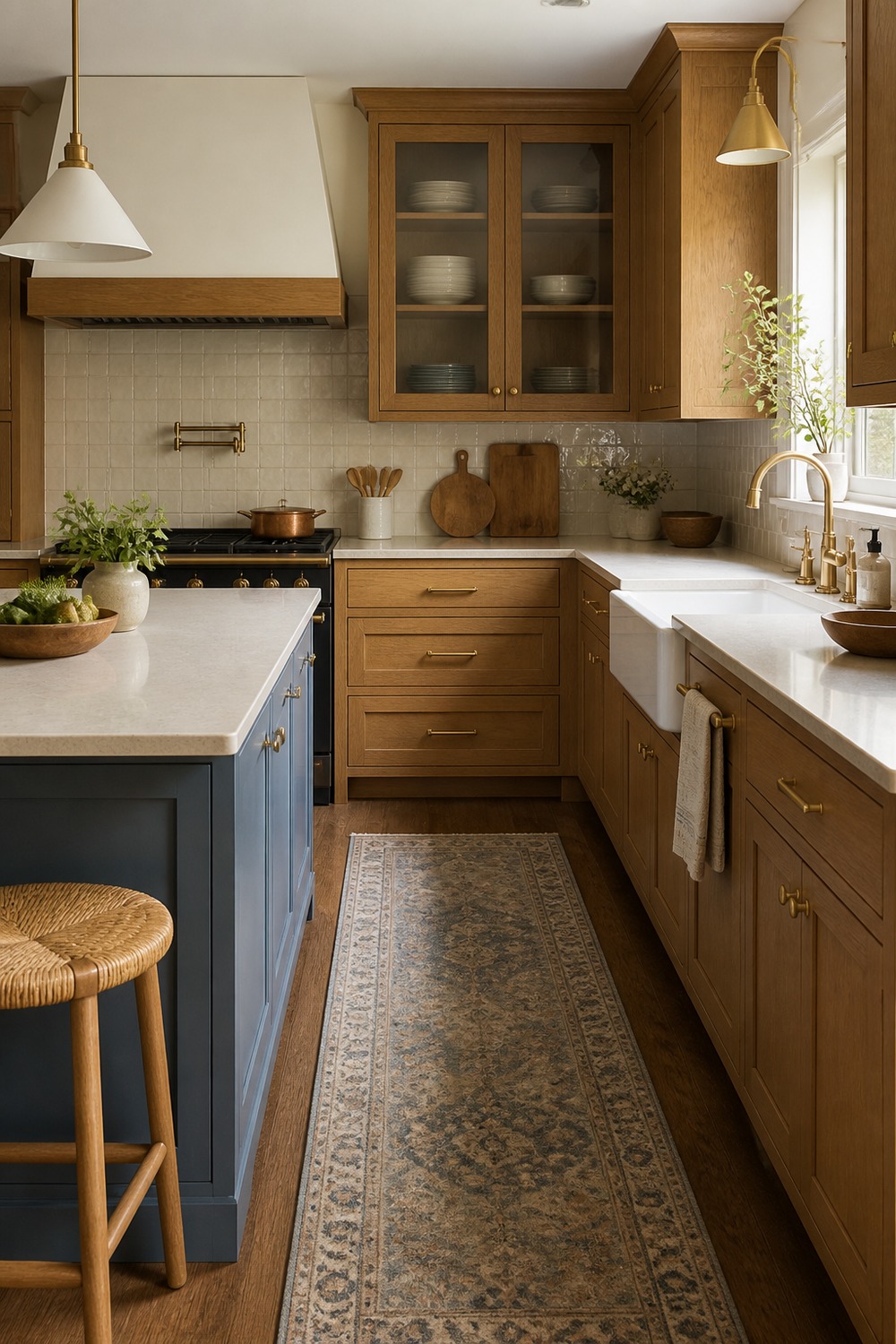
Creamy zellige-style tile works so well with oak because it adds movement without competing with the cabinet grain. I like the slightly imperfect surface here; it gives the kitchen texture, but the palette still feels clean enough for everyday cooking.
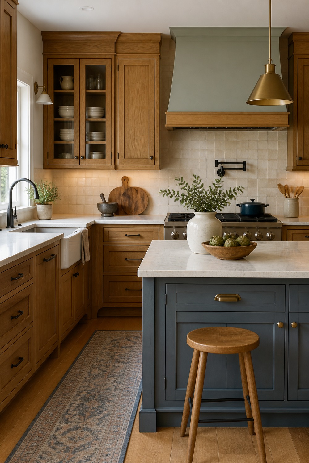
A blue-gray island is a nice middle ground when you want contrast but do not want the room to feel trendy in a loud way. The cooler island color makes the oak look warmer on purpose, and the pale counters keep the whole kitchen from feeling heavy.
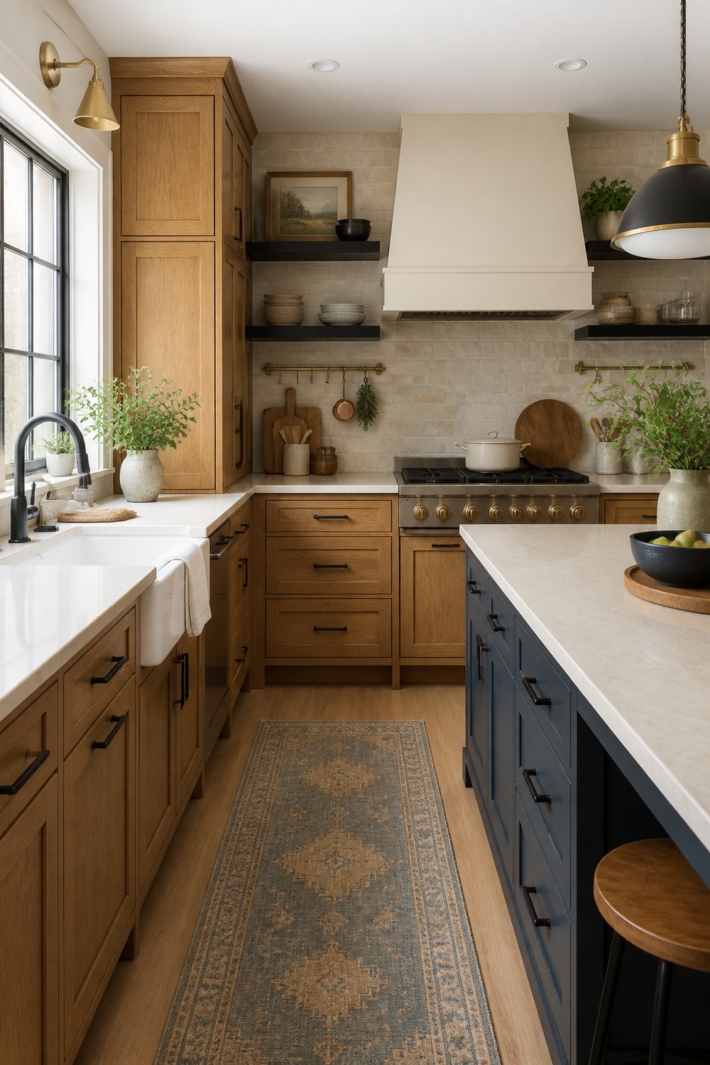
Black accents can make oak cabinets feel sharper almost immediately. The trick is using them in places that already need definition, like hardware, lighting, stools, or a faucet, so the contrast feels useful instead of harsh.
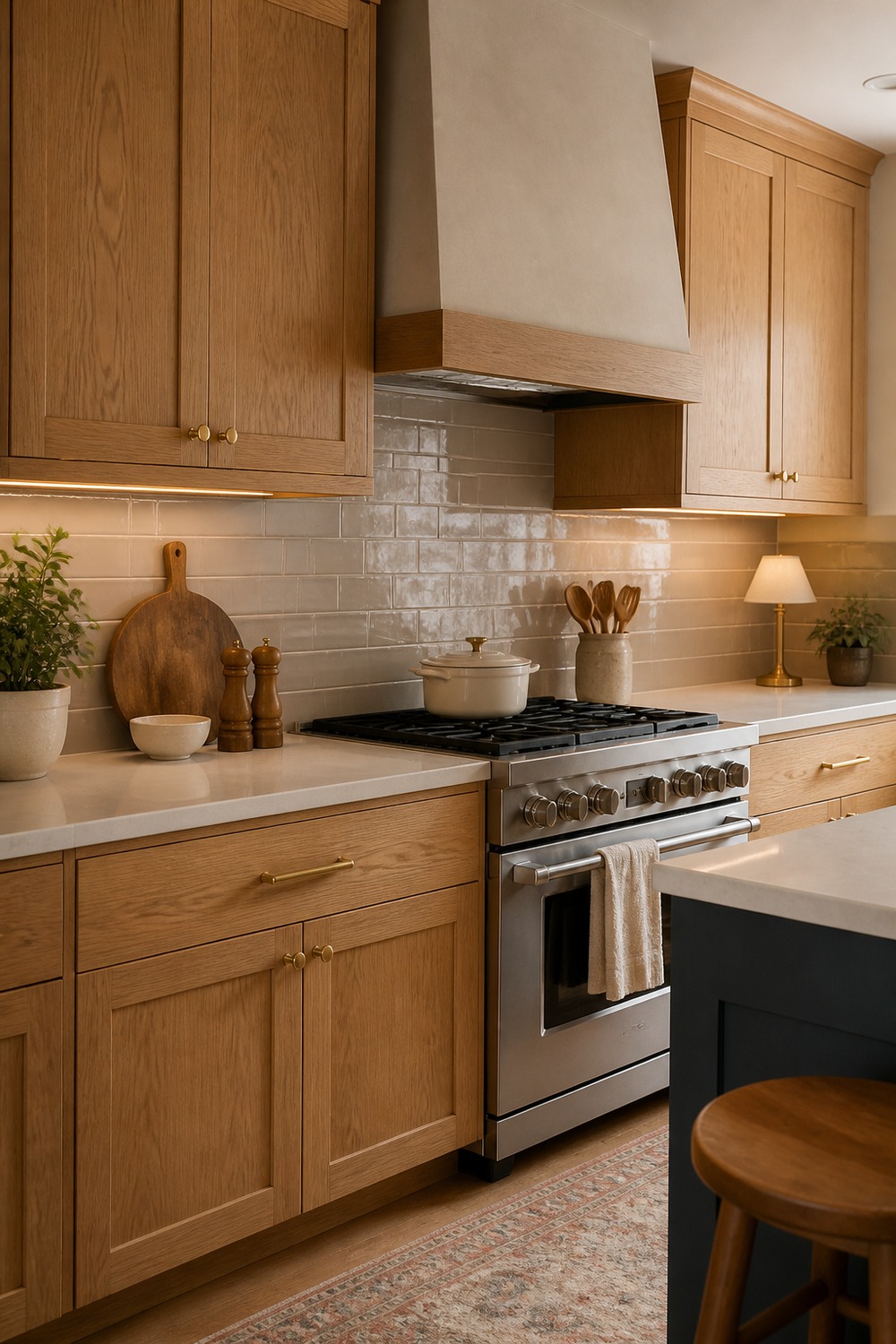
Mushroom taupe is such an underrated partner for oak. It softens the yellow undertone in the cabinets, but it still has enough warmth to feel natural beside wood, especially with a quiet backsplash and uncluttered counters.
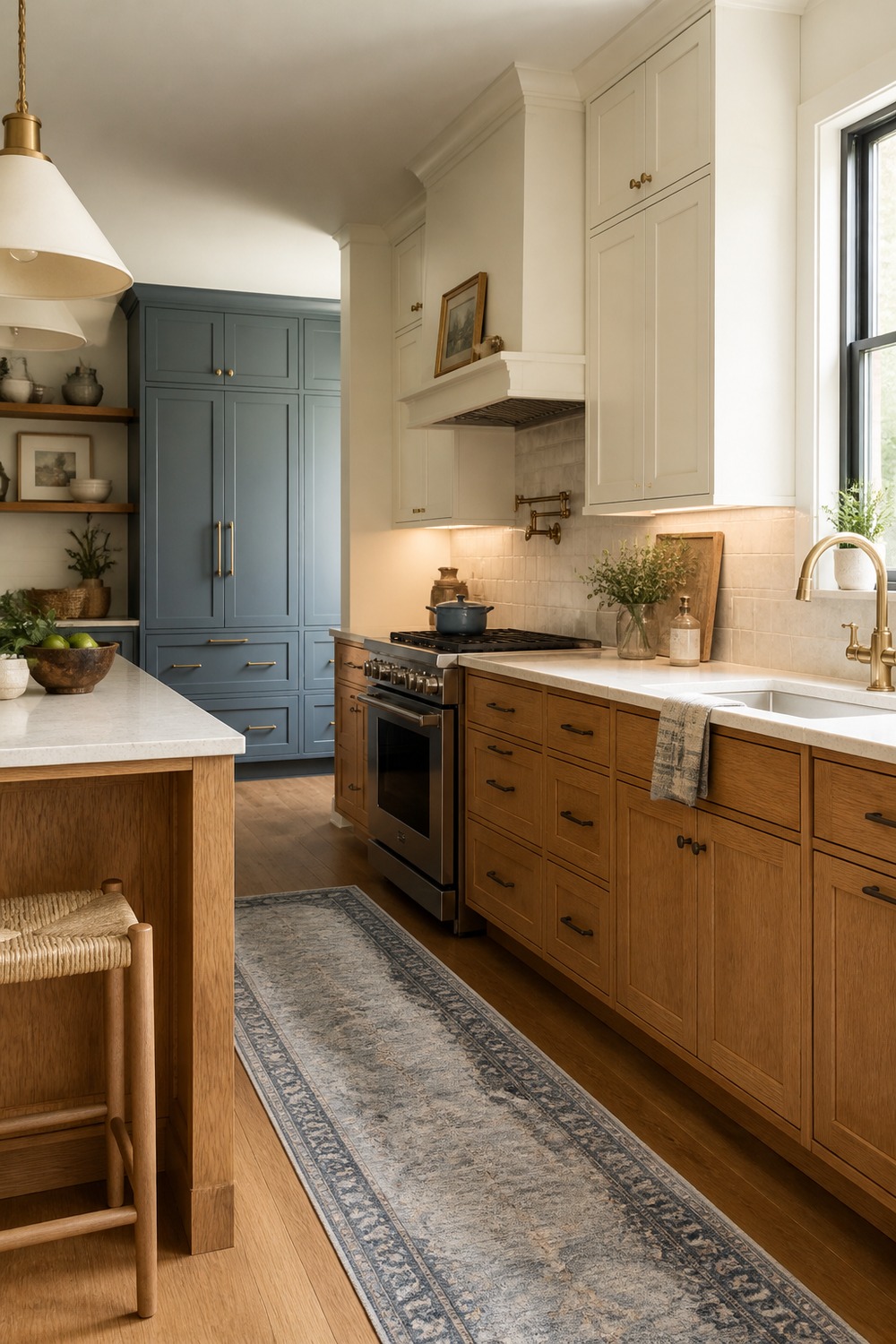
Warm white uppers make this kitchen feel lighter without turning the oak into the odd piece out. I like how the white breaks up the cabinet run, while the lower wood cabinets still bring in that solid, lived-in kitchen feeling.
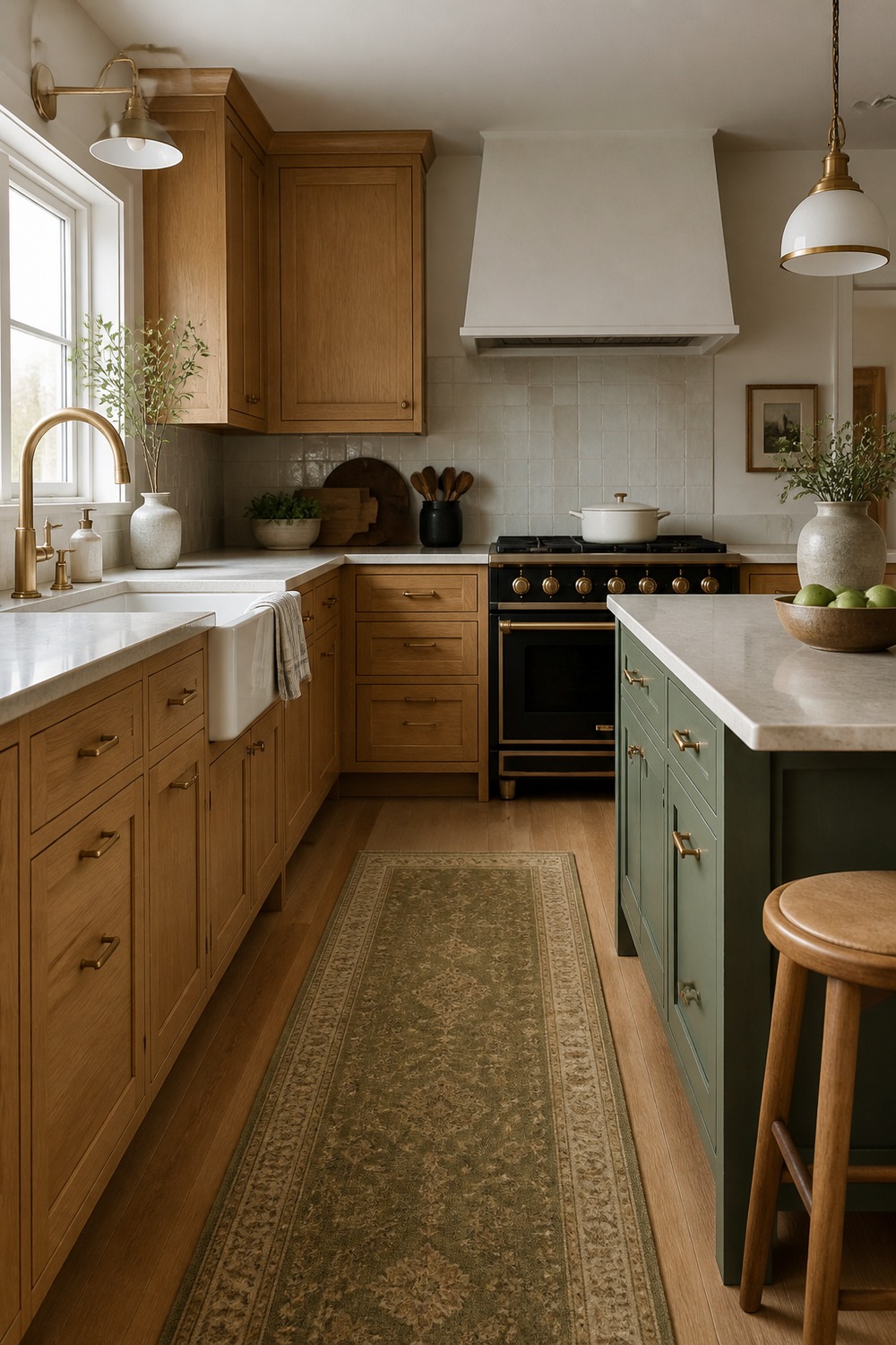
Sometimes the color scheme is not just paint or tile. An olive runner can pull the oak in a fresher direction, add softness underfoot, and make a long cabinet wall feel less flat without changing the actual cabinets at all.
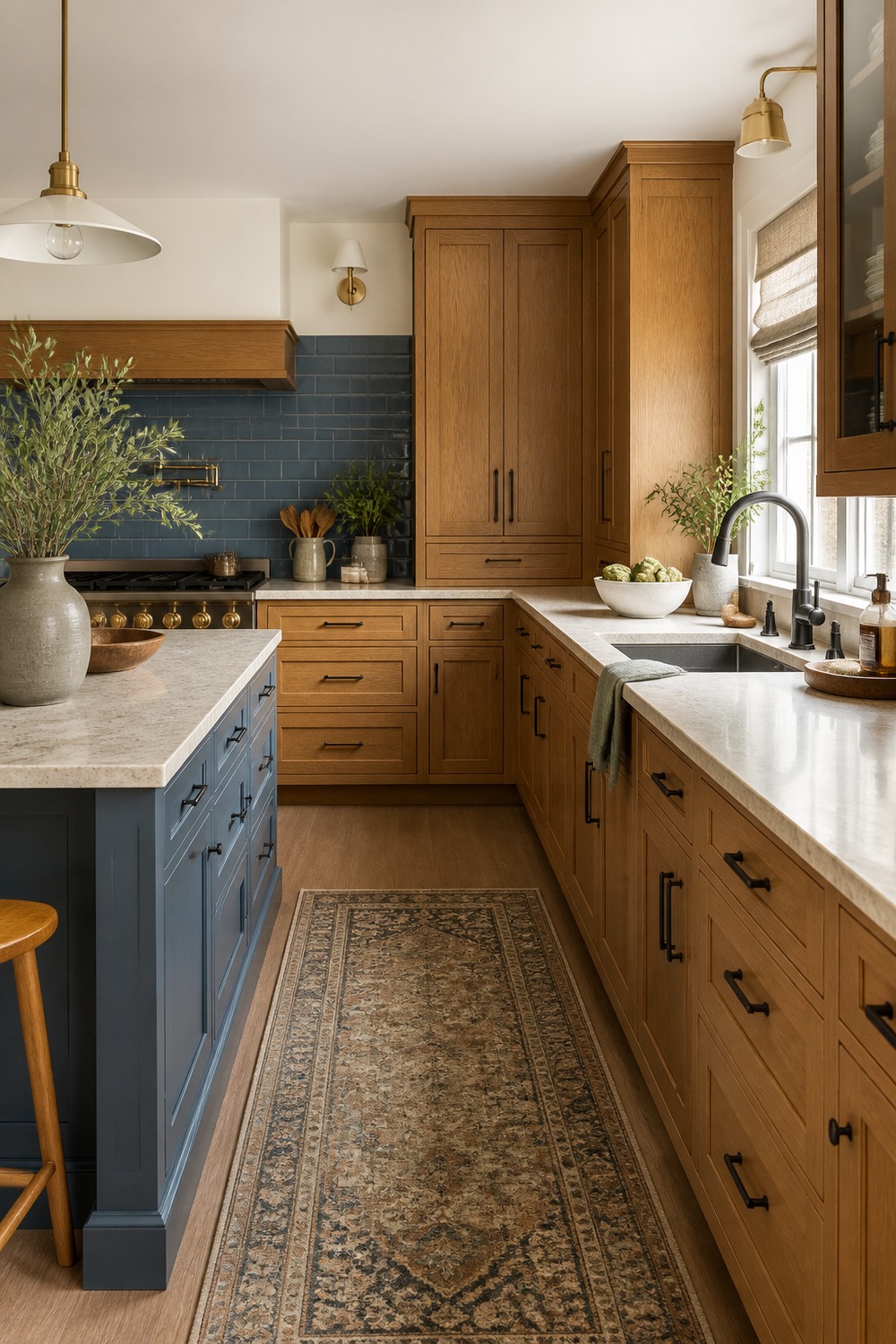
Charcoal hardware gives the cabinets a more grounded edge. It is not as stark as glossy black, but it still adds enough contrast to make the doors, drawers, and warm wood tones look more deliberate.
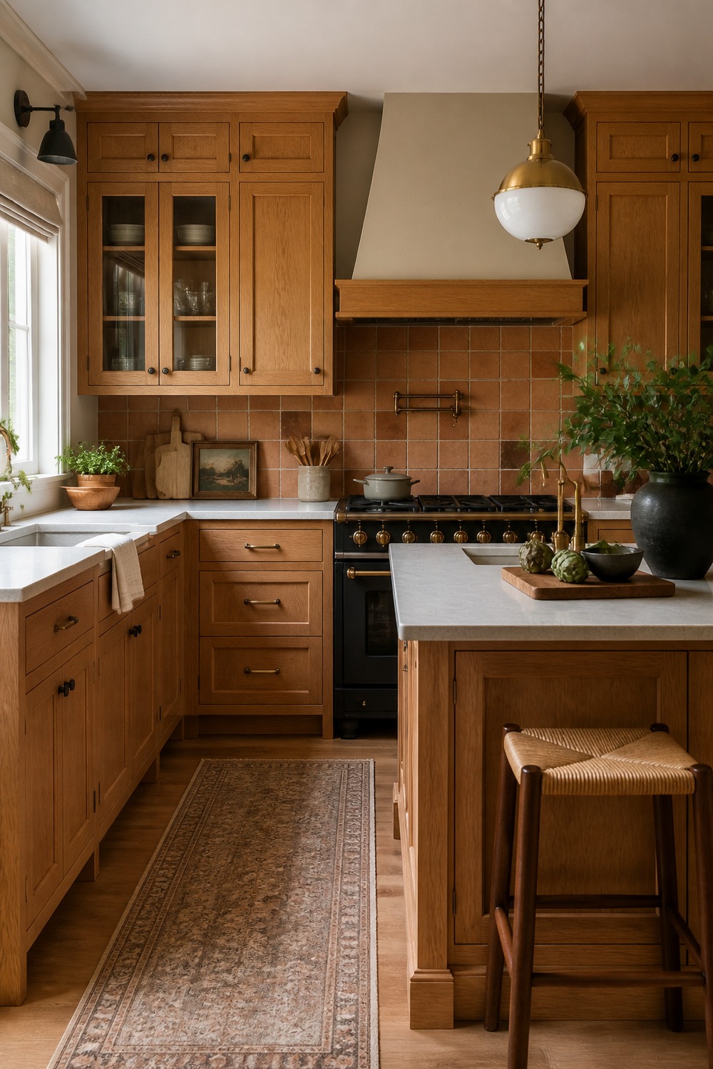
Terracotta tile leans into the warmth of oak instead of fighting it, which can be really pretty when the rest of the room stays restrained. The earthy tile, pale counters, and simple cabinet lines make the palette feel collected rather than orange.
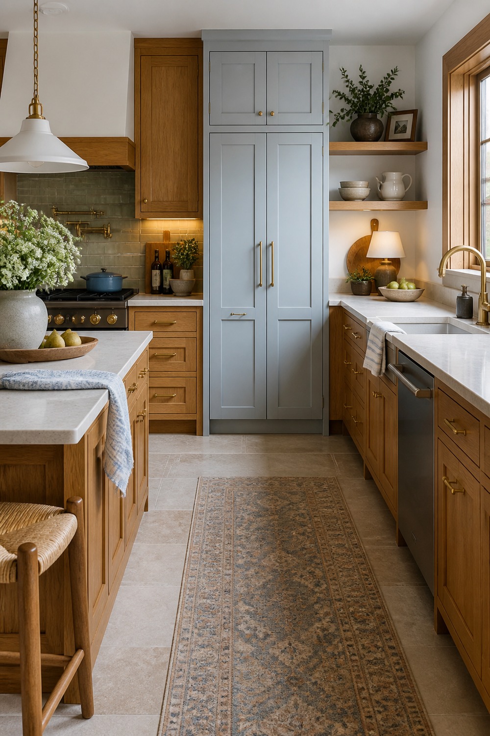
A pale blue pantry wall is a softer way to bring color into an oak kitchen. It gives the eye somewhere to land away from all the wood, but the muted tone still feels gentle enough to sit beside warm cabinets.
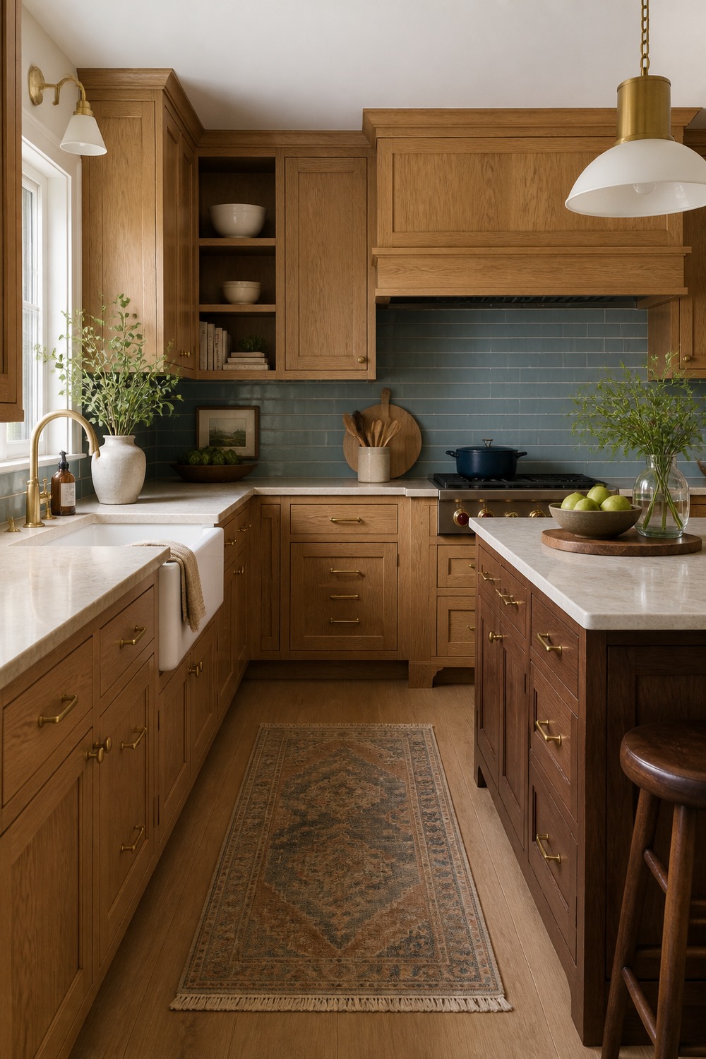
The walnut island deepens the whole room without making the oak cabinets look wrong. Mixing wood tones can feel risky, but here the darker island gives the lighter cabinets more dimension and makes the kitchen look more layered.
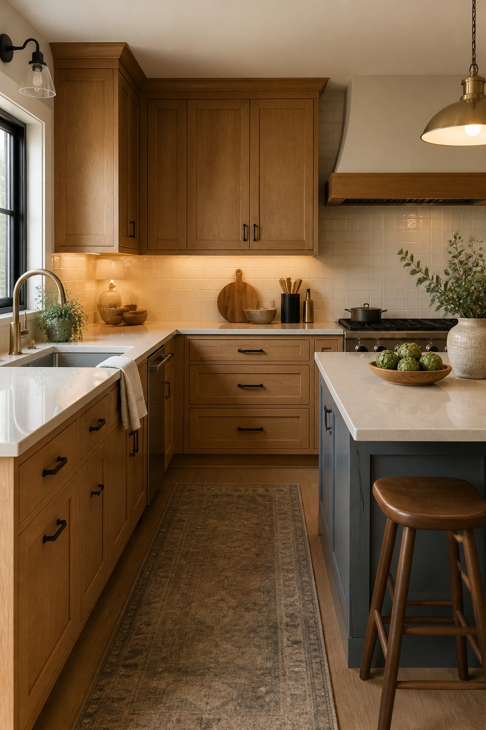
Soft greige walls are good for oak because they calm the background without going icy. This kind of neutral has enough warmth to belong with the cabinets, but enough gray in it to make the room feel a little more current.
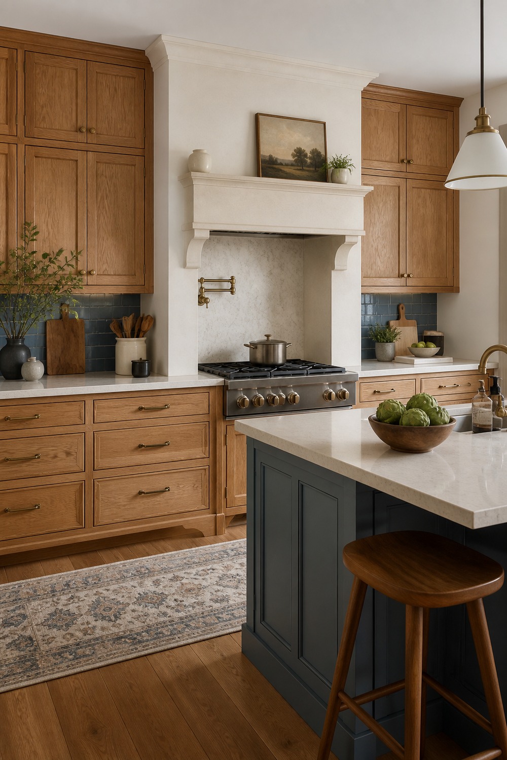
A cream range alcove keeps the warm cabinet palette from feeling too one-note. I like how the lighter cooking zone gives the eye a break, especially in a kitchen where the oak is still the main material.
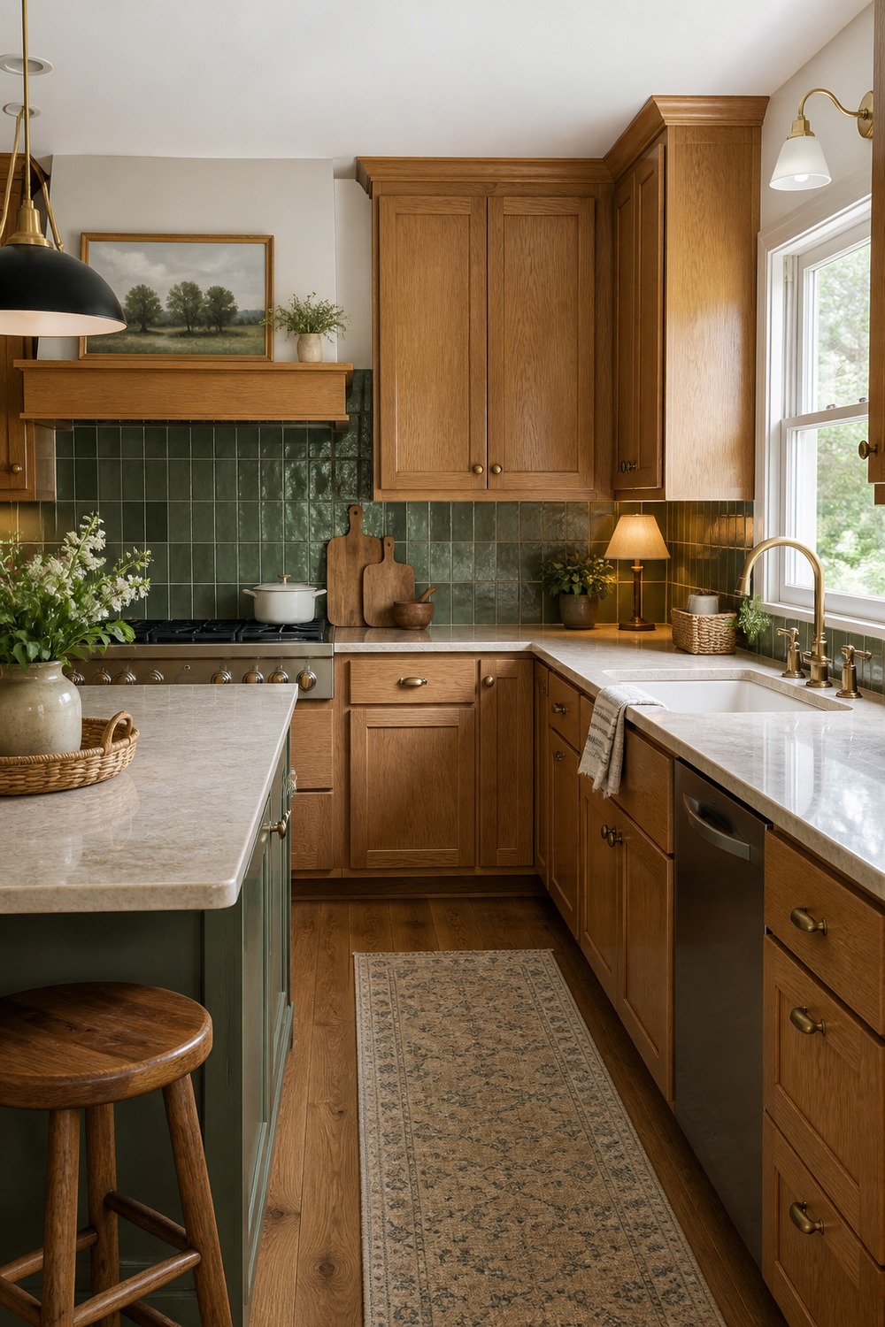
Green tile is a small detail, but it changes the mood of the oak cabinets right away. The color feels fresh against the wood, and using it as a backsplash or accent area keeps the kitchen from becoming too matchy.
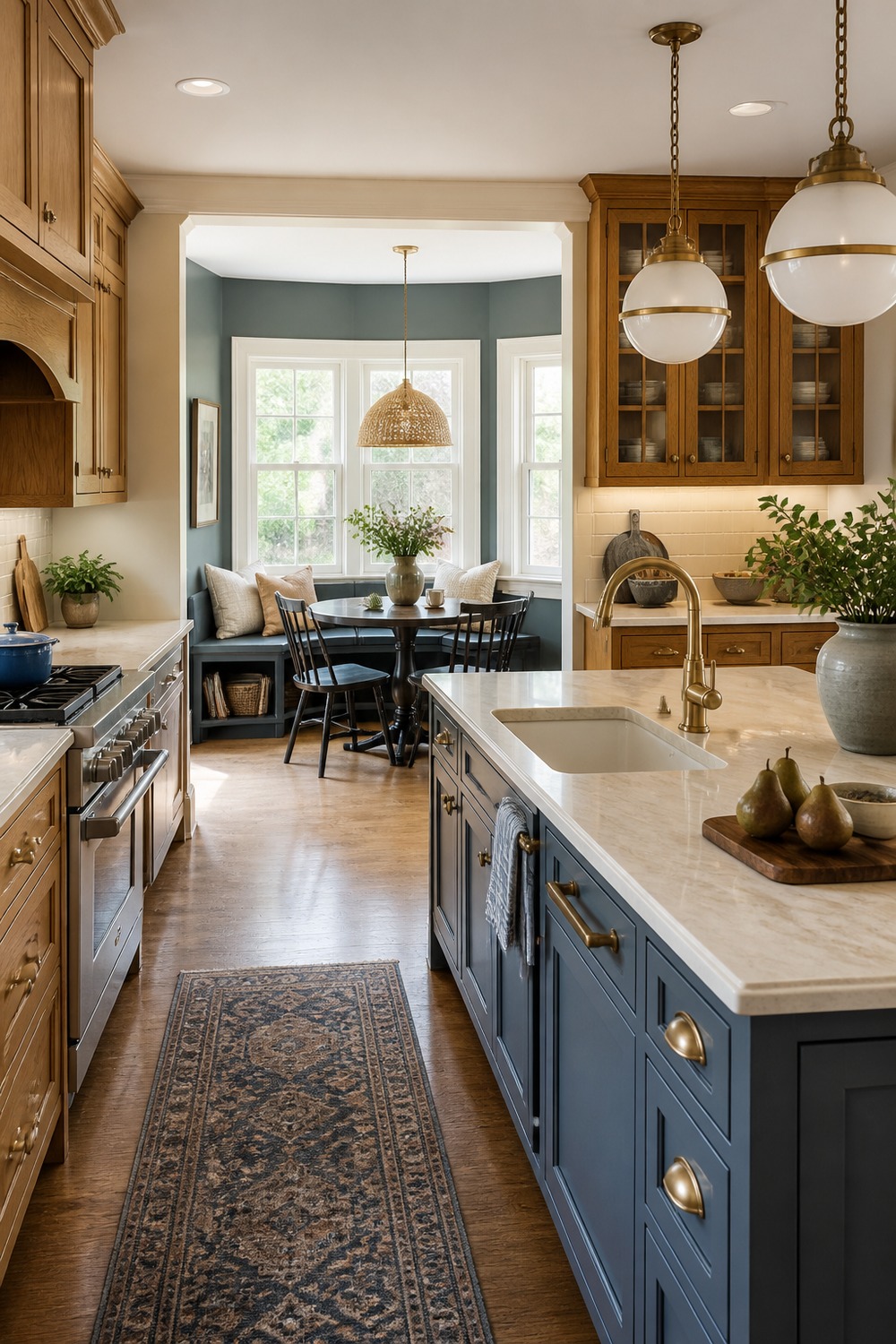
The breakfast nook makes the color scheme feel like it belongs to the whole room, not just the cabinet wall. Soft seating, warm wood, and a quieter wall color help the oak connect to the eating area in a natural way.
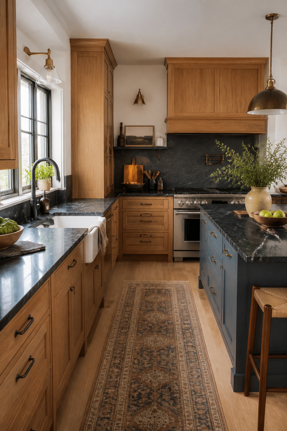
Dark stone counters give oak cabinets a moodier, more finished look. The contrast helps define the work surfaces, while the warm cabinet doors keep the kitchen from feeling too sleek or cold.
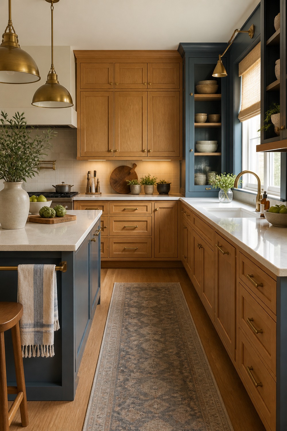
Brass pendants are a good match for oak when they are not too shiny or fussy. They echo the warmth in the wood, add a little polish above the island, and make the cabinet color feel like part of a planned palette.
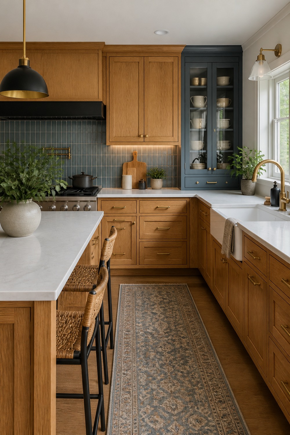
A white quartz island brightens the whole oak kitchen without washing it out. The clean counter surface gives the room a practical prep zone, and the warm cabinet grain keeps the white from feeling sterile.
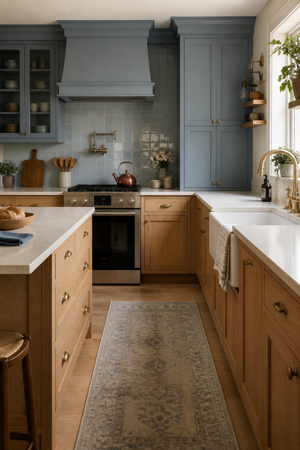
The cottage sink gives this oak kitchen a softer focal point. I like the way the cream sink, simple counters, and warm cabinet doors make the room feel useful and charming without pushing it into a full farmhouse theme.
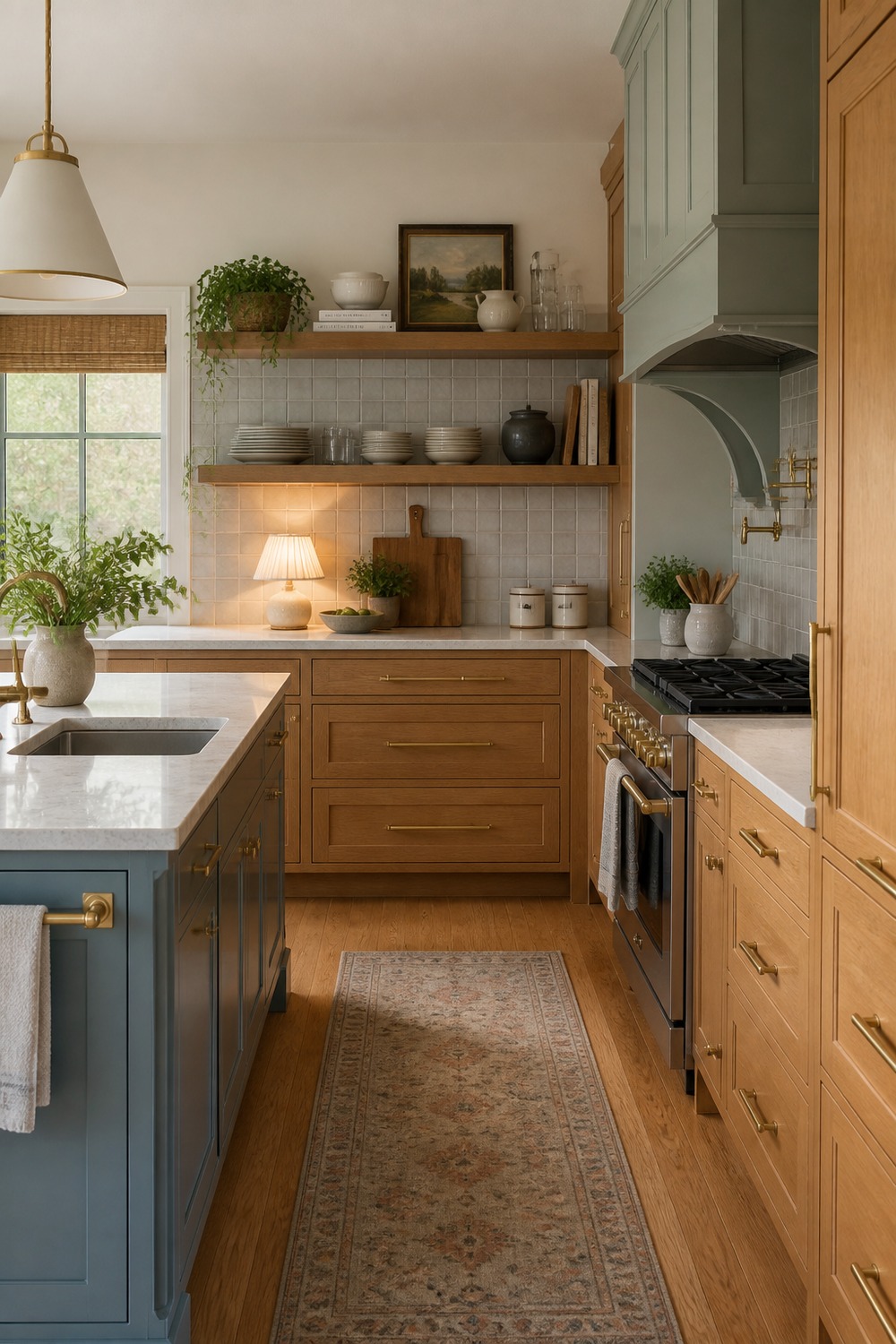
Open shelving can help oak cabinets feel lighter if the colors stay simple. Cream dishes, natural wood, and a few warm metal pieces break up the cabinet wall while still keeping the palette connected.
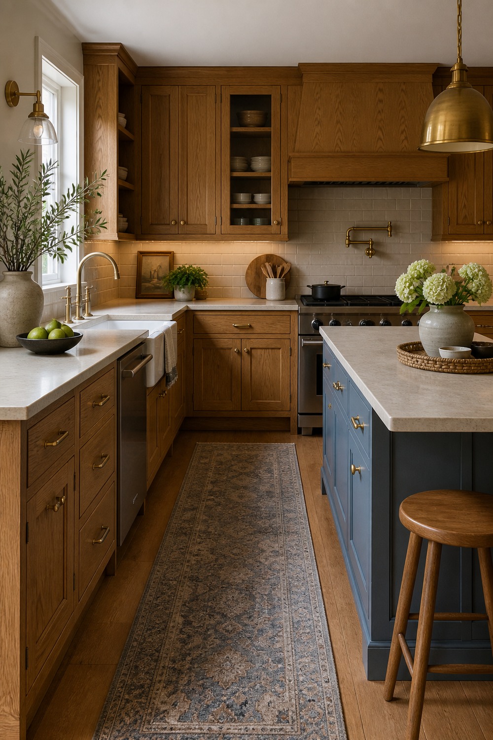
This is the kind of layered oak kitchen that feels settled rather than newly forced. The wood cabinets, warm lighting, soft surfaces, and practical counter zones all work together, so the oak reads intentional instead of leftover.
The easiest oak-cabinet palettes usually give the wood a few good partners instead of pretending it is not there. Soft greens, creamy tile, black details, brass, stone counters, and warmer rugs can all make the cabinets feel like part of the plan.

I work in tech, but my taste in design is straight out of a slow European village. Give me arches, aged brass, and a room that smells like books and coffee. That’s my kind of home.