A neutral kitchen still has to handle crumbs, dishes by the sink, stools pulled out, and the one mug that never makes it to the dishwasher. The best palettes feel calm because the textures are doing the work, not because the room looks untouched.
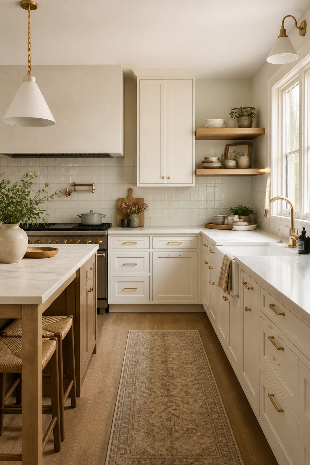
Warm white cabinets can go flat quickly, but the open oak shelves give this kitchen a little breathing room. I like the way the brass pulls, pale stone, and everyday bowls make the palette feel collected instead of washed out.
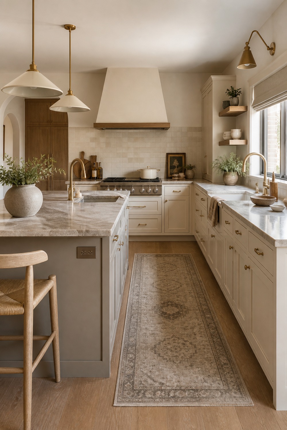
That soft greige island is doing the heavy lifting here. It breaks up the cream cabinets without feeling harsh, and the pale oak stools make the whole room feel like a place where breakfast actually happens.
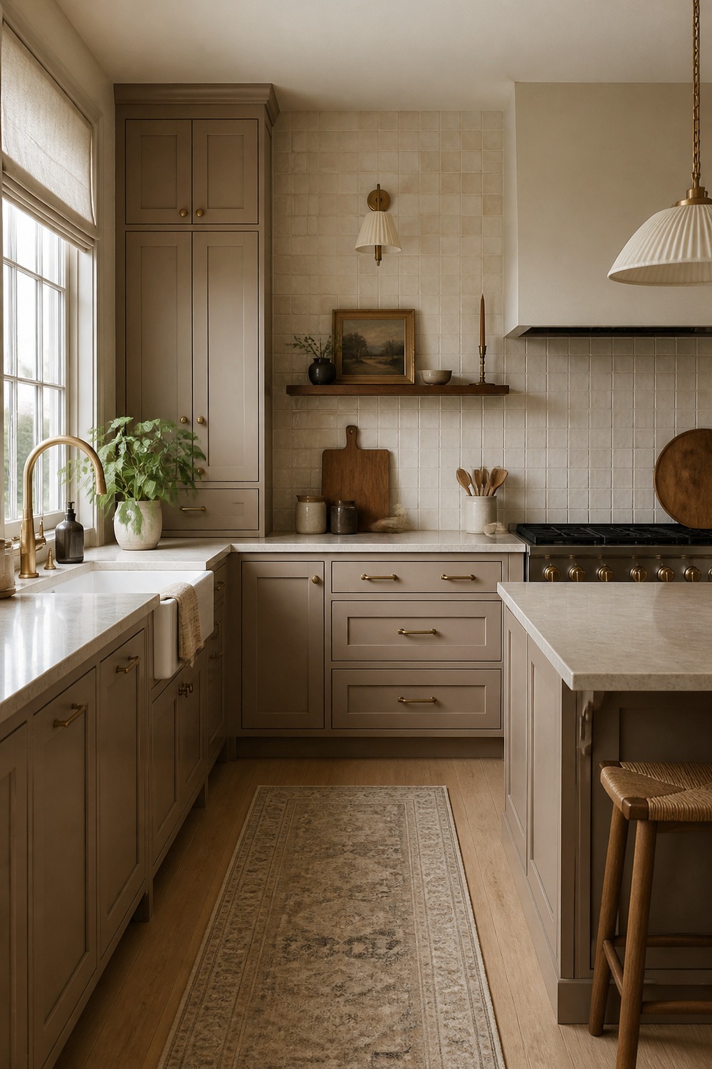
Mushroom taupe is one of those neutrals that feels quieter than gray but less plain than beige. The handmade tile and stone counter give this setup enough texture that the cabinets still feel interesting in daylight.
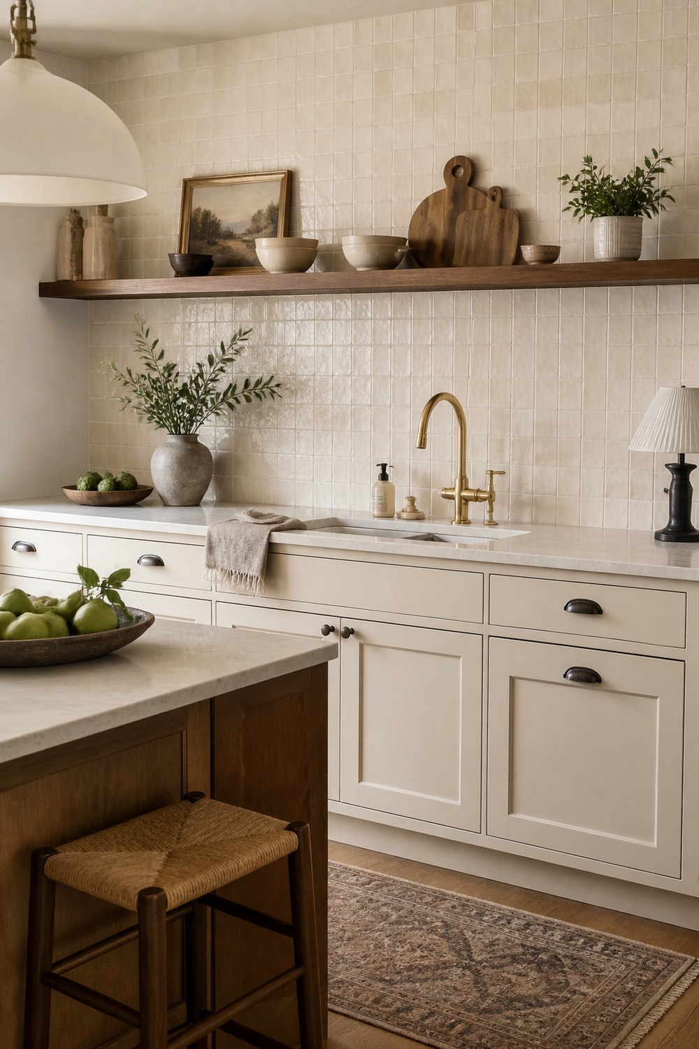
The zellige backsplash keeps this from looking too perfect, which is exactly why it works. A little uneven shine behind the sink makes the warm white cabinets feel softer and more lived-in.
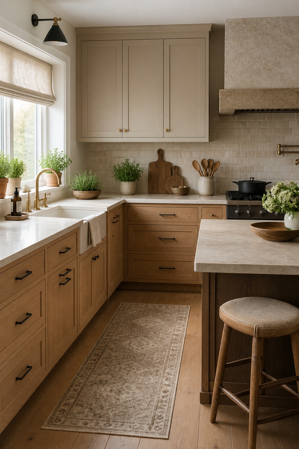
This corner has a really gentle mix of wood and linen tones. The lower drawers feel sturdy and practical, while the pale uppers keep the room bright enough for a smaller kitchen or darker side wall.
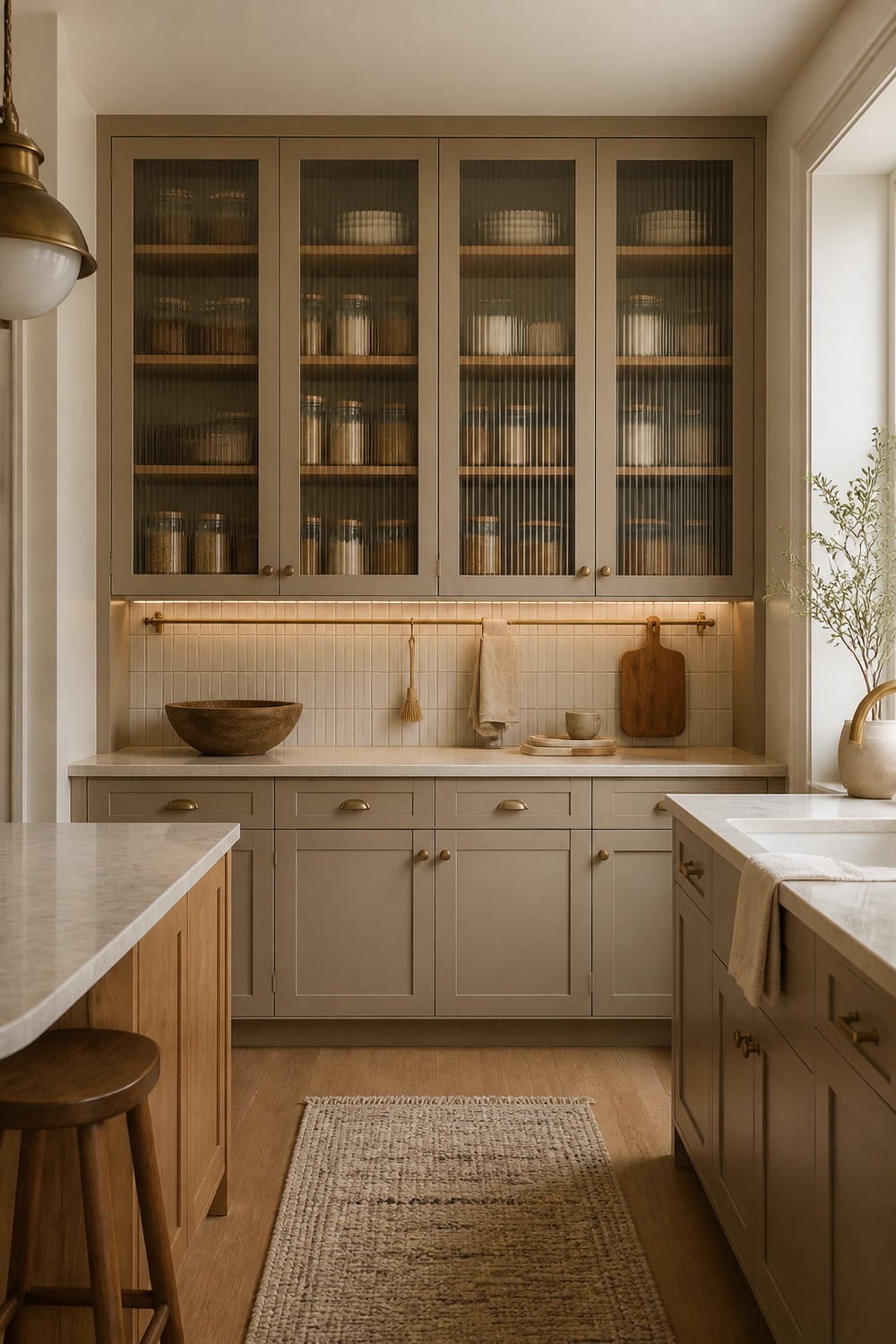
Ribbed glass is such a good trick in a neutral kitchen because it hides just enough. The taupe pantry wall still feels organized, but it does not have that stiff everything-on-display feeling.
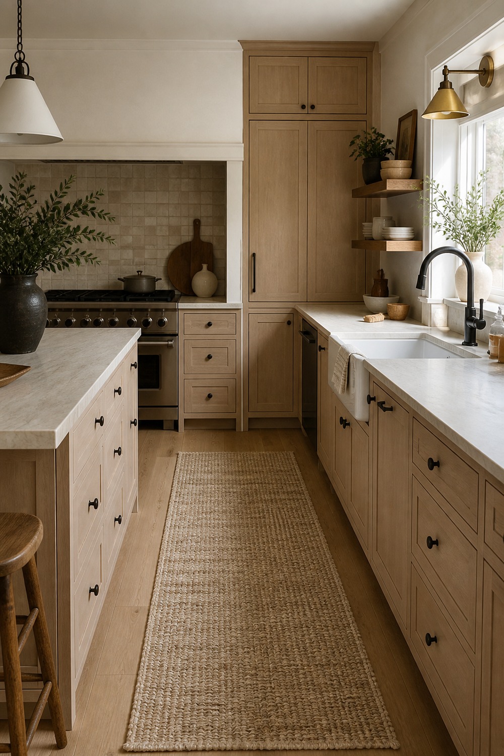
The woven runner adds the kind of texture a neutral kitchen usually needs near the floor. I like how the pale oak, cream stone, and darker hardware make the walkway feel finished without adding loud color.
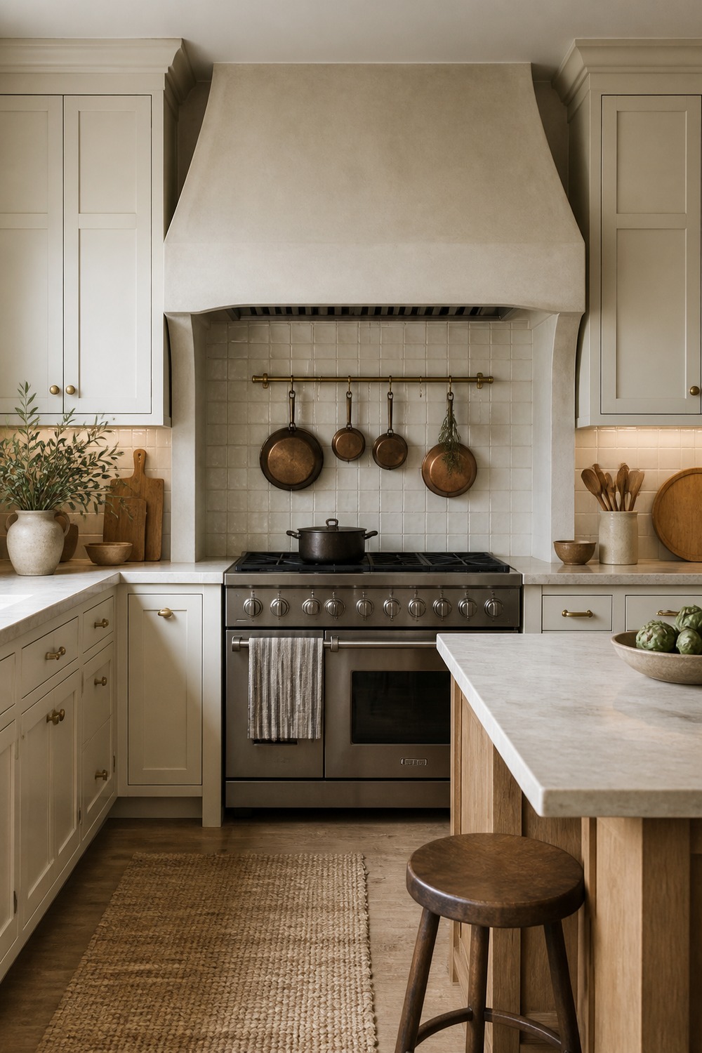
A plaster range alcove makes the whole wall feel softer than a standard hood. The pot rail and blank cookware add a useful everyday layer, so the warm white cabinets do not have to carry the whole room alone.
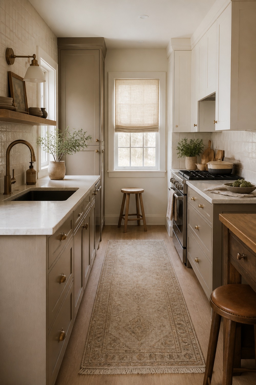
A small galley kitchen needs contrast even more than a big one. The greige lowers give the narrow space some grounding, while the warm uppers keep it from feeling boxed in.
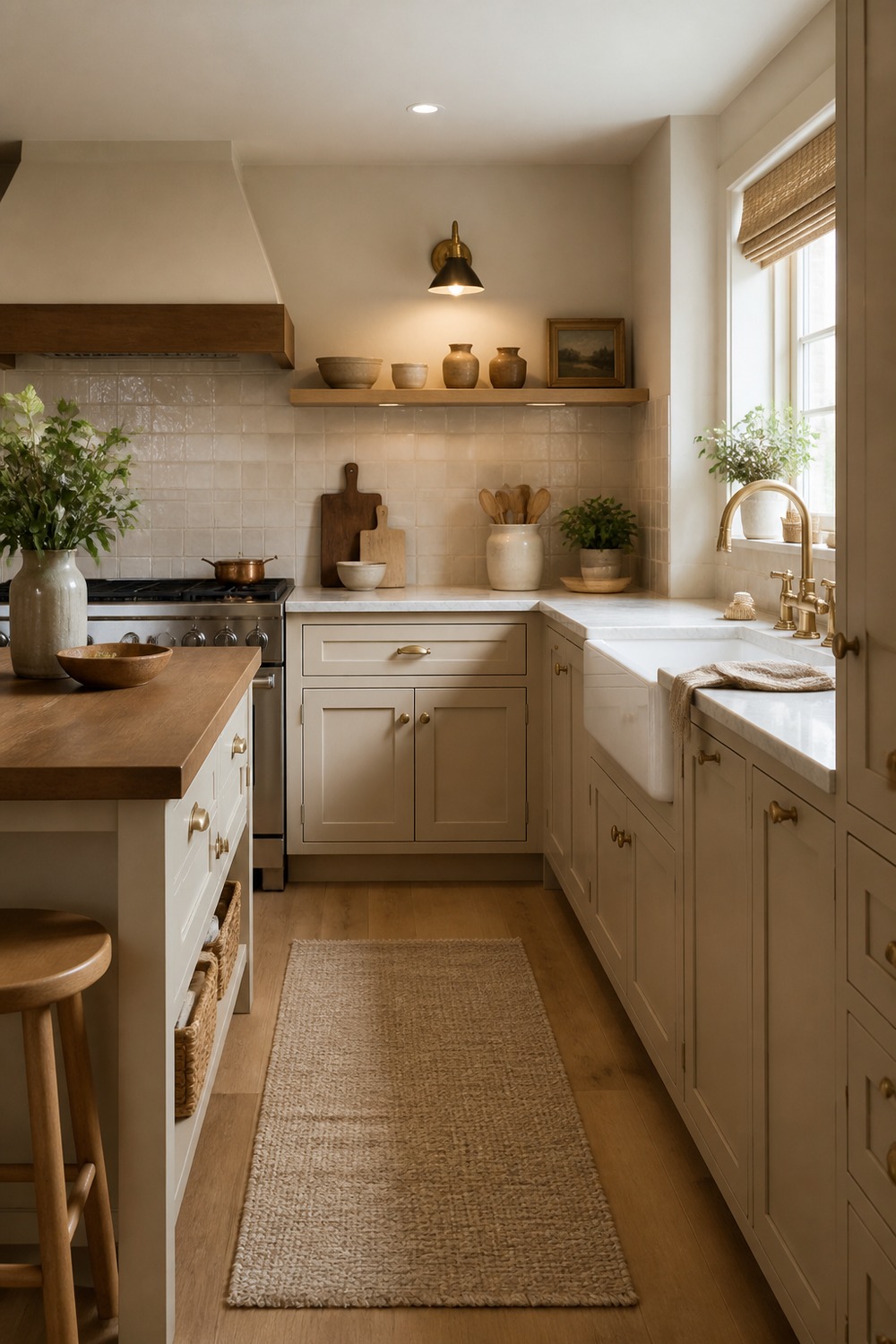
The sand beige cabinets feel cottage-like without going overly sweet. The apron-front sink, woven shade, and simple counter space make this palette feel easy to live with on a normal weekday.
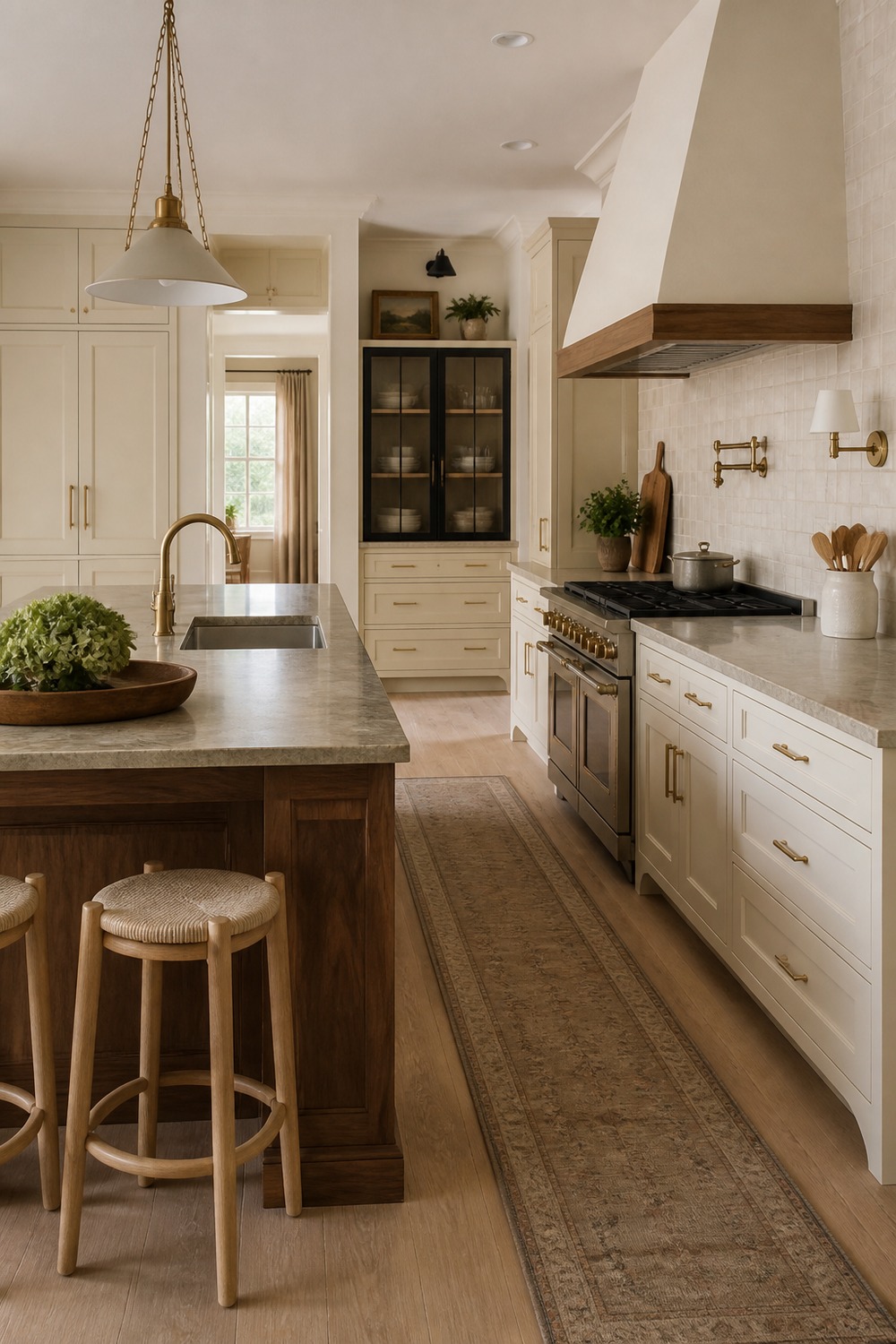
The walnut island adds just enough depth to all the cream around it. This is a nice example of using one darker wood moment so the room feels layered instead of turning every surface the same tone.
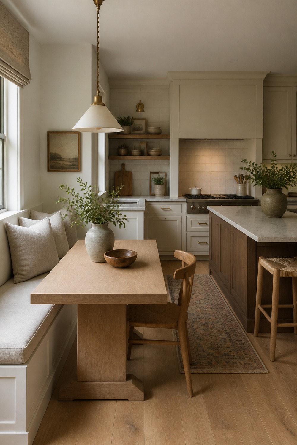
The built-in breakfast nook makes the neutral palette feel more personal. A linen bench cushion, oak table, and soft wall color turn the kitchen edge into a real sitting spot, not just leftover space.
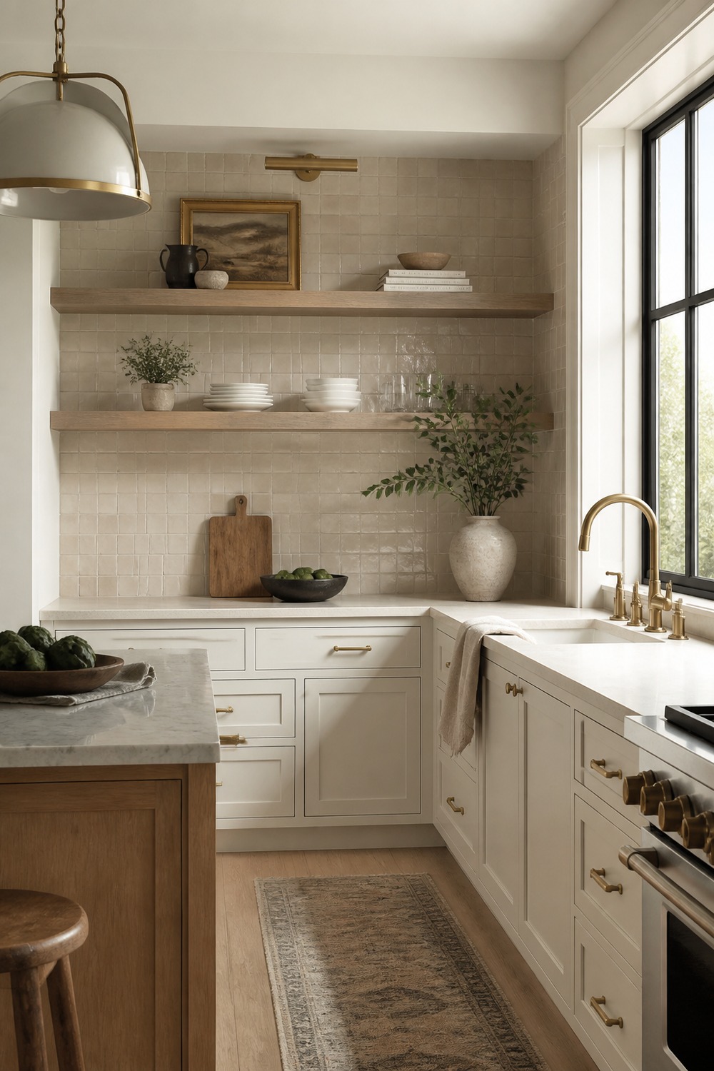
Matte beige tile gives this kitchen a quieter texture than glossy subway tile would. The white cabinets still feel clean, but the backsplash keeps the whole wall from looking too sharp or cold.
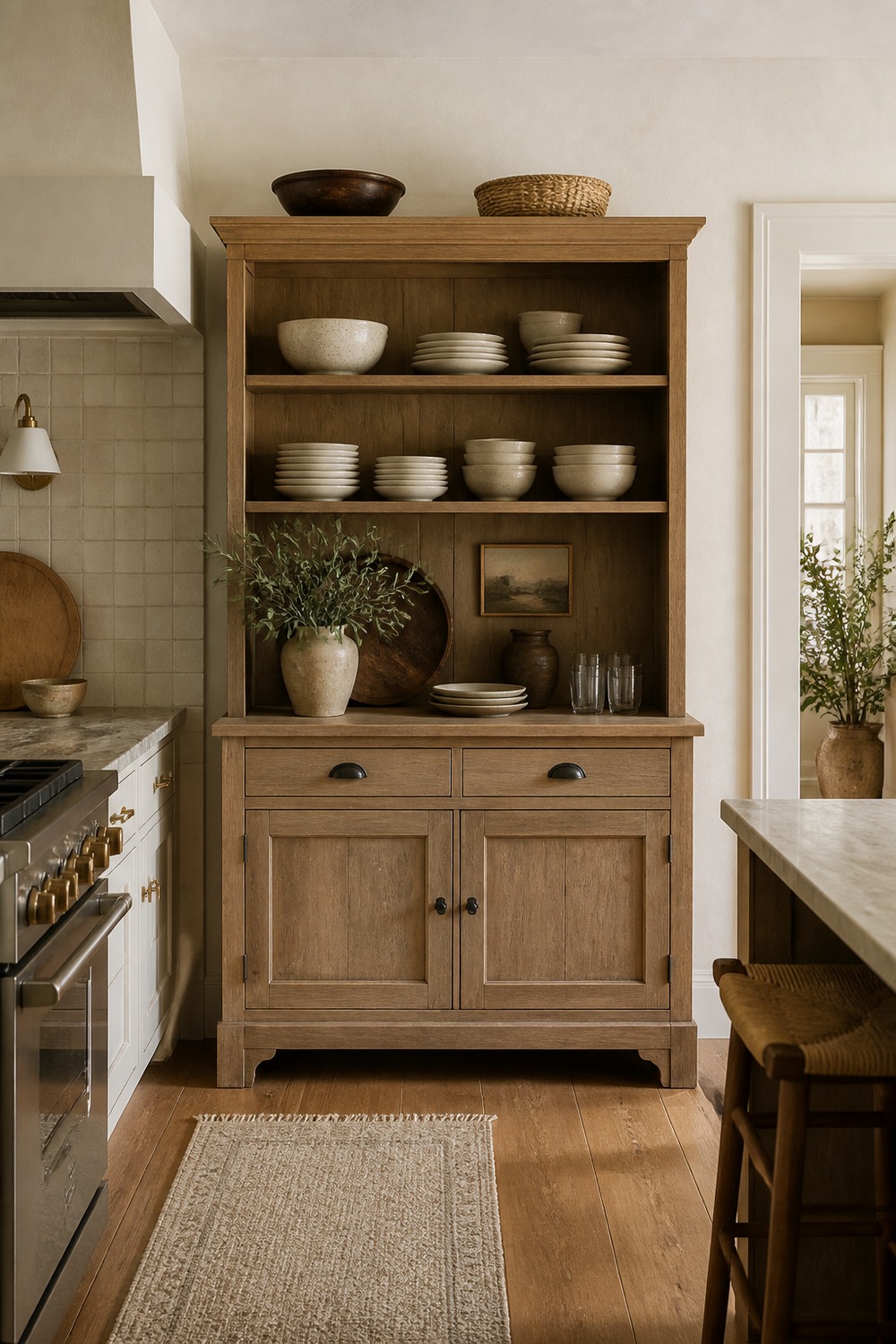
A hutch is a great way to make neutral kitchen storage feel less builder-basic. The cream dishes, plaster wall, and warm wood details make the storage useful while still looking like part of the room.
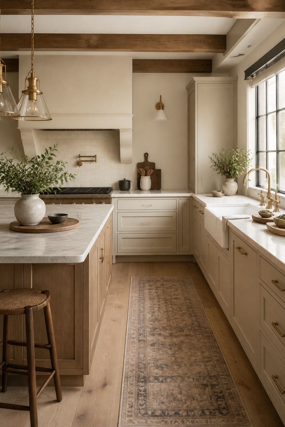
The ceiling beams bring the warmest note into this kitchen. They make the cream cabinets and stone counters feel more grounded, especially with the brass lights pulling a little glow over the work areas.
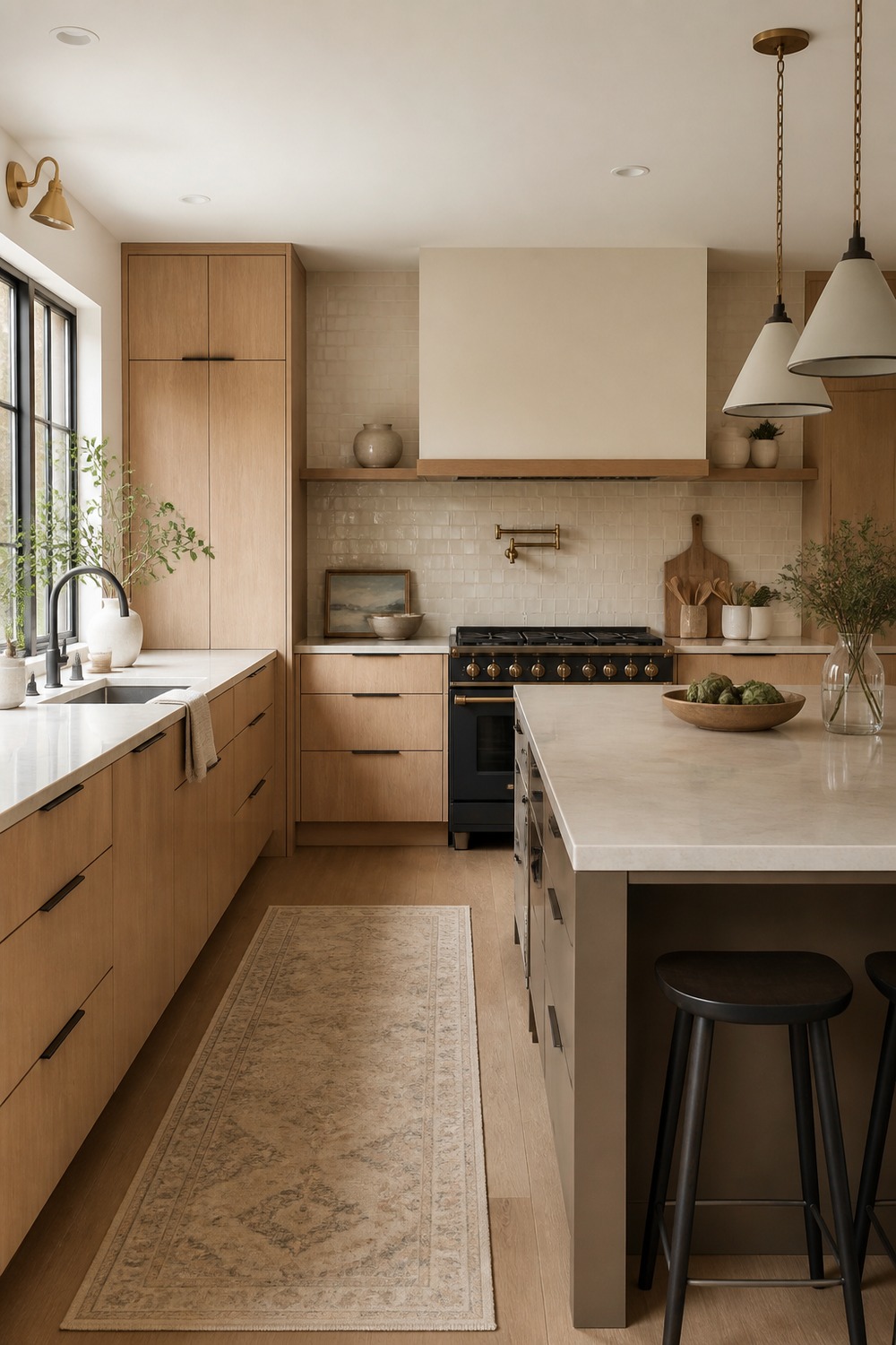
This is the cleaner, more modern side of neutral kitchen color schemes. The flat oak panels and taupe island keep the lines simple, but the cream waterfall counter stops it from feeling too severe.
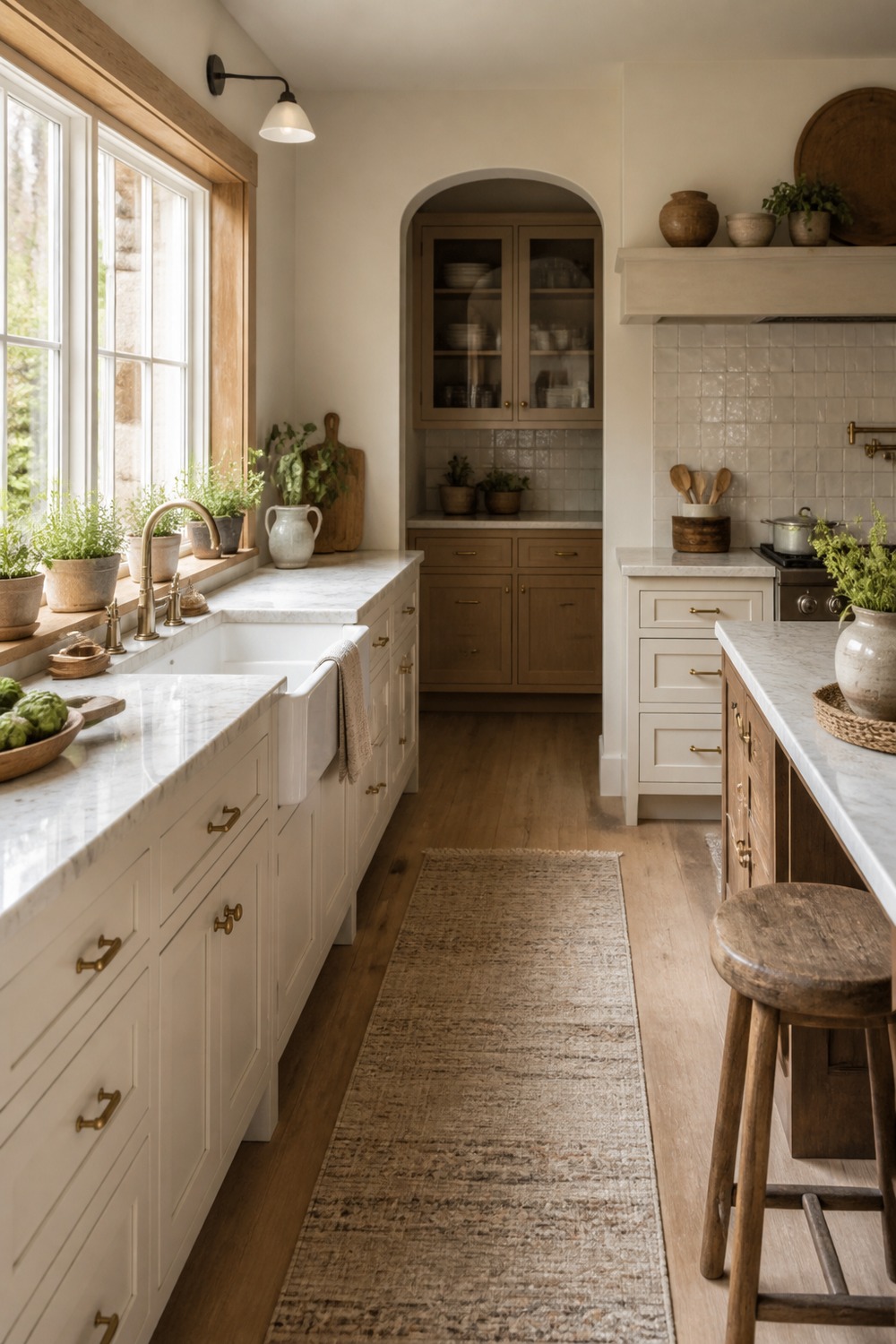
A bright sink wall always makes neutrals look better because the light changes every surface. The oak sill, cream walls, and warm white lowers give this spot a calm morning-kitchen feeling.
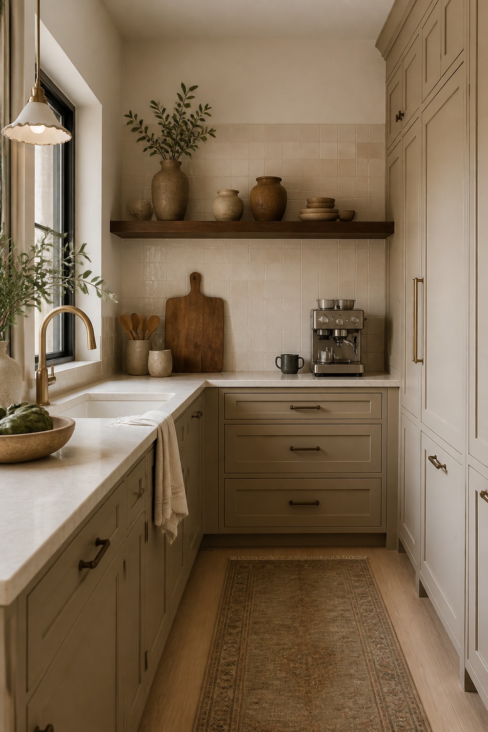
This prep corner feels small but useful, which I always appreciate. The walnut shelf, cream counter, and tucked-away appliance make the neutral palette feel practical instead of just decorative.
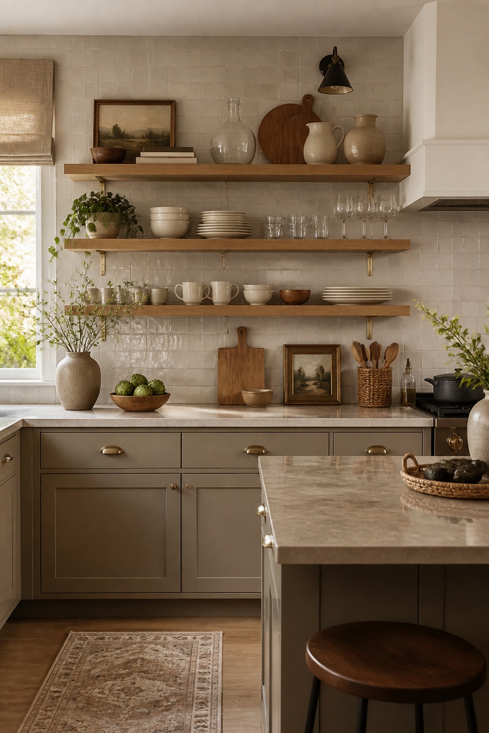
Open shelves can look cluttered fast, but this wall keeps the pieces simple. The greige base cabinet, oak shelves, baskets, and cream dishes give the kitchen storage without making the palette busy.
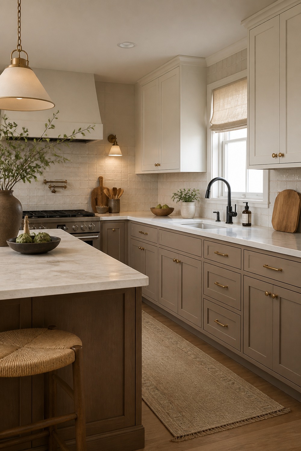
The black accents sharpen the taupe and white without taking over the room. It is a good reminder that neutral does not have to mean soft everywhere; a few dark details can make the whole scheme look more intentional.
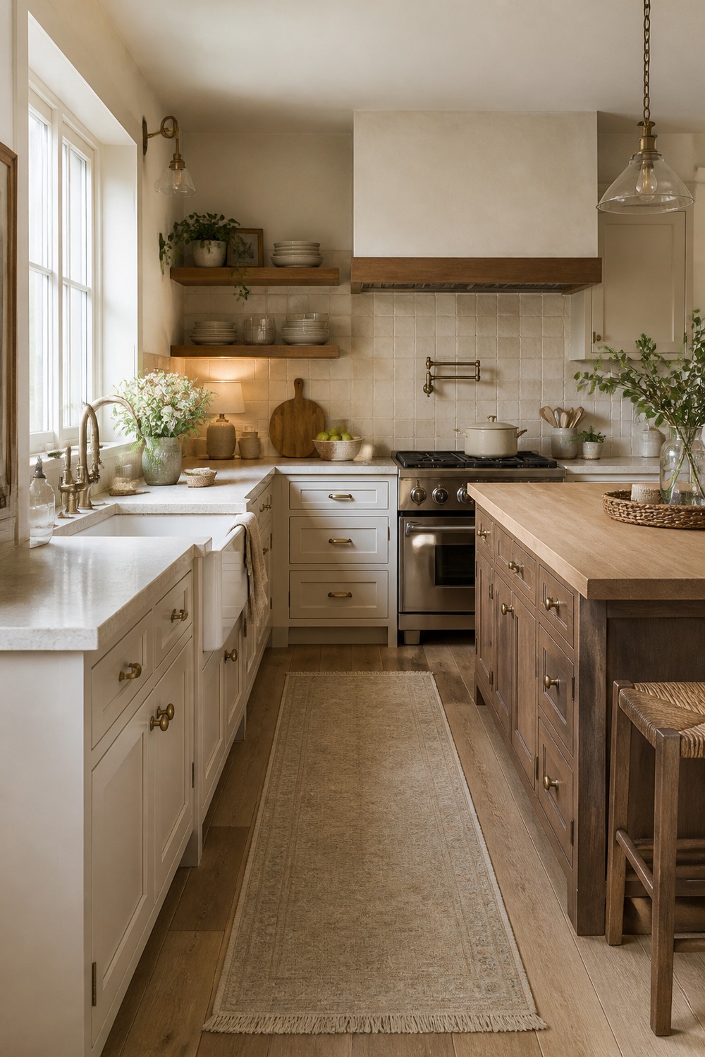
This farmhouse kitchen feels collected because the finishes are not fighting each other. The oak shelves, apron sink, cream stone, and warm cabinet color all feel calm, but there is still enough texture for the room to feel used.
Neutral kitchen color schemes work best when the room has real texture to lean on. Cabinets, counters, tile, hardware, wood tones, rugs, and lighting all help the palette feel layered instead of flat.

I work in tech, but my taste in design is straight out of a slow European village. Give me arches, aged brass, and a room that smells like books and coffee. That’s my kind of home.