Modern kitchens lose me when everything turns into the same white slab and one sad stool. I want color schemes that still feel clean, but with stronger cabinets, stone, hardware, and contrast doing some actual work.
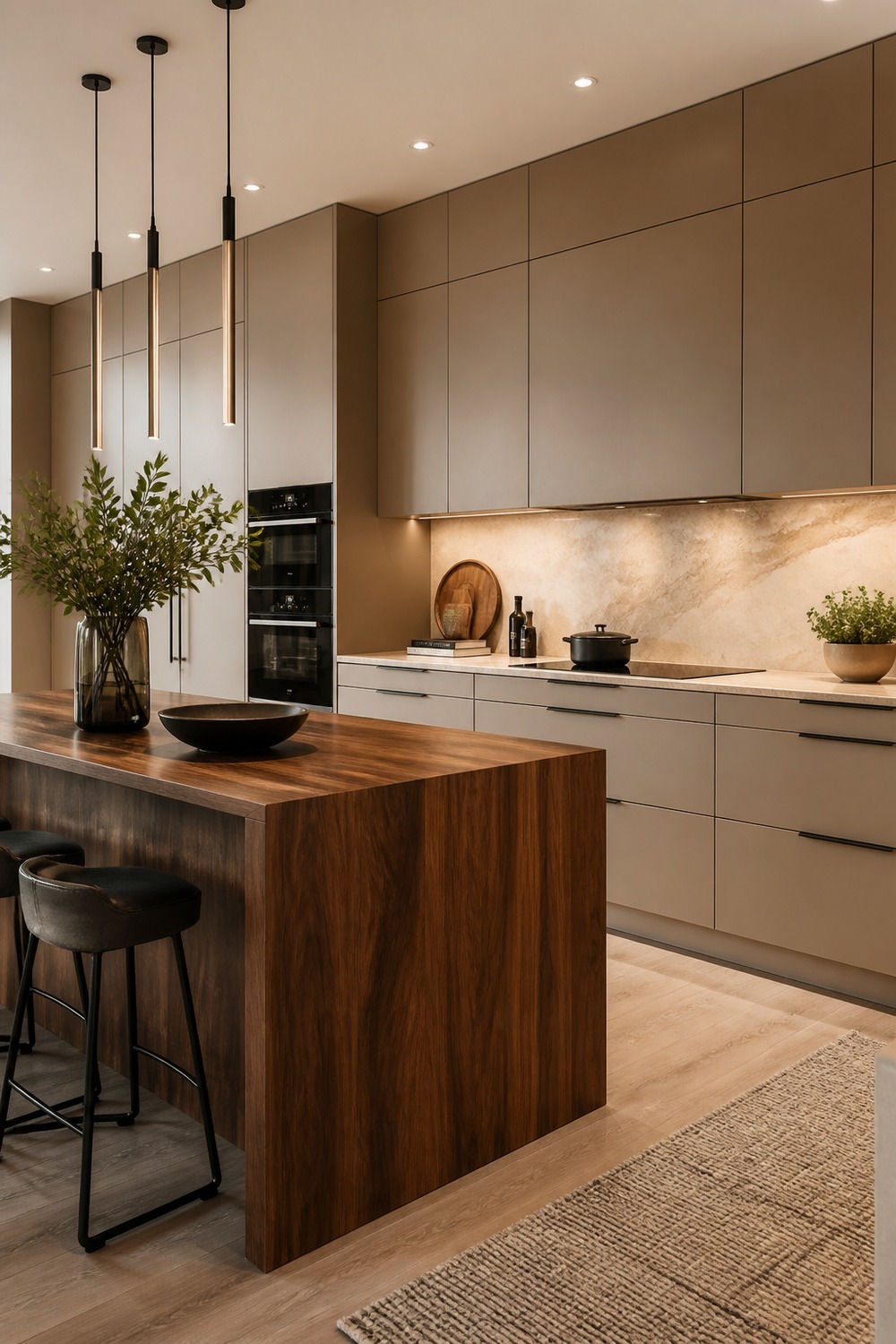
The warm greige slab kitchen with walnut island is stronger than a plain white modern kitchen because the color has a job. The warm greige slab-front cabinets sets the main mood, while the waterfall walnut island and creamy quartzite backsplash keep the clean lines from feeling empty.
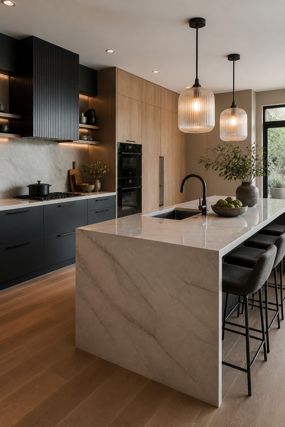
This palette feels modern without going cold. I like how the matte charcoal lower cabinets gives the room structure, then the white oak tall pantry wall adds enough texture that the counters still feel useful for real cooking.
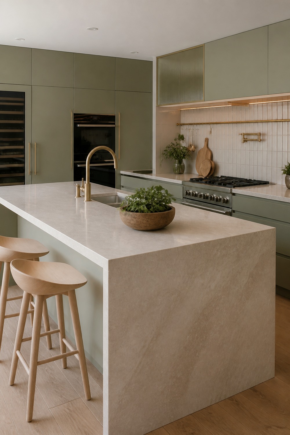
A color scheme like this works because it does not depend on one safe neutral. The muted sage flat-panel cabinets, honed limestone counters, and pale oak stools make the kitchen feel designed, but not too precious to use every day.
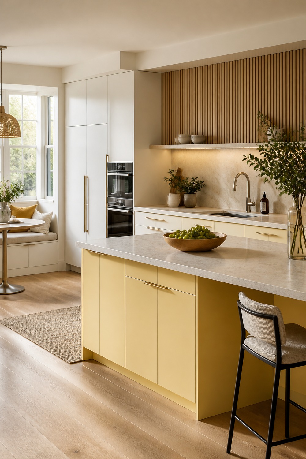
The best detail here is how the modern shapes stay simple while the finishes carry the personality. The warm white perimeter cabinets catches the eye first, and the fluted oak accents gives the whole kitchen a cleaner edge.
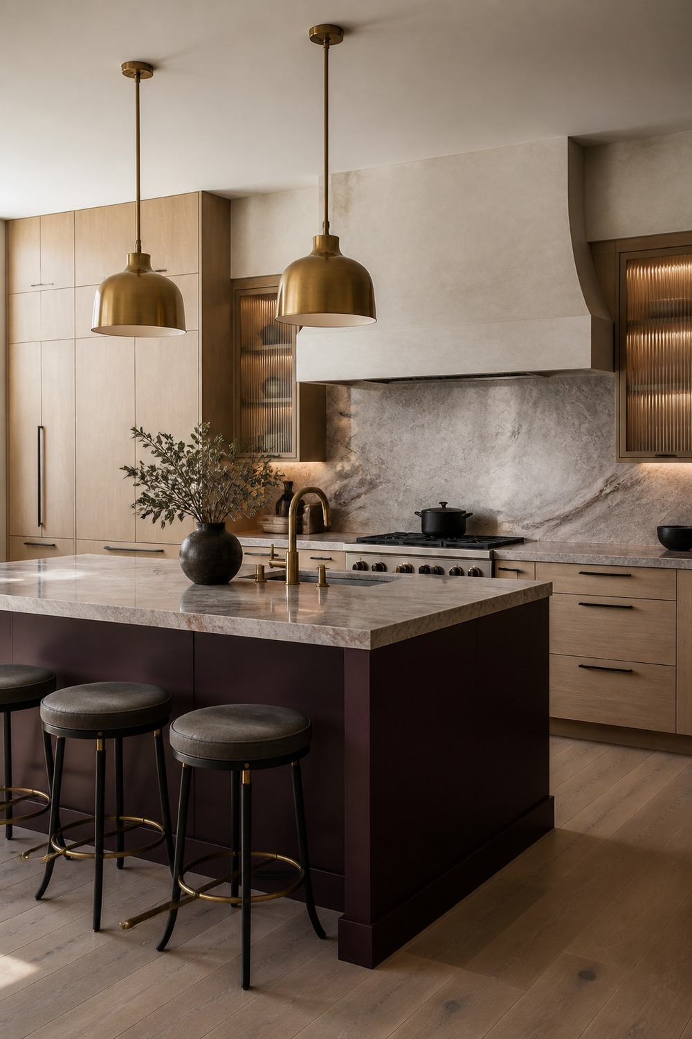
This is the kind of modern kitchen color I would rather see than another flat gray room. The deep aubergine modern island feels intentional, and the pale oak slab cabinets keeps the palette from looking like a showroom sample board.
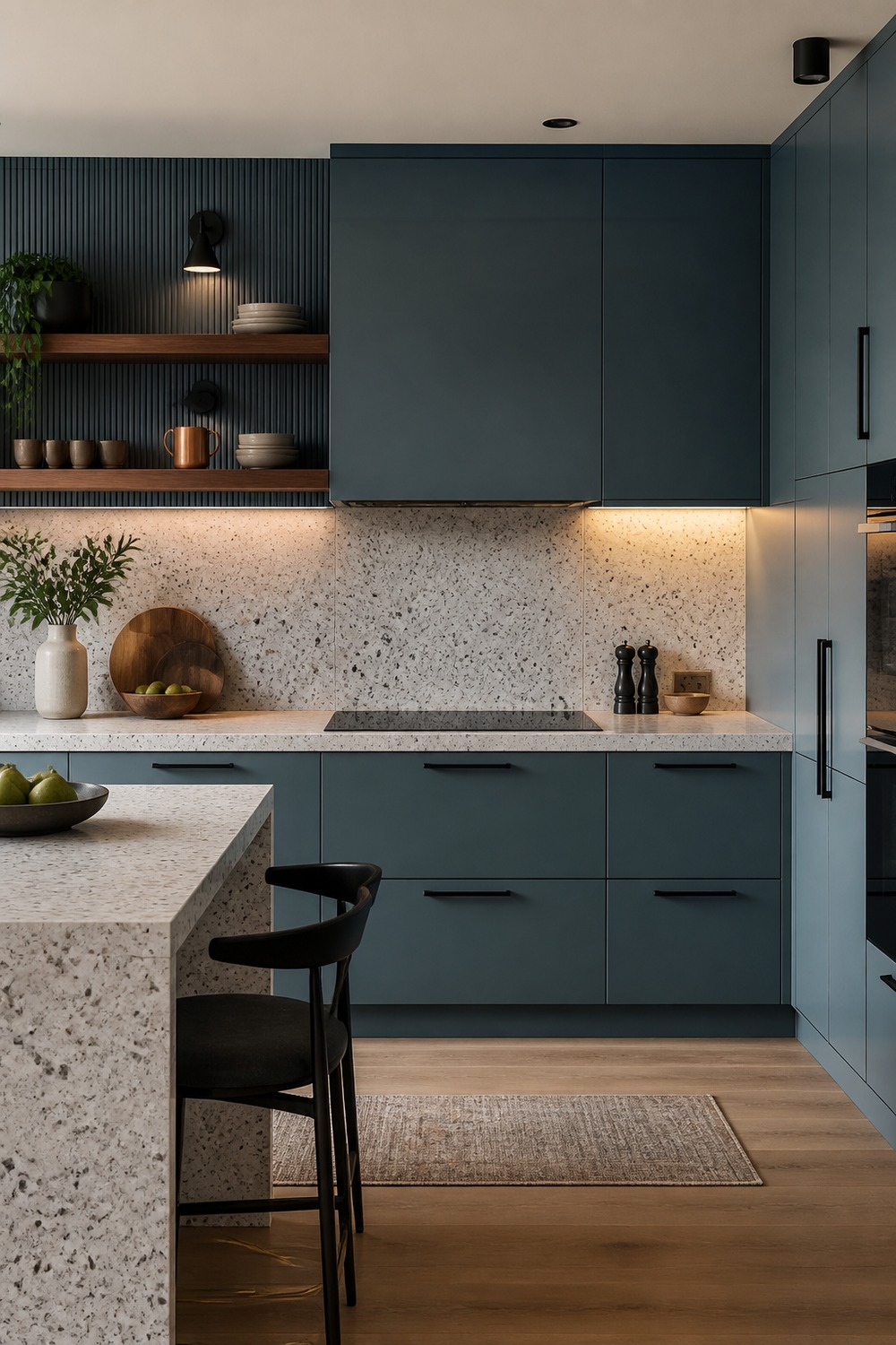
The mineral blue modern kitchen palette has a good mix of polish and normal-life function. The matte black sconces still matters here, so the color scheme reads as a working kitchen instead of just a pretty cabinet wall.
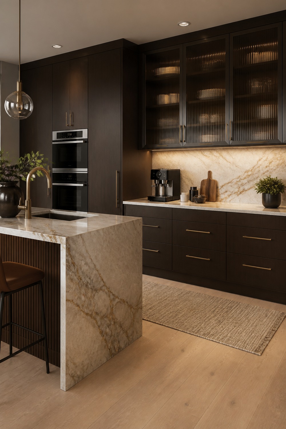
I like how this one lets the hardware and surfaces do more of the work. The espresso brown slab cabinets, cream stone backsplash, and ribbed cabinet fronts give the kitchen a stronger modern rhythm without adding visual clutter.
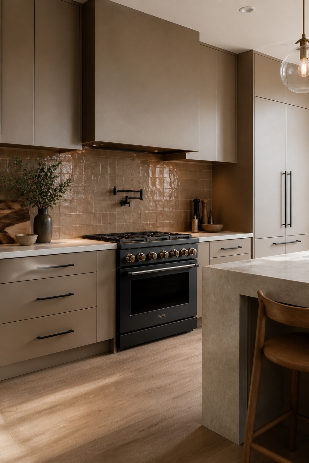
This color mix feels current because the contrast is built into real kitchen pieces. The soft taupe cabinets anchors the room, while the clay handmade-look backsplash tile and creamy stone counters make the work zones feel practical.
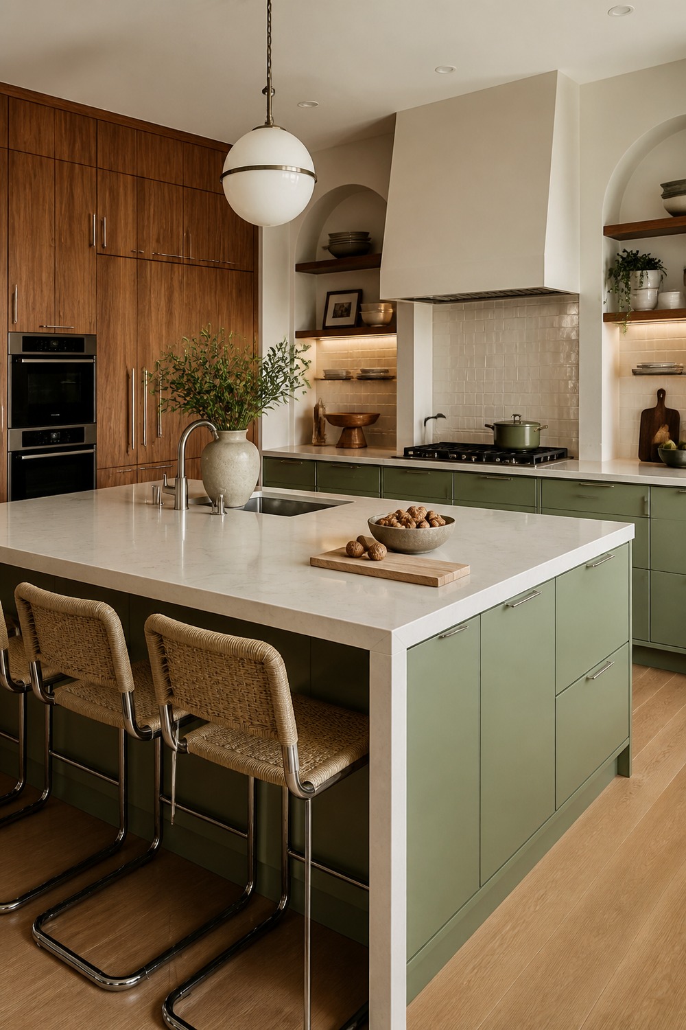
The pistachio and walnut modern kitchen feels bold in a controlled way. Nothing is screaming for attention, but the pistachio green slab island and walnut tall cabinets give the kitchen enough depth that the modern lines actually stand out.
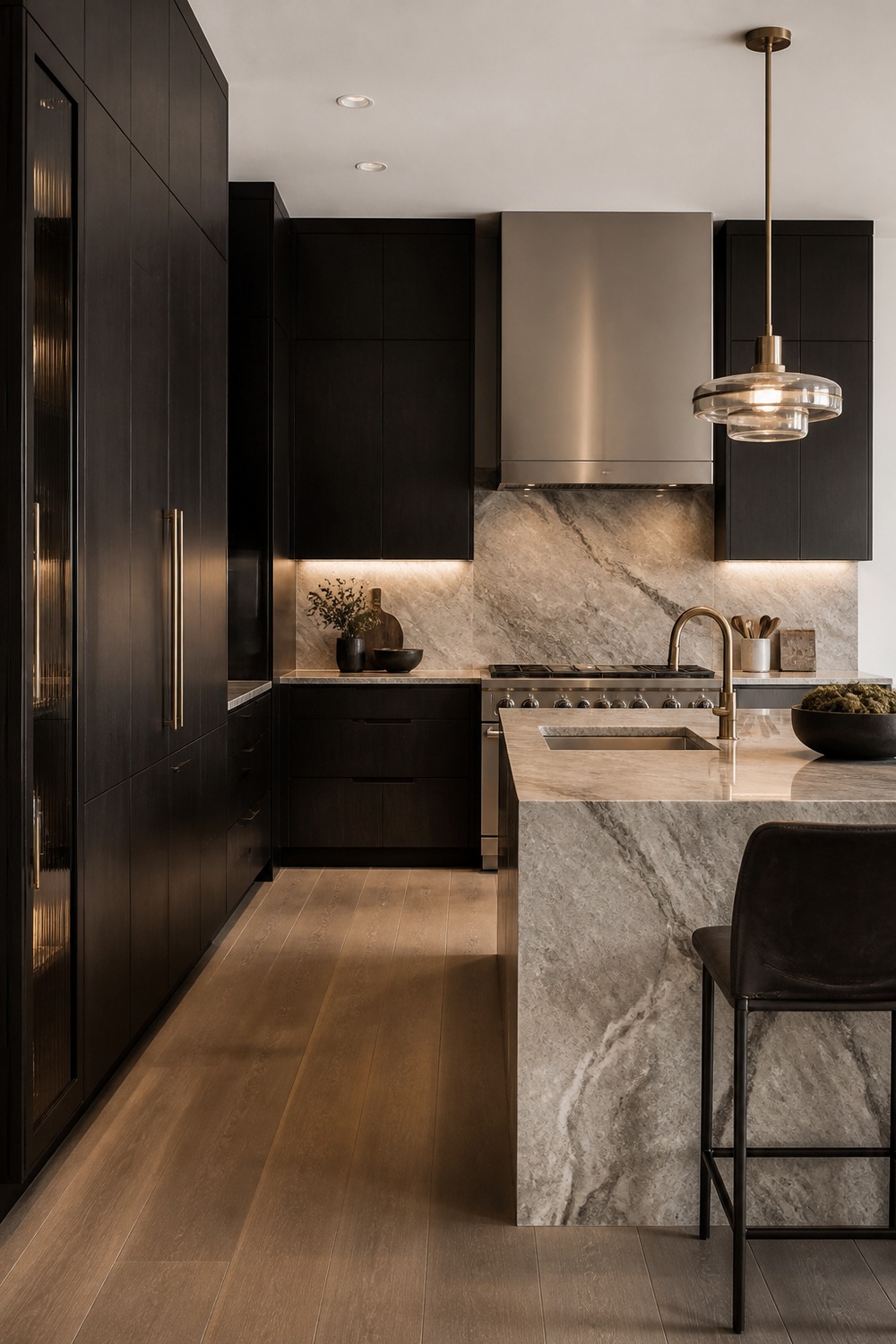
A clean kitchen still needs a few moments with weight, and this palette has them. The dramatic pale stone island, brushed stainless range, and soft white walls keep the design sharp while leaving room for dishes, stools, and everyday mess.
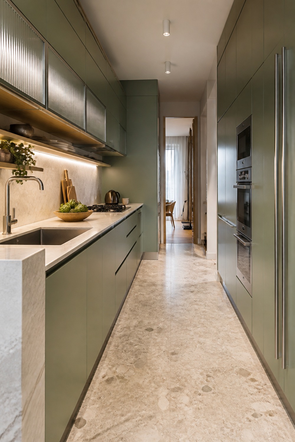
The celadon green modern galley kitchen is stronger than a plain white modern kitchen because the color has a job. The celadon green flat-panel galley cabinets sets the main mood, while the narrow white oak shelves and creamy terrazzo floor keep the clean lines from feeling empty.
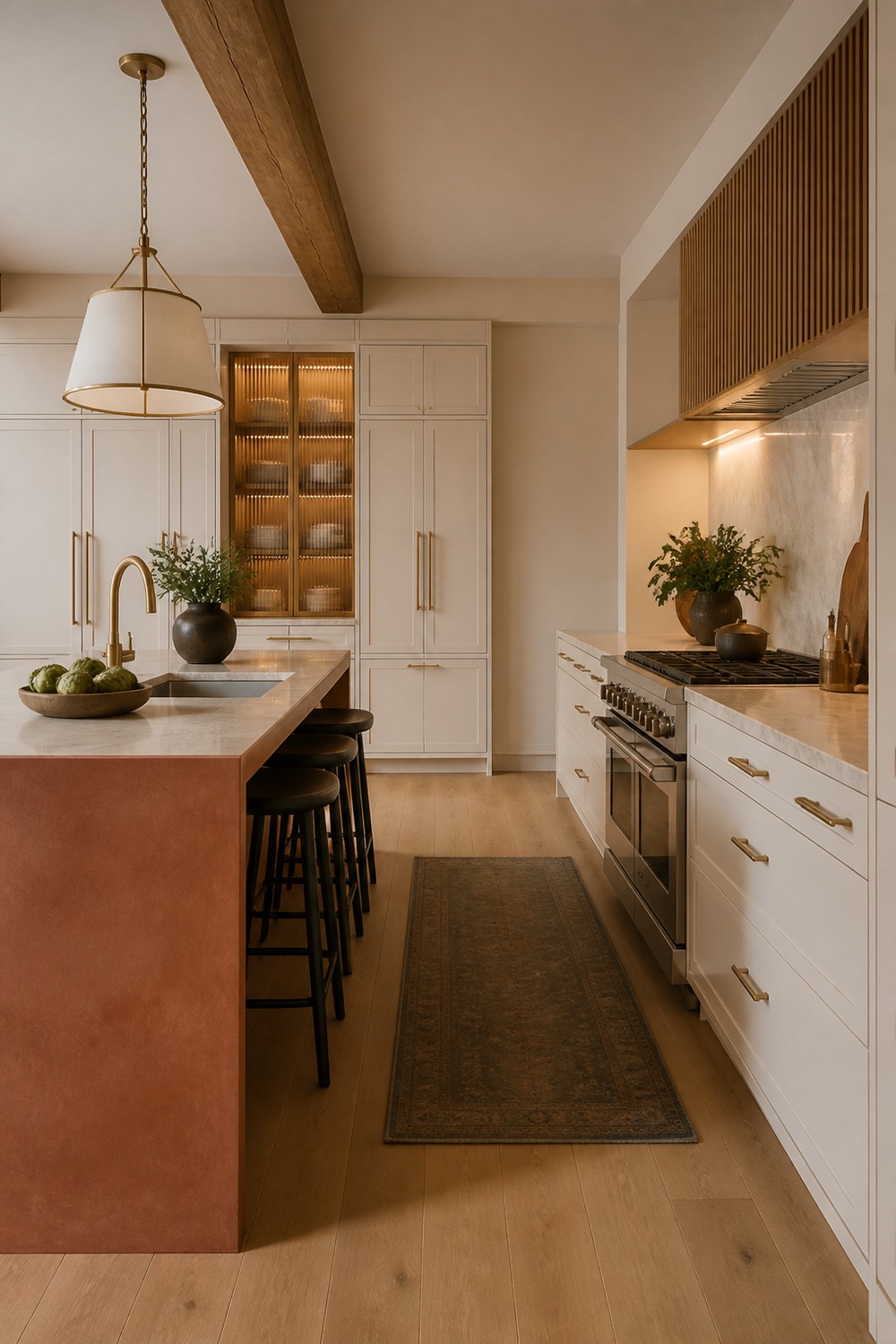
This palette feels modern without going cold. I like how the terracotta plaster-look island gives the room structure, then the warm white slab cabinets adds enough texture that the counters still feel useful for real cooking.
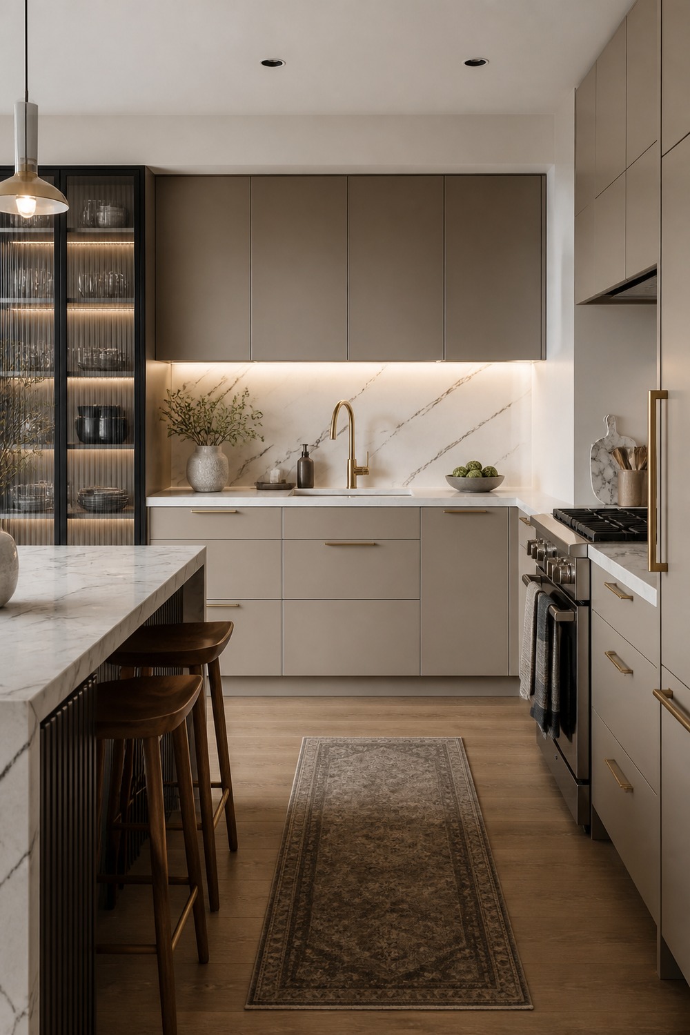
A color scheme like this works because it does not depend on one safe neutral. The mushroom taupe cabinets, black framed glass pantry, and brushed brass faucet make the kitchen feel designed, but not too precious to use every day.
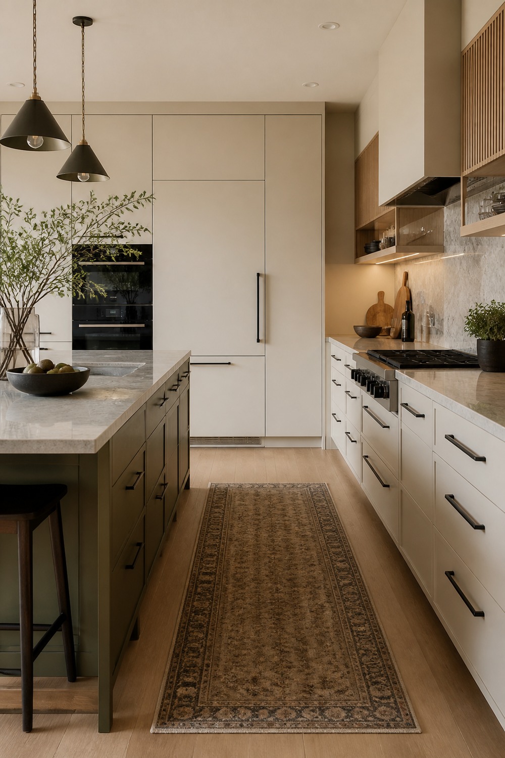
The best detail here is how the modern shapes stay simple while the finishes carry the personality. The cream slab cabinets catches the eye first, and the light oak open shelf gives the whole kitchen a cleaner edge.
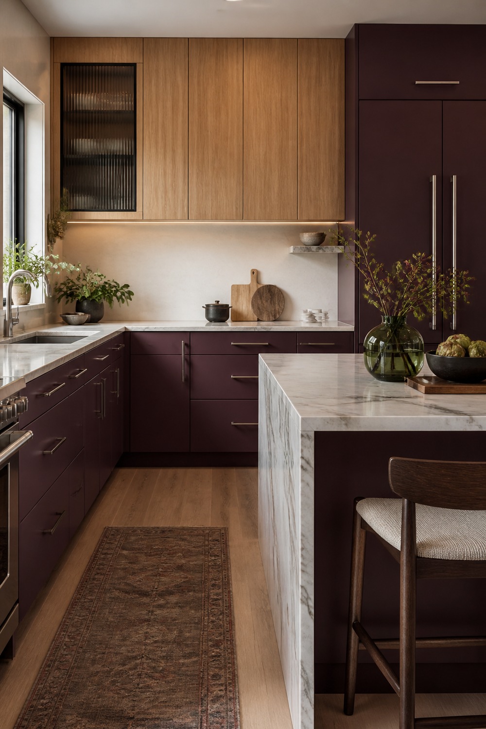
This is the kind of modern kitchen color I would rather see than another flat gray room. The muted plum lower cabinets feels intentional, and the white oak upper cabinets keeps the palette from looking like a showroom sample board.
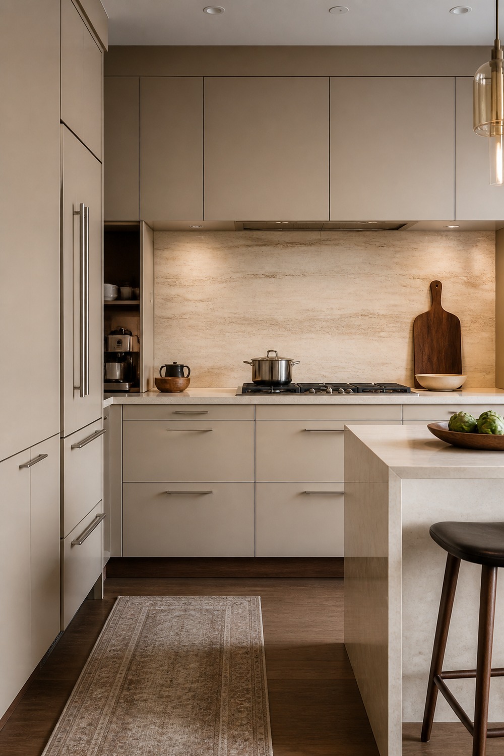
The cashmere beige modern kitchen palette has a good mix of polish and normal-life function. The brushed nickel hardware still matters here, so the color scheme reads as a working kitchen instead of just a pretty cabinet wall.
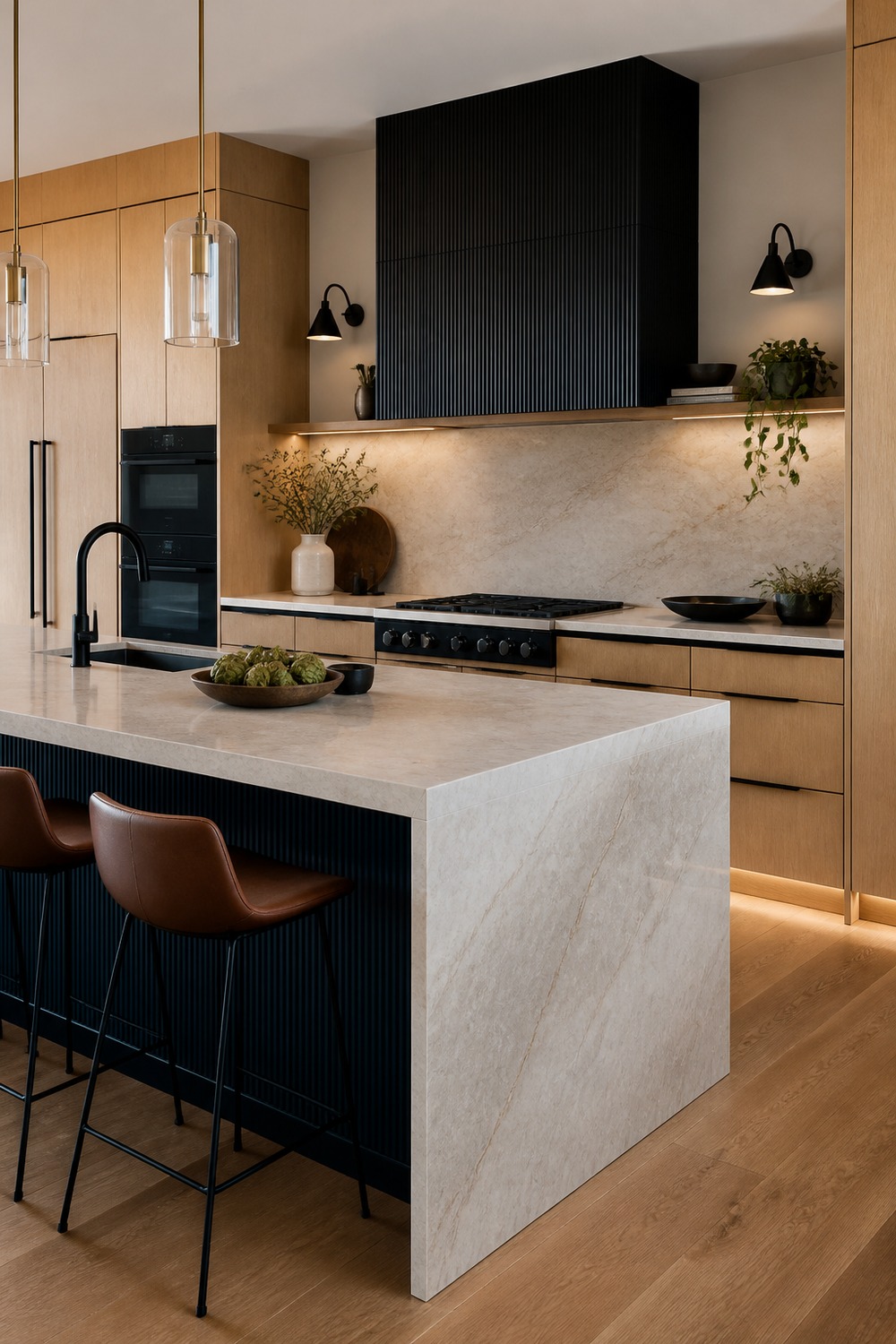
I like how this one lets the hardware and surfaces do more of the work. The inky navy-black island, white oak perimeter cabinets, and pale stone waterfall counter give the kitchen a stronger modern rhythm without adding visual clutter.
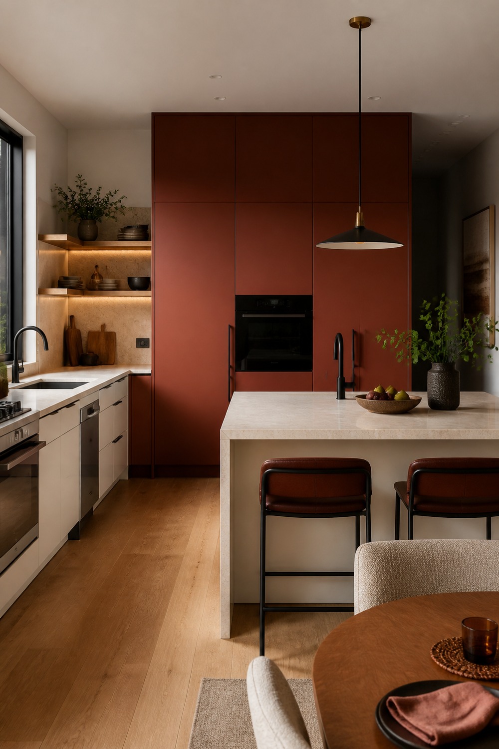
This color mix feels current because the contrast is built into real kitchen pieces. The rust red slab pantry wall anchors the room, while the warm white island and creamy stone counters make the work zones feel practical.
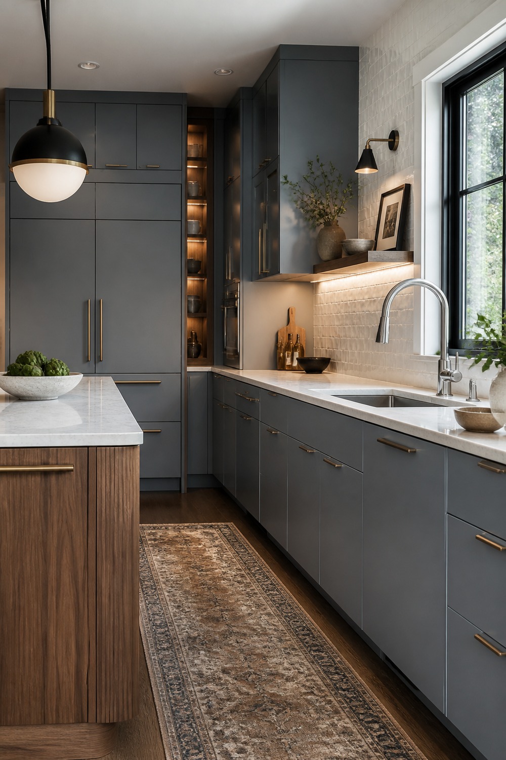
The soft blue gray and walnut kitchen feels bold in a controlled way. Nothing is screaming for attention, but the soft blue-gray flat cabinets and walnut island base give the kitchen enough depth that the modern lines actually stand out.
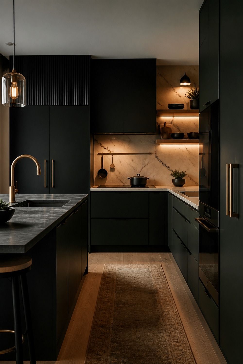
A clean kitchen still needs a few moments with weight, and this palette has them. The creamy quartzite backsplash, warm oak shelves, and brass rail keep the design sharp while leaving room for dishes, stools, and everyday mess.
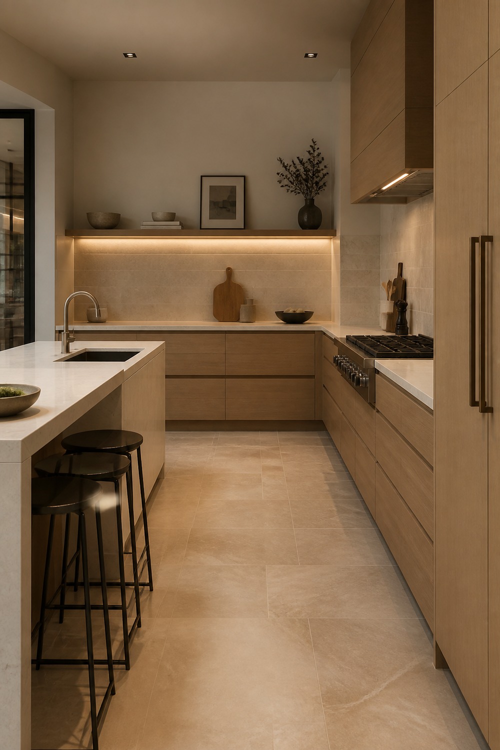
The light oak and warm white minimalist kitchen is stronger than a plain white modern kitchen because the color has a job. The light oak slab cabinets sets the main mood, while the warm white island and barely-there beige tile keep the clean lines from feeling empty.
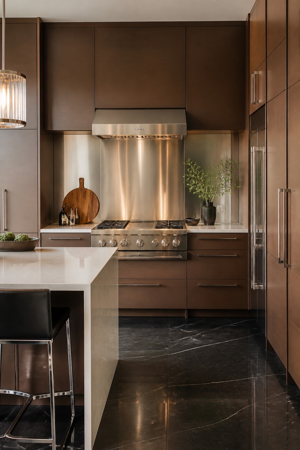
This palette feels modern without going cold. I like how the cocoa brown flat-panel cabinets gives the room structure, then the stainless steel backsplash accent adds enough texture that the counters still feel useful for real cooking.
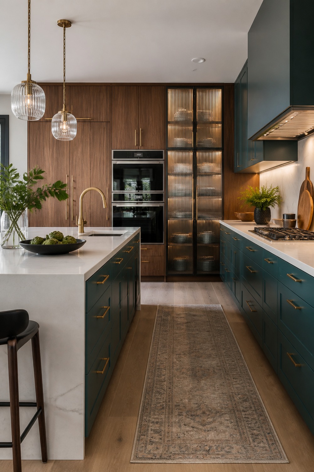
A color scheme like this works because it does not depend on one safe neutral. The smoky teal island, walnut pantry wall, and ribbed glass pendants make the kitchen feel designed, but not too precious to use every day.
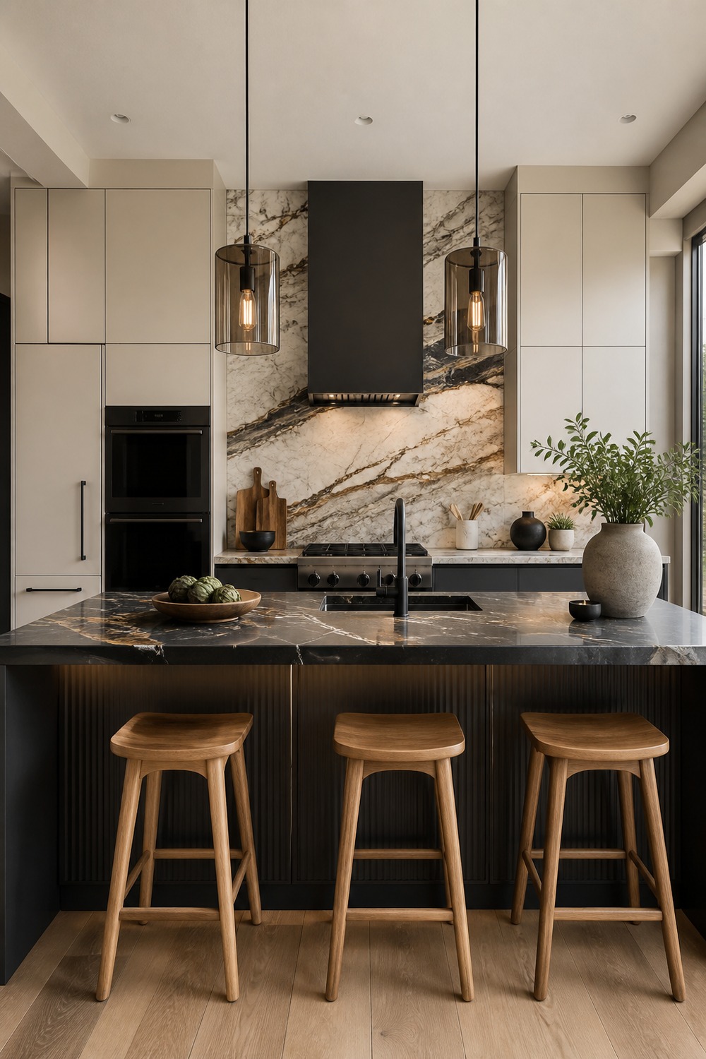
The best detail here is how the modern shapes stay simple while the finishes carry the personality. The charcoal island catches the eye first, and the bold veined stone backsplash gives the whole kitchen a cleaner edge.
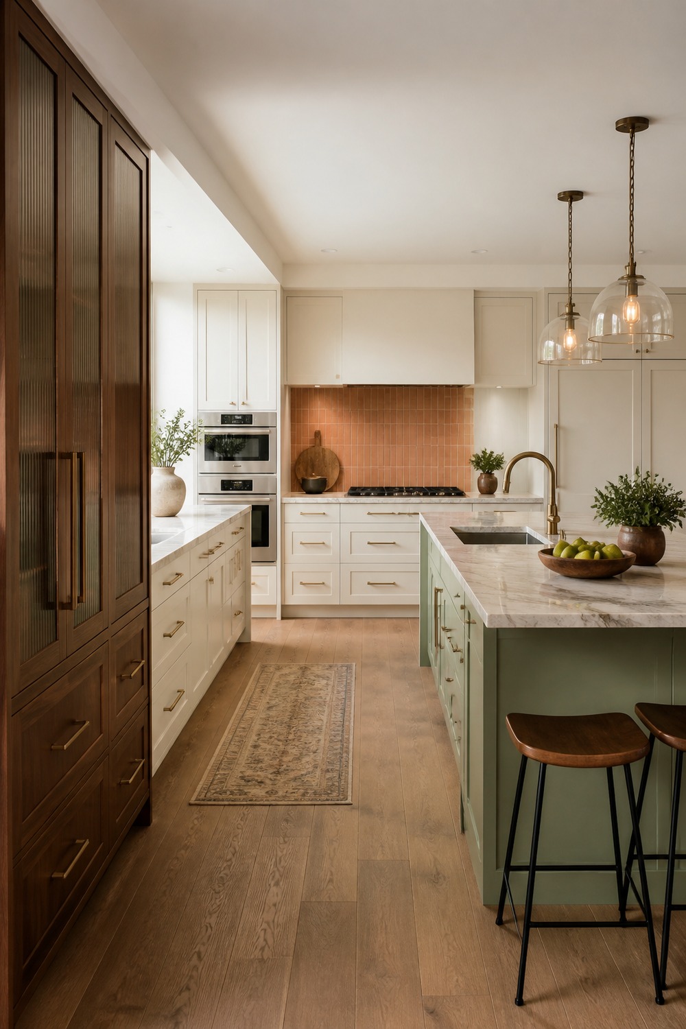
This is the kind of modern kitchen color I would rather see than another flat gray room. The warm white cabinets feels intentional, and the pistachio island keeps the palette from looking like a showroom sample board.
A kitchen color scheme feels best when the color has something real to work with. Cabinets, counters, tile, hardware, wood tones, rugs, and lighting all matter, because those little pieces are what keep the palette feeling layered instead of flat.

I work in tech, but my taste in design is straight out of a slow European village. Give me arches, aged brass, and a room that smells like books and coffee. That’s my kind of home.