Orange can look incredible in a kitchen when it is treated like a real palette, not just a loud cabinet choice. I like it most when the terracotta, clay, apricot, rust, copper, wood, tile, and lighting all work together so the room feels warm without looking flat.
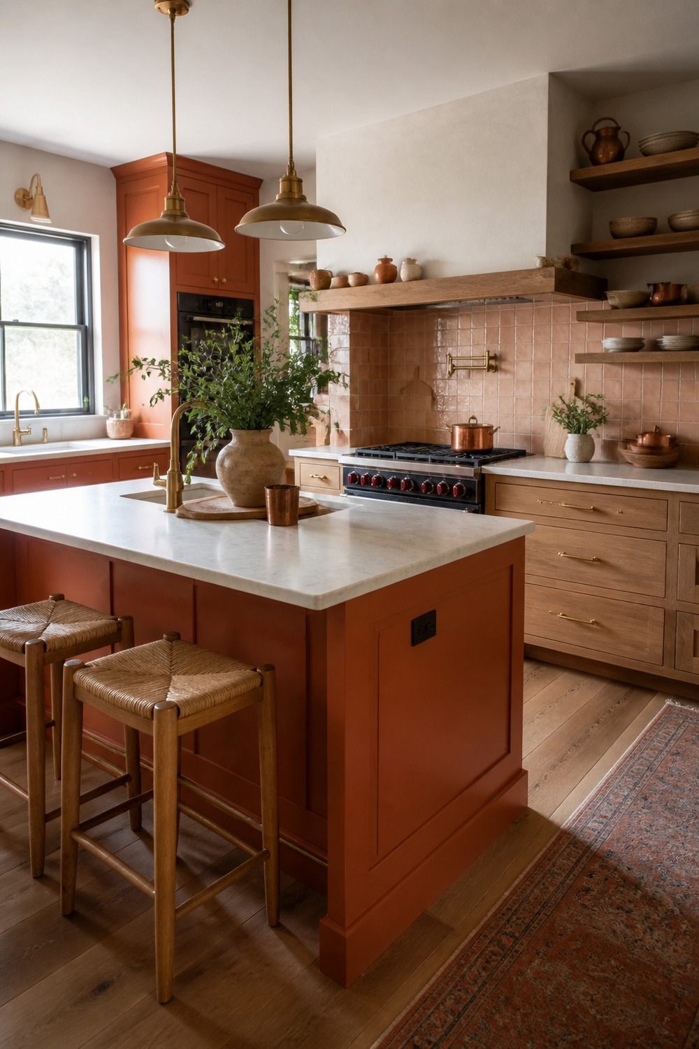
A burnt-orange island gives this kitchen a real focal point without making every cabinet compete for attention. The cream counters, oak stools, and brass hardware soften the color so it feels warm, useful, and still easy to live with on a normal weekday.
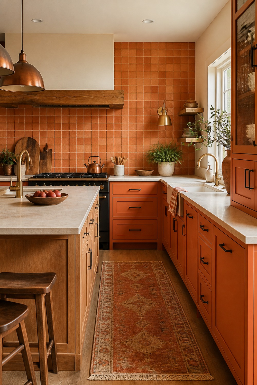
The terracotta backsplash is doing the heavy visual work here, and I like that the rest of the kitchen stays calmer around it. Cream cabinetry, simple counters, and warm wood shelving make the orange tile feel intentional instead of overwhelming.
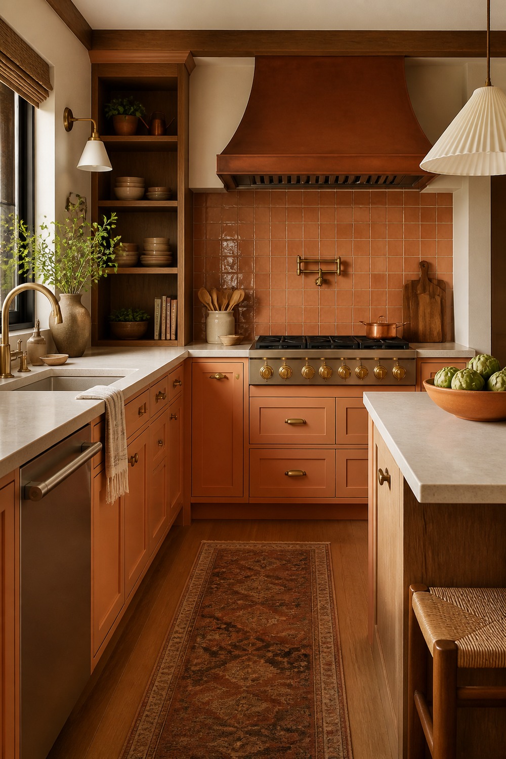
Apricot lower cabinets are such a softer way to bring orange into a kitchen. The color sits low in the room, while the pale counters and simple upper wall space keep the whole palette from feeling too sugary or too loud.
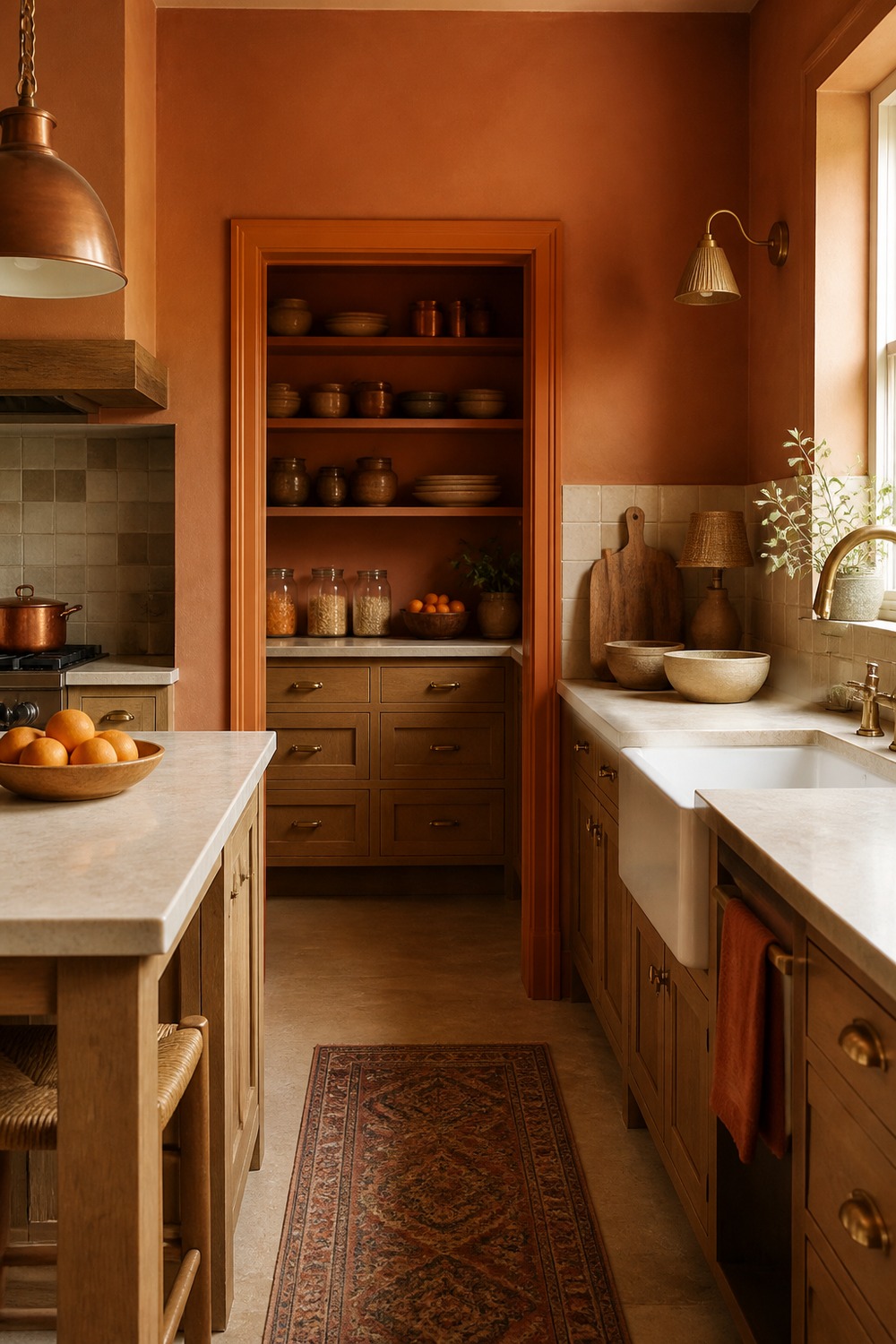
This clay pantry wall feels like the kind of color choice that makes a kitchen look collected over time. Closed storage keeps the busy stuff hidden, and the earthy orange tone adds warmth without needing a lot of extra decor.
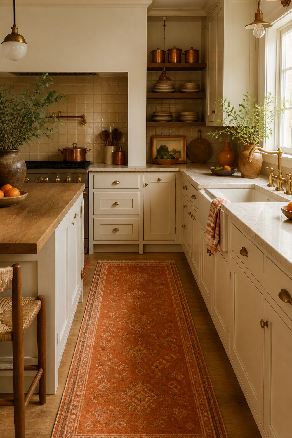
A runner is a smart low-commitment way to test an orange kitchen color scheme. The cream cabinets stay timeless, while the rust-orange rug, wood tones, and little countertop pieces bring in enough color to make the room feel finished.
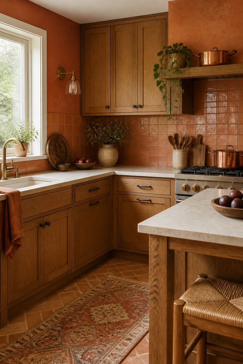
The copper and oak combination makes this corner feel warm before you even notice the bigger color palette. I like how the metal, wood grain, and soft orange accents add depth without turning the kitchen into a themed space.
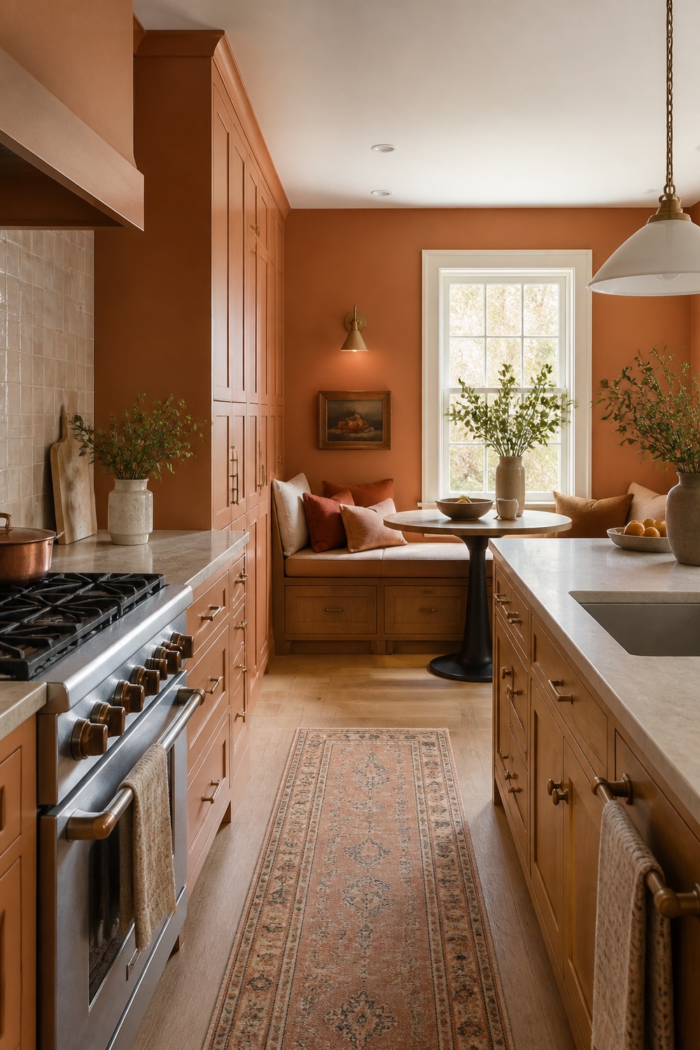
This breakfast nook uses orange in a quieter way, which can be easier to live with than a full saturated kitchen. The muted cushions, warm wood table, and nearby cabinet color make the little eating area feel connected to the rest of the room.
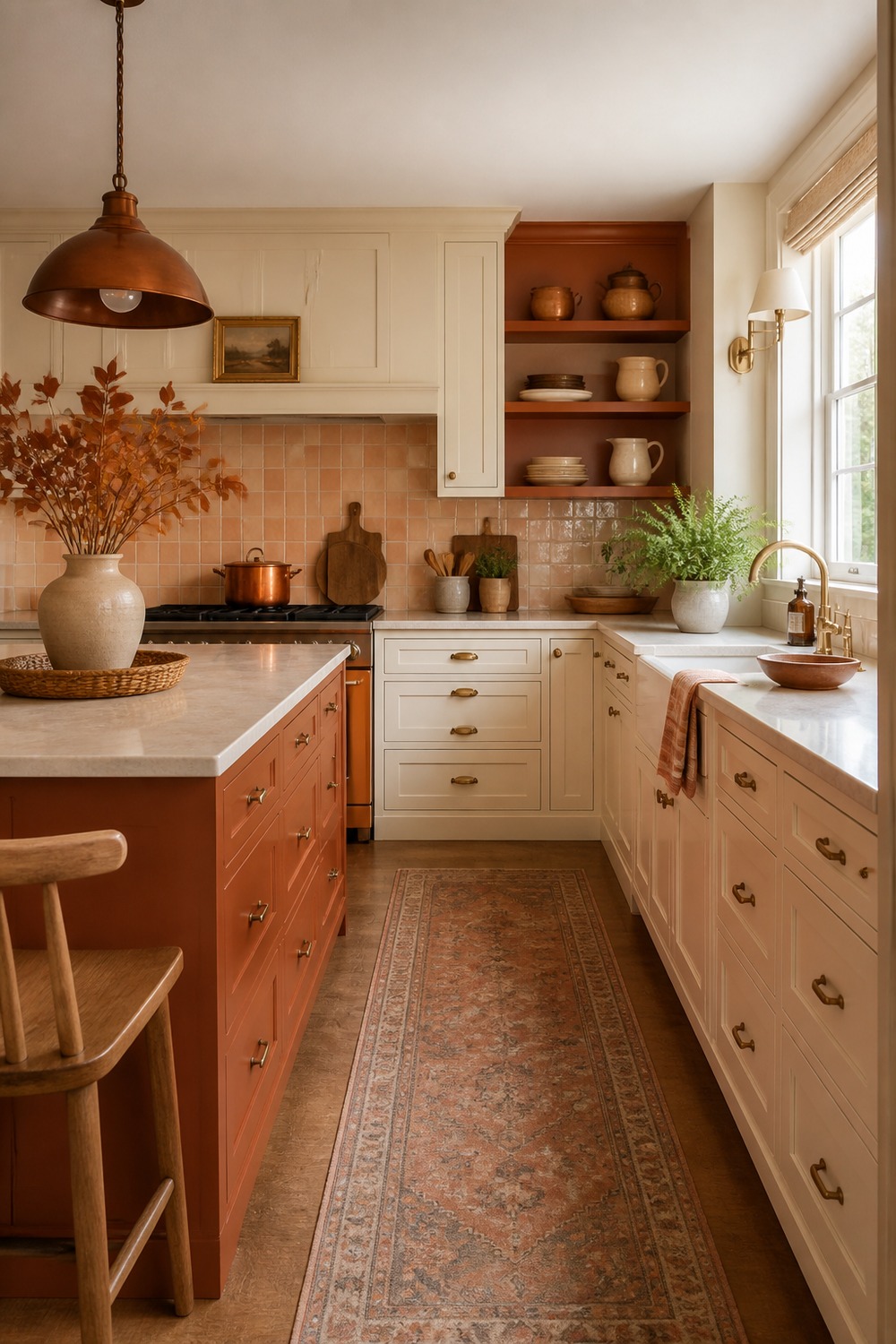
A rust-colored island looks especially good against warm white cabinets because the contrast feels strong but not harsh. The island becomes the anchor, while the lighter perimeter cabinets keep the kitchen open and practical.
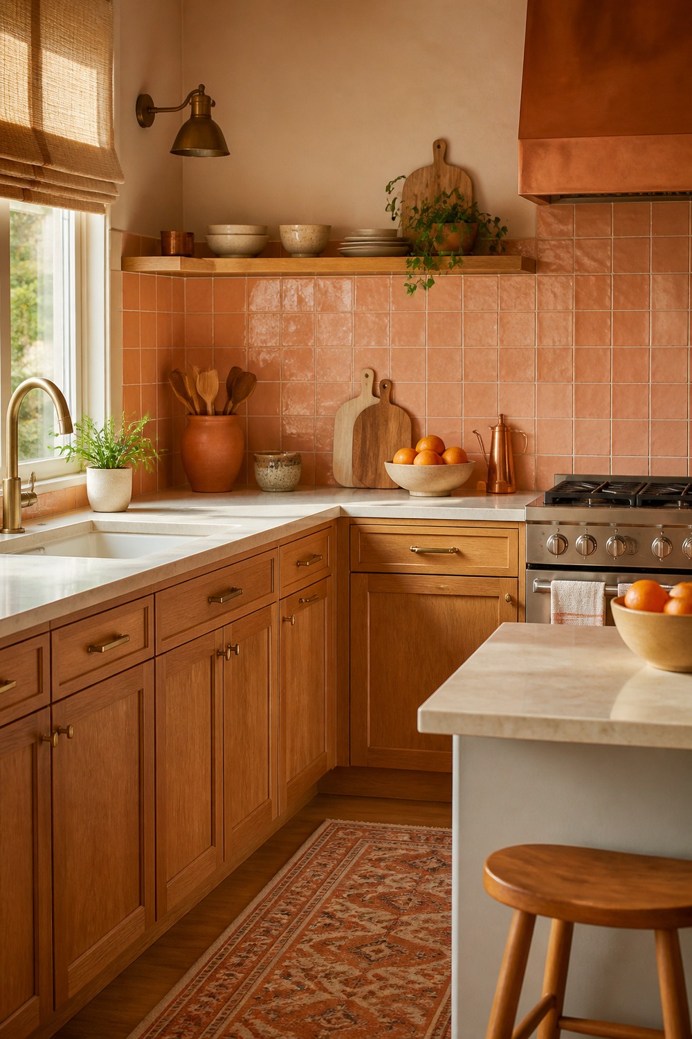
Peach tile can go childish fast, but this version works because it is paired with grounded finishes. The prep corner still feels like a working kitchen, with enough counter space, wood texture, and warm light to keep the color from floating by itself.
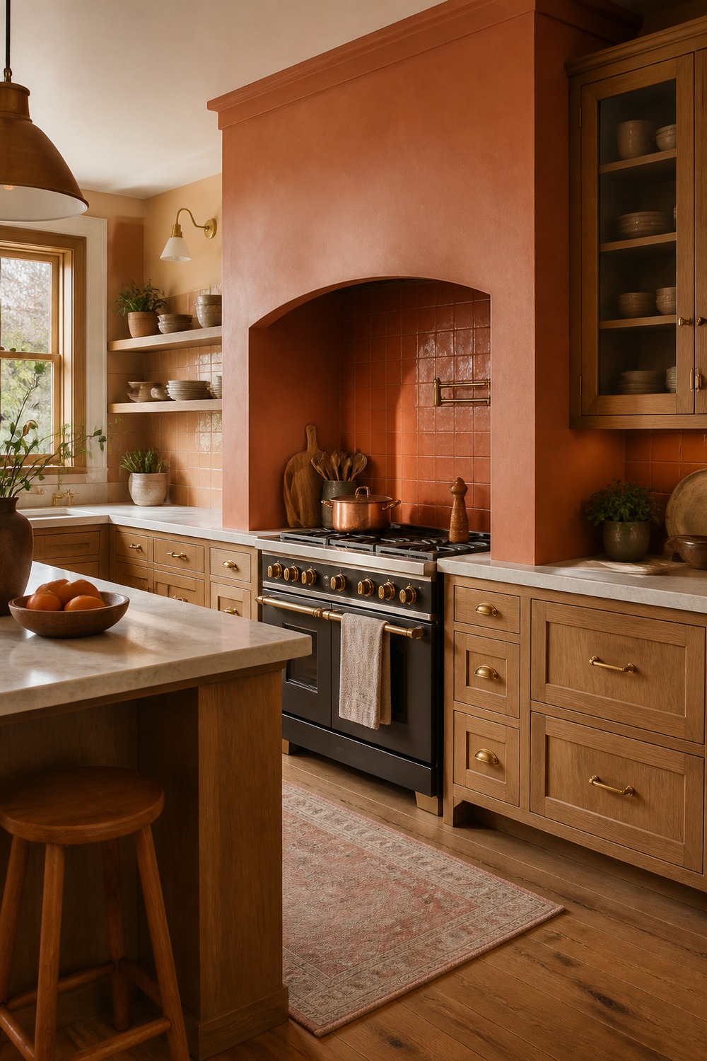
The terracotta range alcove gives the cooking wall a built-in, almost old-world feeling. I like the way the orange tone frames the range while the stone counters and simple shelving keep the focus on texture instead of clutter.
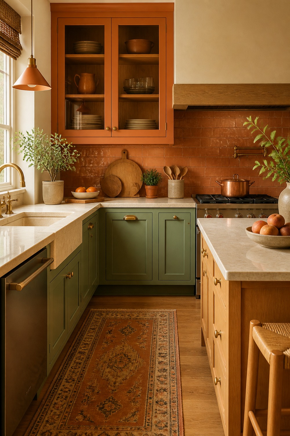
Orange and sage can be a really pretty kitchen pairing when both colors are a little muted. The sage keeps the palette from feeling too hot, while the orange tile and warm hardware give the room more personality than plain neutrals would.
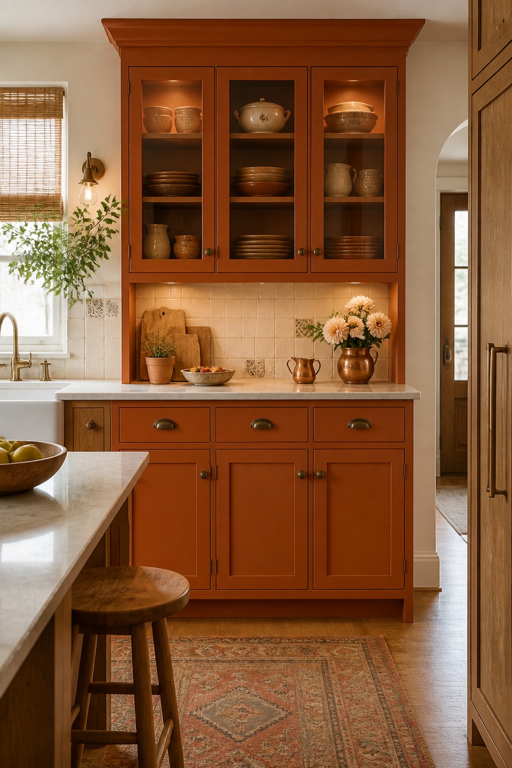
An orange hutch is a nice middle ground if full orange cabinets feel like too much. It gives the room one bold storage moment, and the dishes, shelves, and counter space around it make the color feel useful rather than random.
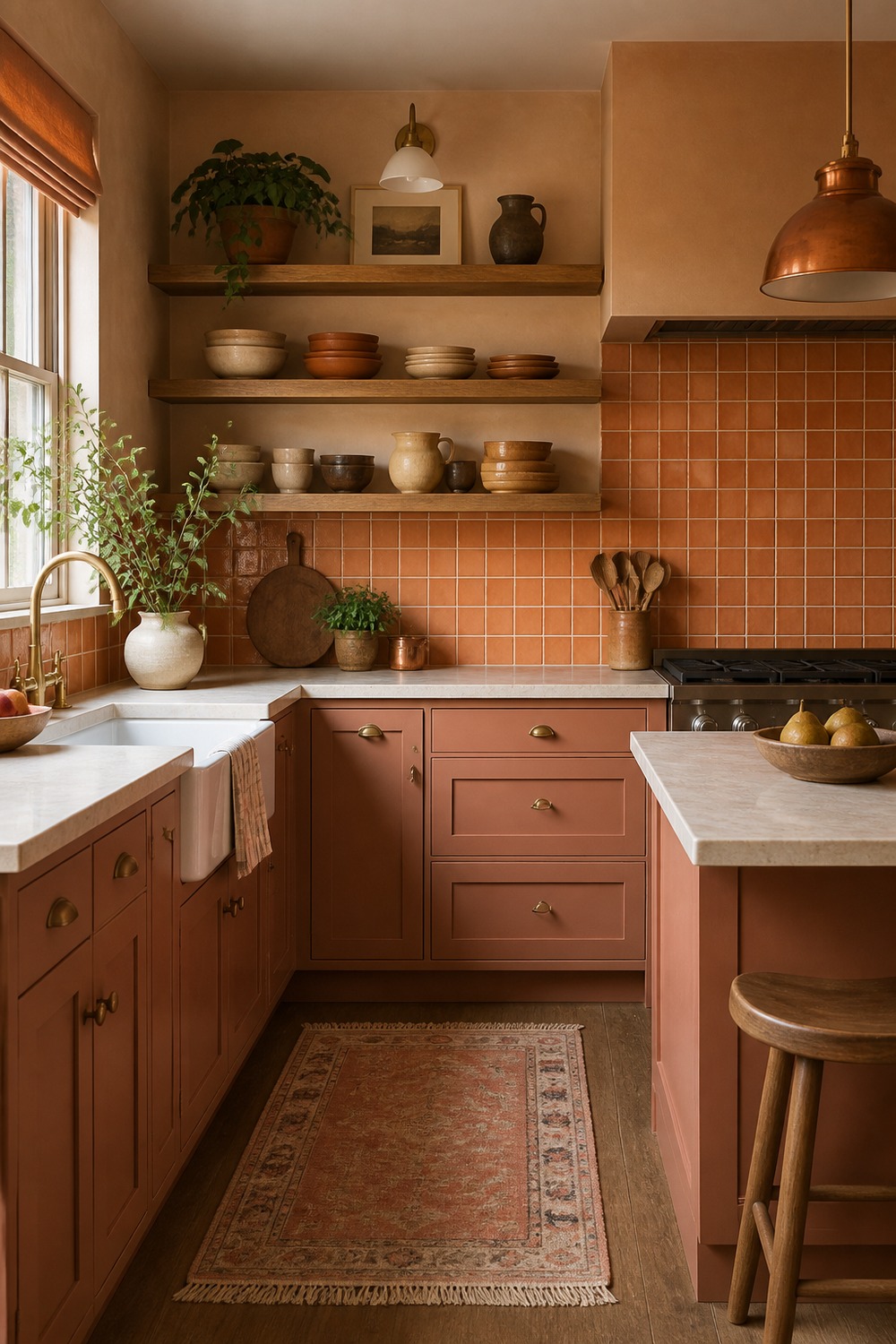
Clay lower cabinets with oak shelves feel grounded in the best way. The open shelving brings in a lighter natural texture, while the lower cabinet color adds enough warmth that the kitchen does not need much extra styling.
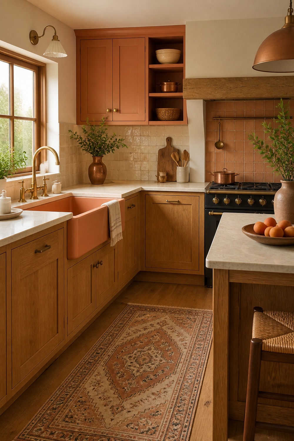
This soft orange cottage sink area has that relaxed, lived-in feeling I always like in a kitchen. The skirted texture, pale counters, and warm wall color make the orange feel charming instead of too polished.
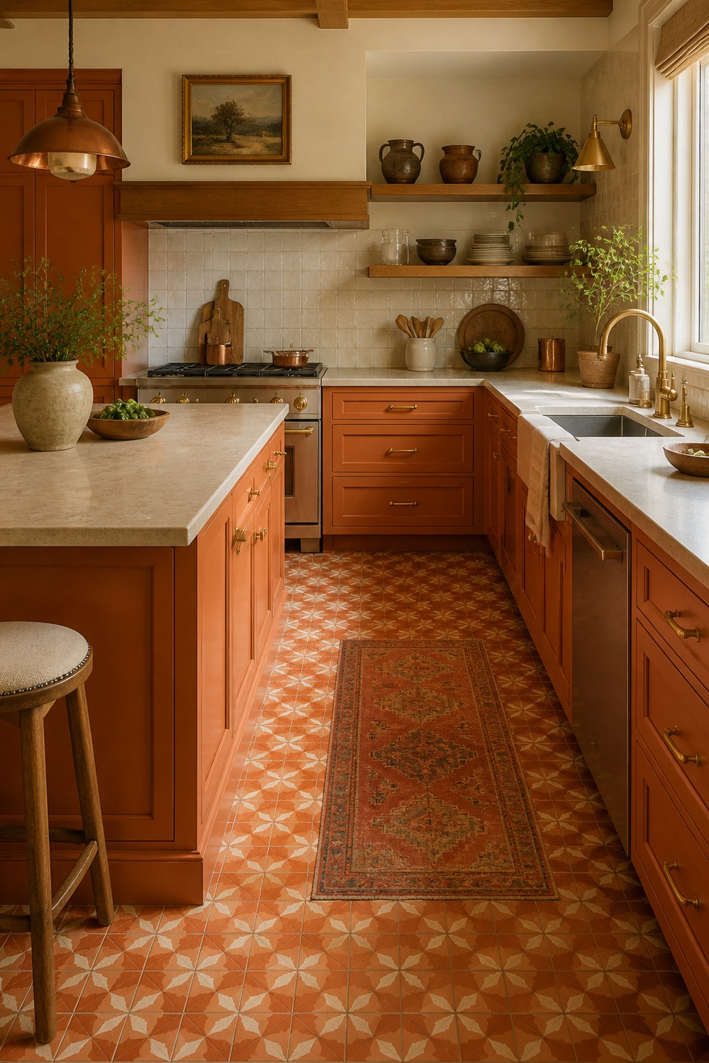
A patterned orange floor is bold, but it works when the upper half of the kitchen stays quieter. The cabinets, counters, and simple shelving give the eye a place to rest, so the floor feels fun instead of chaotic.
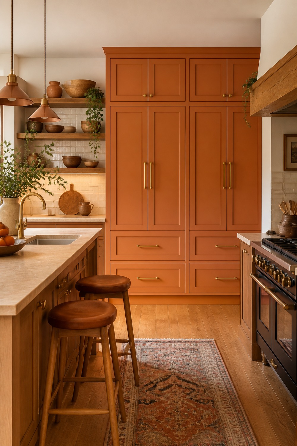
The rust pantry cabinets make this wall feel rich and practical at the same time. Tall closed storage is doing real work here, and the earthy orange color keeps the built-ins from looking like a plain utility wall.
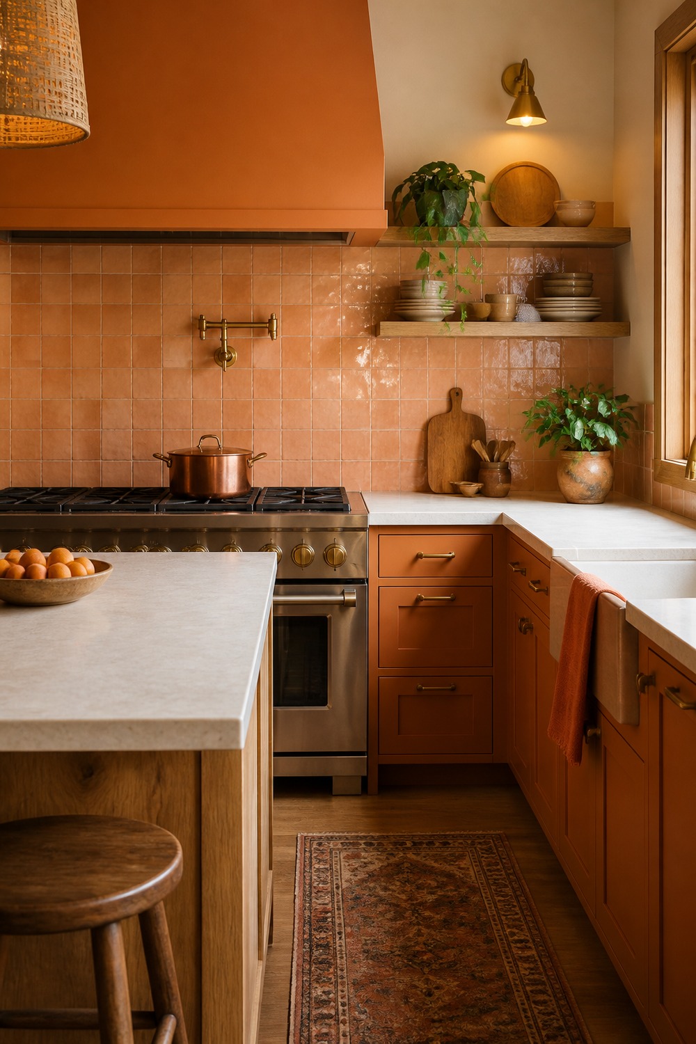
Apricot zellige tile adds color in a way that still feels handmade and soft. The uneven shine, pale counters, and warm wood details give the kitchen texture, so the orange does not read as a flat paint-chip choice.
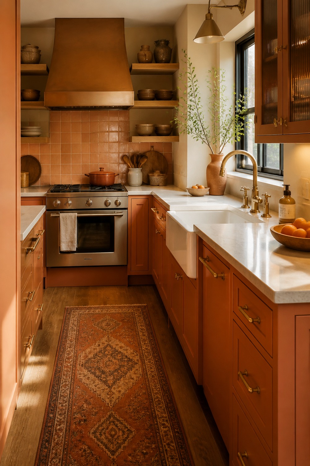
Small galley kitchens can handle orange when the color is used with some restraint. The warm cabinet tones, clear counter runs, and practical lighting make the narrow layout feel cozy instead of cramped.
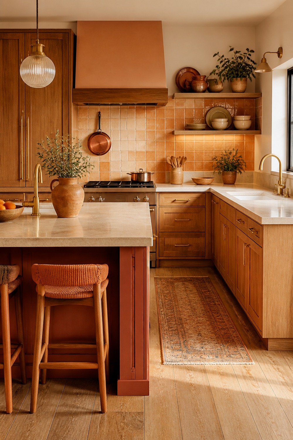
Terracotta island seating is such a good detail because it brings the palette down to the place people actually gather. The stools, island base, and warm lighting make the kitchen feel social without overloading every surface with orange.

Walnut cabinets already bring a lot of warmth, so the orange accents only need to nudge the palette further. The result feels layered: wood grain, small terracotta pieces, simple counters, and enough contrast to keep the kitchen from looking one-note.
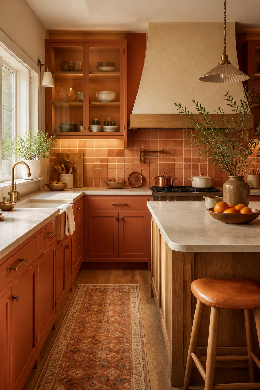
This kitchen works because the orange is layered through several smaller decisions instead of one giant statement. Warm cabinetry, clay accents, textured tile, and soft lighting all build the color story while the layout still feels usable.
Orange kitchens work best when the color has real materials around it. A little terracotta tile, warm wood, brass, clay, copper, or rust can make the whole room feel richer without asking every surface to shout.

I work in tech, but my taste in design is straight out of a slow European village. Give me arches, aged brass, and a room that smells like books and coffee. That’s my kind of home.