A lot of kitchen color ideas start looking old the second they lean too hard on safe sage, brass, and vintage runners. For 2026, I like the palettes that feel warmer, sharper, and a little less expected: oxblood islands, butter yellow cabinet walls, chrome with pistachio, dramatic stone, and cleaner cabinet lines that still work for everyday cooking.
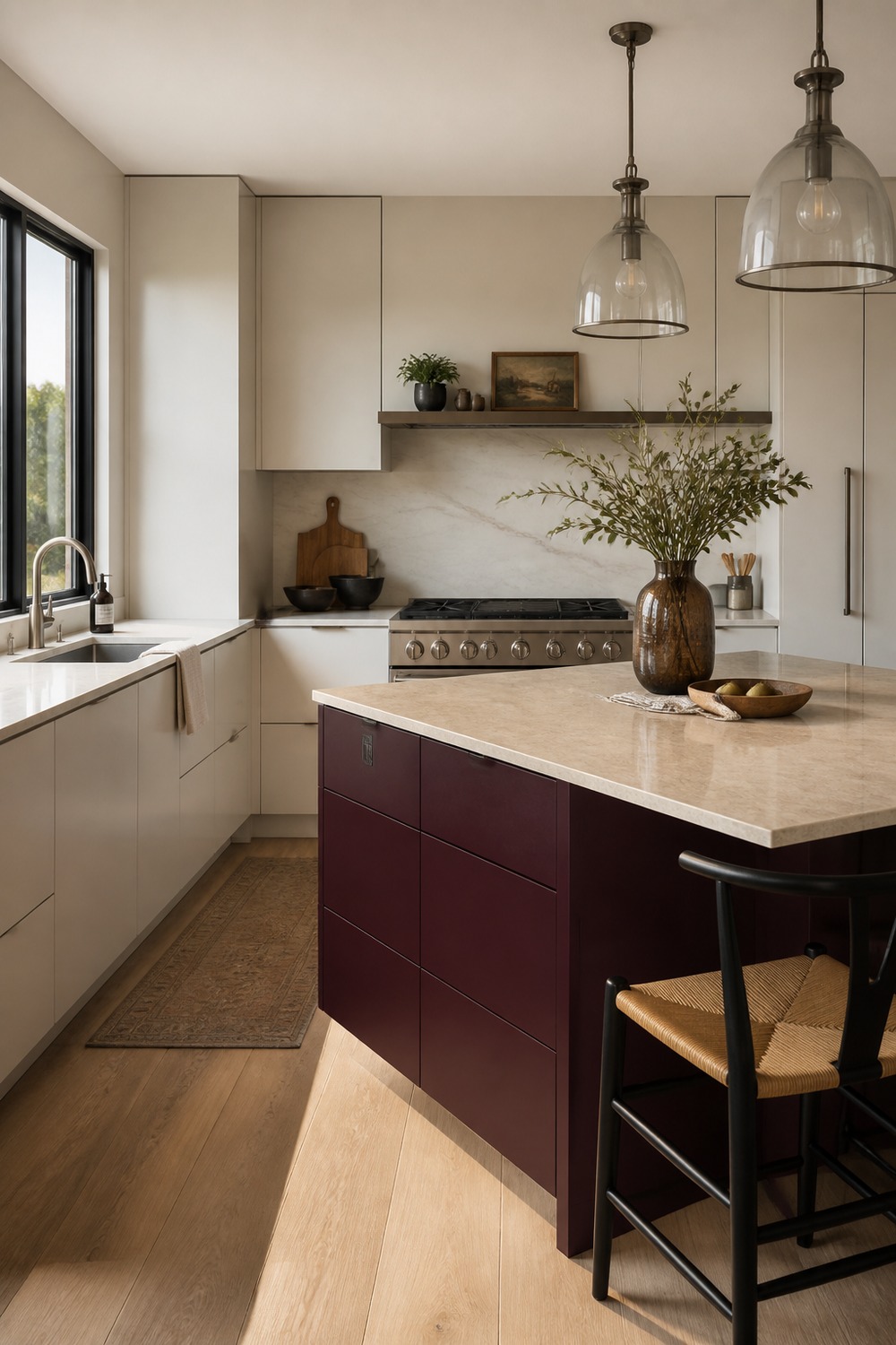
The oxblood island makes this kitchen feel current without turning the whole room dark. I like it because the warm white cabinets and honed stone give the color somewhere clean to land, so the island feels deliberate instead of dramatic for no reason.
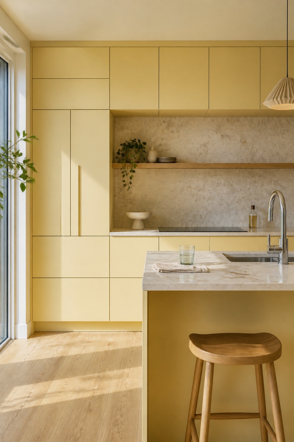
Butter yellow feels much fresher here because the cabinet fronts are simple and flat. The chrome faucet and pale stone keep it from looking too cottage-y, while the color still makes the kitchen feel sunny before anything is even styled.
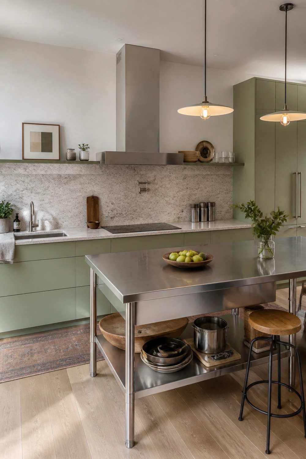
This pistachio and stainless mix feels very 2026 to me. The green is soft, but the steel island cuts through the sweetness and makes the whole room look more modern, useful, and a little more restaurant-inspired.
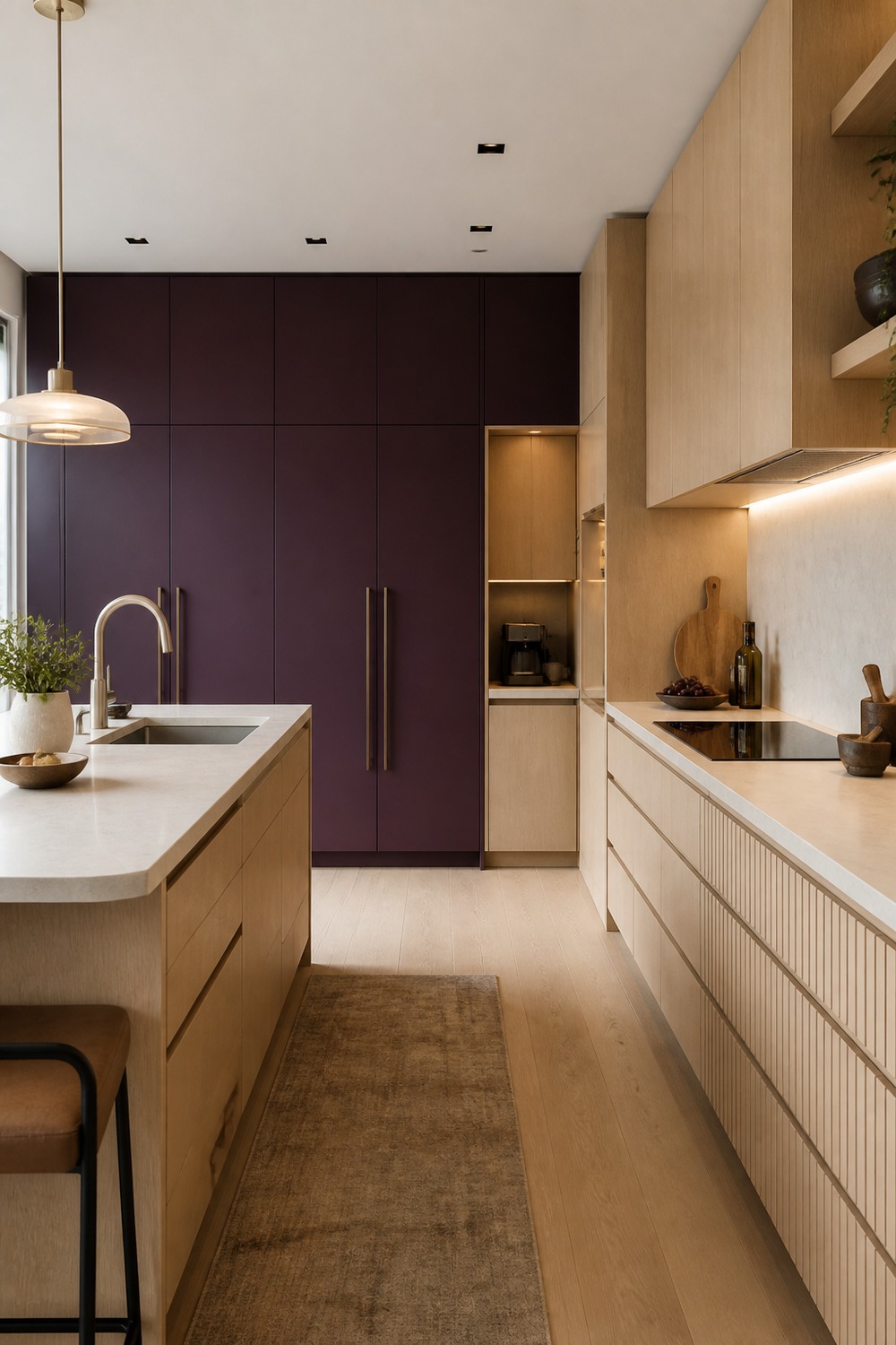
Aubergine is one of those colors that can feel risky, but using it on a pantry wall makes it easier to live with. The pale oak and cream slab backsplash stop it from feeling heavy, and the hidden storage makes the color feel tied to function.
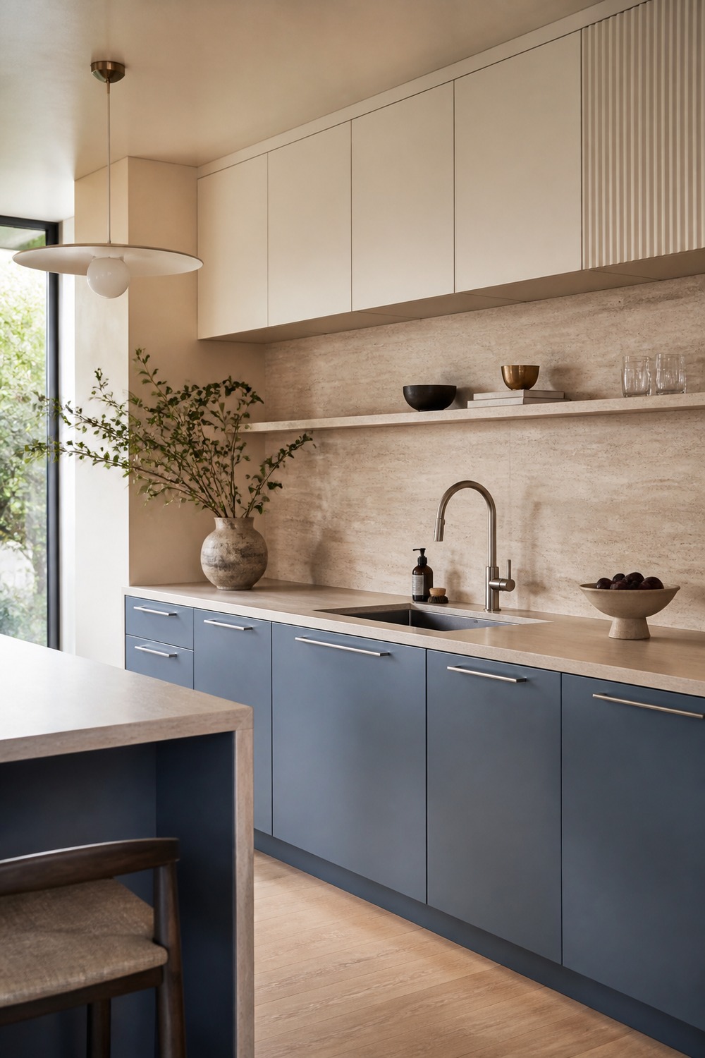
The mineral blue cabinets feel cleaner than the older dusty-blue kitchen look. What makes this one feel newer is the travertine wall behind it; the stone has enough movement that the palette feels designed, not just painted.
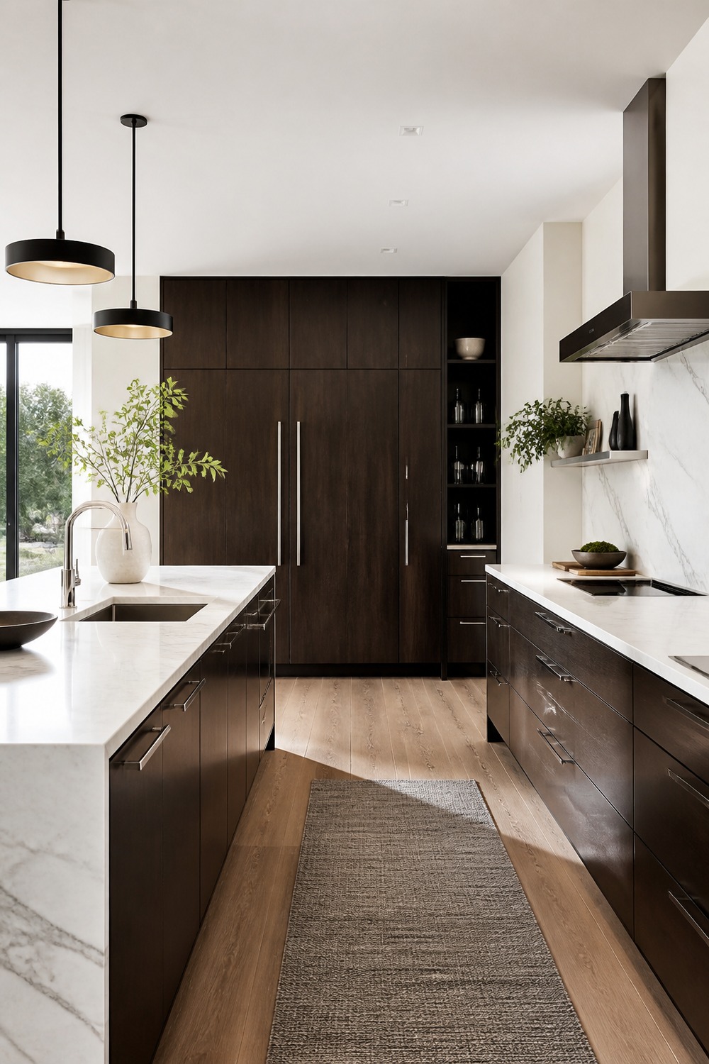
Espresso brown is back in a better way when it looks this clean. The chrome and white stone keep the cabinets from feeling like an old dark kitchen, and the concealed appliance wall makes the whole setup feel sharper.
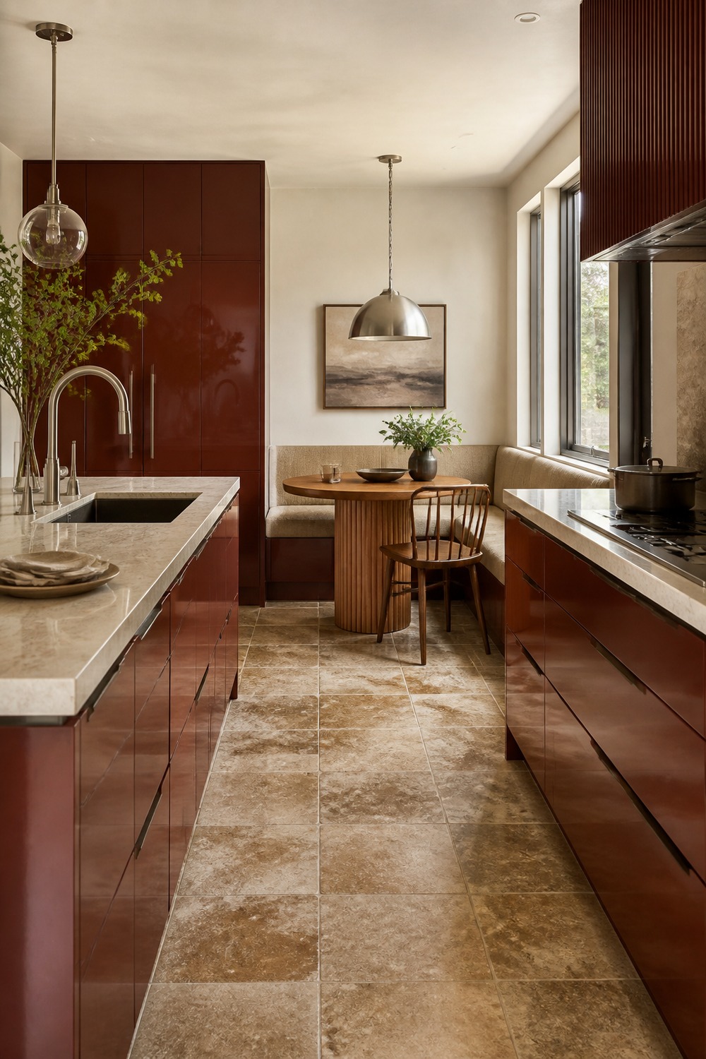
The red-brown lacquer gives this breakfast corner a little fashion edge. I like that it is paired with an actual table, pendant, and tile floor, because the shine feels intentional instead of like a random glossy cabinet color.
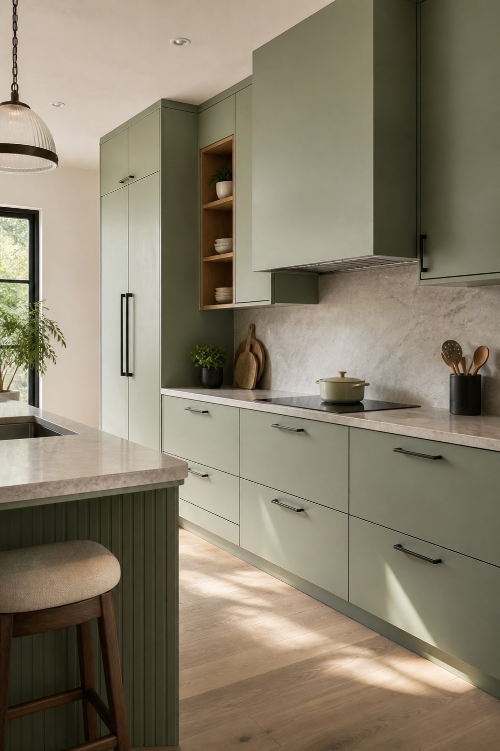
Celadon feels softer than sage but less familiar, which is why this kitchen reads newer. The blackened bronze details give it a grown-up edge, and the uncluttered range wall keeps the color from getting lost in styling.
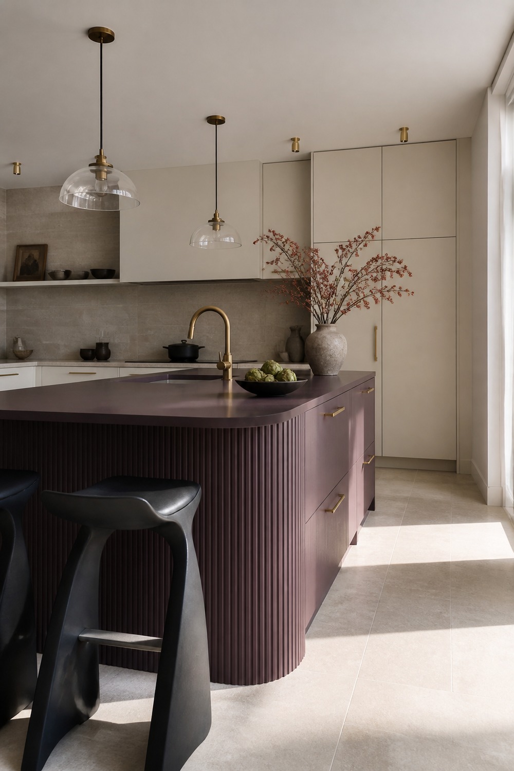
A plum island feels more interesting than another navy or green one. The pale limestone floor matters here because it gives the darker color air, so the kitchen feels moody without sliding into that old heavy transitional look.
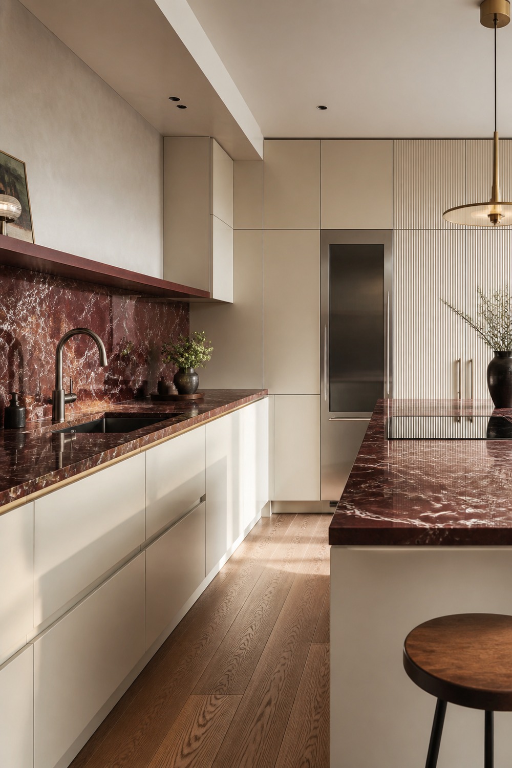
The burgundy stone is the whole point here. Instead of adding lots of little decor pieces, the slab does the visual work, and the cream lacquer cabinets make the kitchen feel polished but not cold.
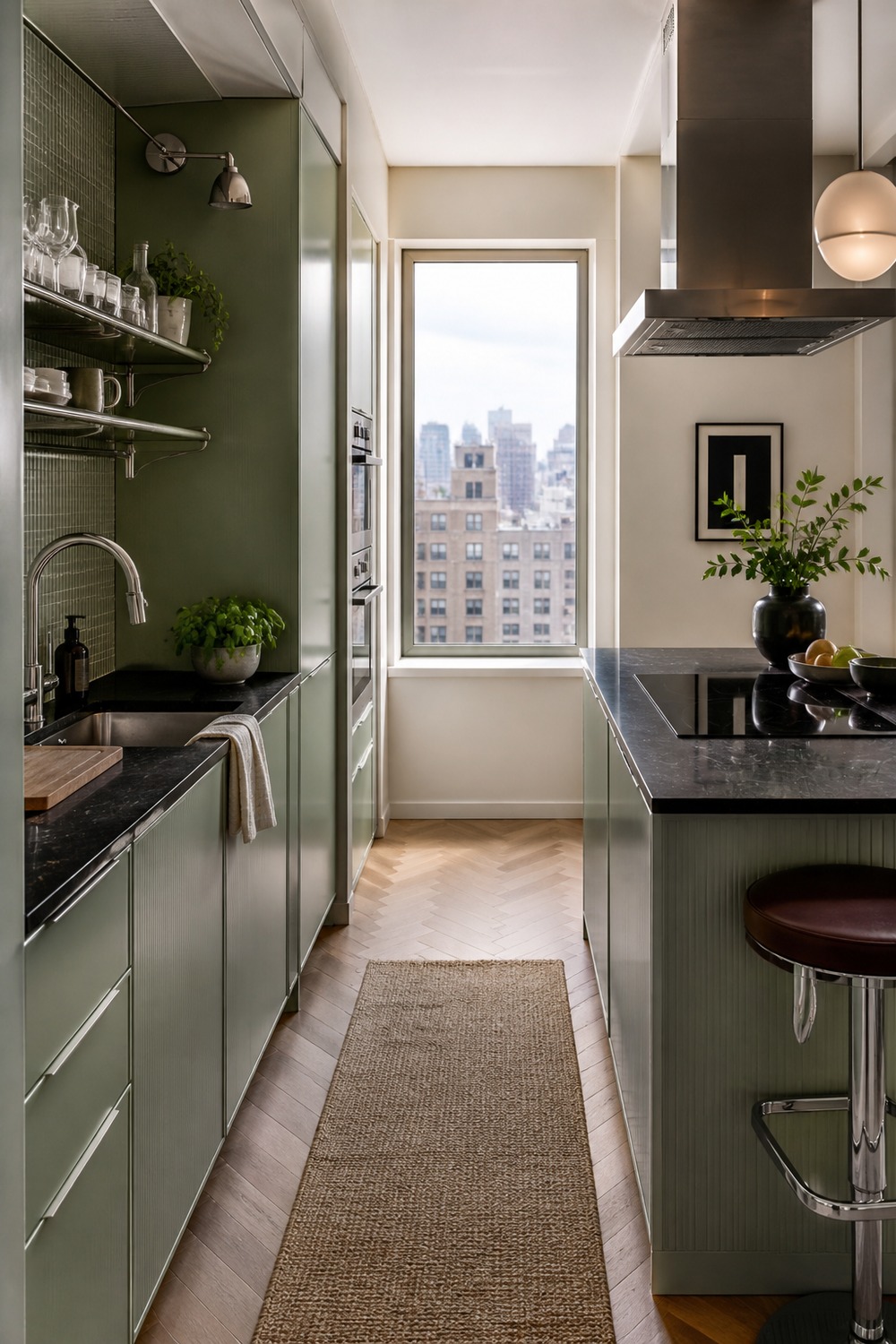
This small kitchen feels trendy because the finishes are doing more with less space. Sage, black stone, and chrome feel sharper than the usual brass-and-shaker combo, and the vertical storage makes the narrow layout feel planned.
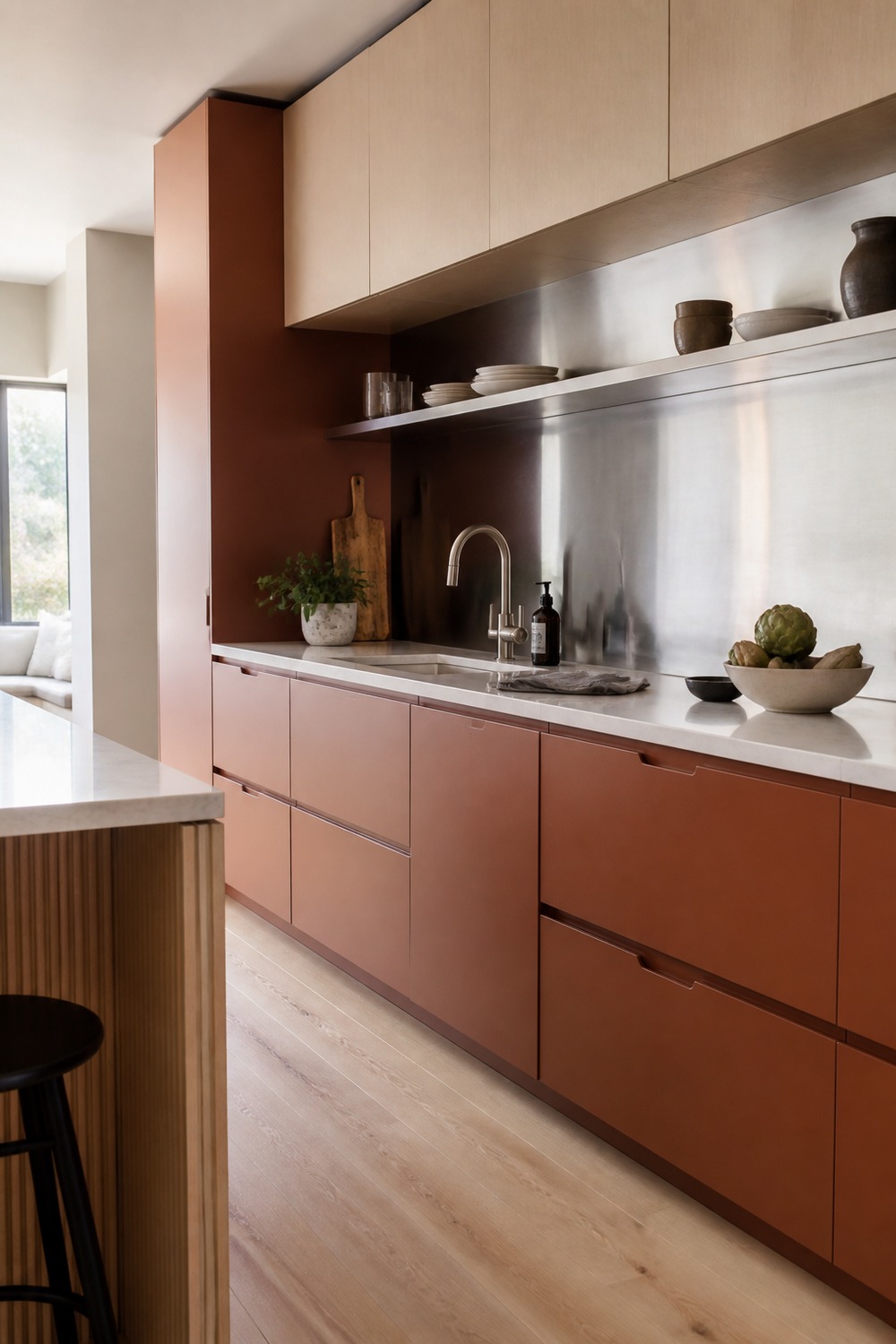
Clay cabinets can look very old-world, but the stainless backsplash makes this version feel more forward. It has warmth without looking dusty, and the cleaner upper wall keeps the color from becoming too heavy.
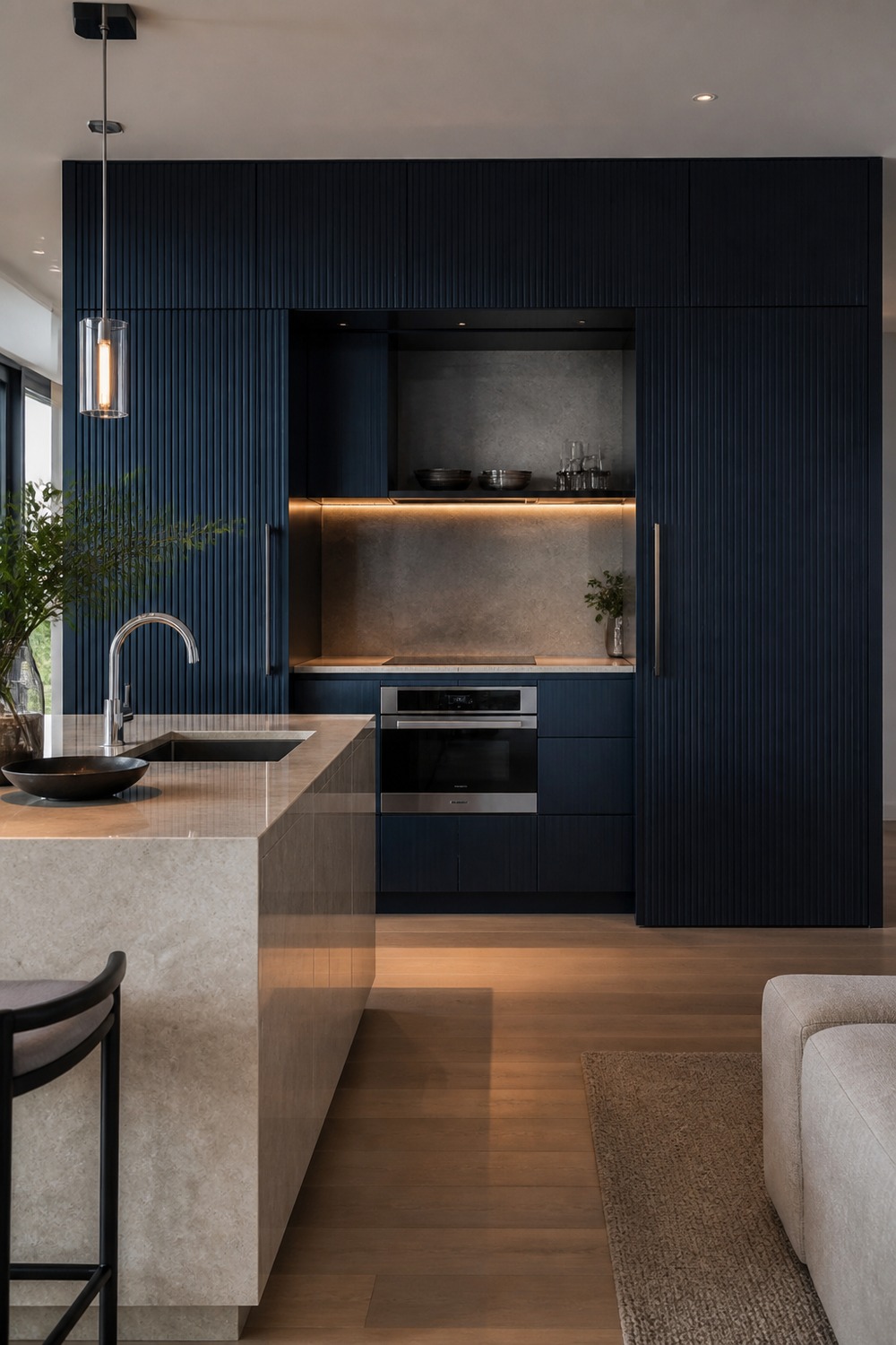
The hidden kitchen wall is what makes this feel newer than a normal dark kitchen. The inky blue-black color almost reads architectural, and the pale island gives the room enough contrast for daily life.
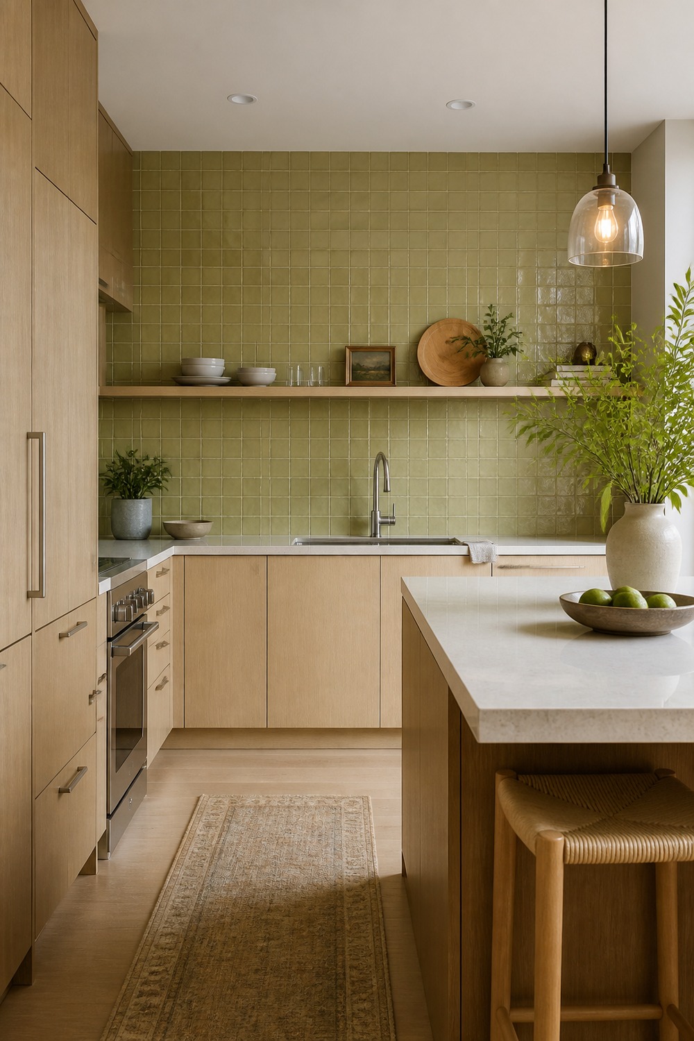
Chartreuse can go wrong fast, but this version works because it lives in the tile instead of every surface. The white oak cabinets calm it down, and the color feels fresh without turning the kitchen into a novelty room.
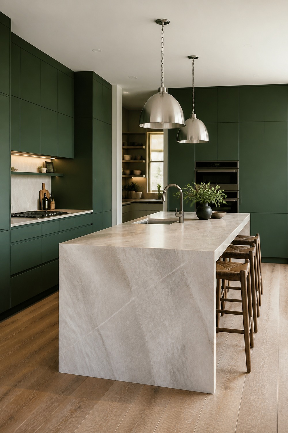
Deep green still works for 2026 when the cabinet style is cleaner. The slab fronts, nickel lighting, and pale stone island make this feel less farmhouse and more like a modern family kitchen that can handle real prep space.
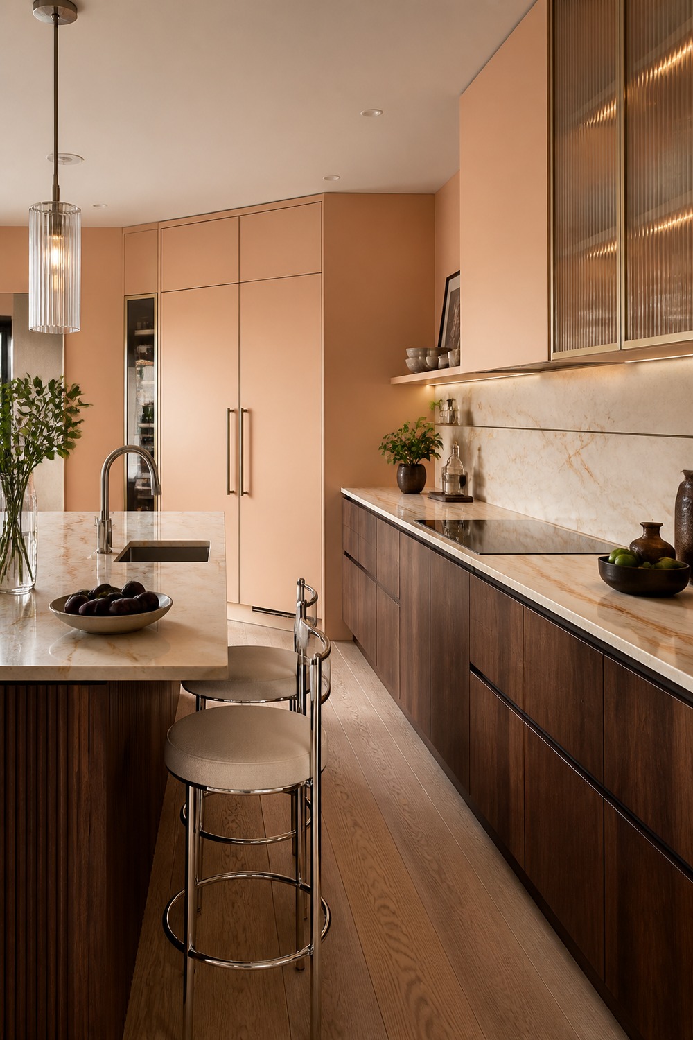
The apricot wall gives the walnut lowers a warmer personality without making the kitchen feel pastel. I like the ribbed glass and nickel details here because they add texture in a more current way than more open shelving would.
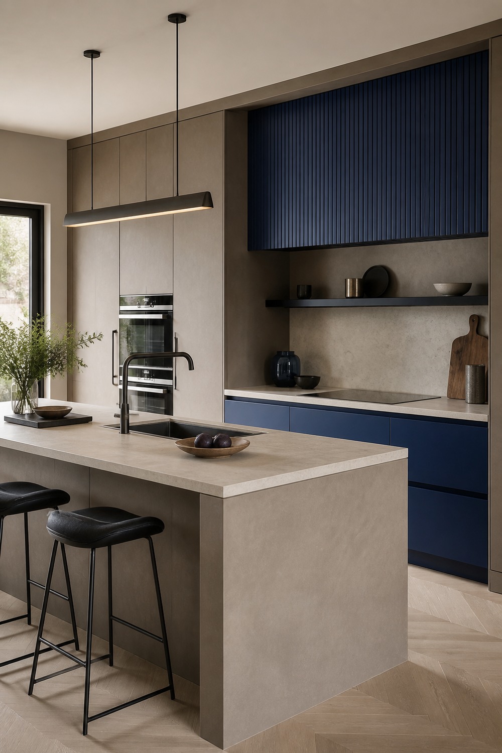
Taupe microcement gives this kitchen a quiet base, but the cobalt niche keeps it from feeling sleepy. The contrast feels fresher than a room full of soft neutrals, especially with the blackened steel shelf adding a sharper line.
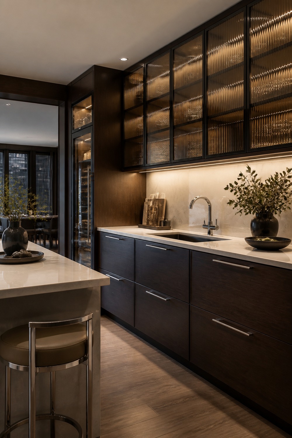
Smoked glass makes the espresso cabinets feel more layered and less flat. The backlit uppers give the room some depth, and the chrome pulls keep the darker palette from looking stuck in an older brown-kitchen era.
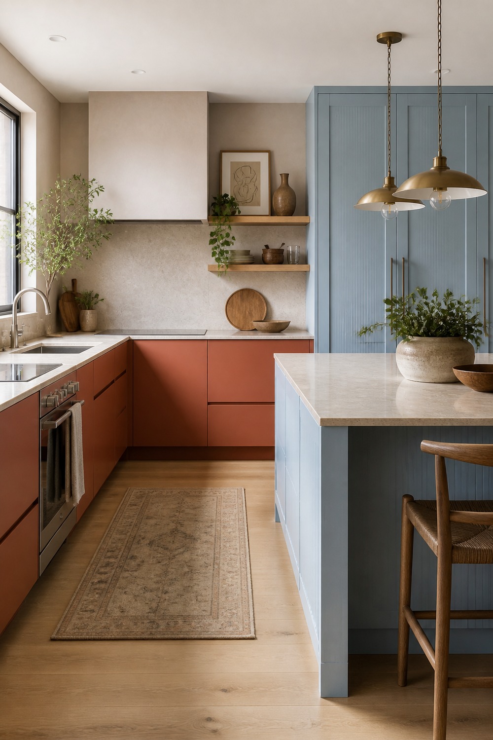
Terracotta and pale blue feel more interesting together than either color alone. The pairing has personality, but the cream stone and oak shelves give it enough normal kitchen texture to stay usable.
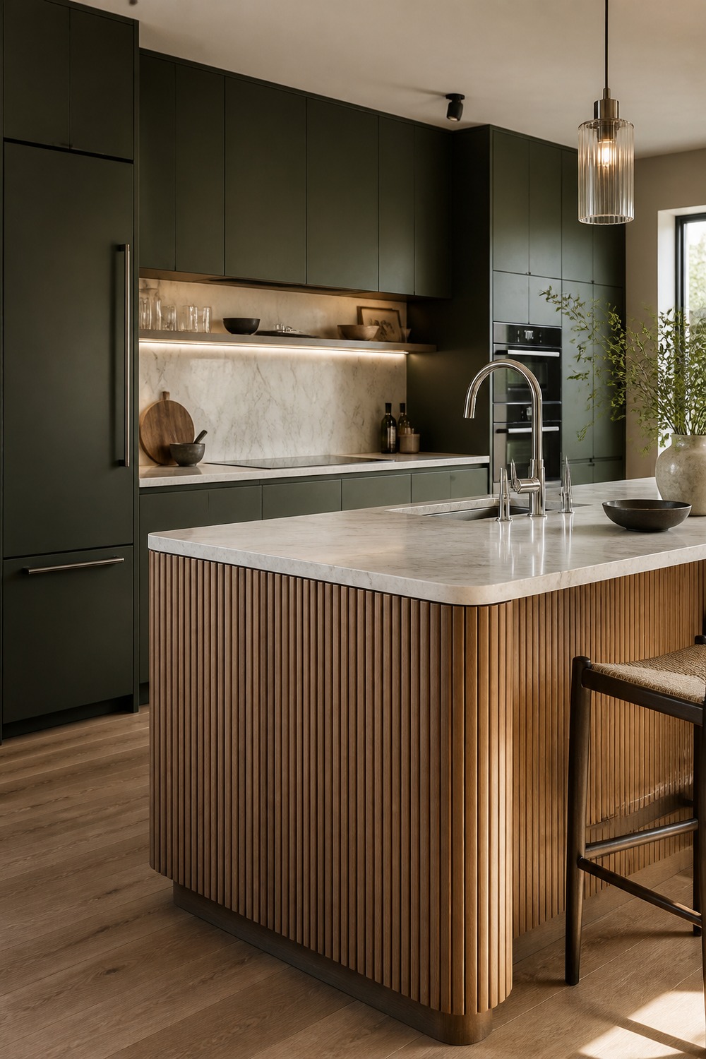
The fluted wood island makes this palette feel much more current. Black-olive cabinets could easily feel heavy, but the ribbed texture, pale stone, and cool metal details add enough movement to make it feel designed.
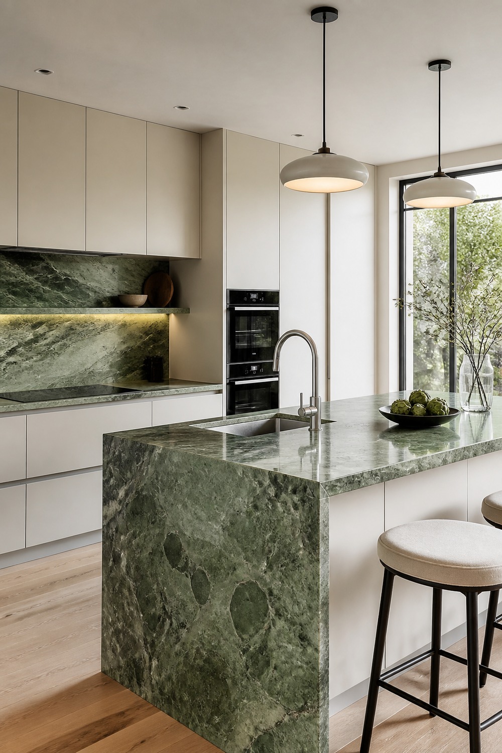
This is a good example of letting one material be the trend moment. The white cabinets are almost quiet on purpose, so the green stone can carry the color without needing busy tile, rugs, or extra shelf styling.
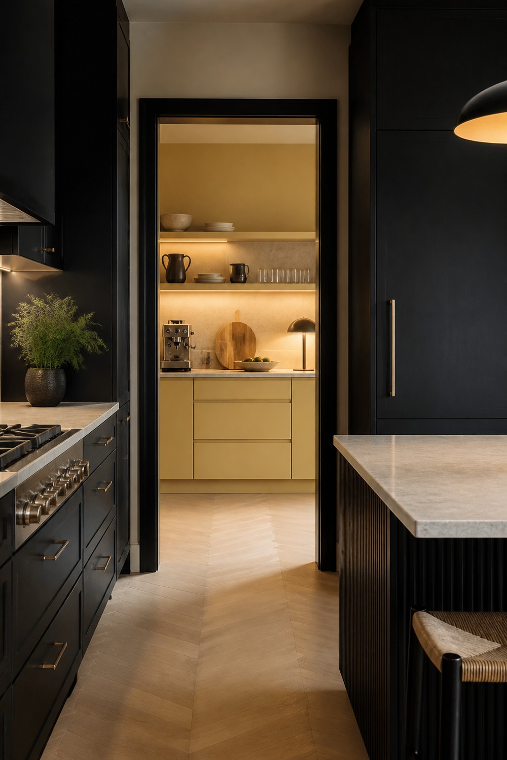
The butter yellow scullery makes the black cabinets feel more playful and less serious. I like that the color is tucked into a hardworking zone, because it gives the kitchen a surprise without taking over the whole room.
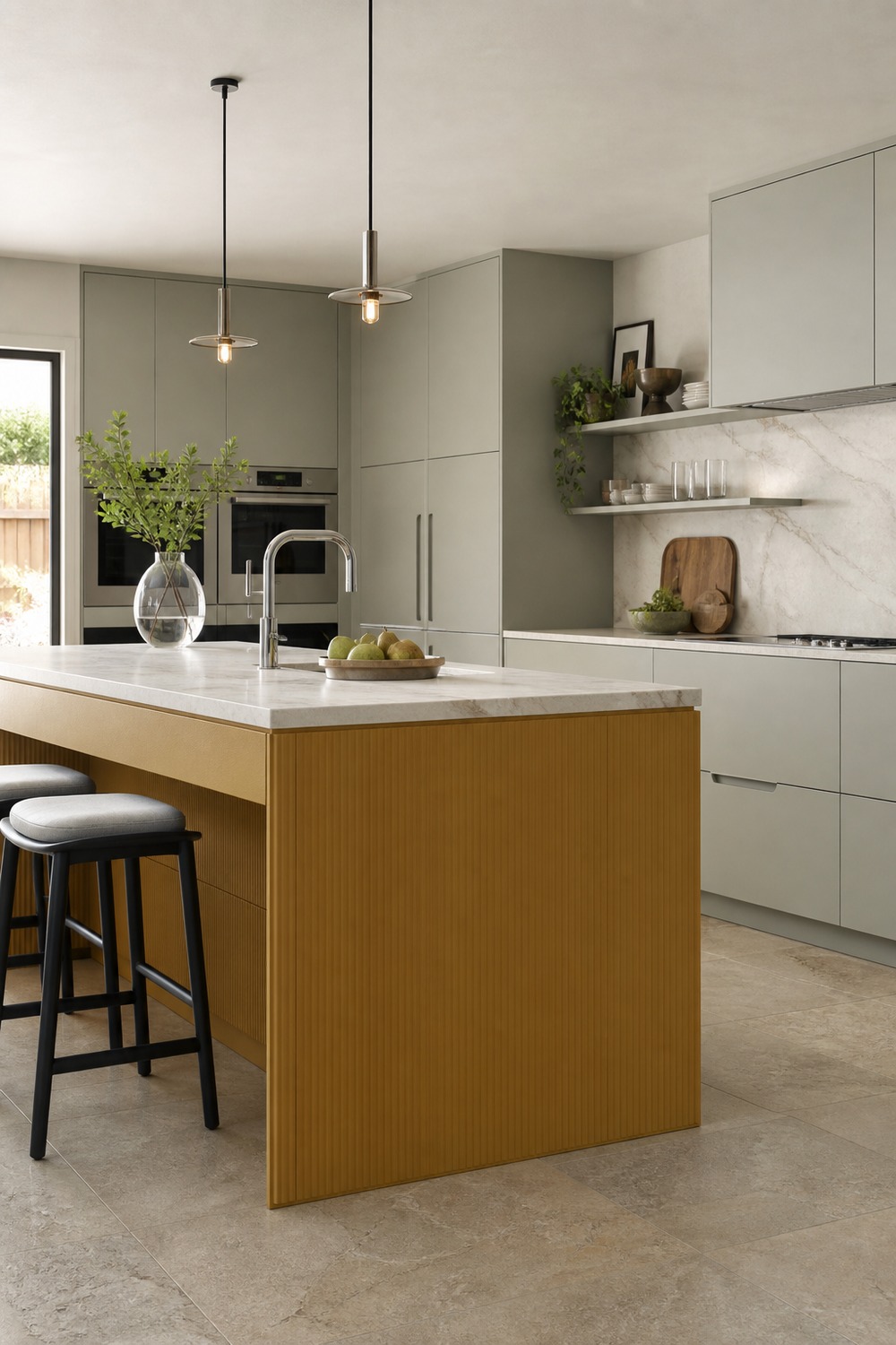
An ochre island feels warmer and more specific than a basic wood island. The gray-green cabinets soften it, and the chrome details keep the palette from drifting into the older brass-heavy kitchen look.
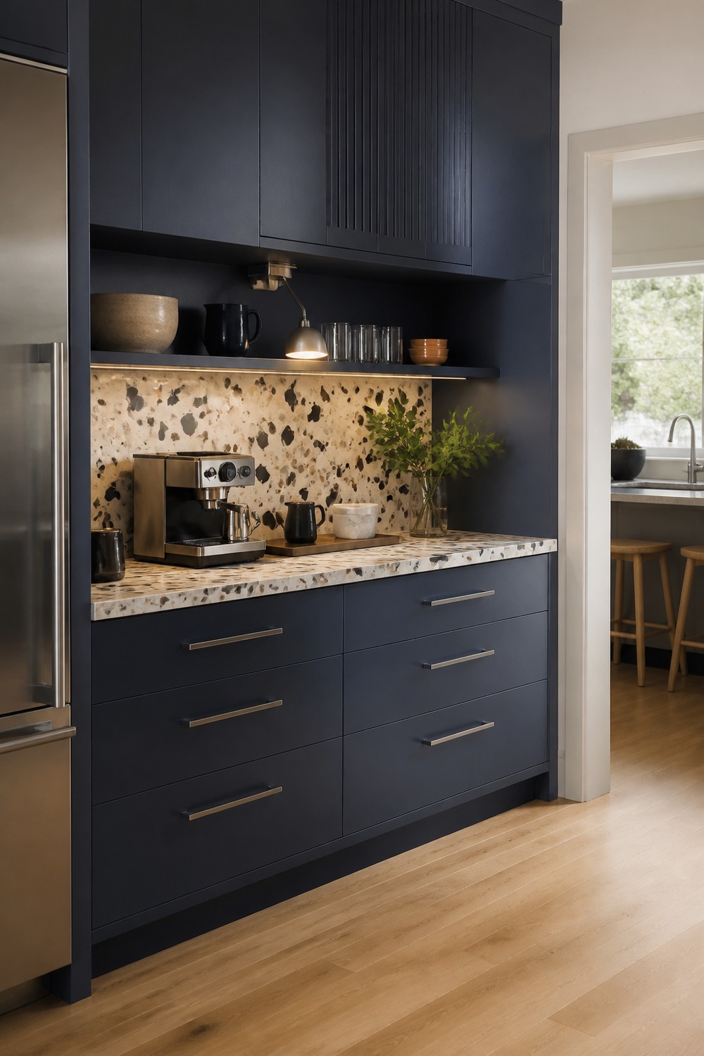
The terrazzo counter is what makes this pantry wall feel more 2026. The ink blue cabinets give it depth, while the small breakfast-station function makes the color story feel useful instead of just decorative.
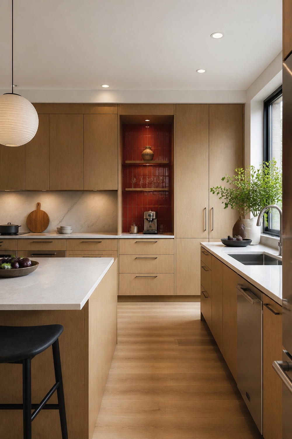
The red niche gives this white oak kitchen just enough friction. It would be easy for the room to feel too safe, but that one saturated pocket makes the whole palette look more intentional and current.
The colors that feel newest here are not trying to make every kitchen loud. The stronger move is usually one confident cabinet color, stone slab, metal finish, or pantry moment, then enough clean counter space and storage to make the room feel livable after the trend photo is over.

I work in tech, but my taste in design is straight out of a slow European village. Give me arches, aged brass, and a room that smells like books and coffee. That’s my kind of home.